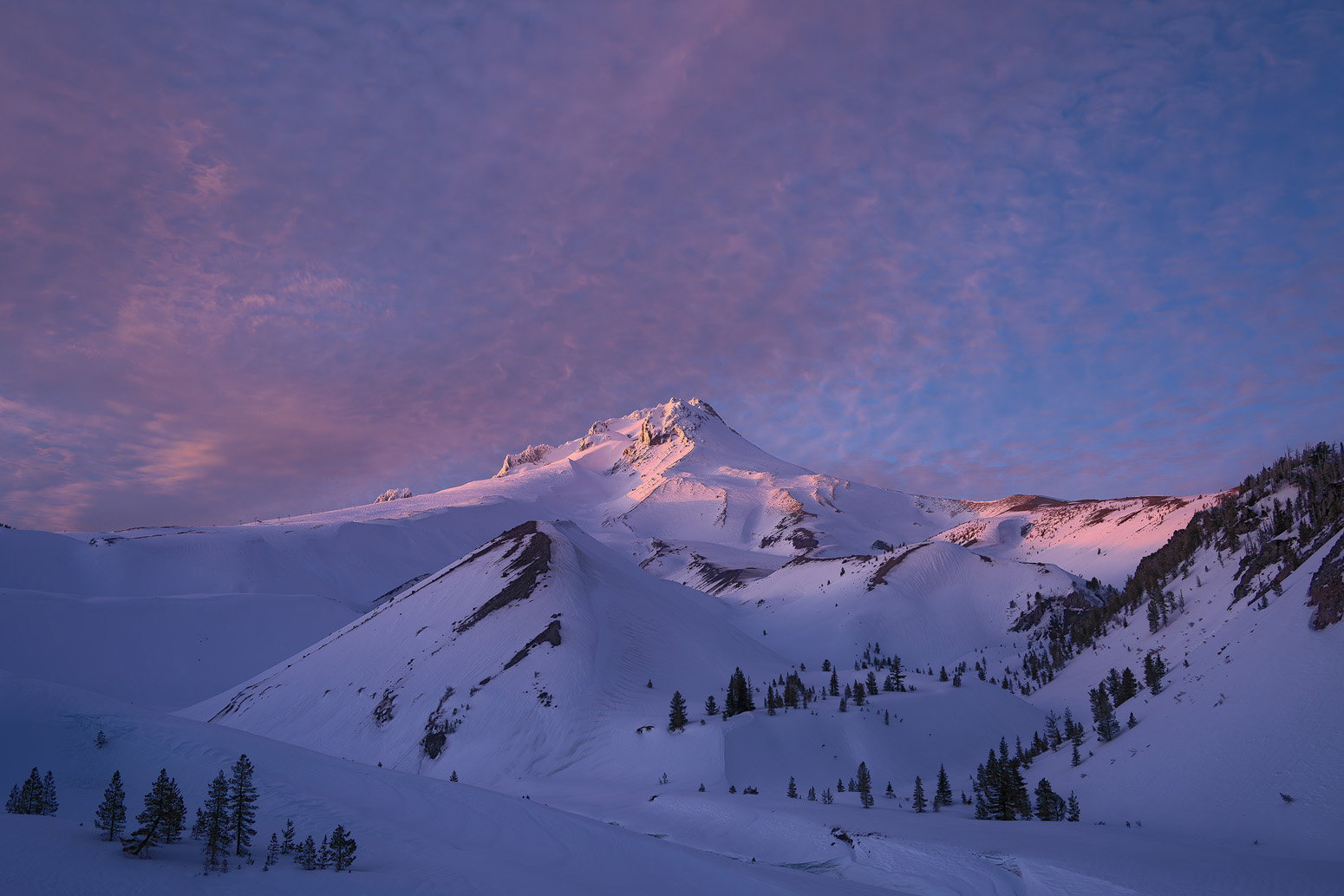
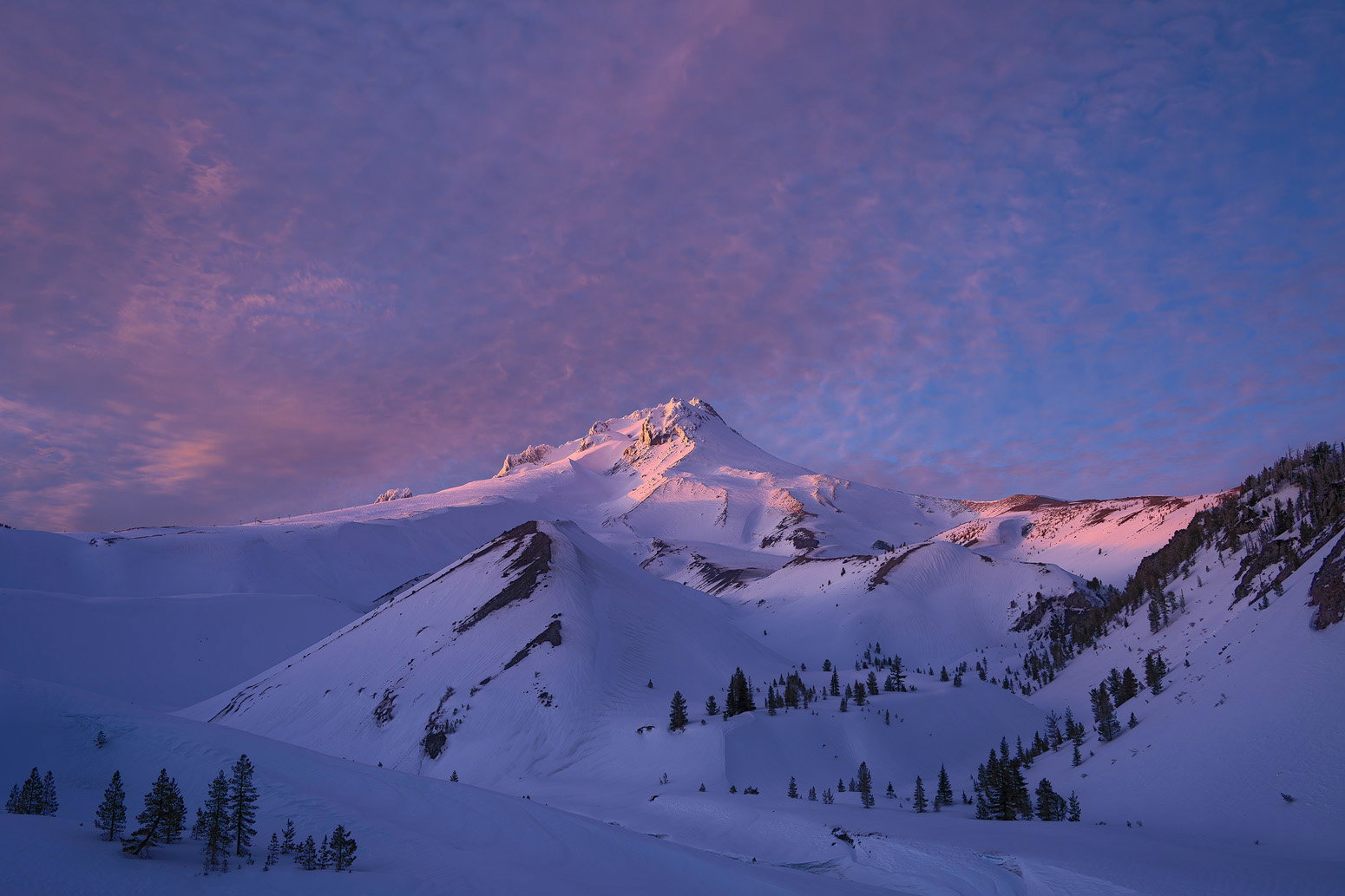
I may be in the minority here but I like the first version with the slightly lower saturation but overall I like this image very much. The light is beautiful and there is some really nice texture in the sky. I might be tempted to play around with the crop because even though the sky is nice, it fills up a large amount of space in the image.
I agree with Tom, the less saturated version works better for me. What a sky! I like how the little trees in the lower left corner anchor the scene. Simple, but lovely image.
The lower saturation version works for me. I like Tom’s idea of cropping out some of the sky. This feels calm and quiet, and a more pano crop would add to that feeling of serenity. Absolutely lovely!
Hi John,
Looks like you guys had a fantastic winter trip as the hits keep on coming. The first version is my favorite as well because I think you hit the sweet spot with the saturation. The light on the mountain is flat out gorgeous and the warmly lit clouds in the sky are amazing. Like @Bret_Edge I am liking the way those trees in the LLC anchor the scene. My only suggestion; and it is probably me because no one else has mentioned it; but there is something sticking up above the ridgeline about 1/3 of the way down on the left side of the peak that catches my eye a little. Beautifully done!
Well, certainly if I thought your previous was “Epic,” then for sure this one is too! I can’t think of any better descriptions! This is just gorgeous.
Now I think I’ll be in the minority now and say that I give the edge to the second version. When I cycle back and forth, the slightly more saturated version actually gives me the impression of more structure in the clouds and detail on the peak. It’s overally just slightly darker; which makes the light even more special. Of course either one is spectacular.
Also, I don’t see this mentioned, but I kinda like the very centered composition; ie. the peak is almost dead-center. And for me, this works! (remember, there aren’t no rules… ha ha.) I don’t see a good crop off the bottom. If anything off the top, it’s should be very much - that sky is gorgeous. I suppose you could crop maybe 5% off the sky and an equivalent off the right? But we’re splitting hairs here.
A wonderful image. I prefer the lower saturation. But with the change in saturation, a small change in brightness and contrast is very common. If you maintain the lower saturation in combination with the contrast and brightness of the second image, you would have the best of both worlds in my opinion. Nitpicking, of course, both images are beautiful.
No need to crop out any sky for me, and I like the trees in the LLC.
John, this is spectacular, love the magenta in the clouds and the last rays on the high peaks. Add me to those who slightly prefer the original, mostly because it’s just a touch brighter and I think that adds to the viewing of the shadows in the bottom half.
Well, I just commented on your previous image and now this??? Dare I say that I think I prefer this one to your previous post. I love the colors. For me it’s a coin flip between the two versions. Maybe something in between would work for me but that’s just trying to find something to nit pick in a perfect scene. As I said in your last post, I really love those trees in the LLC. I might consider a pano to eliminate some of the sky but I think as it sits, there is nice balance to the sky and a crop might upset that balance. You certainly had a good winter this year with yur images. I’m loving everything you’re coming back with.
It sounds like the consensus leans to less saturated, but maybe with the lower luminosity of the more-saturated version. I’ll play with that (and consider the suggested cropping).
I’m late to the party, but here goes. It’s a very beautiful photo, and I prefer the second. The increase in saturation seems to have created more contrast with the white snow capped peak, and it stands out more in a very pleasing way. And I also wouldn’t crop…the sky is an intimate part of the light show.