Hi Folks!
My two cents on the topic. While I find everything that John mentioned to be true, I also find an RGB color representation a bit misleading, and I usually use HSB/HSL translation of a color.
With RGB notation we know that most saturated red is R=255, G=0 & B=0. Same goes for every other primary channel. And, as John mentioned, if we start adding brightness tu pure red, we will start introducing values in other channels as well. So, one could make an assumption, that one most saturated channel is at “one third” possible brightness. After all, we have one channel at its maximum value already, and we only have two other left to make our adjustments.
I find it misleading , because it can obscure the fact that the most saturated colors (even prime ones, like red or green) has different lightness / brightness value. That’s why I prefer using HSB/HSL model. I’ll make a use of a Granger chart, which I found first in Tony Kuyper’s materials on saturation masks. For some reason I cannot upload it directly in the post, so I’ll put a link here: Granger Chart.
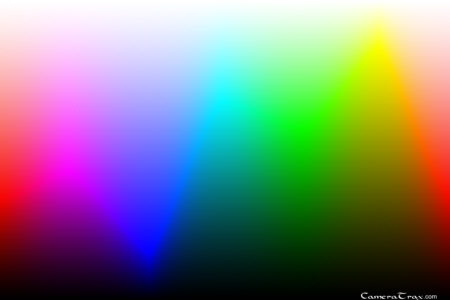
It’s basically a chart of all hues (on x axis) vs luminosity (from black to white on y axis). It shows that different hues have their most saturated points on a different brightness / value level. For instance - yellows are most saturated towards the top of the chart - meaning with their brightness right next to white. While blues are most saturated in the dark parts, right next to the blacks.
During sunset we mostly deal with colors like oranges and reds, and after sunset with purples and deep blues. While oranges can be highly saturated toward upper midtones, all other colors are more vivid in the range from midtones to deep shadows. Brightening the very saturated reds (which are in the lower midtones) will wash them out and make less prominent.
I find these hues (deep reddish oranges and reddish-purples) very tricky to post-process, as they don’t work well as “bright” highlights. Instead, they have to be placed somewhere in the midtones and act as highlights just by contrast with other, darker parts of the image.
To answer question about histogram - it’s a tool, and it can help you tremendously. For instance - when I’m shooting I’m always checking two things:
- my “blinkies” - if I don’t see any blown highlights
- and even if I don’t, I go to my RGB histogram to see each channel and evaluate, if none of these touches my right hand side of the histogram
Even one blown channel can make some problems as that pixel will always have one of the RGB values set to 255 from the start, which can hinder my ability to work with it in post-processing.
Histogram also helps with evaluating overall exposure. I fooled myself at least few times when looking only at the back screen of my camera, especially when its brightness level was set to “auto”. Everything looked great. But in the Lightroom panel I saw heavily underexposed photo, with most pixels on the left side.
And that brings me to the last part - I don’t think there’s a proper histogram you should look for with every photo. If the photo is meant to be dark (like a night shot), obviously most pixels will be on the left. If it’s a high-key photo - most will be on the right side, without any pure blacks or deep shadows. For starters - I would use it only to evaluate overall exposure and possible blown highlights. In post, you can check it from time to time, but don’t try to make it look more “even” or “from left to right” just for the sake of it. We’re not making photos for the sake of a pleased histogram. 
Hope that make sense - if I wrote something that’s unclear, please let me know. 