Woodland Smoke (+revised)

Project Overview

Image Sequence

Image 1

Image 2

Image 3

Image 4

Image 5

Image 6

Image 7

Image 8

Image 9

Original Submission

Project Overview

Image Sequence

Image 1

Image 2

Image 3

Image 4

Image 5

Image 6

Image 7

Image 8

Image 9

Brief Project Description

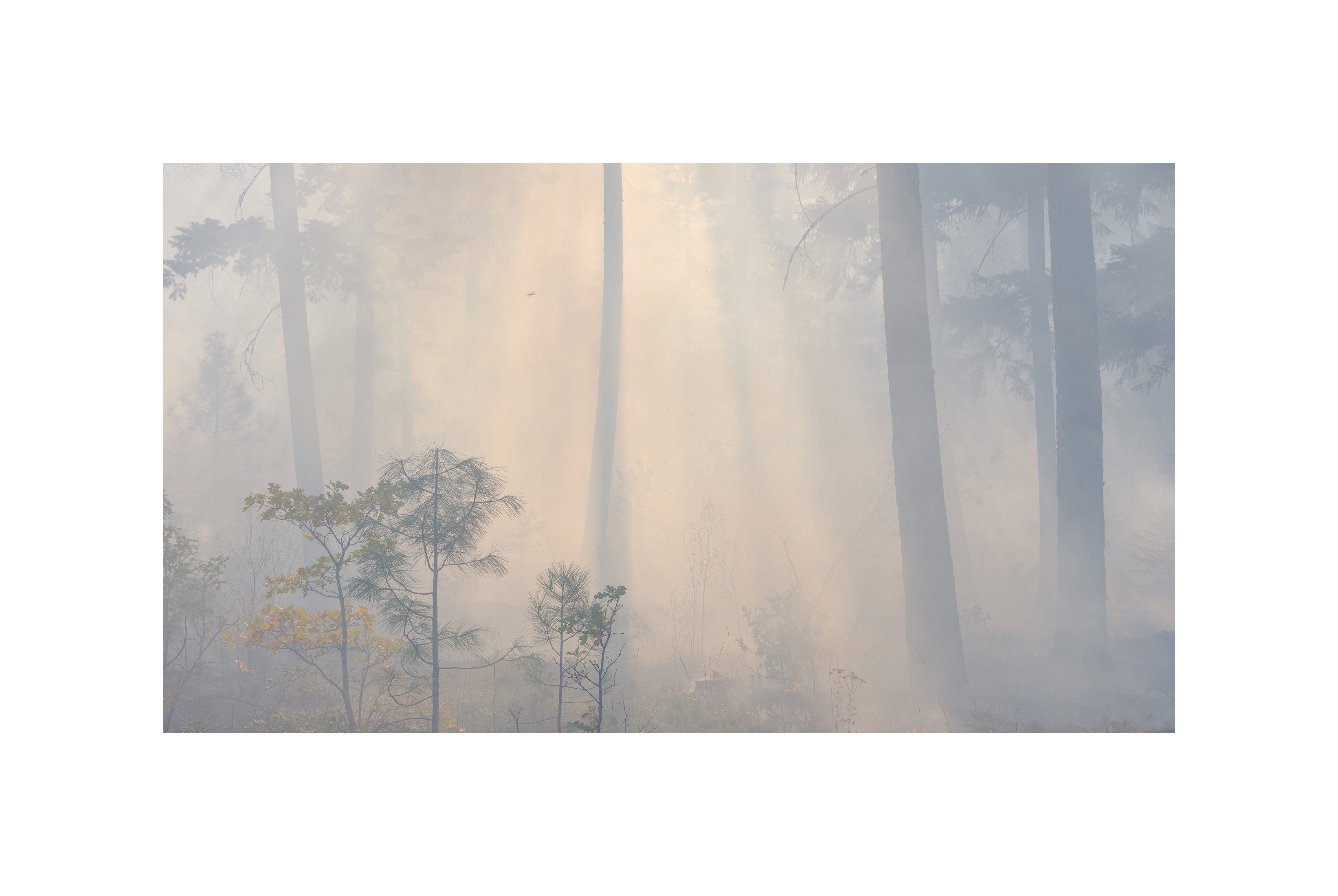
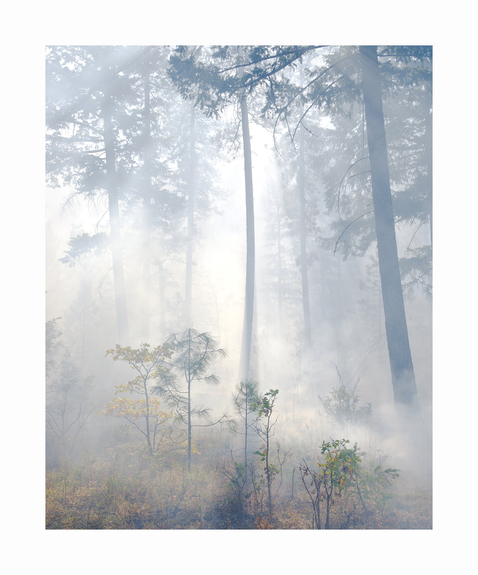
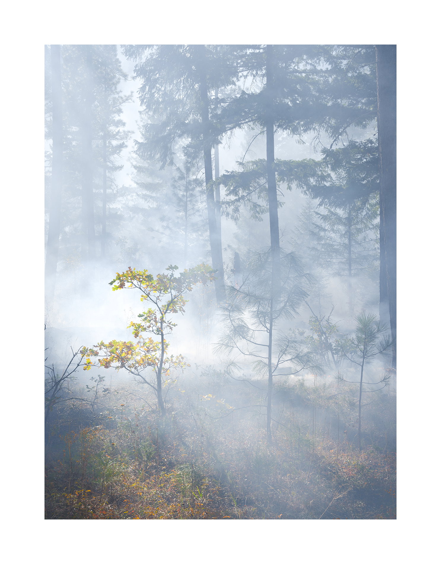
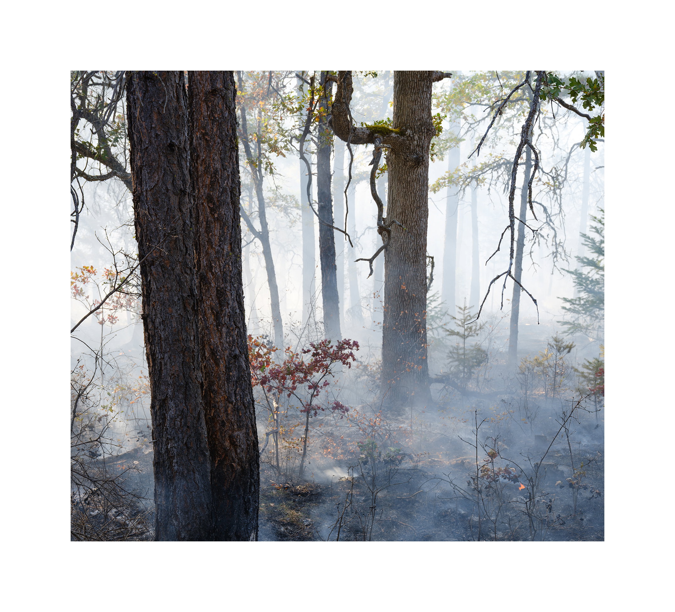
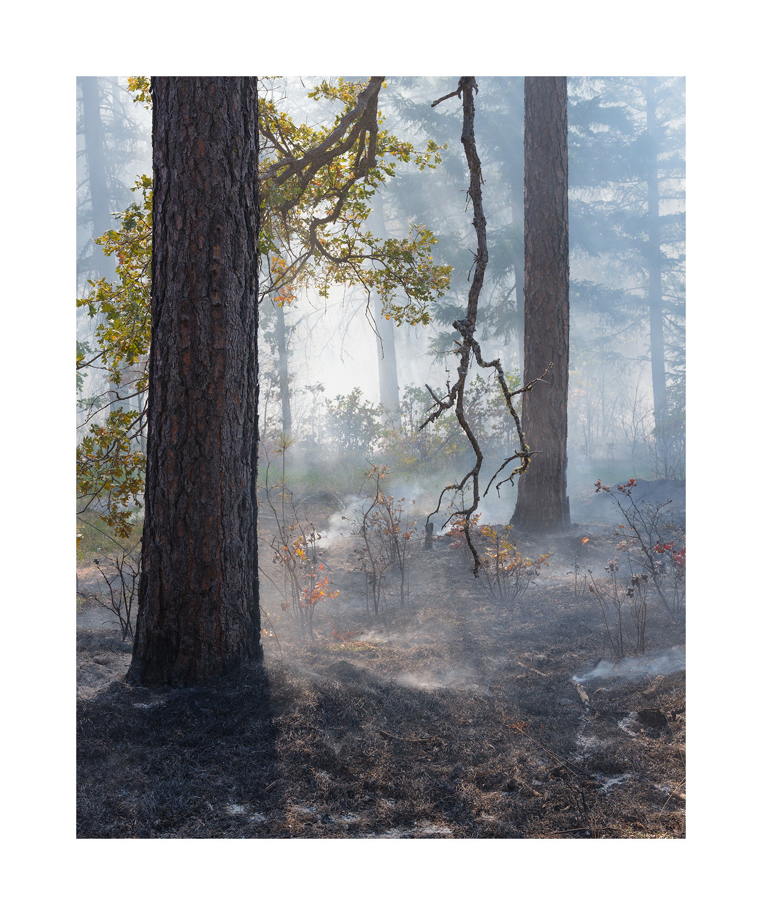
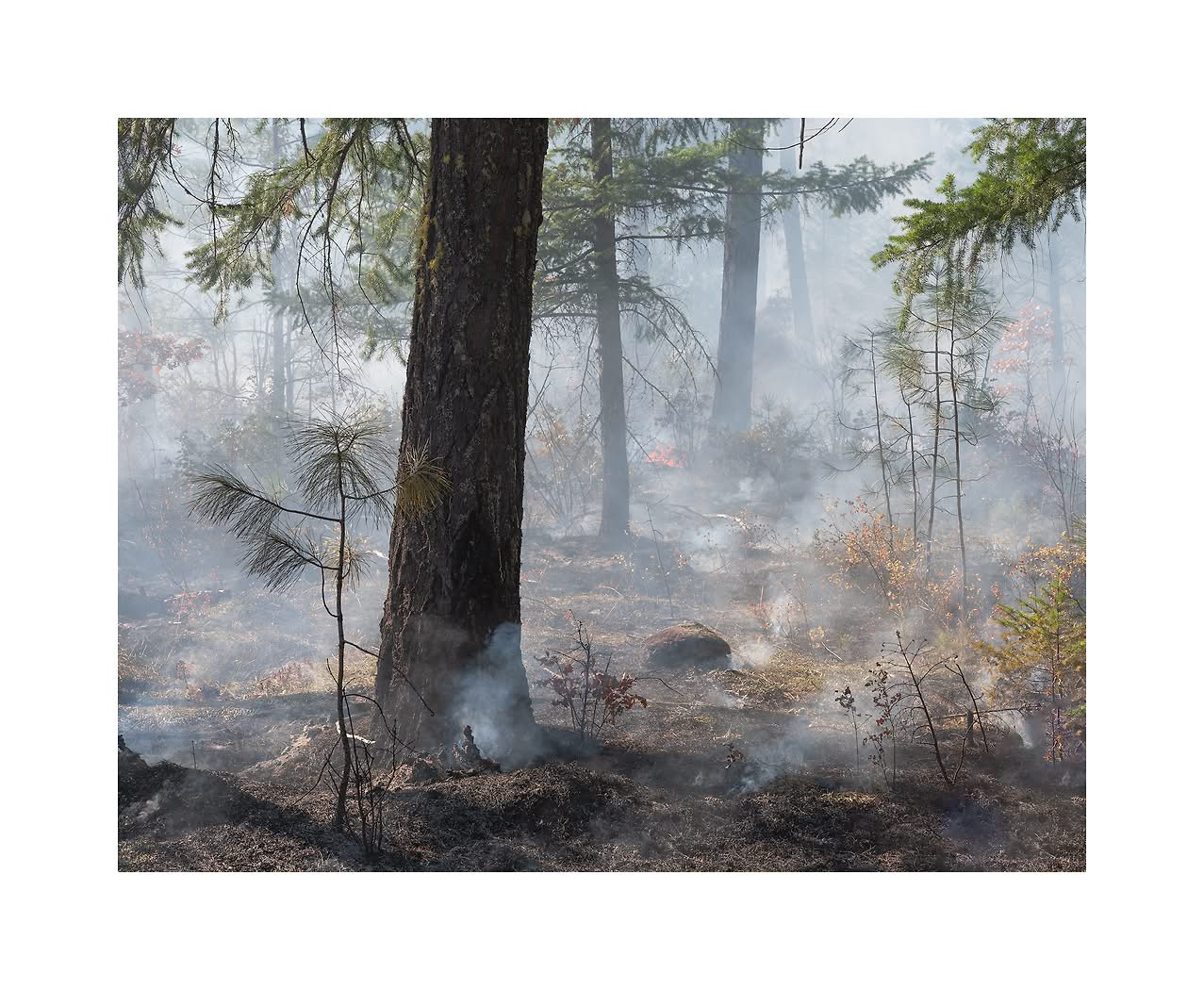
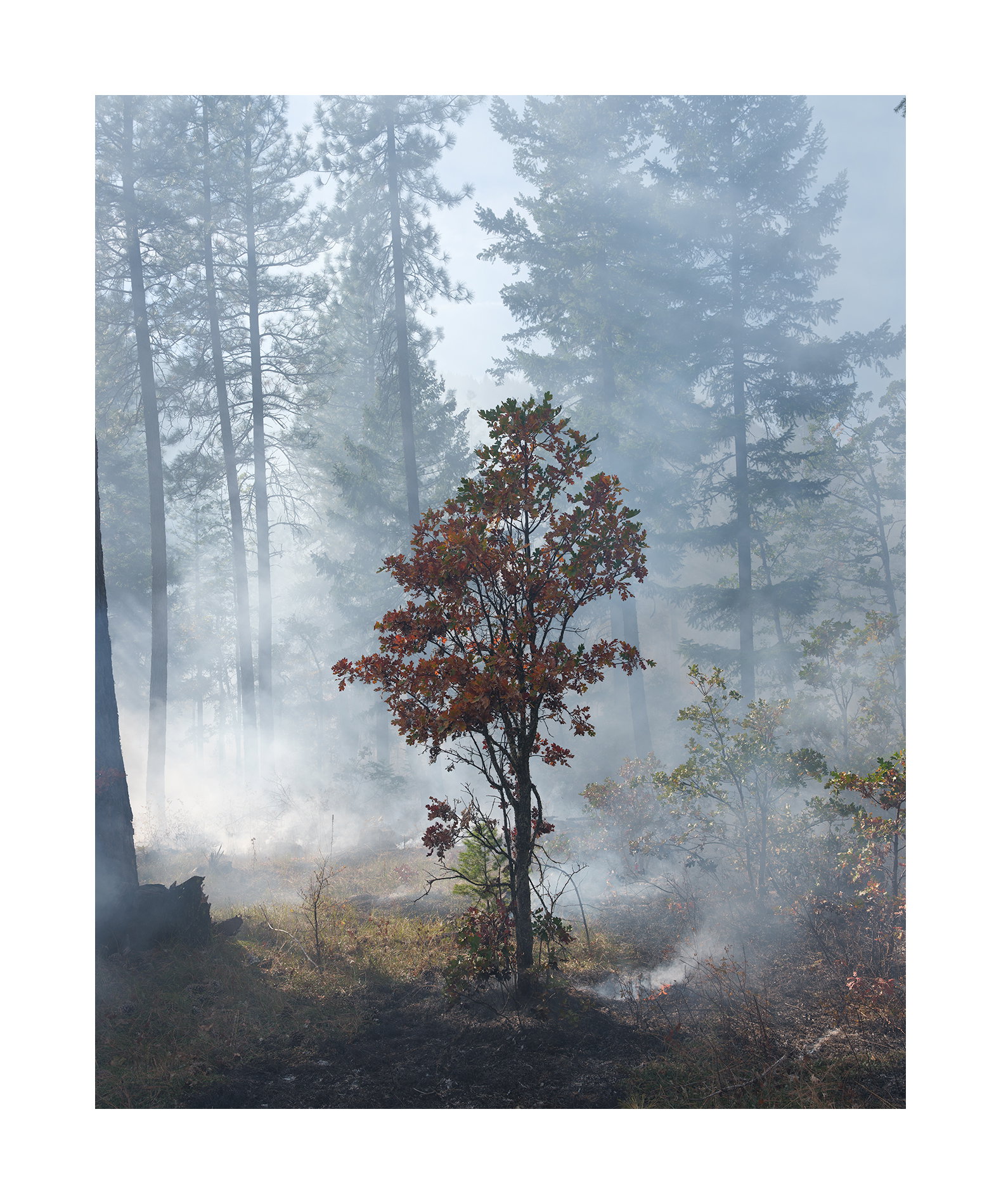
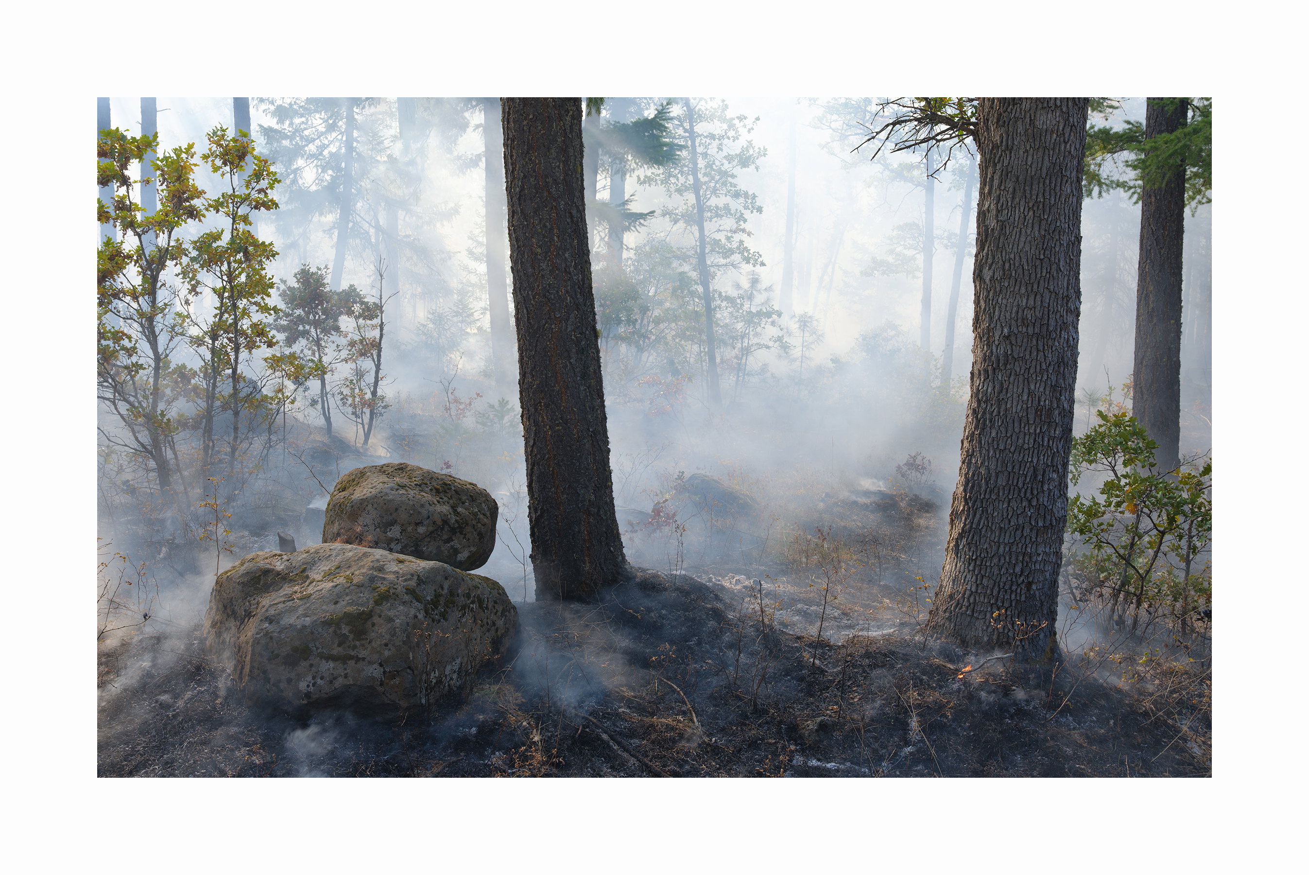
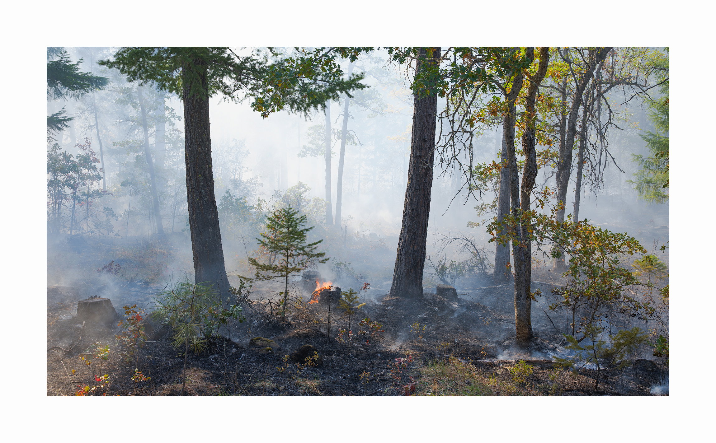
This is about how forests look when engulfed in smoke. The object is to show different appearances of smoke amongst trees and brush.

Creative Direction

The images fall into two groups. One group consists of images of smoke seen through a screen of well defined trees. The second group consists of smoke and ghostly figures rising out of the smoke. There are also images where there is a transition between the two and contains elements of both group 1 and 2. There are several ways of presenting the images.

  1. A continuous transition from group 1 to group 2. Image order: 1,2,3,4,5,6,7,8,9
  2. A continuous transition from group 2 to group 1. Image order: 9,8,7,6,5,4,3,2,1
  3. Start with group 1 then transit to group 2 and end with group 1. Image order: 1,3,4,5,7,9,8,6,2

I have decided to go with option 1 but would like to hear your opinion.

Self-Critique

I chose to present the images in order #1 because that is the way a person would see the spectacle. They would first take in the whole scene and then slowly zero in on smaller and smaller aspects of the scene.

If you think of a collection as a musical piece then order #2 seems better. Most musical pieces starts slow and build up. A crescendo. In this case the flat images are softer and the contrasty images.

Order #3 has less order but greater variety. It has the advantage in that it separates images which are obviously alike. That is image 7 from 8, and 5 from 6.

Which order do you think is better as a presentation?
Do you think having similar images next to one another is an advantage or a detraction?

Feedback Requested

During the shoot I felt that at least some of this images should show the fire itself. However, as I look at them the fire images seem literal due to the absence of smoke. Do you agree or should it be added?

There were several rejections. But the best of the rejections is the one above. Should it be included? The lighting is kind of nice but it lacks the mystery. That’s my opinion.

Presentation Goal

Gallery Exhibition

Alternate Images

Please provide feedback on whether any of these images would fit more cohesively in the project.
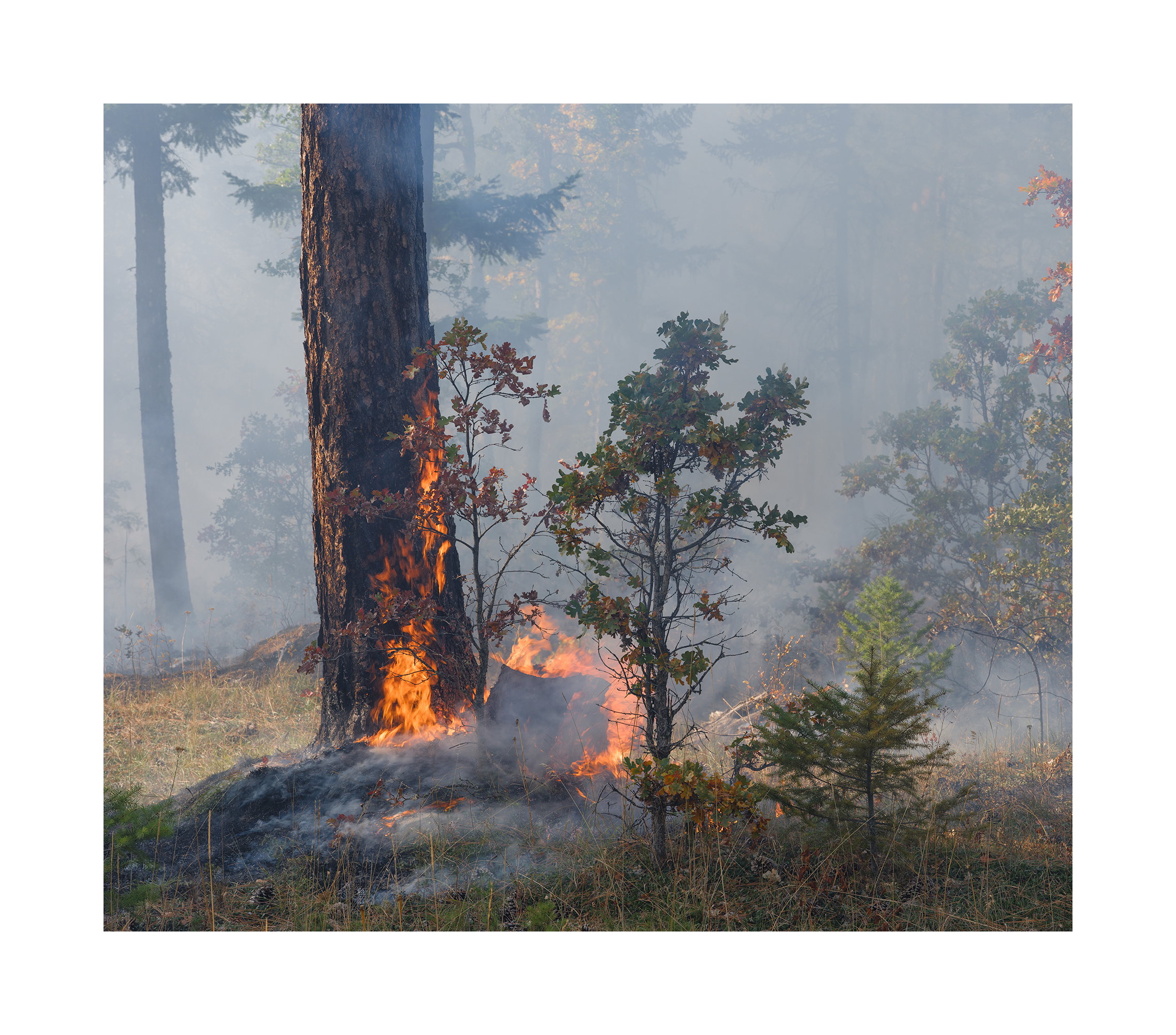
This is always difficult, Igor. I’ll start by saying I don’t feel the alternate image fits with the rest-it’s just too blatant and you have other indications of the fire in the series. I think your first and last images are quite appropriate. I remember hearing somewhere that you want to put your best last and your second best first, for what that’s worth.
Image #3 somehow feels like a discontinuity in the series to me, though I suppose it could also be considered an accent point. I like the image as a stand alone image, but I don’t think I’d include it. Tome it’s too much like a portrait of the tree rather than the story of the fire and smoke.

As to whether like images should be together or separated, the sequence you decided on feels smooth to me, so I think keeping them together is working here.

As you noted elsewhere, how they’re arranged on a wall could make all the difference. When I did a wall in our house I put them all in a single file in PS so I could rearrange them, but it’s really difficult to get a good feel for the composition because they become so small (unless you have a very large screen TV you can view it on-ours is smaller than my monitor).

Hi Igor

this is fun - but you need to build a book or a presentation with a story

My thoughts - the Alternative suits the beginning.
You need to be walking through the slides in a sequence that tells a story

igor walkthrough.pdf (20.1 MB)

Here’s a MOVIE

Huw

I can see your point. It doesn’t fit into the two categories of perspectives on the burn: through the trees and within the smoke. It’s still an obvious fire image but it has side lighting rather than into the light. But it’s one of my favorite images of the series.

Isn’t this what it’s doing? I’m not following.

Yes Igor
I’m suggesting my sequence as an alternative, and offered the movie as a way the images might follow each other - showing how the portrait and landscape images might follow each other and work sequentially on a wall or as a slide show.

…6,5,3, 7,8,9 would work well as a sequence

Just a suggestion.
I like the way the show holds together. I love your slides but I feel the way you have suggested 1->9 puts those very or too similar together.

Obviously just my thoughts for you to consider and use if you like it

Regards

Huw

1 Like

Wow, this is a very tough question. Because your goal is for this to be presented in a gallery I think I would start with 9. It’s the least obvious image and I would think you’d want to lure the viewer in and get them thinking and asking questions about what this is rather than telling the whole story in image 1. I think image 9 does that and it’s one of my favorites or my favorite image in the series. It could simply be light beams in fog. Images 8, 7 and 6 are more obvious and the viewer will likely be able to tell that this is not fog but rather a forest fire but yet they don’t tell the whole story. Images 6 and 5 are more contrasty with different light than 9, 8, and 7 making them a great transition point. By the time you get down to image 4, you’re getting a whole different perspective on the landscape and the story is thrust right at the viewer. There is fire in each of the images from this point forward, even if you have to look hard, you can see more of the ground vegetation and it should really be apparent to the viewer what’s transpiring and what story you are telling.
I agree with @Dennis_Plank regarding image number 3. It really doesn’t squarely fit into either of the two camps you are trying to portray, but I also don’t think it really needs to. It could also be a good transition point between the two groups maybe somewhere around the middle of the sequence however, the only drawback to that would be that you’d have 4 vertical images in the sequence from 5-9 and shown on a wall in a gallery, that may not work well.
I could also see image number 2 and #4 being switched in order because I feel like from a distance, image 1 and image 2 are very much alike and of virtually the same dimensions that you may want to break them up and stick image 4 into the 2 slot. Then you’d have a pano in image 1, a 4x5 in image 2, a vertical in image 3 if you keep that one there, and then another semi pano in image 4 followed by a square in image 5.

The next question…is the gallery going to be all of your images in a straight line or are there going to be images on top of each other. If they are going to be stacked you could do a 3x3 on a wall or a 4x2 with the lead image on it’s own to start things off. But honestly, I would reverse the order and start with image 9 like I’ve stated. It’s colorful, it’s soft, it’s beautiful and it doesn’t hit you right between the eyes with the whole story right up front. It’s the soft note in your musical example and you’d finish with the bold and contrasty image 1 that defines the story if there is still confusion. I really could play with this all day and just let the imagination take you away.

1 Like

Thank you for this thoughtful and detailed analysis. This is really what I was hoping for when I created this project. These images were shot at the PNW shoot at Mt Adams. All images were shot within 45 minutes of one another as I thought I was going to pass out from the smoke. As a result the variety of images is not and could not be as a project that took months. There was no time to think almost. I shot instinctively and based on past experience. Luck had fallen at my feet and I used all experience to make the most of it.

I never thought of making a project when shooting and @John_Williams was the first to suggest it. But once I got started I realized this was going to be much more complicated than I thought. Only then did it become clear that the images broke into certain ‘types’ and the challenge became how to present these ‘type’ (genres). I still don’t know if I did this all backwards. There was no project before the images came about. Perhaps you should come up with a project and then make images that support your idea. I made images and then tried to bind them together as a story. But as I’ve stated many times before I don’t like to use images for narratives. I prefer to have an emotional narration, have images that have similar emotions next to each other (contrasty next to contrasty and high key next to high key). In a way I think I’ve done that. I think you’re right that it should go from 9 to 1 rather than the other way around. Yes, you’re right. Thank you for that.

On the issues of ‘is it fog or is it smoke’ I personally don’t find that to be interesting. After all, it’s spelled out in the title so why should there be any mystery about that. Several comments went along that line on the individual images and frankly it baffled me.

One thing I’ve learned from this whole thing is that high key images are difficult to print well and even their best versions come nowhere close in beauty to the ones with a rich tonal range. I’ve concluded that it’s due to their flatness. They lack the transition shadows that give objects volume. All those pale ghostly trees make good background but just by themselves they aren’t very impressive. It’s the combination of the two that works well. I was surprised by that.

Igor,

First of all, these are all outstanding images portraying really an active fire. My simplistic mind is more basic than your description of groups:

I see it simply as the presence of smoke, including 1. as lots of smoke, hinting at active/more fire/flames and 2nd group as less smoke, smoldering near the end of the fires life. Hope that makes sense.

#9 to given the heavy smoke represents to me, the heaviest and most active of the fire/smoke images and I would start with that. Same as David, but I guess for different reasons. The last image in the series would be #4 as that is mostly smoldering smoke and to me indicating the fire is closer to clean up mode, than an active fire.

With that line of thinking and a quick pass at it, would be something like 9, 8, 7, 5, 3, 2, 6, 1, 4. This is based roughly on the diminishing amount of smoke (mostly close to the ground as opposed above the ground behind the trees.) And because of that thinking, #3 fits my interpretation of an order. Although I do see that one showcases the lone tree a bit more than notion of smoke and fire.

If the intent is to tell a story, I think showing them in the chronological order of Hot, active fire through to the smoldering cleanup stage is what works for me. But then again, it’s not my show!

Honestly, another alternative would be to randomly display them or alternate the images, back and forth from group 1 and group 2. If that makes sense.

Finally, I would agree that the alternate doesn’t fit the series - although on it’s own is a wonderful image with it’s own story to tell.

Great job with this. thanks creating and sharing the Project

Thank you Huw. For some reason I hadn’t got a notification that you had posted. I only saw your post after reading David’s. Thank you for your time and effort in putting your ideas together. As I stated to David I am now less interested in telling a story about a fire and more interested into the emotional aspects of the images themselves. Another words I don’t want to start with #9 because it’s the most beautiful. I want to start with it because it’s the quietest. With that in mind I want emotional continuity and want to achieve that by putting similar images next to each other. I just wish I had a larger selection to choose from but the range, I feel, is good. There are images that are mostly strings and woodwinds and there are others that are brass and percussion. All right, brass aren’t very brassy. But you get the idea.

Thank you Lon. I have made a revision of the order based upon the input you and others have provided. As I see it whether you see this as a history of a fire or a range of smoke mystery the order seems to be about the same. From more mystery to less mystery or intense burn to end of burn. I personally find the mystery of smoke with objects partially revealed to be the best art of these images. As I stated earlier, high notes and low notes.

I feel that similar images should be together rather than apart, however. I understand the attraction of the jolt of differences but I personally like slow transitions where a mental comparison is made by viewer when they move from one to the next. I have rearranged the images accordingly. I feel that the two panoramas should be adjacent. Number 4 and 5 are enough alike that they should be together with 4 being more mysterious. And number 6 and 7 being remarkably similar with 6 being more like the preceding one.

Now the pendulum swings the other way and I start to wonder how important is order after all and whether the images themselves is what’s really important. Well, I worked on the images endlessly and don’t want to go back to that.

Hi Igor,

I was waiting until I had time to really dig in and think about the order, and in doing so, I think you have worked out a good order in the revised numbering above. I think what makes it so hard with this project (and maybe with most projects) is that there are several elements in each image, and then the elements of images themselves in a series. It’s one reason I think the project forum doesn’t get as many posts or as many critiques. It’s hard work for all. It requires thinking in a really organized fashion. This is about as many thoughtful critiques as I’ve seen here.

So, for what it’s worth at this stage, my first instinct was that #3 concept of order is the most dynamic. To complicate matters, there is another element that is salient to me: the presence of a young tree whose life (yes, personal possessive pronoun since it is a life, and not a “that”) will be improved by the reduction in fuels around it and the production of nitrogen and other things in the soil as a result of the burn.

It’s probably because I read Thoreau’s “Succession of Forest Trees” in graduate school and can hardly see a forest or a fire without thinking about seed dispersal and the impact of fire on particular species. There is a kind of Darwinian element to it. So then there is the expansion of this other element: deciduous and evergreen trees as young trees in a hall of giants surrounded by smoke.

That, however, is my story, not your story, and with your two groupings (trees seen through smoke and trees clarified among smoldering grounds), I think your current order works great.

As for that alternate, it could be a teaser “cover” for the series, but not in the series. I’m not sure how kosher that is, but I think it’s a compelling image on its own.

If this is going in a gallery in the area, I’d like to go see it! If it’s in an online gallery, send us the link!

ML