The photographer is looking for generalized feedback about the aesthetic and technical qualities of their image.
Description
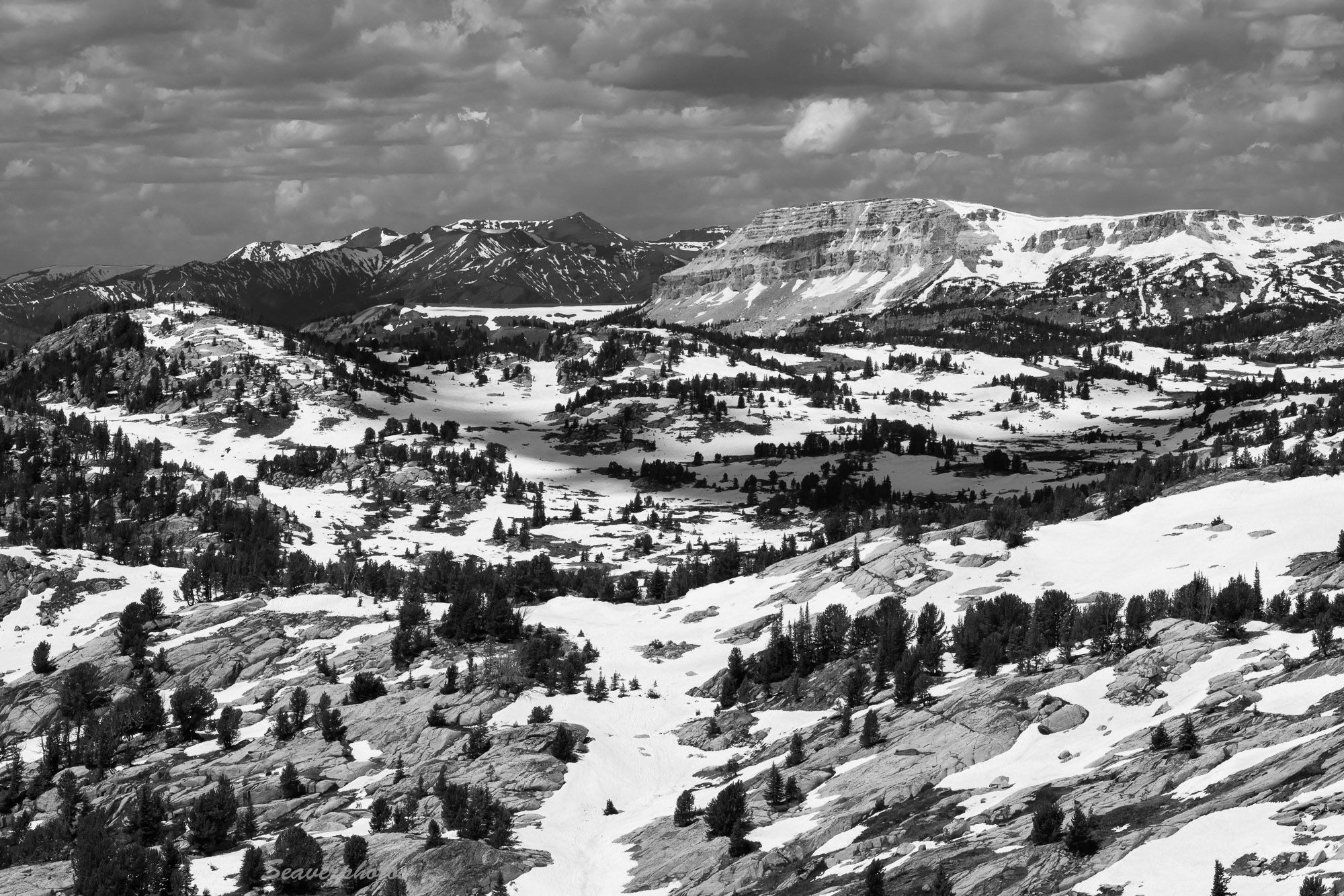
We drove the western section of the Beartooth Highway, which provides some great views of mountains, lakes, rivers with a moderate amount of snow. Given that this view is mostly dark green trees, grey rocks and snow fields, converting to B&W seemed obvious. Darkening the blue channel added nicely to the contrast in the sky/clouds.
Specific Feedback
We’ve done this drive regularly over the years. The mix of snow, rocks and trees this year made it more interesting that previously, when the ground was mostly snow covered.
Technical Details
R5, 100 - 500 @ 135, 1/250 s, f/16, iso 400, tripod and polarizer.
Critique Template
Use of the template is optional, but it can help spark ideas.
Mark, there is a lot to like here. The snow patches and tree lines contrast nicely with the rock and sky. I like the treatment you did to the sky to bring up some drama. That looks like nice mountain country
One trick I use for B&W images is to start with the color image in PS. I add a B&W layer. You can then selectively adjust red, yellow, green, cyan, blue. Adjusting these channels changes each channel’s luminosity and gives you wide control over the tonality of the image.
Another little trick for color images: Add a B&W layer and set its blending mode to ‘Luminosity’. Doing so allows you to brighten or darken the channels. I use this a lot.
-P
A grand mountain landscape - and perfectly done for b&w. The tonalities and contrast you’ve created look great! I think especially important for the sky as you’ve retained some nice textures and contrast in the clouds. Well done! I also like the clouds shadow play in the center area of the image.
Hi Mark,
I can see why you have made this drive many times over the years as it certainly is a grand view. It is a varied landscape with the trees, snow and the rocks; lots to look at and enjoy. I also like the drama with the clouds in the sky as it seems to finish off this lovely landscape. My only suggestion; and take this with a grain of salt as my brother says my monitor is to bright; would be to tone down the bright patches a snow just a touch. I hope you have a couple more to share from your drive. Beautiful image.
Preston, thanks for the tips about b&w processing. For this post, I did everything except final dodging and burning in Lightroom using the color adjustment sliders. I do not expect them to adjust luminosity, which can be a critical element, so I’ll be doing some testing in PS.
Beautiful shot, Mark. The B&W conversion looks great. I will laugh at @Ed_Lowe 's comment, cause that was going to be my only small critique about the whites.
@Ed_Lowe amd @Michael_Lowe, I’m now back in MD with a newer monitor. The first thing I noticed on turning it on was that it was brighter and crisper than it’s much older MT counterpart. While the whites are bright (now), particularly that leading line from the bottom center, I still see details there.