The photographer is looking for thoughtful feedback on the image as a whole, especially around the areas noted below.
Feedback Focus: Artistic + Technical
About This Image
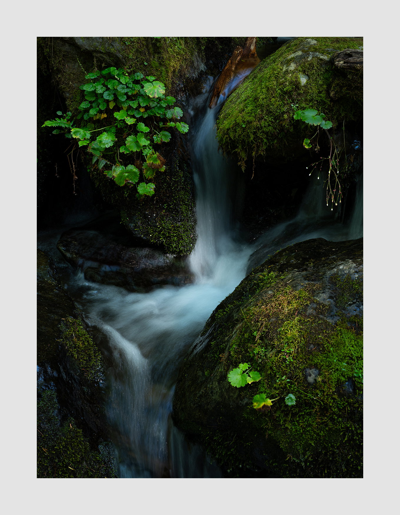
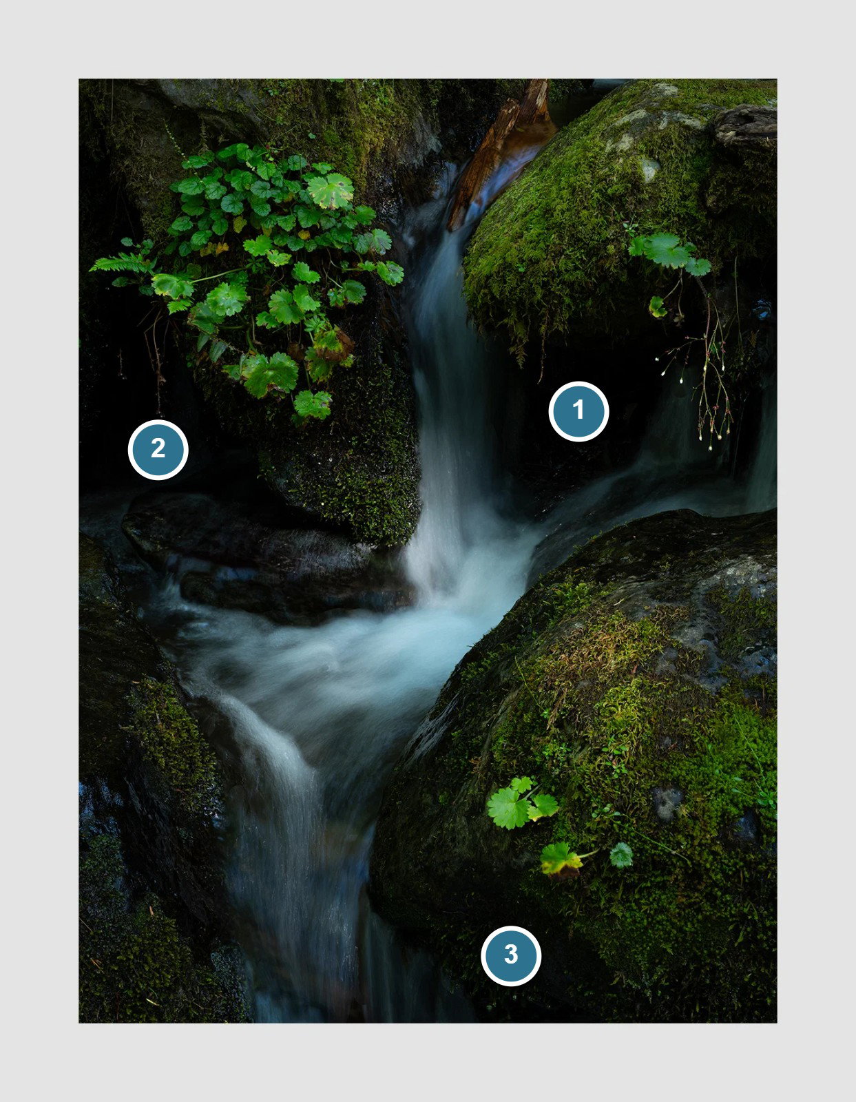
Big falls become little cascades and eventually trickles. This image was made at the base of a much larger waterfall.
Feedback Requested
I’d welcome thoughts on what would most strengthen this image, either artistically or technically. I have a slightly narrower version which I like as well.
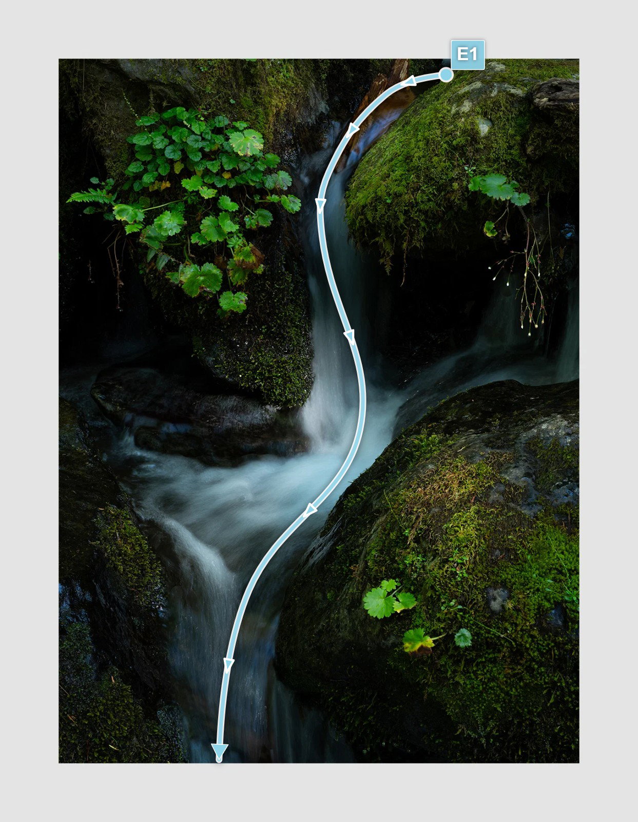
Tough question. This is exceptional as is with really good balance side to side and top to bottom. The flow of water goes right through the center of the image with little offshoots to the side that make the eye explore. I actually like that there is no green plant life in the LLC or it would look too gimmicky. You could probably crop off the right side because it feels maybe just a little bit heavier than the left side but not much. You nailed the water texture. Perfect. Just the way I like it.
I do find the left side of the image darker than the right side by a hair so maybe bring that up a smidgen. There is also some blue cast in the water at the top of the falls. You might also bring down the luminosity of the green leaves in the LRC. They are pretty bright. You could also reduce the warmth of the piece of wood in the water at the top of the falls just a little bit.
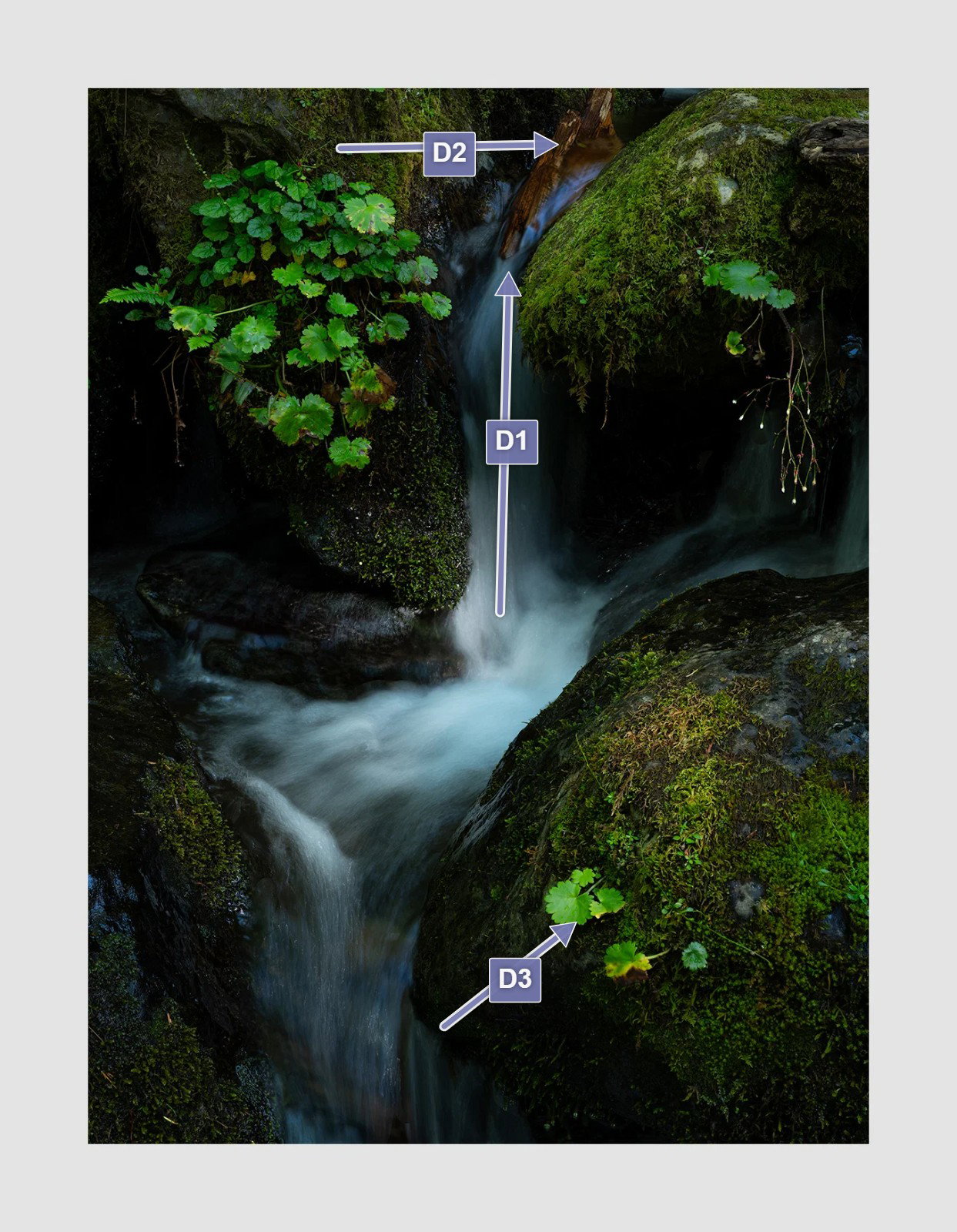
Visual Notes
[D1] Maybe try and remove the blue tones in the water here
It’s a beautiful image, Igor. I understand what David is saying but I like the luminosity of the leaves. I agree that the blue cast in the water at the top should be reduced. Otherwise I don’t see anything I’d change.
I like it Igor, and I think the leaves look natural and I’m assuming they are moist which gives them a bit of shine.
I see the area of blue cast which I’m guessing is a reflection of the sky. It’s natural, but a little distracting in the image. I agree with the others that it needs to be toned down.
It is a wonderful image. Great composition and balance. Well done!
Very effective image Igor. I like the balance I like the flow. You got the shut your speed just right for the water. I agree that the blue cast should be reduced but other than that, I can’t think of anything I would do.
The only small thing I would do is reduce the blue as others mentioned. Just the streak in front of the log.It looks quite unnatural. The other little bit is fine to my eye. I love everything else. I like the dark shadows and rich color which keep the eye directed toward the cascade. I also like the spoptlit area in the center.
I love the relationships you’ve created here; the “+” shape in the water; the four crossed boulders.
I like the light; the contrast between the light and shadow areas.
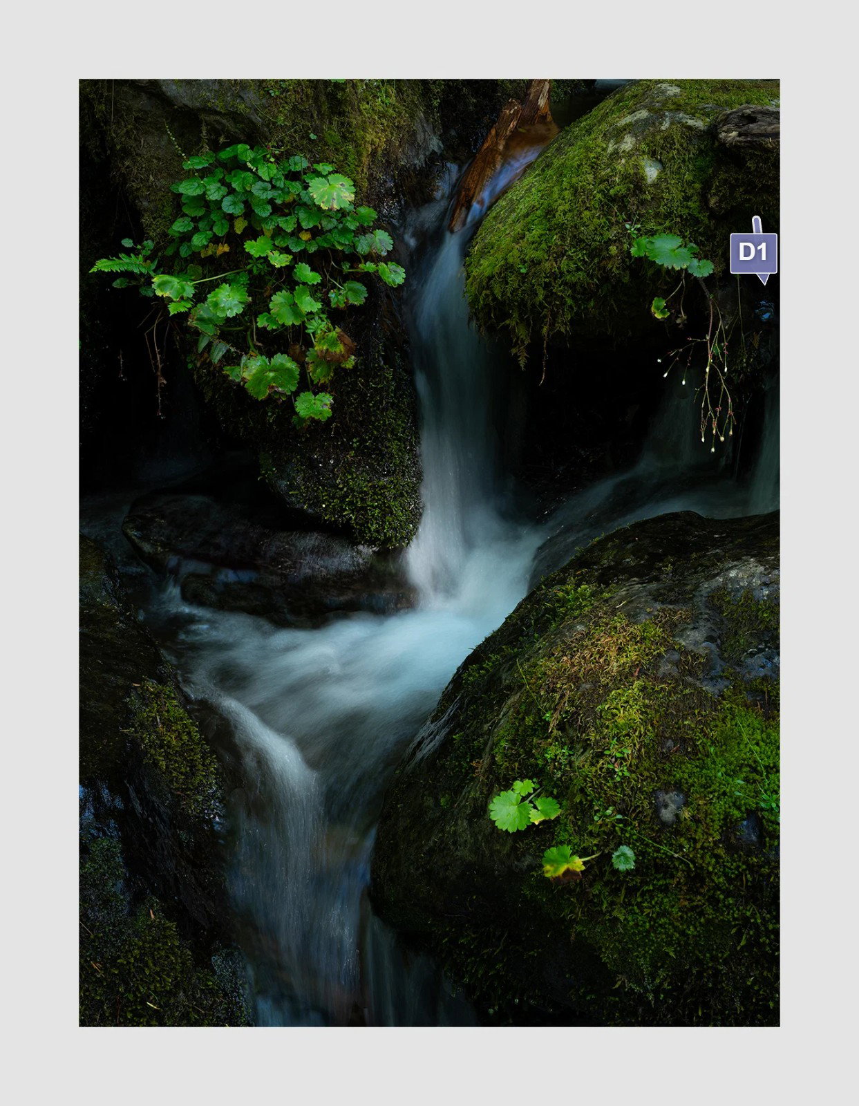
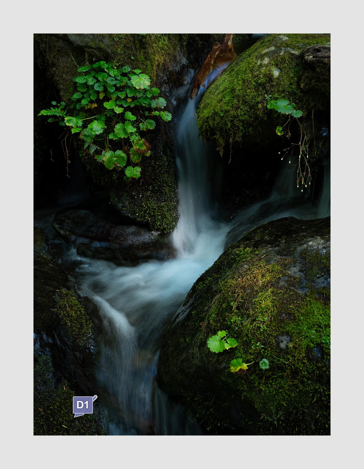
A small detail that immediately caught my eye is marked below; I would remove it or darken it significantly.
What a lovely composition. The only tiny thing I can add is to burn or clone out the tiny white bits in the LLC. That is really gilding the lily, though.
Igor, This is not a documentary image but interpretative art. You get to determine the color of the water and the details that remain. Frankly, I had an immediate, positive response to the image and I can’t exactly explain why but I did. It’s beautiful as is.
I know what you mean Alice. I often like my images as they are and never experiment further. Although most post processing looks a bit contrived is you look longer. I admire those b&w guys that create something really different in photoshop. Like Kimmler.
Lovely intimate scene. I love the cool color palette . I think the water has enough blue throughout and the transition from the dark blue to the lighter is in line with how the moss in the LRC is brighter indicating to me that some direct light is falling there and on the water just behind it, ergo the lighter blue. The flow of the water leads the eye nicely through the image. The only thing that I might want to see is more detail in the darkest areas
this is a great picture in my eyes. i just wonder how it would look without the branch in the upper water stream (as it was there, i would also not have it removed). i also like the bright green leaves, they make it radiate
Igor, I really like the quiet intimacy and how there’s a spotlight effect on the water near the center. I do wonder about a slight overall increase in brightness. That would let some of the darker regions show a bit more and it would add a bit of glow to the greens. Yes, that would reduce the quietness of the mood.
Simply gorgeous image Igor. The composition is spot on, the various elements are well balanced, the saturated colors are beautiful and the exposure is perfect. I wouldn’t change a thing.
Thank you for the EP. I’m often my harshest critic but I like this one as well. I understand the desire for more detail in the shadows. One thing I would suggest is showing what you mean. I felt that this is an image of hiding most information to accentuate that which is revealed. I suppose all dark images are constructed on that idea.
Very late in responding here. First, congrats on the EP! Well deserved.
I don’t know if this will make sense, but one of my first thoughts was how much I thought this was a departure for you… yet at the very same time, is quintessential Igor. Perhaps it’s the symmetry and the 4 distinct quadrants, separated by the classinc S-curve that made me think a departure; so much of your work I think avoids the standards, which makes your work stand out so much. Then again, the darker presentation and your intentions I think clearly tell me it’s yours.
All that to say that this also may be one of my favorites of yours. This is just gorgeous! The colors, saturation and processing in general just make this scene come alive.
I have no suggestions other than to offer my nitpicky eye-catchers which for many are not even relevant here. In fact I’m not even going to use the tool to point them out. But there’s a bright what looks like a pine needle along the LL edge and also a blue “spot” on the right edge of the upper quadrant. You might consider cloning, or not.