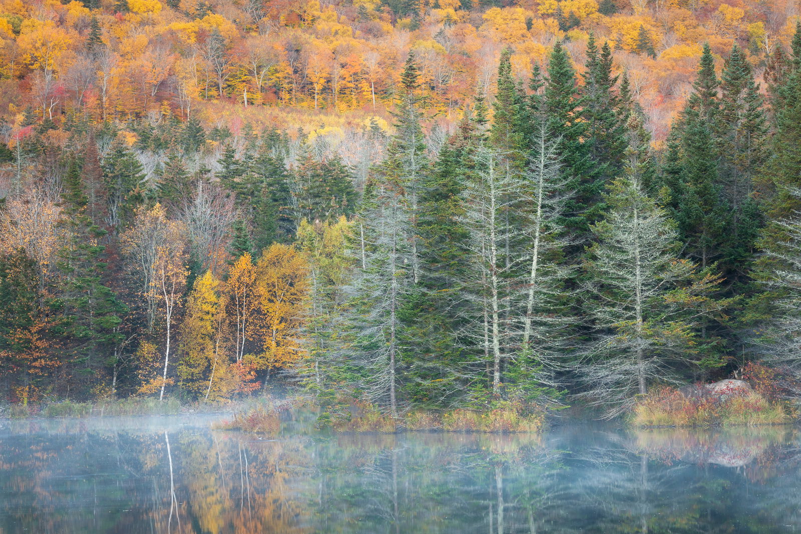
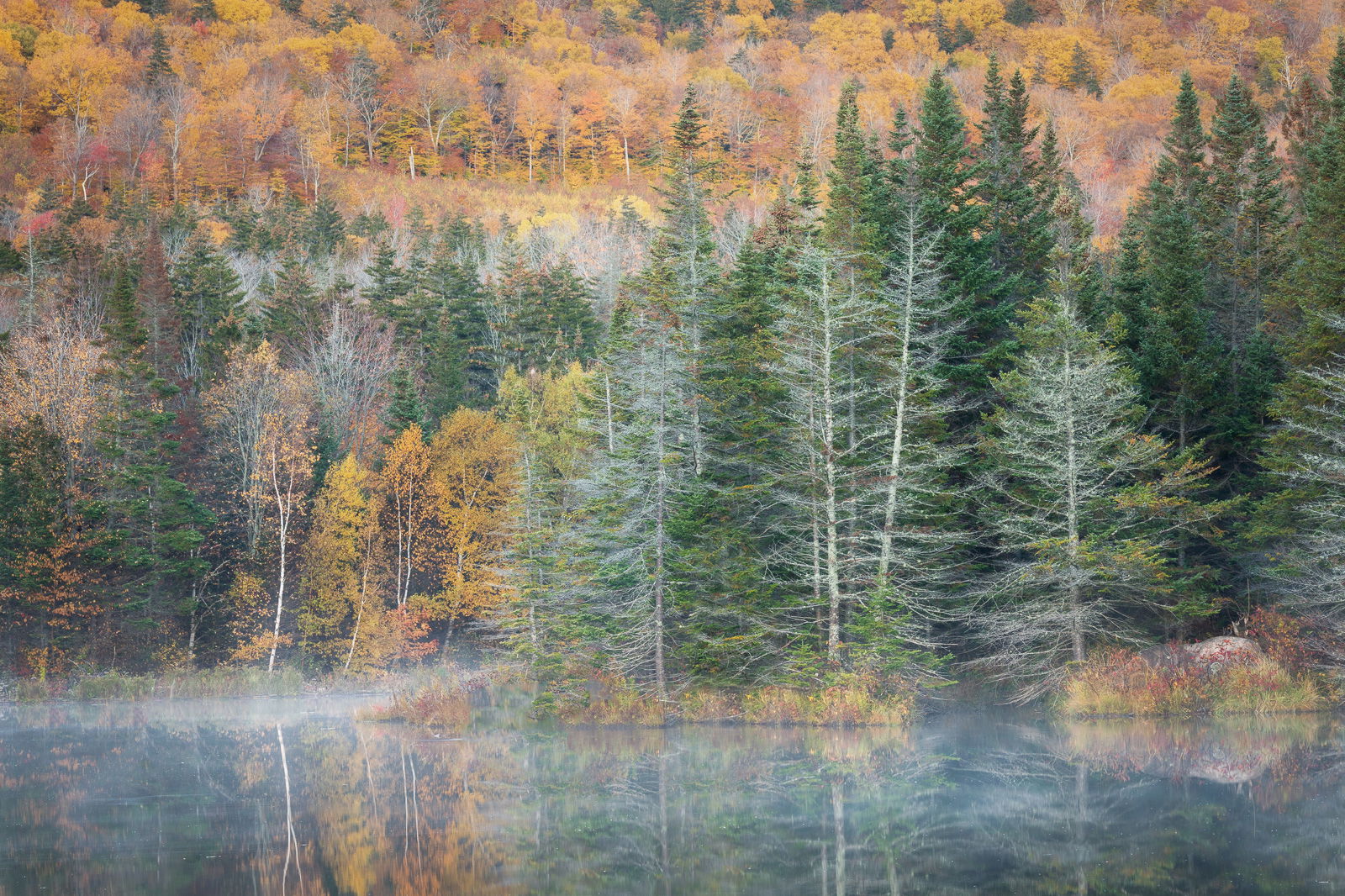
In my recent post “New Hampshire Pond”, a tight shot of trees along a pond, I received comments about cloning/cropping. Those comments led me to post a second image that showed a much wider view of the location to illustrate the situation that I faced. In posting that wider view, I described it as a “throwaway” image shown only to illustrate a point.
@Lon_Overacker seemed surprised that I considered it a throwaway, but I replied to him that I thought the image was too cluttered and busy, and that after having shot Autumn in New England for many years, my standards for keepers were fairly high.
But Lon’s comment stuck in the back of my mind, and I decided to revisit the “Throwaway”. I concluded that my original evaluation of this image was a bit too hasty. Thank you Lon for nudging me to take another look, I now think it deserved to be rescued from the recycle bin. I am also posting the original un-editted file to provide a before and after processing example.
What artistic feedback would you like if any?
any critique and comments are welcome
The “Throwaway Image” after being rescued from the recycle bin
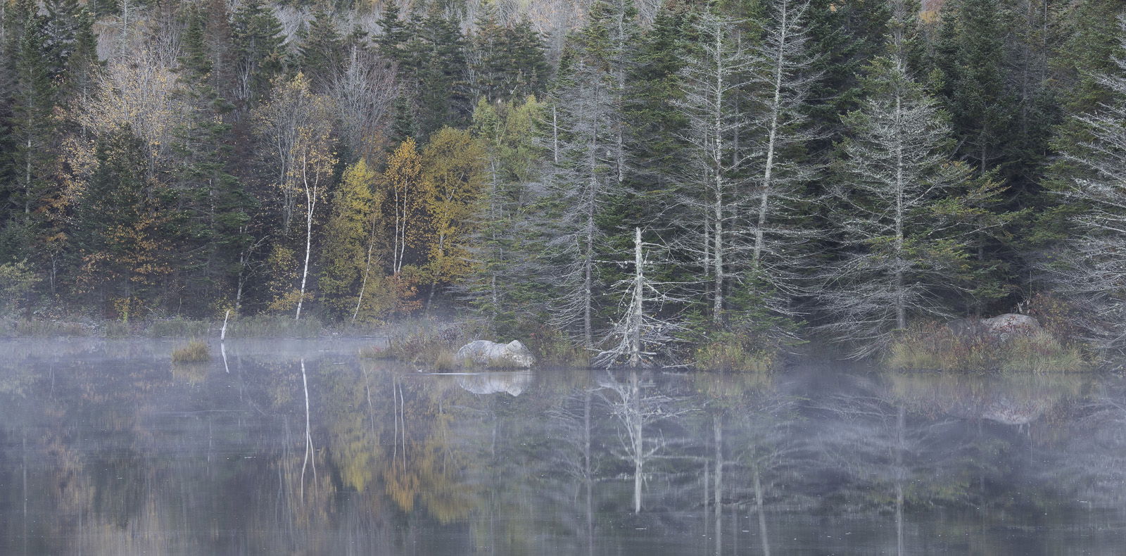
I agreed with Lon but I thought he meant something different. I find the eye drawing yellows diminishing the warm colors below. A cool image with a few yellows scattered about appeals more to me as a composition. Also, the original oozes with mood which is largely destroyed by boosting the saturation. And finally, I really liked the dead tree. I thought it went with the dreamy mood. So I would keep that. Here is the crop I would go for. I wouldn’t add much saturation or contrast to it. The tree on the right edge bothers me a bit but I wouldn’t want to crowd the rock. Different strokes for different folks, as the saying goes.
Ed, I would definitely not consider this one a trash canner. I quite like it. That said, I would agree with @Igor_Doncov 's saturation/mood comment and I really like his crop and presentation. Great mood to his rendition and it really looks good to my eye. When it comes to the uncropped versions, I prefer the more moody original.
Ed, I prefer the unedited original over the “saved” one. The less saturated colors suit the image better. To be totally honest, compared to your excellent body of work, is it a portfolio image? Probably not, but still definately not a throw away.
I suppose there is a great difference between having high standards for places you’ve photographed time and time again (I get that many times over…) vs. disgarding them because they don’t reach that standard? I would contend this is a beautiful scene and image and for someone who’s never been there before, it’s quite striking and would never understand it reaching the recycle bin…
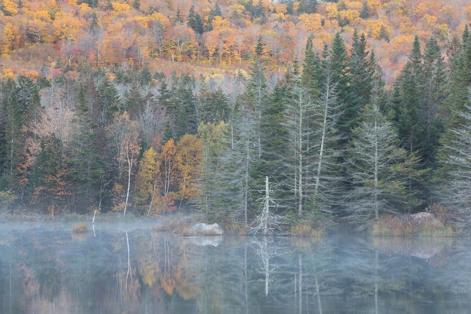
I think both versions have their place. The original works as a whole scene where the mist covered water sets the mood and atmosphere, which is then carried throughout the autumn scenic with the muted colors and softer contrast. The “rescued” image works as well if capturing and presenting vibrant autumn landscapes - more about color than about mood. In the reworked version, the only suggestion I have there would be to work on the color balance of the mist covered water - it looks a little aqua/cyan to me; where as the original misty water was pretty neutral.
Igor’s crop is also a viable alternative.
This is one of those scenic landscapes that can be taken in multiple directions - each of them having merit and pleasing results.
My 2$ (2 cents adjusted for inflation): I like the contrast in the rescued image, but the foliage in the background is too saturated and overwhelms the heart of the image which is the late, mist and near shore.
I think that if you adjust that saturation and tweaked the mist to a more neutral color, the image would have more impact.
Igor’s crop is also nice, but creates an entirely different image.
-P
I agree that I let the water/mist go too cool, I’m not sure it needs to go all the way to neutral, but it should not be as cool or green as I had it before. I struggle with the saturation of fall color sometimes, especially when it’s wet (this image was shot the morning after rain overnight). To me the fall color in the un-editted image is too dull, and looks like past peak foliage (when it really was at full peak color). I agree with Preston, I like the contrast in the original post, I like what it does to the spruce trees and shoreline. But adding that contrast increased saturation in the maple trees. In fact I never touched vibrance or saturation at all in the processing of the original image, so it’s all from contrast.
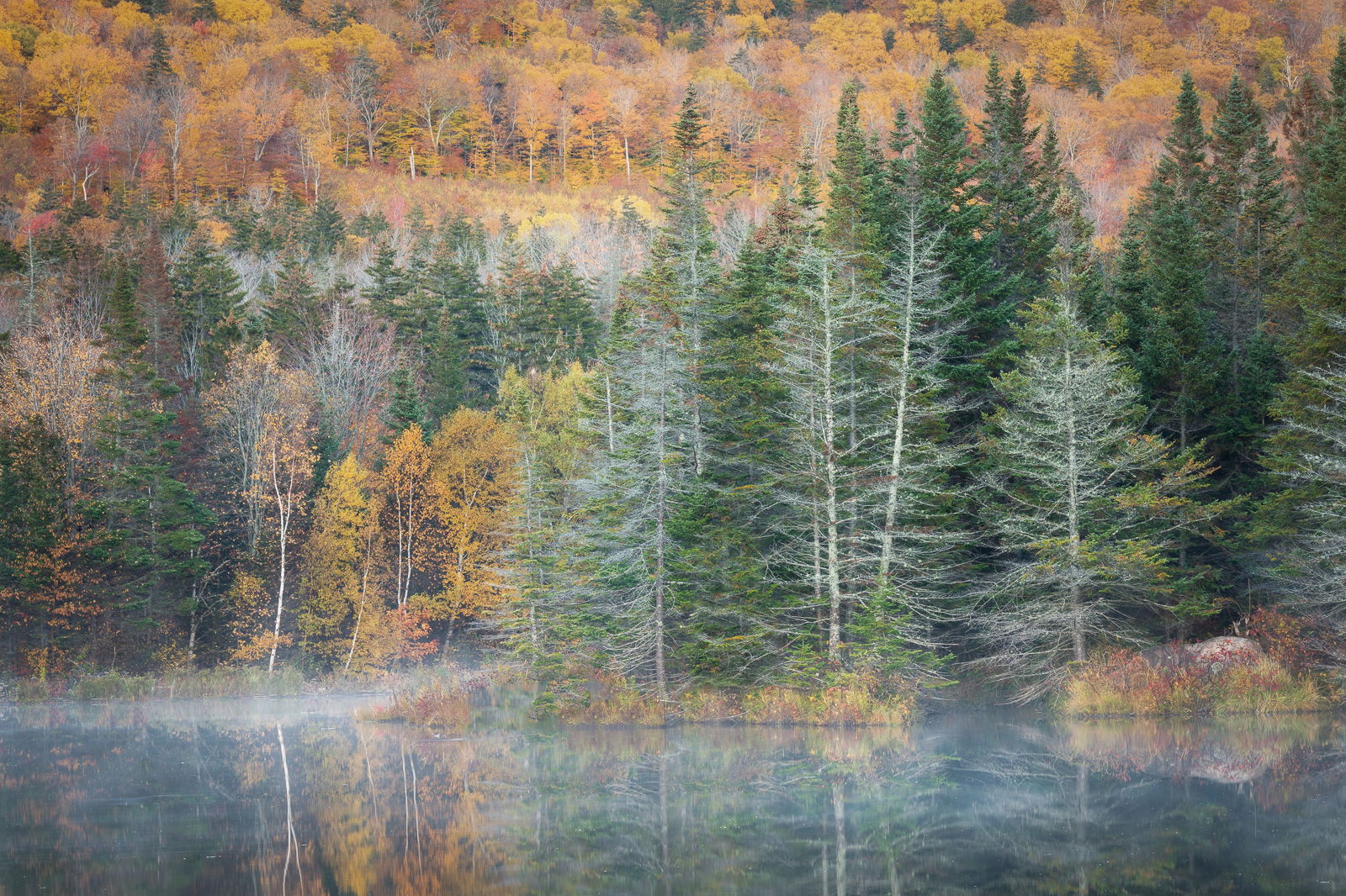
But I do get what you all are saying about the saturated maples pulling attention away from the shoreline and mist. So for this image I have to pick what should be emphasized, the mist over the fall color. So I did a rework to correct the color cast in the water, and to reduce saturation in the maples. Even after doing that, I still felt the shore/mist was not emphasized enough, and realized the issue was not just saturation, but also luminosity of the yellows, so I added a vignette, which to my eye helps too. So for comparison purposes here are reworks with and without the vignette, and the original for comparison.
Igor, I like your suggested crop as well, it tells a slightly different story, but one that works well too. I am torn about the tree in the center that was cloned away, it does have some character. I was trying to emphasize the mist and grasses along the shoreline, and thought the little tree was so bright it competed with the shoreline. Perhaps burning the tree down instead would work rather than removing it.
Ed, apologies for the super late comment but the image intrigued me right away. I do not see this is a throw away by any means and I really like @Igor_Doncov’s crop. I think that would be how I frame this image if it were mine. I hope this ends up being a keeper!!