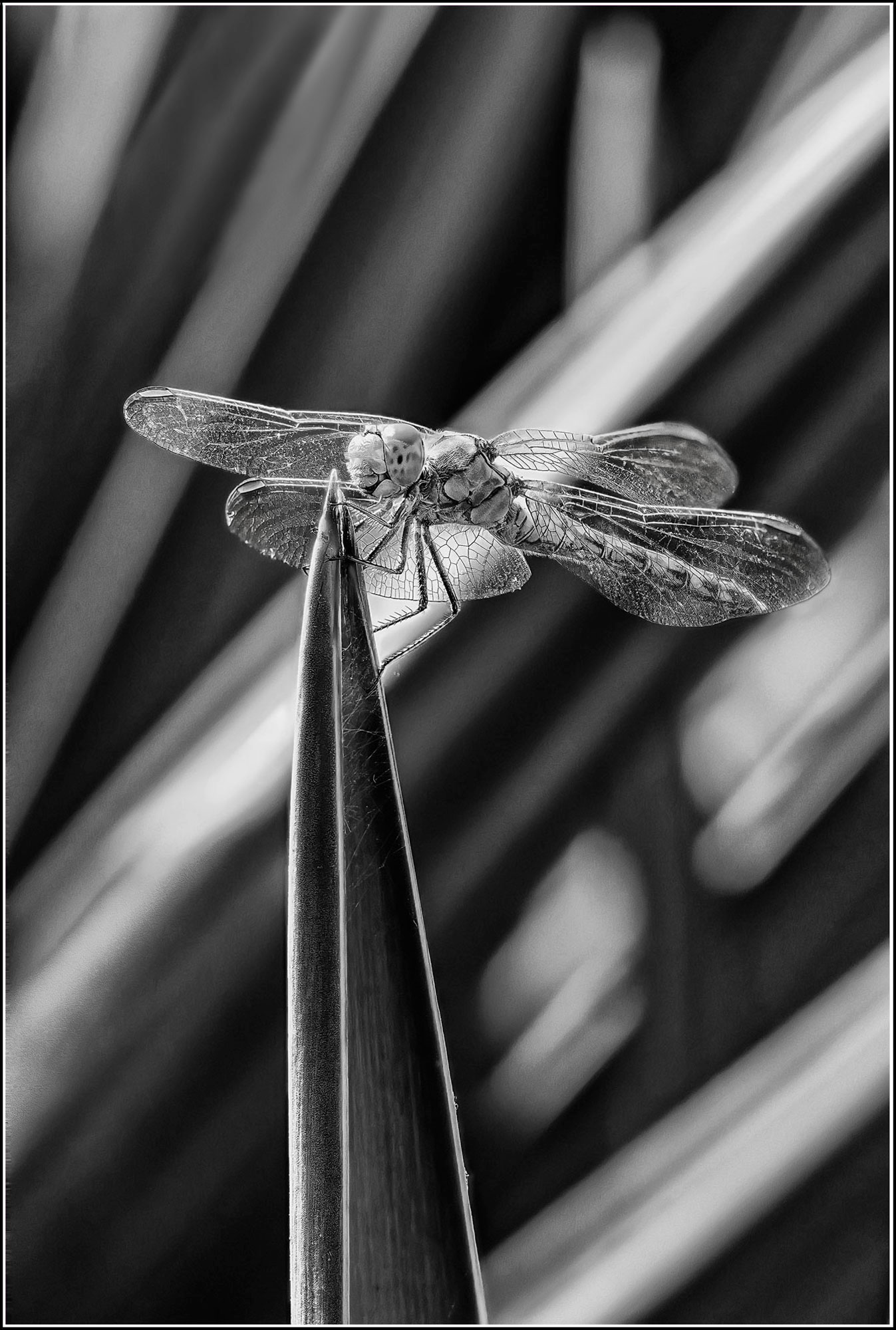
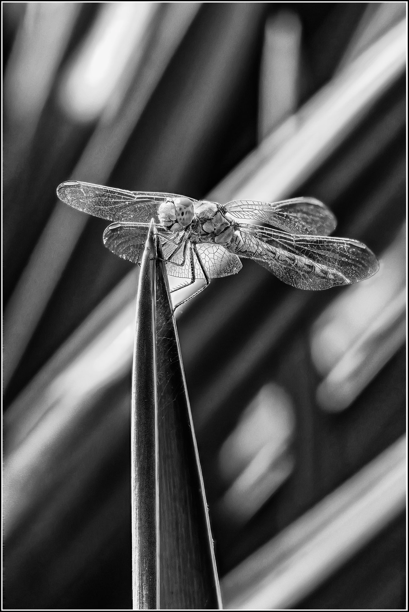
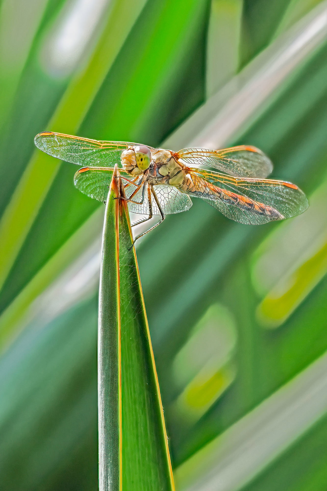
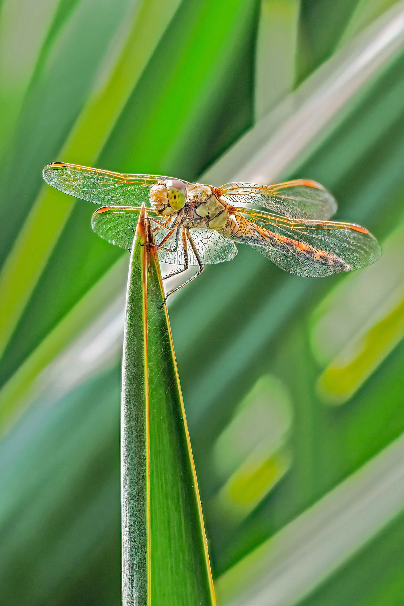
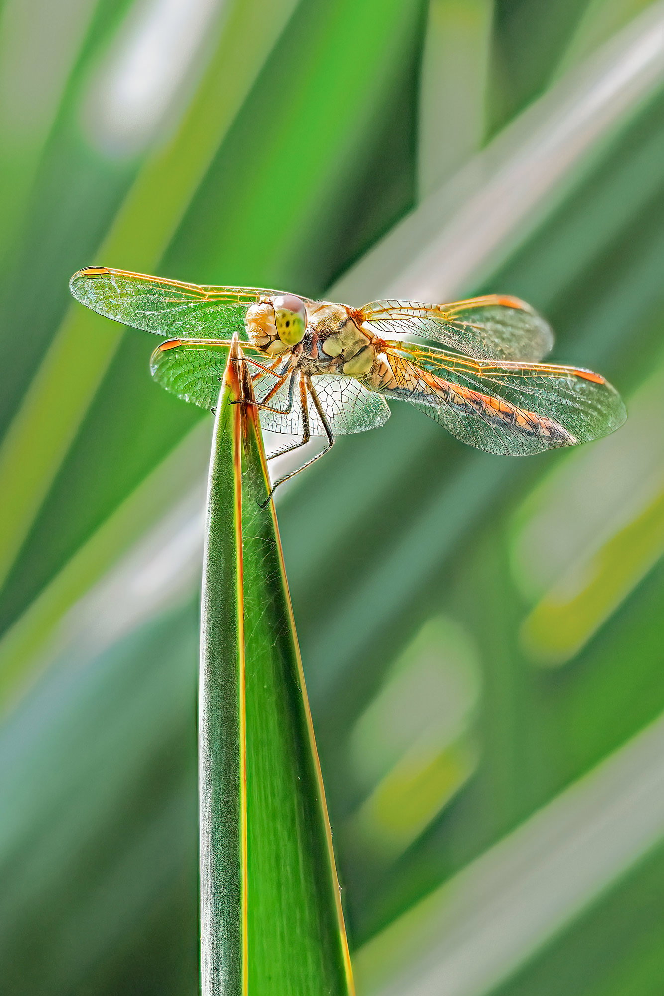
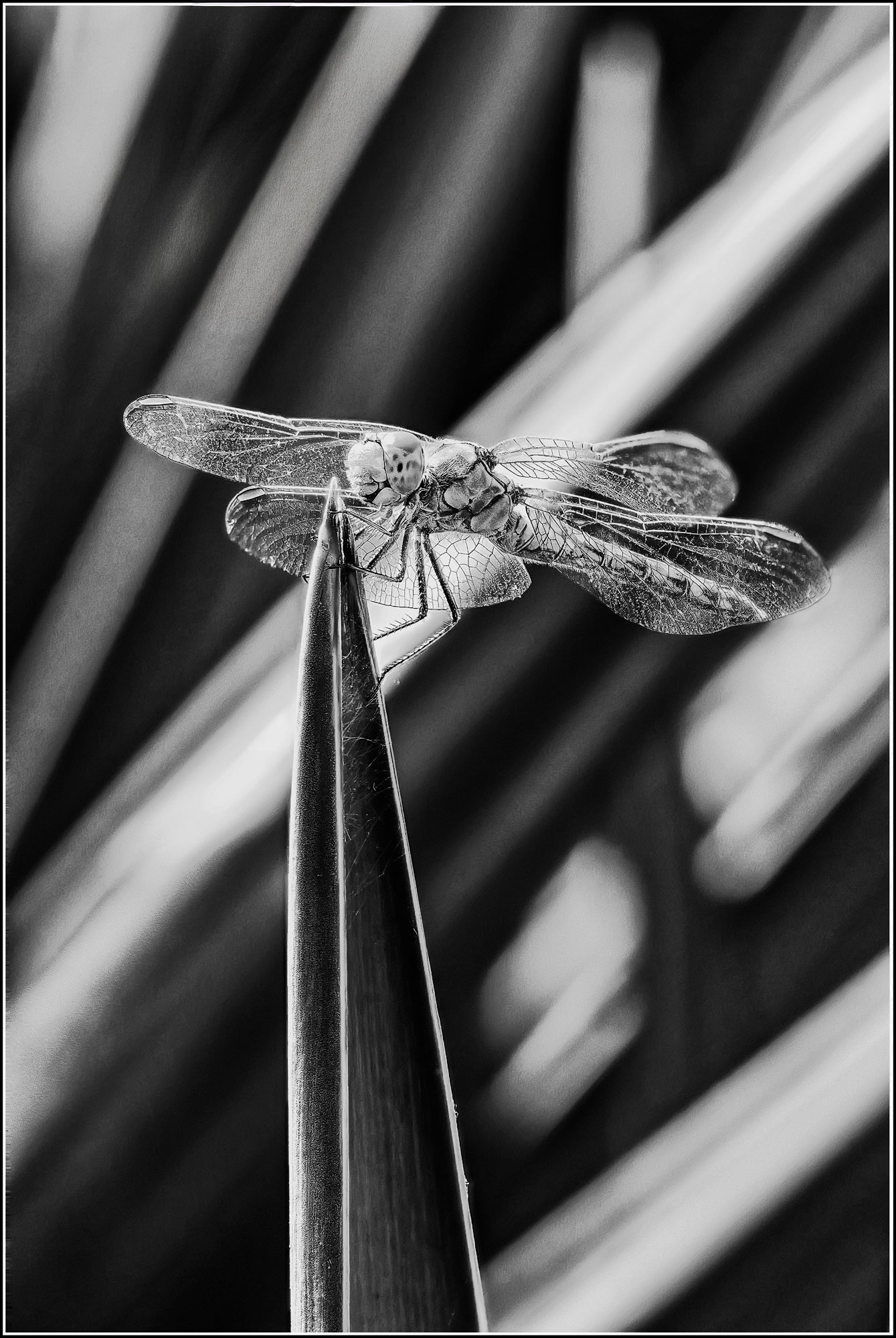
What changed: I removed the white patch in ULC and muted the BG
About This Image
Critique Style: Standard
The photographer is looking for thoughtful feedback on the image as a whole, especially around the areas noted below.
Feedback Focus: Artistic + Technical
Strange things happen to me on NPN. After viewing Lon’s Yucca Weaves yesterday I went out to photograph insects and quite by chance I passed a few yuccas at the roadside. I couldn’t resist shooting a bit into the bright sun. But, just when I was determined not to snap another dragonfly this year, down came this guy, and I fell for it of course.
Feedback Requested
Color version or B and W ? Is this one dragonfly too many?
Technical Details
Images 1 and 2
Camera: OM-1
Lens: 60mm macro
Shutter speed: 1/1600s
Aperture: f/3.5
ISO: 800
10 shots stacked in Zerene.
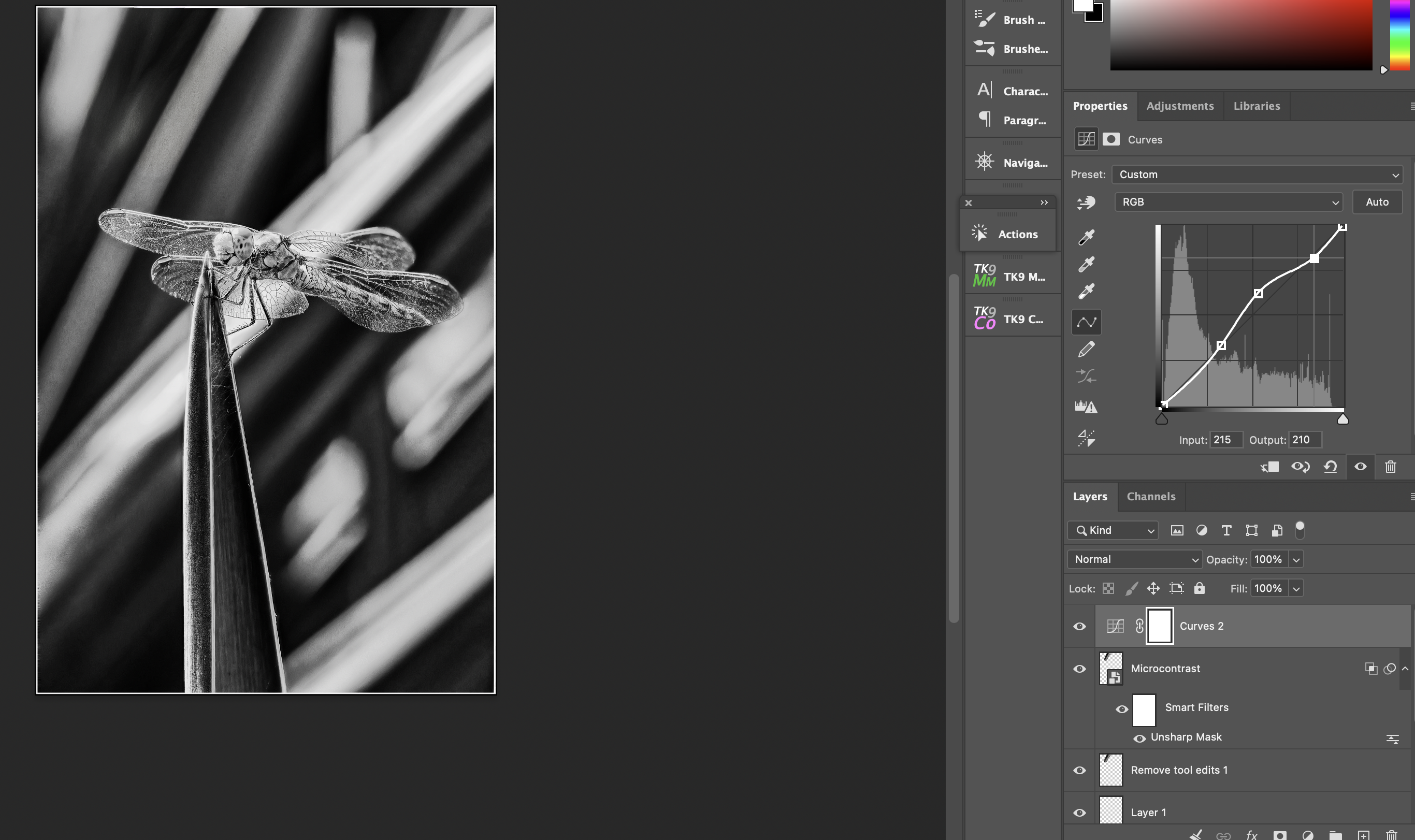
B and W conversion in PS, then added Structure and Contrast in Nik Silver Effex. Final cropping in PS.
Mike: I like both versions; the B&W for its artistic flare and the color for the wonderful detail in the dragonfly. My only suggestion for improvement would be to tame the hot spot in the ULC a bit more in each as it does pull my eye. The bright areas in the middle of the frame don’t bother me as they don’t make me drift away from the subject. Still grade A on both from me. >=))>
Never too many dragonflies, Mike. I like both the color and B&W versions. The B&W shows off the dragonfly a bit better in my opinion, though @Karl_Zuzarte did a nice job of taming that background on his version of the color image which helped a lot. Now it has me wondering what the color dragonfly on the B&W background would look like.
Mike, both look very good and are very striking because of the high contrast and strongly angled background. Your positioning of the DF works well in the slightly pano crop. If you want to try something, a bit of mid-tone dodging of the DF in the color version would show off it’s colors better.
Thanks too @Bill_Fach@Mark_Seaver and @Dennis_Plank - the color with B and W idea, Dennis, is great, but I didn’t like the green of the BG shining through the wings and a workaround would be a bit difficult for me.
Lovely capture, and never too many of these little flying jewels! Both versions work for me and the removal of that one highlight worked wonders! One tiny nit – the distal part of the right rear wing becomes abruptly OOF. Trying to sharpen it would probably result in artifacts but it might work to slightly blur the transition a bit. We can all forgive not getting all of the wings in focus.
@Diane_Miller. I’ve done a bit of tweaking to the oof wing parts (see above) - but I don’t think I can get them looking any better than this. Thanks for the advice.