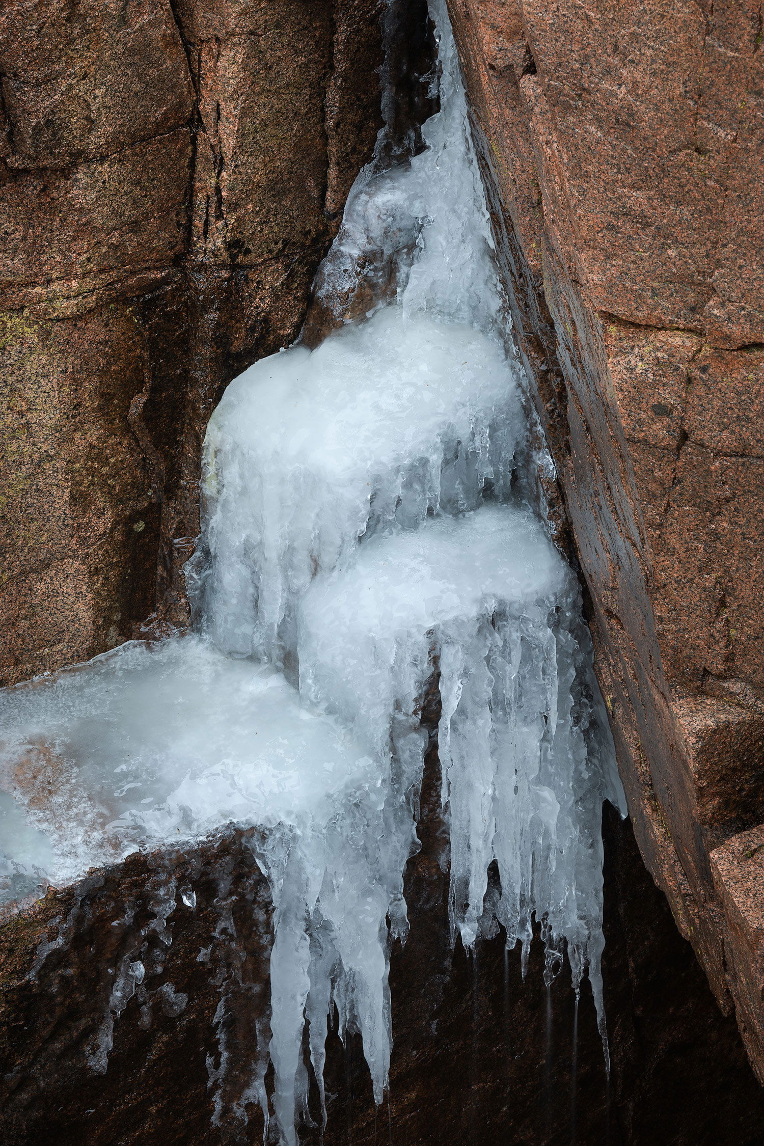
Another shot from February 2020 trip to Acadia NP. Spent a miserable rainy afternoon looking for small scenes on the pink granite cliffs south of Monument Cove. I was looking for shots that said winter, and finally found this scene. The rain melted away most of the snow on the cliffs, but it was cold enough that ice had formed in some of the nooks and crannies among the rocks. I think these icicles work better than the ones included in my recent post from the same trip. I like how the long exposure caught the water dripping from the bottom of the icicles, if you look close you can see it.
This intimate scene was well worth shooting in some miserable conditions, Ed. The vertical presentation suits the ice formations rather nicely and you nailed the color palette with the pinks of the Acadia granite. It might not have been possible, but I find myself wishing that that one bit of ice in the middle was not cropped off. Certainly not a deal breaker as I think this was a great find under such lousy weather conditions. The dripping water is readily apparent in the large version and the ice has some lovely details and textures. Great eye to spot this.
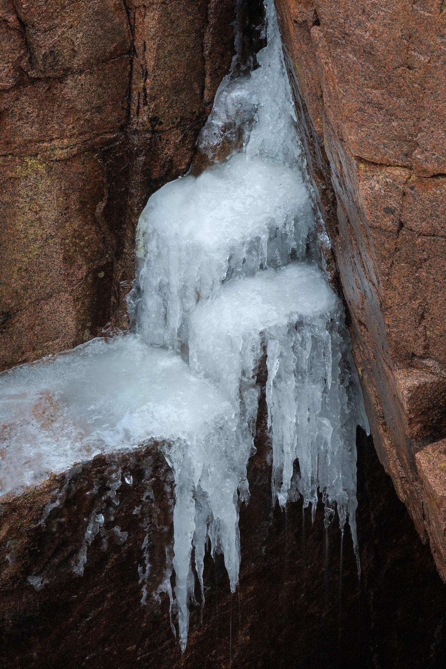
Thanks Ed. Yeah, I went back and forth on the icicle. I actually do have the full icicle in the raw file but was worried about how much negative space it introduced at the bottom. But after seeing your comment I decided to post it both ways and let people have a chance to decide. Rework posted up top.
I much prefer the re-post Ed. It seems better balanced to me even though there is some negative space at the bottom. What actually drew me to this image was all of the triangular and rectangular shapes in this image. Looks well exposed even though you have some very dark areas and some very bright areas. Nothing seems to be without information. Nice image Ed!
@Ed_Lowe@David_Haynes@Igor_Doncov thank you all for your comments. In hindsight, cropping the icicle did not make any sense, even though I was concerned by how much negative space there was in the LRC. That’s one of the good things about NPN, you can get a fresh perspective on issues like this.
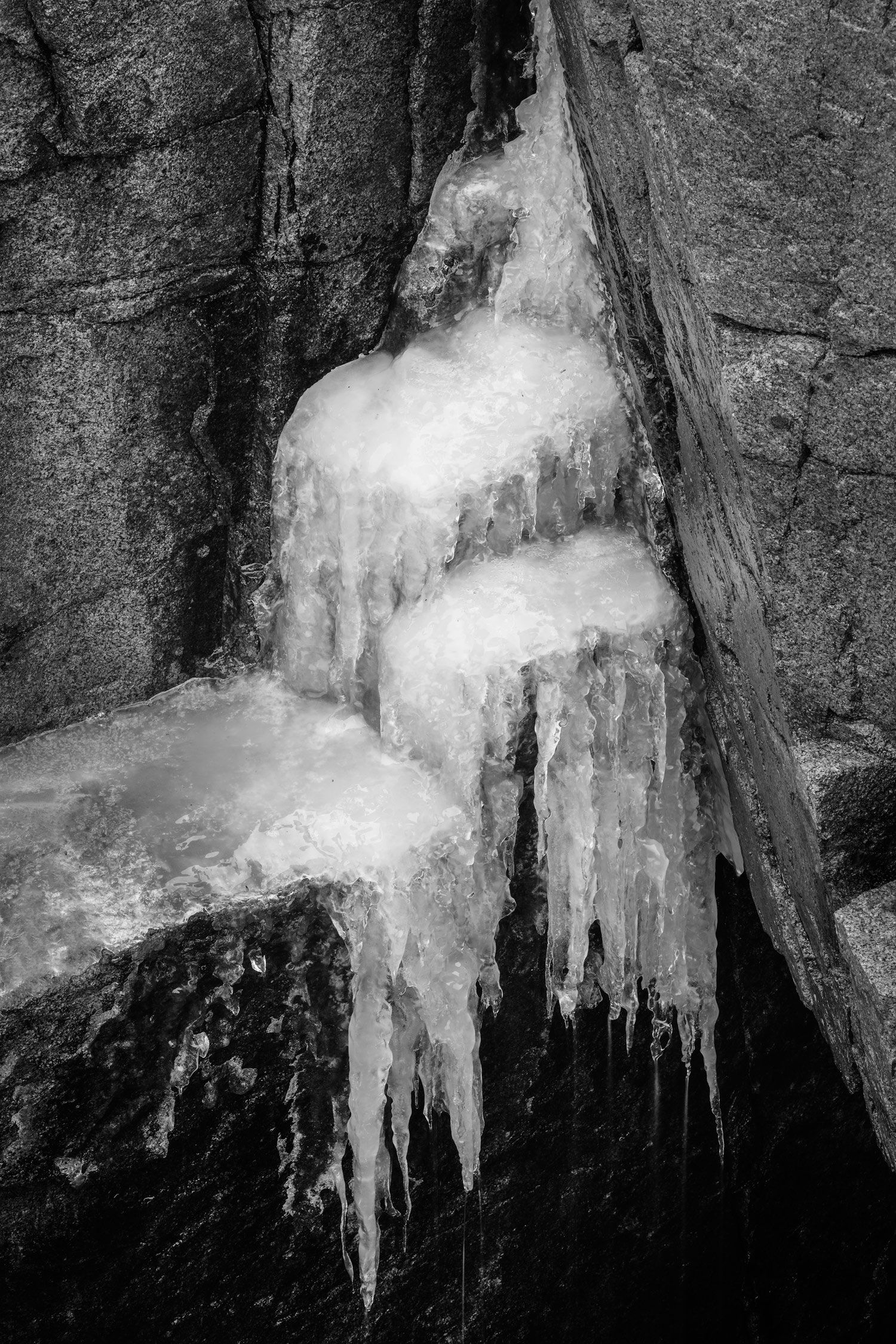
@Igor_Doncov as you know I’ve only posted color images here at NPN. I don’t often venture into B&W landscapes in my work, but I agree with you that this image is a good candidate for B&W. So just for the heck of it I decided to post a second rework up top that converts it to B&W.
I too prefer the repost @Ed_McGuirk. I totally understand why you cropped, but in this case I don’t feel it was worth the cost. In addition, it is a better balances the ULC with the LRC too. My vote is also for the color version.