The photographer is looking for generalized feedback about the aesthetic and technical qualities of their image.
Description
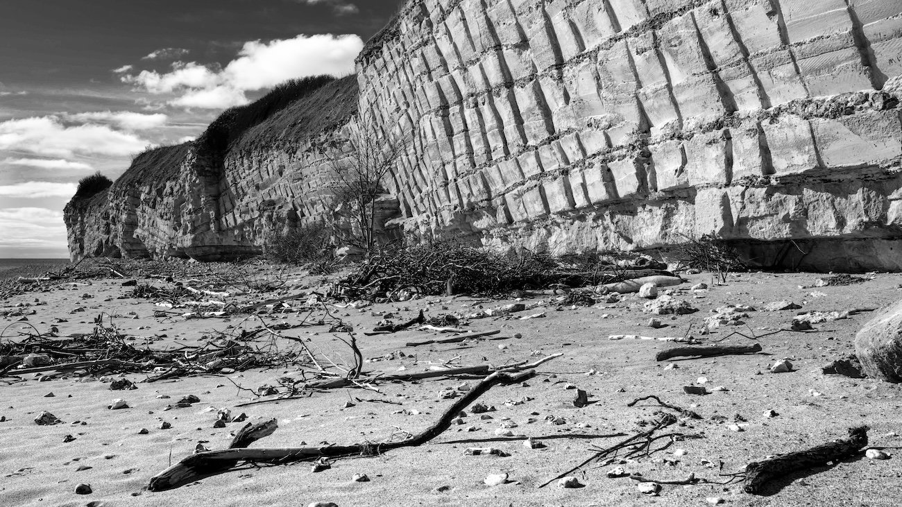
This image is taken at Stevns, Denmark. The layered cliffs date back 65 million years, where a meteorite hit the planet and caused mass extinction. The event left these cliffs with a grid pattern, exposing plenty of fossils. Normally, there is vegetation below the cliffs, but this image is taken right after a storm that uprooted almost all vegetation and left the beach covered with sand and debris, thus adding a minor disaster to the infinitely larger archaic disaster. Standing below these cliffs, one is easily overwhelmed by the brute force of geological evolution on a large time scale.
Specific Feedback
The scene is chaotic and visually untidy, and I am not totally sure about my approach. I might have chosen a different perspective, perhaps a smaller section, in order to get a visually more tidy image. However, I opted for this perspective, since it conveys the reality of the scene, that is, its chaos, untidiness and brute force. Does it work for you?
Technical Details
Camera: Nikon D850
Lens: Sigma 35 mm f1.4
Capture: 1/4 sec. at f11, ISO 80
Critique Template
Use of the template is optional, but it can help spark ideas.
I like the contrast between the patterned rock face and the messy look of the beach. Also the contrast between ancient events and recent events. Nice image. Yes it works for me.
I too like the contrast - both the visual and mental/story, between the cliff and the debri-covered beach. If you hadn’t have included the back story however, I would have no idea how the cliff’s would have been formed. A meteorite? Wow. The structure almost looks man-made, it’s almost to perfect like it was “constructed”. But also just hard to imagine the forces of nature that created this; add time, erosion, plate tectonics, etc.
Your chosen composition does well to showcase the contrast. It’s farily evident the chaos on the beach was a result of a storm.
I like the balance in the composition too, including the sky/clouds. You were fortunate to have some clouds up there, otherwise maybe that corner would be less relevant. But it does provide contextual location for the viewer.
No suggestions really. Perhaps curious what the color version was like; choosing the b&w however worked well to showcase the contrasts.
Hi Leo,
This is certainly different. The B&W conversion looks great and has a nice range of tones. I also like the diagonal placement of the cliff as it helps draw the viewer into the scene. The textures and lines on the cliff face are fascinating and thanks for the backstory on how they were formed. My only suggestion would have been to move a little more to the right as I find myself wishing to see a little more of that rock or none at all. The clouds were certainly a bonus for you that day. This is nicely done. BTW, it does work for me.