The photographer is looking for thoughtful feedback on the image as a whole, especially around the areas noted below.
Feedback Focus: Artistic / Expressive
About This Image
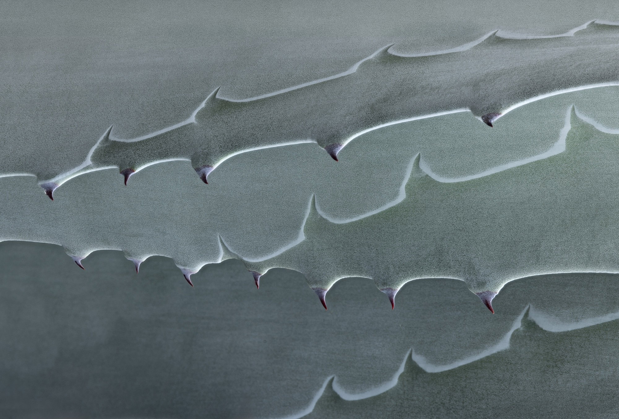
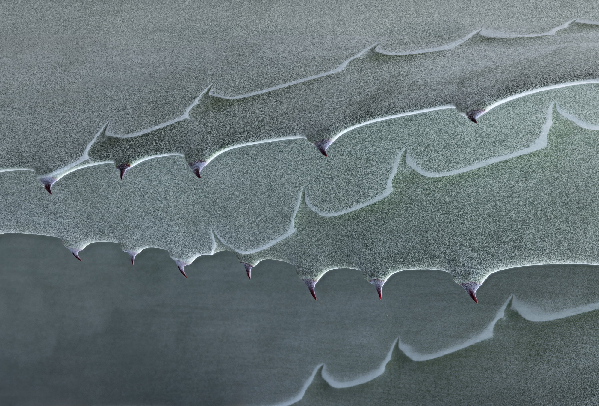
Wednesday night we had our annual try-to-ruin-the-grape-harvest rain, and I went back to this recently-discovered Agave Thursday in hopes of soft light and a few remaining rain drops. This time I took the 1000 mm macro, to give me the working distance I love for dangerous subjects. I shot several compositions to try for the interesting details but wasn’t thrilled with any of them. This is only a slight crop of three overlapping leaves.
Feedback Requested
All comments welcome!
Technical Details
Camera: Canon EOS R5
Lens: RF100-500mm F4.5-7.1 L IS USM + EXTENDER RF2x
Focal length: 600mm
Shutter speed: 1/15s
Aperture: f/16
ISO: 100
Processing software: LR and PS
Major adjustments: Only some global tonal detail.
Blending/stacking: Focus stack.
Other notes: A few small cosmetic flaws corrected.
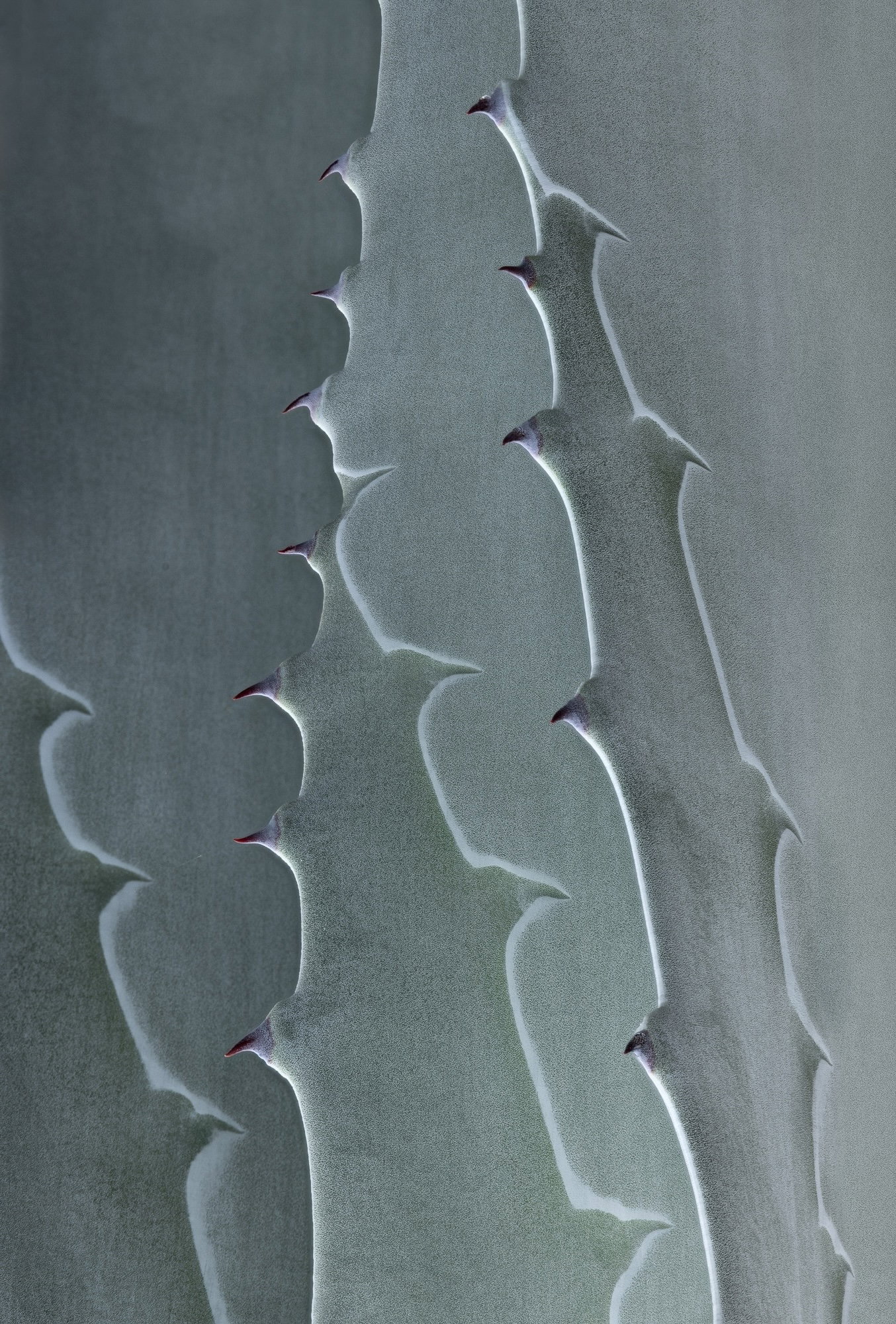
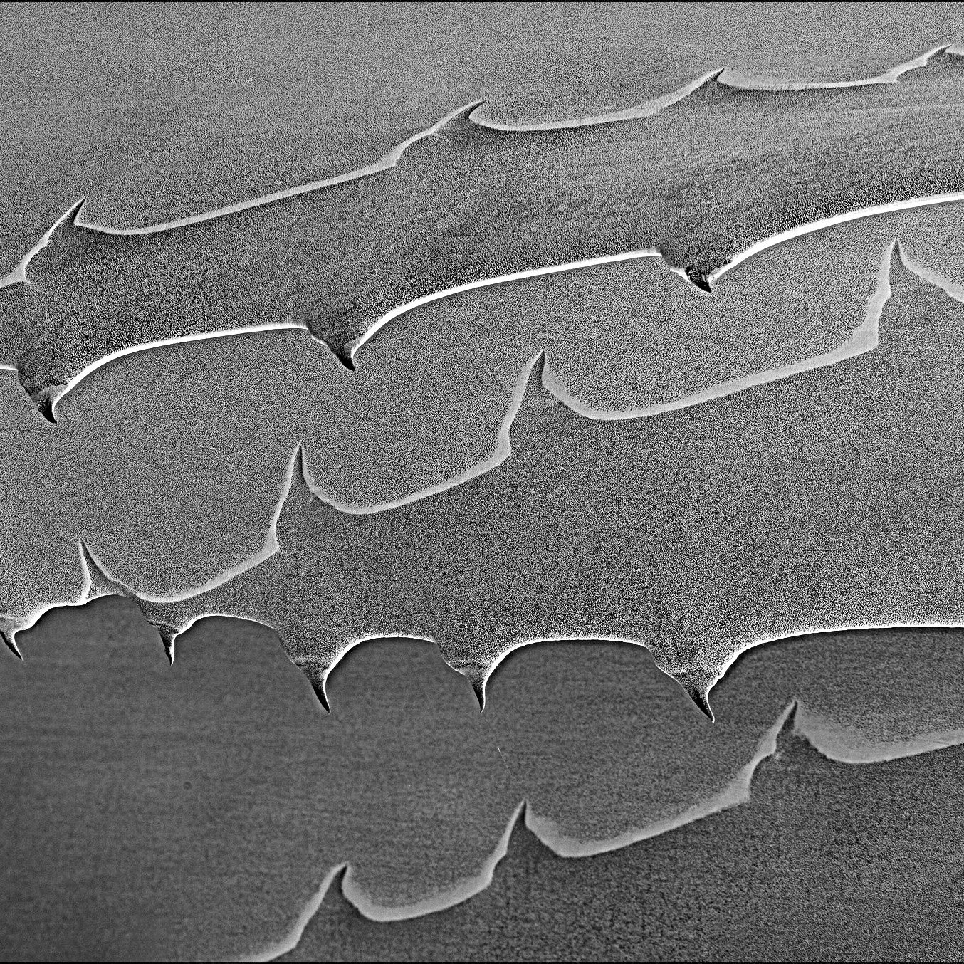
An interesting composition, Diane. When I looked at it, I saw a landscape rotated 90 degrees, so I did so, then rotated it a bit more to get the slopes I liked and lightened the nearest leaf to give the image a bit more depth. Now i suppose it’s more of an abstract than plant life.
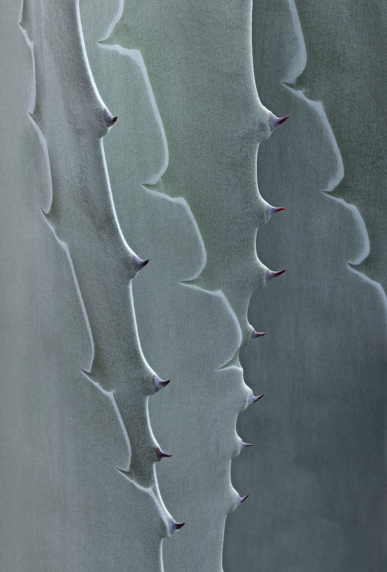
Interesting semi-abstract, at least if one knows agave. But @Dennis_Plank rotation got me thinking. I wouldn’t crop anything, but I if it was rotated 180 degrees from What @Dennis_Plank did, then it really becomes abstract.
I like the abstract nature of this image. Although I will admit, I like the approach that. @Dennis_Plank took with the rotation. I guess we are so accustomed to seeing agave in a vertical format. I suppose that’s why I’m intrigued with some of the other critics and their takes on this image. I think the grains goes really well with the subject.
Diane, this is nicely abstract with your focus on the thorns. The fact that the different rotations all look good speaks to its abstract nature. @Dennis_Plank’s idea of adding tonal variation is a good idea for creating visual flow across (or up or down…). The leaf in the lower right is a bit soft, another 1-3 shots would have fixed that. Well worth another visit.
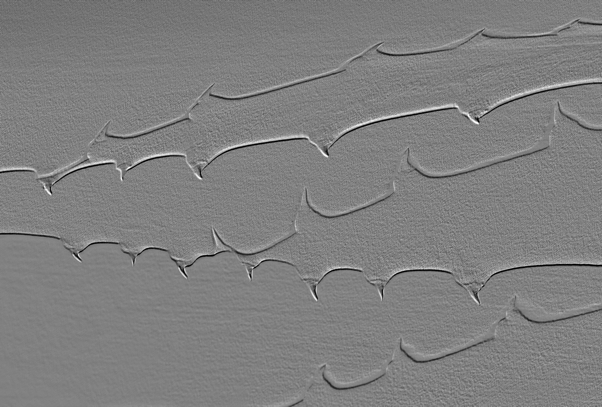
Thanks, @Dennis_Plank , @Don_Peters , @Youssef_Ismail , @David_Schoen and @Mark_Seaver ! I love the rotations and Youssef’s version does a face / vase thing to me, with the actual thorns looking more like indentations! Maybe it’s because the light is now coming from the bottom and that’s counter to what we expect. Yes, that version is definitely abstract. I’ll post a rotation above!
Both new variations are very interesting. I am really surprised that the 180 rotation made such a dramatic change. I much prefer that to the original composition, though it’s difficult to define why.
Not withstanding all the rotations and options with this, what I’m initially loving about this is the texture - very much like film grain. And the subtle variations in tone/hue help separate the varying fins(?). Very cool as originally presented.
I completely agree with Mark in his comment, "…
the different rotations all look good speaks to its abstract nature.
You really can’t go wrong with he multitude of options.
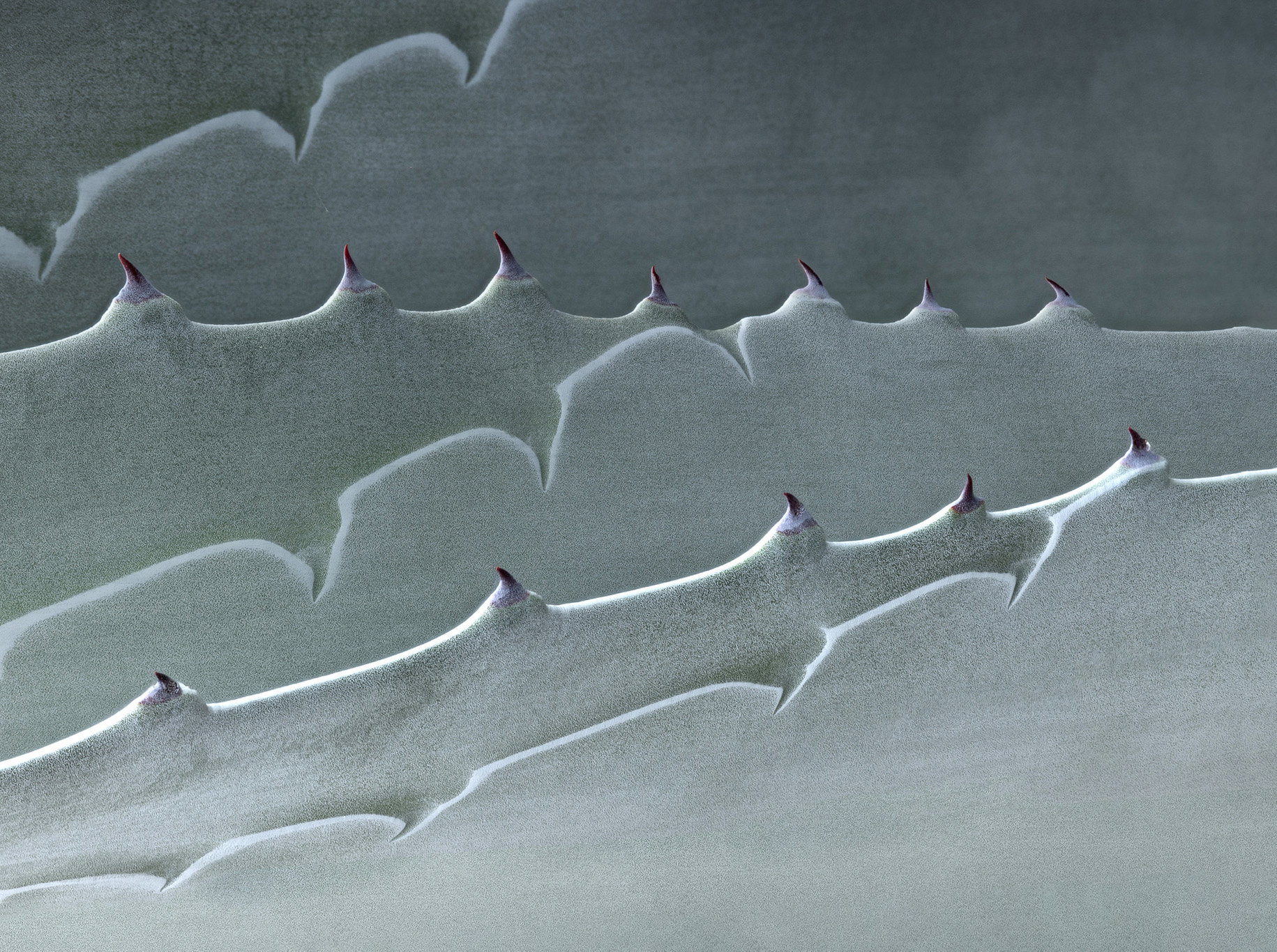
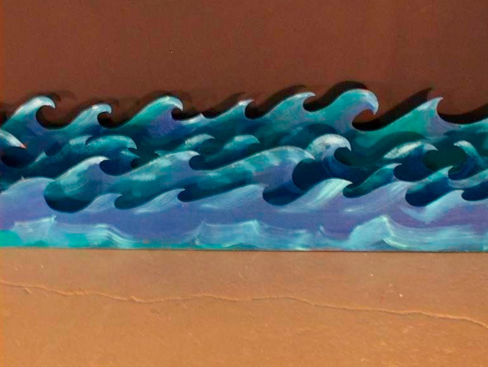
For me the original rotated 90deg ccw works very well. In fact, it’s impression changes quite a bit for me. Perhaps this is a stretch, but this reminds me of old stage props attempting to show ocean waves. I can’t explain well, so I’ll just have to demonstrate with the below photo.
Any way you slice it… great eye and vision with this.
Diane, I hadn’t noticed the in/out/up/down views of the thorns until now. They stand out in the revision making a strong vase/face view and a feeling like this is a chain saw with the teeth about to start pulling back and forth with each leaf moving independently…
Diane: One of the benefits of being tardy is that I get to view all the previous comments and revisions. On final review I think I like the latest revision and the original the best. I find agave to be a target rich environment and you’ve taken great advantage here. Well seen and superbly captured and presented. >=))>
Definitely like Revision 1. Very unusual take on agave. It makes it very abstract and reminiscent of sand dunes. It feels much more dynamic in this version.