The photographer is looking for generalized feedback about the aesthetic and technical qualities of their image.
Description
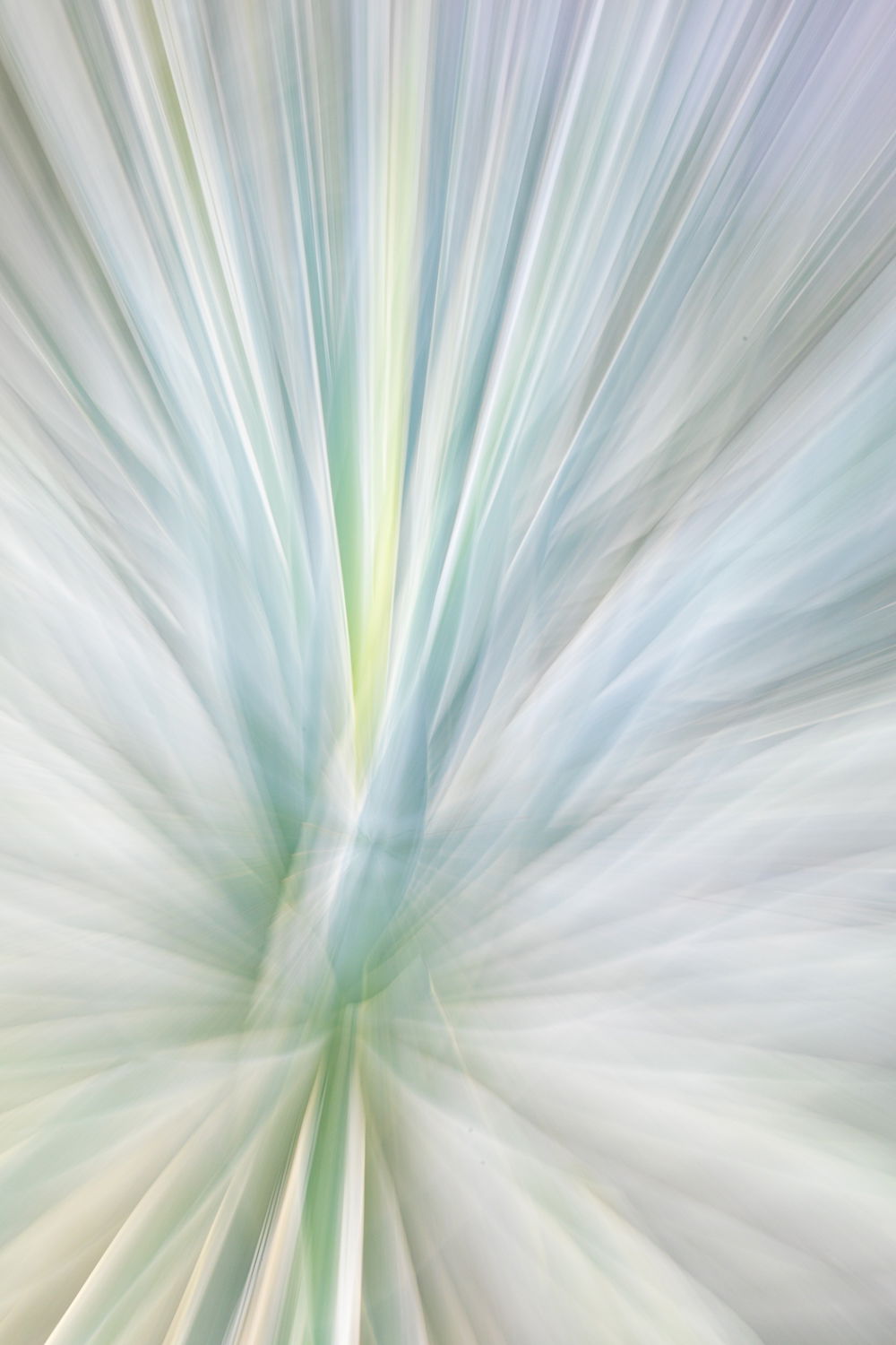
This is another zoom exposure using the same agave and similar technique as in the preceding image posted here. Agave Zoom Exposure
I can’t tell from metadata whether I zoomed in or out. The focal length on this one is the wide end, and in the preceding one, it was at the long end. I would assume metadata for focal length shows where I started?
In this one, I decided to go vertical.
Specific Feedback
As usual, I’m open to all feedback, including a ho hum or snort of derision. However, I’m particularly curious about the angle of the composition and the crop. I have more width and more at the bottom. As shot, the image was almost perfectly vertical, and that didn’t really appeal to me. And I wanted as much of the warp speed lines (thanks @Dennis Plank who mentioned that in the other post).
Different angle?
More saturation? Contrast? Black Point reduced
More texture?
Different crop altogether?
I’m open to all sorts of creative suggestions with this one.
Technical Details
Canon 5DIV with 24-105mmL at 24mm
ISO 100, f/22, .3 sec
Zoomed in maybe? Not sure now that I think about it. The preceding post metadata said 105mm.
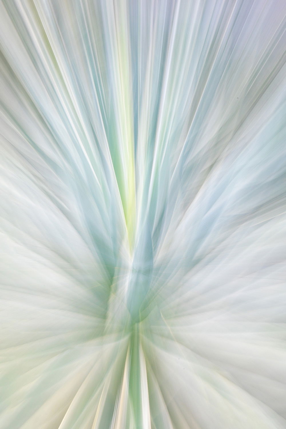
Hi Marylynne. the angle was the first thing I noticed on this one. I found myself looking at it with my head cocked to the right. I think that’s due mostly to the bottom of the image where the entire lower right quadrant has the soft look with all the brighter, sharper features just to the left of the centerline in the bottom portion of the image. I wonder how it would look with a bit of counter clockwise rotation and chopping the whole bottom of the image off? Or maybe not even the rotation?
Ok, I had to do it. Rotated and cropped with content aware fill in the corners:
Marylynne, I had to take a look here as I don’t do any of these lens movement abstracts and liked what I saw. With that said no thoughts for changes, but seeing Dennis’ updated version I like his idea too. At least I can relate to the neat title…
Marylynne: I love this kind of stuff but one has to have the right subject to carry it off and I think you did great. I really like the pastel color palette and the energy. I see what @Dennis_Plank is saying and I like his variation as well but this is a finely crafted image in any iteration. >=))>
Thanks everyone. I’ll keep playing with rotation. There’s no wrong answer there, but Dennis’ is closer to “as shot,” which probably means something.
ML
Hi Marylynne, the colors are really eye-catching, as are the radiating lines. I can see what Dennis had in mind, but view it as a different creative version rather than an improvement. I do like that it’s not perfectly verticlal too. No ho hums or snorts from me .