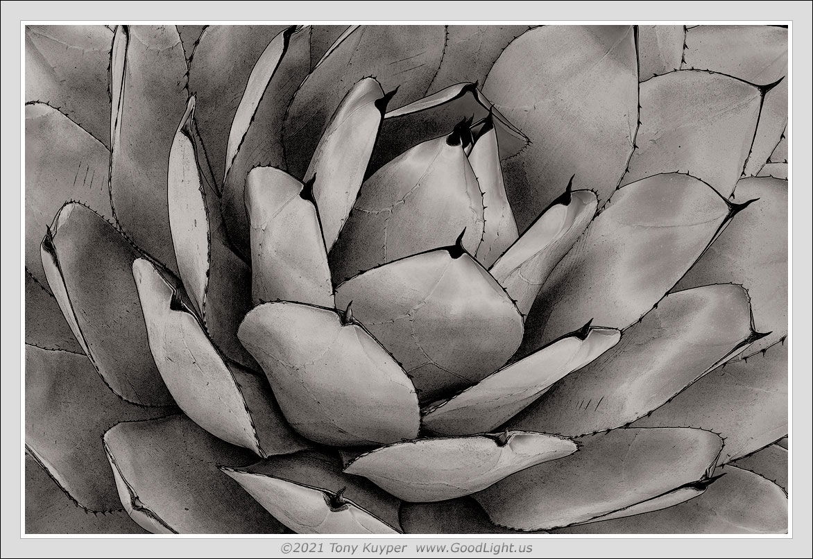
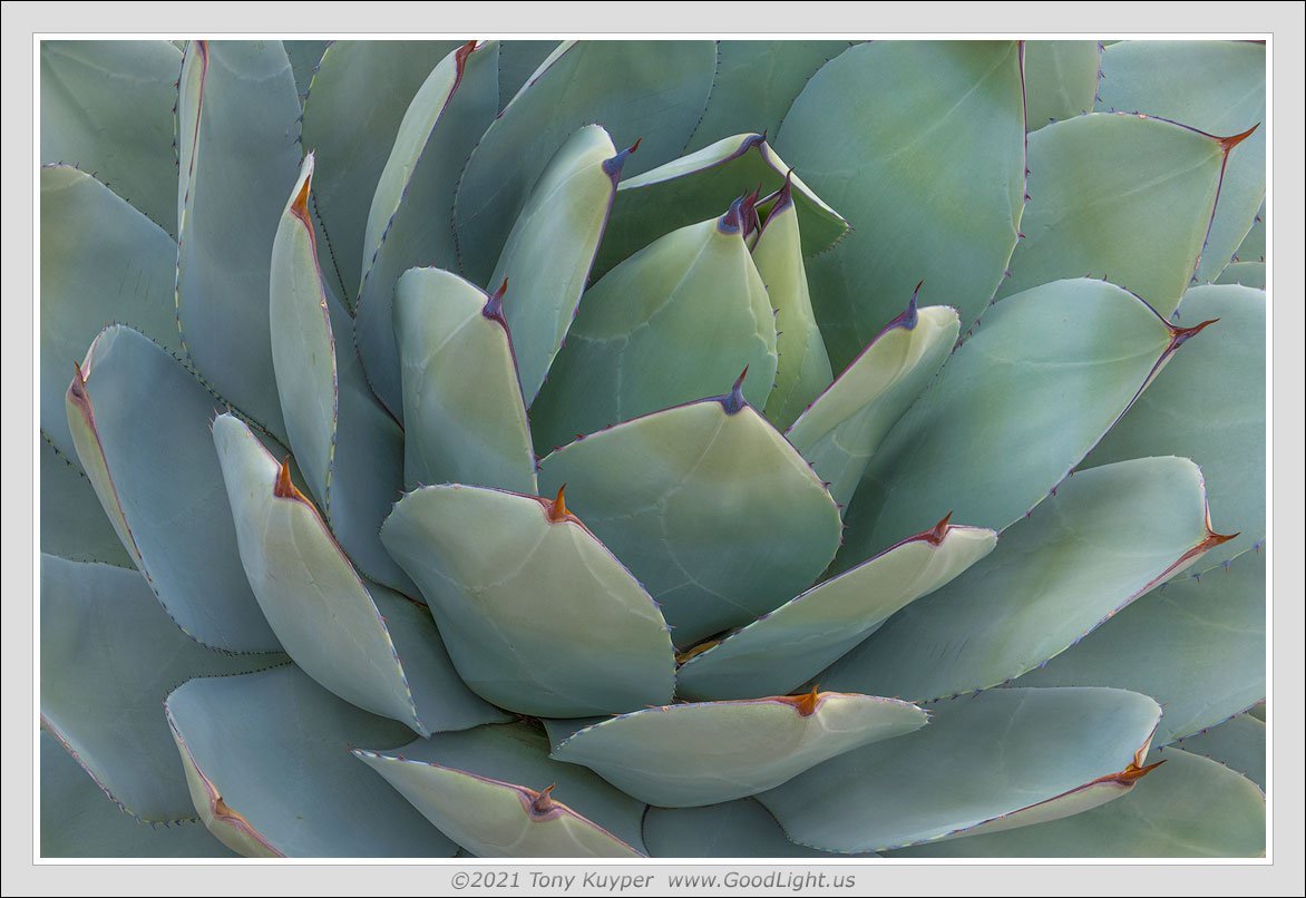
I was starting to run out of steam in my thorn-scape exploration, so I decided to try some alternative processing. This is a combination of a sketch action followed by a Zone 7-1/2 luminosity mask that becomes the image. The original image, posted below the sketch, is interesting, but the color is uneven and the edges less distinct. I think this “sketch” version better captures the textures and sharpness that are indicative of these plants and this series so far.
I prefer the sketch, Tony. The simplicity and the emphasis on the points of the cacti make the image pop, for me. The technique you’ve used sounds very interesting and am going to give that a shot. Thanks for sharing it with NPN.
Both images work well. I also prefer the sketch b &w which emphasizes the thorns and shapes of the petals. As a alternative composition, I would like to see a little more room on top
Your first image looks fine as presented in BW. Your application of luminosity masks and other post processing techniques improved the crispness of the image. Placement of the center if the plant in an unconventional spot in the frame works well here as well. Well done…Jim
I like both versions. I like the enhanced edges and thorns in the first image. The softer tones of the send image are gone in the first, but if you didn’t present the sketch version, I would have liked the second version a lot more. This composition works very well.
I feel that the color is so important to this subject that I prefer the second image. The gentle transition of blue to greens to yellow is marvelous to behold. The sketch I feel lacks some tonal richness and looks too graphic for my taste. Perhaps that’s why it’s called a sketch - a tonal abstract of the real thing…