The photographer is looking for generalized feedback about the aesthetic and technical qualities of their image.
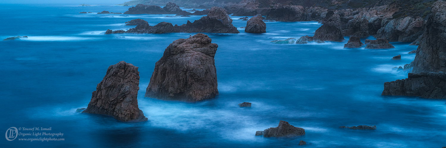
Description
The coastline at Garrapata Beach along the Big Sur coast. I was wandering around looking for a vantage point to photograph the Milky Way against these two sea stacks but could not find a good spot. I was hoping to make that photo that night back in June. But the weather forecast was wrong and the entire area was under clouds. So I bumped around until after sunset and then on my way back to the car, kind of depressed at the outcome I decided not to go home empty handed and made this photo. It was about 30 minutes after sunset so the shutter was dragged out to expose in the low light. That lone seagull on the sea stack set the mood and reflected what I was feeling as well.
Specific Feedback
Any feedback appreciated. Is it to blue? Does the blue express the feeling of being alone?
Technical Details
Nikon D850, Nikon 50mm f/1.8 MF at f5.6, 30sec, ISO 200
Processed in ACR and PS. Cropped to the panoramic format to emphasize the main sea stacks and the sea gull.
Critique Template
Use of the template is optional, but it can help spark ideas.
Vision and Purpose:
Conceptual:
Emotional Impact and Mood:
Composition:
Balance and Visual Weight:
Depth and Dimension:
Color:
Lighting:
Processing:
Technical:
I agree. This is quite dramatic, and you made lemonade out of lemons. I love the blue against the landforms. The gull adds a sense aloneness that I find appealing.
-P
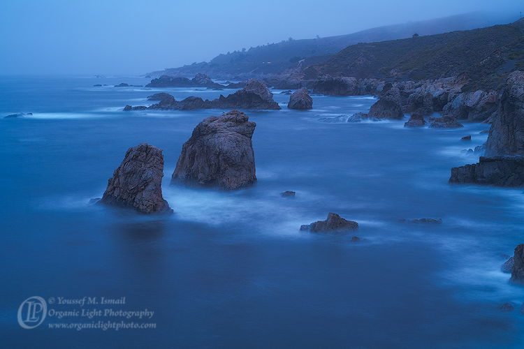
I know this area of the coastline well and I love it. I agree that it can be hard to make images from there as I too have struggled in the past for good compositions. But I like that you didn’t give up, and that you stayed late, got an idea, and shot the scene during blue hour. I don’t mind the crop but would also like to see the un-cropped version or at least a version with more of the mountain backdrop just for comparison. The rocks in that area definitely have an orange hue to them which is understated in this image because of the overall blue cast which I find that I like quite a lot. I guess the only part of the image which feels out of balance is the horizontal rock along the very right portion of the image which stops my eye and feels contrary to the rest of the rocks in the image. I guess you could crop off the right portion of the image to eliminate that rock…maybe, maybe not. Honestly, that’s the only thing I could find even remotely objectionable about this moody, cold and gorgeous image. Well done, Youssef. You now have me wanting to take a quick trip up the coast.
Youssef, the blues are set of very well by the white breaking water. The scattered sea stacks add good depth and the sea gull is good for a grin as it adds some quietness that fits the colors.
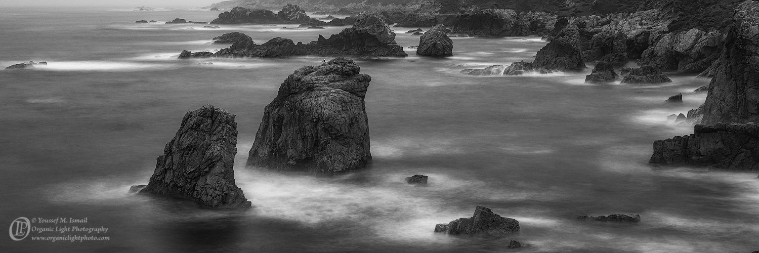
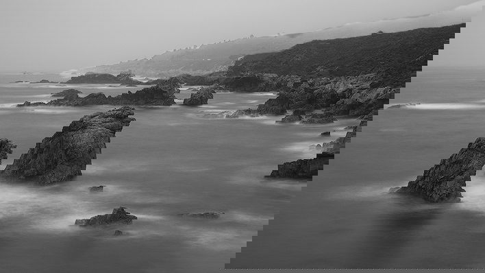
I know this area quite well also although I’ve never photographed there. A lot of great b&w were made in this area so I wondered what it would look like. I agree that a bit more space above the horizon line would be good not only compositionally but would add more depth and a sense of space.
I did not think of going B&W with this one, but I like it. When I decide to crop to a panoramic, I try to keep to a 3:1 ratio. It makes it easier when I get to the print and matting phase, as I can get one 8x24 print matted out of one 32x40 sheet of mat. Further, there was not much more above the top edge of my crop that added much to the scene. I will try to add the RAW frame for a comparison. But thank you for the B&W rendition.
To be honest I don’t think it matters much what’s back there. Just some gray tones to offset the dark rocks and not have them up against the frame. But you may be right. There are some dark ones on the right. It’s really hard to say without seeing what was removed. You probably did the best with what you had. I think I know what you were after - dark shapes ringed by white. I often work that way as well. I decided what I’m after and then walk around t see how best to convey it within a frame.
PS. I also like the 16:9 aspect ration for panoramas. For some reason it hits the sweet spot.
Interesting now that both have been posted to compare. I think @Igor_Doncov may be on to something. In color, the blue almost overwhelms the forms, where in the black and white the shapes and textures come through better. Good stuff either way, and I do like a bit more room than the original crop has.