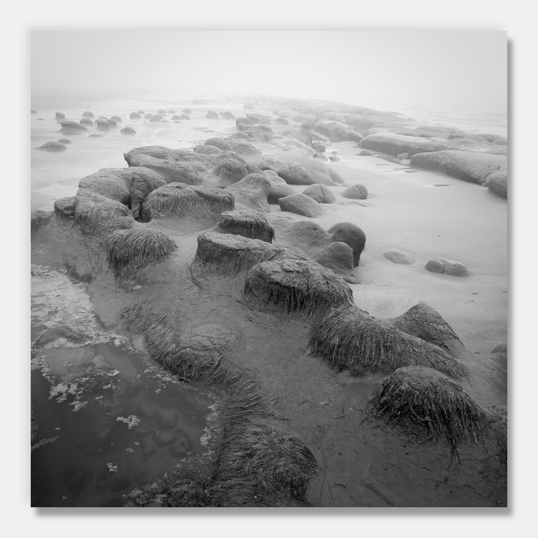
Here’s an edit making a run at the suggested changes:
Original image:
Critique Style Requested: Standard
The photographer is looking for generalized feedback about the aesthetic and technical qualities of their image.
Description
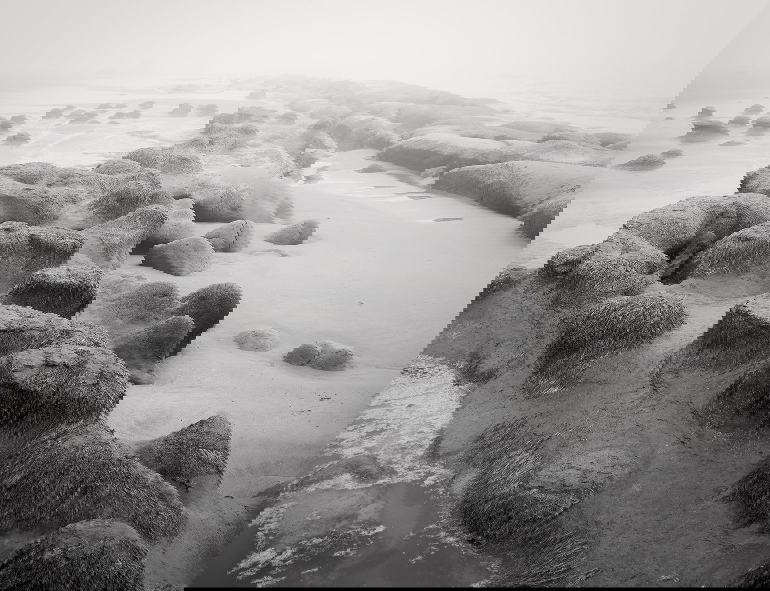
We don’t normally have a lot of hot weather where I live, but every summer we a few runs where the temperature will hover around 100 F. When it does, it’s not rare that there will be fog at the coast as the rising warm air inland pulls the cool moist air onshore.
We had that weather pattern a little over a week ago, and I had a few days off. I decided to go see what I could come up with, and have a few images I’d like feedback on.
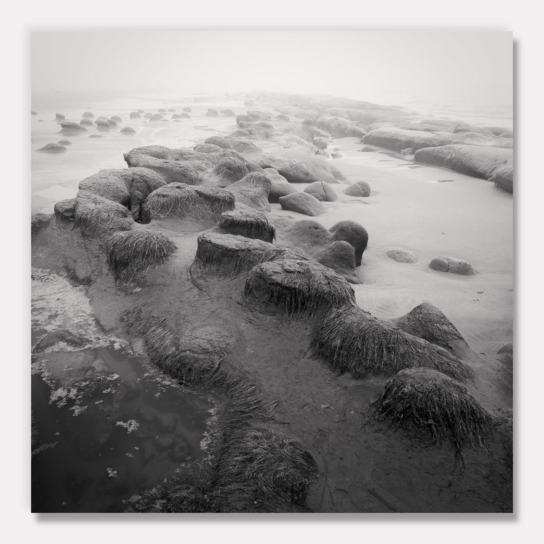
This first image is from Ona Beach, part of Brian Booth State Park. There are interesting rock formations exposed when the tide is out, and I’ve tried to photograph them before without much luck. I was happier with how they looked with the fog.
Specific Feedback
I’d love your thoughts on the crop and processing. (I’ll post the sidecar jpeg below.) I played with different crops and found I like square a little better than the others. I thought black and white carried a much better mood here, letting the shapes be the story. I often tint BW images cool, but decided to go slightly warm here to lend an aged feel.
Technical Details
NIKON Z 7II
NIKKOR Z 24-200 f/4-6.3 VR at 24 mm
1/10 sec. at f/10 and ISO 64
Two images blended for depth of field
Critique Template
Use of the template is optional, but it can help spark ideas.
- Vision and Purpose:
- Conceptual:
- Emotional Impact and Mood:
- Composition:
- Balance and Visual Weight:
- Depth and Dimension:
- Color:
- Lighting:
- Processing:
- Technical:
The black and white is the ticket here. I love the soft tones and the mellow contrast you’ve achieved.
The composition is excellent. It may be just me, but it feels tilted clockwise.
This looks like a great place to explore.
-P
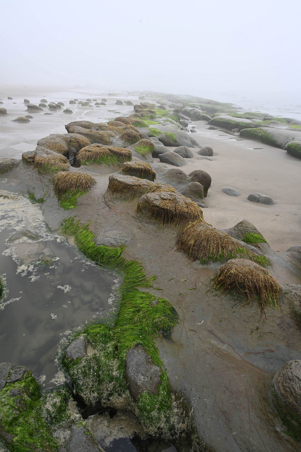
Very nice John! I can see why you made this crop. The bottom green algae and rocks just got in the way of seeing the pattern of rocks. And you’re right the green just gets in the way of the overall brown/grey image. B&W was a great decision. I love how detail fades as your eyes move up but it looks like there are some great patterns of just the rocks without the horizon. Perhaps that’s coming in subsequent posts. But no, this is a great image. I liked it before even opening up your post.
Very fine image. Black and white was definitely the right choice.
John,
What first grabs my attention is the apparent roundness of the image. I mean it feels like I am on a small sphere and I can see the curvature on the horizon, very interesting effect.
I want to see more contrast, especially in the FG to help bring out some of the texture that the sea grass has that shows up well in color but not in B&W due to the tonality of it and the rocks are so similar. Does the following work for you?
What a gorgeous image!! It does have the feeling of a fisheye and I also get the tilted feeling. I’m not sure I wouldn’t try to correct that, at least partially, as it grabs too much of my attention than it should. But that is probably just one of my foibles. I love the scene and the way you composed it . I think your crop is the right one. I think @Youssef_Ismail has a good idea about bringing out the grasses more. Another possibility could be to just brush that contrast onto each rock and most of the LL corner. A wonderful capture and presentation in any case!!
Thank you @Preston_Birdwell , @Igor_Doncov , @Don_Peters , @Youssef_Ismail , and @Diane_Miller ! As always the input is valuable and appreciated.
It was late in the day and quite foggy when I took this; the camera rendered it brighter than what my eye was seeing. Because of that I couldn’t see the horizon, and I attempted to be fastidious with the in-camera level. However, based on prior experience I know that the camera’s level is crude at best. I don’t think the image is rotated, but it’s possible. Regardless, even if it is truly level I agree it doesn’t look level. In the edit above, I’ve tried to correct that. (Maybe I should go even farther?) I didn’t want to crowd that lower right corner rock too much, so instead of rotating the image I transformed that upper right corner higher.
In the edit above I took the shadows darker responding to your and @Diane_Miller’s comments, but my personal preference is the mood of the original. The higher contrast version feels more dramatic to me, and I prefer the more subtle mood of the original. That’s the beauty of photography though, there are lots of ways to express the art and I more than appreciate your thoughts!
1 Like
The RP looks wonderful! It’s definitely artist’s choice here! I could see even more Transform – maybe with some Warp – for comparison – but that might spoil the curvature?
1 Like
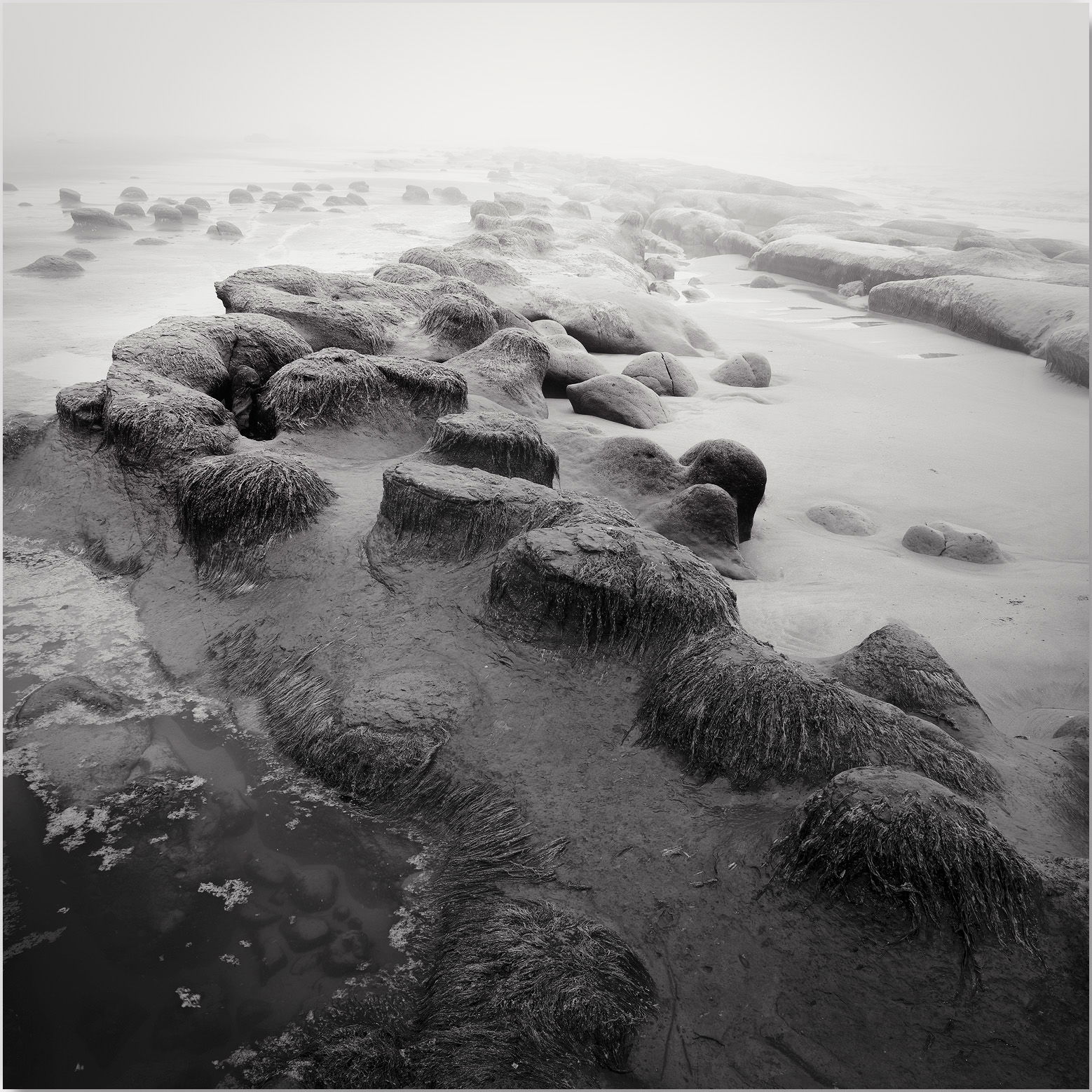
This was going to be my suggestion. I didn’t make it because it’s such a severe crop of the original.
1 Like
Another great black and white shot with a pleasing repeated pattern that certainly stands out best for me, as in your square crop with the lower contrast look.
Perfect for B&W… I love the Tone and Vibe this image offers.