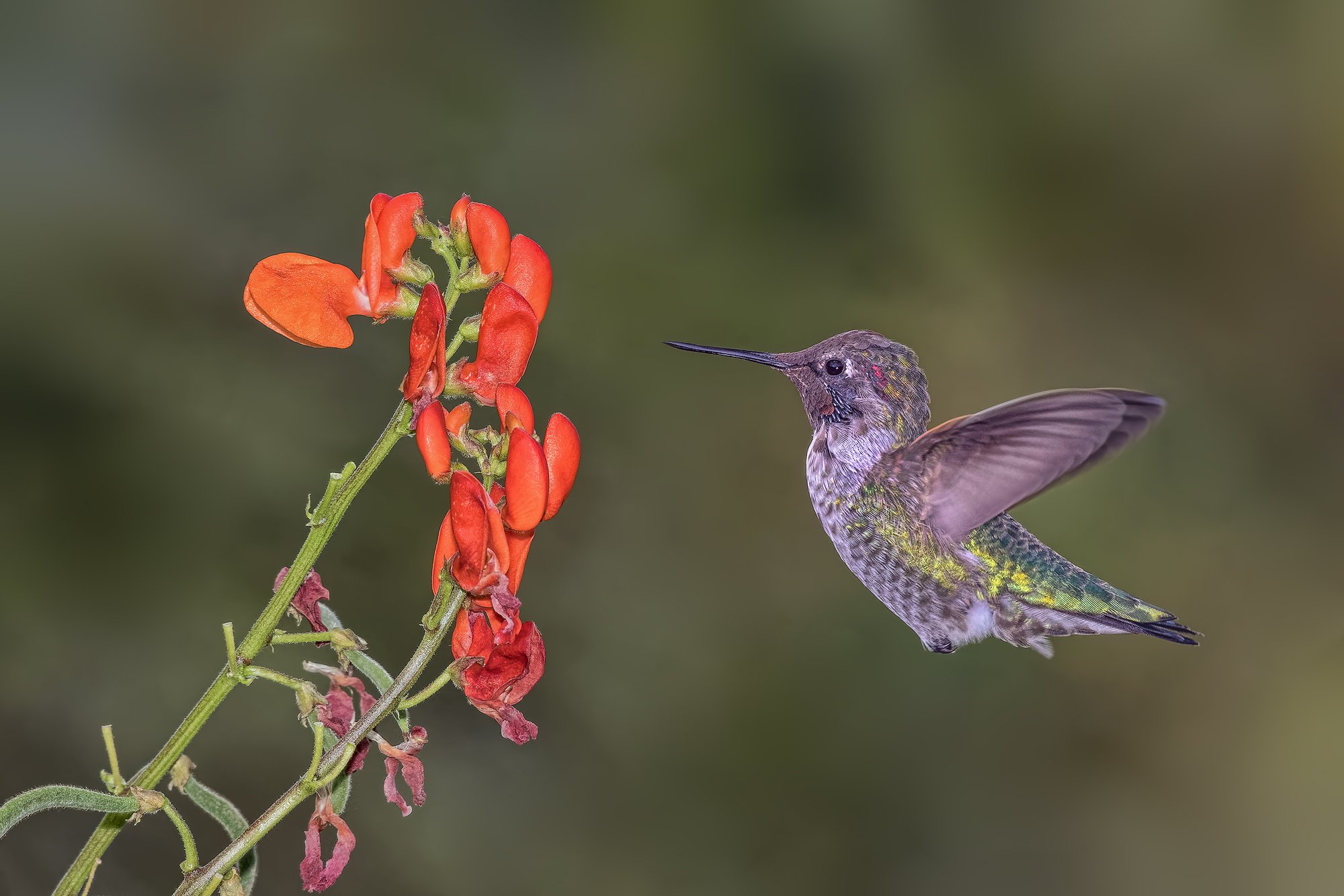
I had a late season volunteer green bean plant that has exhibited a fair amount of flower color. The Anna’s Hummingbirds seem to enjoy its nectar. This was done with a single flash unit and the background is natural.
How do people feel about the depth of field with respect to the flowers?
Is the composition too tight? This image was very sharp to begin with, considering iso 2000. I added a little bit of sharpening. Any concerns about the sharpening?
Iso-2000, 200-500 at 500 mm, F9, 1000th, D 500, -0.7 EV, fill flash at -1, 85% of full frame, DxO photo lab, Adobe camera raw 10.5, Topaz Adjust, TK sharpening action at 20%.
A great shot, David. Wonderful detail in the feathers. I think all of our hummingbirds got the weather report about the hurricane that may be coming our way before the meteorologist did, and got out of town! We haven’t seen any for a week I think. I still have a feeder out in case, as I understand that is good to do for them.
David: Pretty nice image of the hummer. Bird position looks pretty good. You asked about the sharpening. The larger version does look over sharpened to me.
The other thing I’d consider is working the flowers a bit. They are pretty saturated and draw away from the hummer. The orange petals more so than the red ones. I regularly have to desaturate the reds in flowers with hummingbird images. I don’t think digital sensors do well with saturated reds.
Keith, thanks so much for your feedback. It is appreciated. You are correct about the digital sensors and red/orange tones. This was already cut back 25% on both the red and orange saturation. The image was taken under cloudy skies which also has a tendency to over exaggerate saturation. I am not sure what to do on the oversharpness but I will try to reprocess from the original without any sharpening components and see what it does.
Great wing position, David. You asked about depth of field, but I doubt you could do anything about the back flower cluster and still have any kind of shutter speed. I agree with Keith on the sharpness. I’ve not used tony’s sharpening action, but it looks as if it’s a bit of overkill for an already sharp image-at least for avian images. I like the composition. To my eye, the saturation of the flowers looks reasonable, but it does compete with the hummingbird. It’s an awfully fine line to avoid making the colors look washed out.
A follow-up on my comment, I have seen 2 hummingbirds this afternoon at our feeder! So, for those that have feeders out, it might be good to keep them a bit longer. I understand that it is helpful to them as the migrate south.
Thanks for the feedback.
Here is a repost; this is the image taken immediately after the original posted image. I have post processed this one with an eye on keeping the sharpening at a minimum. I also decreased the red and orange saturation a tiny bit. This is at 1250th sec.
The plumage looks much more natural to me, David, though this time of year a lot of new plumage has a rather coarse look naturally until it seems to wear in. The colors are much mellower.
I really like the detail in the birds wings and the image overall. I do thing the flowers looked a bit unreal like the bird was dropped in an image of the flowers. Hope that’s not too much. I’ve been away for a while so my critique chops may need some fine tuning.
Thanks for your comment George… The flowers do look unreal. To me this has to do with their uniformity and lack of microcontrast. Iso 2000 and DxO Photo Lab may also have something to do with it. But this is a single image. I have attached a composite image taken in the same place so you can compare. I did this so I could see how the image looked with more DOF on the flowers. I have never and would never post a compositwe on the NPN site without a disclaimer.! This would be okay to post in Photo Art …