Aquilegia canadensis L. (Eastern Red Columbine, Wild Red Columbine)

The plants were photographed in situ, growing out of a small crack in a limey sandstone rock face. Managing the lightbox into position behind plants was a comic engineering task. It ended up with several long sticks scavenged from the surrounding woods holding, just barely, the box in place. I try to avoid schlepping a ton of equipment but do rely on props found serendipitously. Fallen branches can be your best tripod at times.

Specific Feedback Requested

I’m game for any feedback from graphic form to processing and the placement of copy and chop. The final intent of the photograph is to print, mat, and frame for gallery sales.

Technical Details

Is this a composite: No

Nikon D-600, Zeiss Makro-Planar T* 100mm f/2 ZE, f22, Picture Control - Flat, RAW file. Processed in Adobe Bridge, and copy added in PS.

paulgwiegman

I really like this one, but I wonder if the red is too muted. I’ve seen and photographed wild columbine quite a bit and know how vivid they are. Hm…

The flower colors are not right for this plant. Vibrance and saturation of red and yellow need to be addressed. Comp is fine and I like the high key presentation of the photo…Jim

Agree with Jim and Kristen on colors. I like the composition and the high-key background. Enhancing the red in flowers can be helpful.

Thanks, Kris, Ravi S. Hirekatur, and Jim Zablotny

When I posted the photograph, I was surprised at the darkness of the flowers, comparing that to the master file I use for prints as well as the printed images. So, you all are right. This isn’t an excuse, but for prints, the color space is Adobe Pro. For the web, I shift to sRGB. There is a big difference in the gamut of the two, and strange shifts happened.

However, the big problem is that I’m red-green color-blind. I’ve worked out a system that I go with the RGB numbers below the histogram in Lightroom Classic, and I may not have checked them carefully.

As an example of what I see, the upper and lower halves of the image are exactly alike.

Thanks Ravi. See my response to Kris concerning the colors.

Hi Paul
Other than the color, which others have commented on, I really like the technique and the fact that this resembles a botanical illustration.
Another thought- I do a lot of lightbox photography in the studio and I wonder if you have a lighter version of this that you could use for the non white parts of the flower? That would give those parts more translucence and I believe improve on the color issue. Colors are never going to be quite the same on a light box unless you monkey with them. I usually take about 9 exposures, 1 exposure difference each. The really light ones are the ones that provide all the fantastic translucent effects.
And I have to ask, how big a light box are you carting into the field and what make? Sounds like a fun thing to do.
Best
Kathy

“And I have to ask, how big a lightbox are you carting into the field and what make? Sounds like a fun thing to do.”

Hi Kathy,

Thanks for the comments. As soon as I posted the photograph, I knew the colors would get attention. The prints I make from the master file have a light, airy, diaphanous glow, especially on watercolor fine art paper. I guess the transfer to sRGB and JPEG, both of which have a more constrained color space, pushed the reds and yellows to a muddy lump.

I love finding flowers like Aquilegia because of their translucent petals and fine leaves. The challenge with making the images I’m working toward is balancing the strong backlight and beautiful transmitted tones against the front lights necessary for at least some reflected color and texture. I start with getting the backlight just right, watching the red flash of death on the LCD screen. That lets me know I have a pure white background. Then working with either the distance from the subject or manually controlling the output of the front two flashes, finding that sweet spot. Setting the camera file output on flat and saving a raw file, I have lots and lots of data to work with using Adobe Camera Raw. It’s a joy, both in the field and in front of the computer, to work with these flowers.

I carry different lightboxes depending on what I am expecting to find in bloom. The little flowers are up early spring, and a 12" X 5" box will do. Later for trees, big flowers, and shrubs, a 2’ hex works well. In the summer, I turn to garden plants and then the 4’ hex.

The portable soft boxes are from China. My daughter and family lived there for 6 years and we visited often. I would find what I wanted on a website Ali Express and then, if the manufacturer was in Shanghai, I could go directly to them and get the equipment an a very low cost. Even using Ali Express you can find great prices. A small one is $1.45 US. A 21" hex is $32 and free shipping to the US. They aren’t top of the line quality, but with a little care they are fine. Google Ali Express and search for soft boxes. Do a lot of comparison and watch out for some of the shipping costs.

Much of the work is along a dedicated bike trail that follows the Youghiogheny River in the Allegheny Mountains. The gear is carried in a bike trailer.

I’ve taken up too much of your time. If you have questions you are welcome to use the direct message.

Again, thanks for the comments.
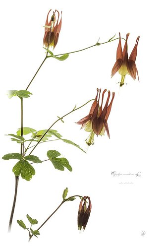
Great composition, clean background and choice of the flowers in different stages of growth. Another stellar presentation. Great series. Keep them coming

1 Like