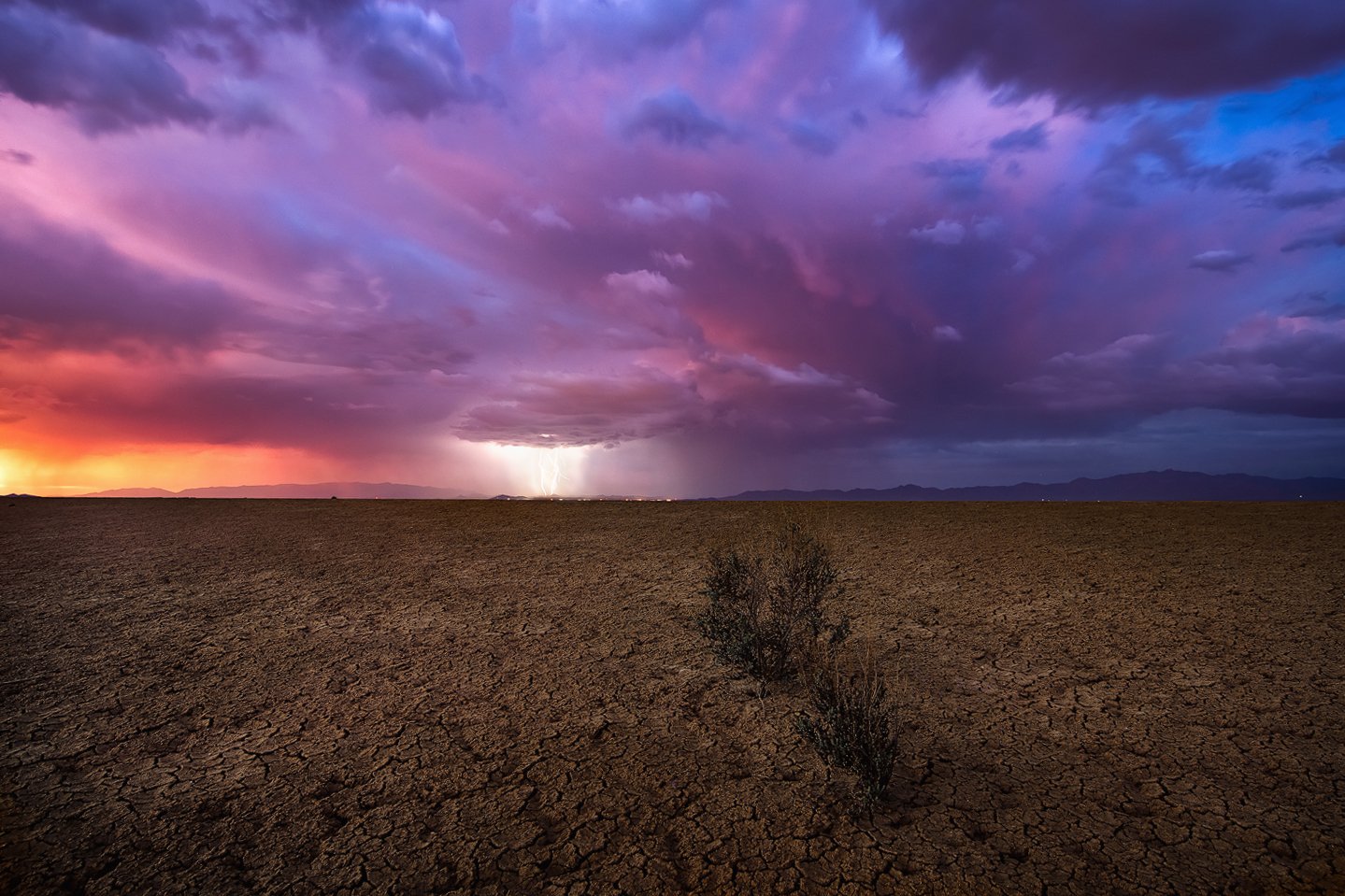
This is a single 30 second exposure taken on a playa as we were chasing storms at sunset.
Any and all critiques and opinions are welcome.
What technical feedback would you like if any?
What artistic feedback would you like if any?
Pertinent technical details or techniques:
(If this is a composite, etc. please be honest with your techniques to help others learn)
If you would like your image to be eligible for a feature on the NPN Instagram (@NaturePhotoNet), add the tag ‘ig’ and leave your Instagram username below.
You may only download this image to demonstrate post-processing techniques.
Greg, that’s a tres mendous sky and I like how the FG bushes lead the eyr to the Bg lightning, but to me the FG just doesn’t hold much interest. I might have left the bushes out alltogether and gotten closer to the ground and found some patterns in the cracks and emphasized them. JMHO
Thanks for the input @Michael_Lowe . I thought of that also. But the cracks are small and nothing like what you find at Death Valley. So that’s why I located these little bushes. But in this case the sky was the shot anyway.
Wow, those storm clouds are beautiful! I especially like the gradation from warm to cool colors. The lightning adds even more drama. Your processing looks good. The colors are bold, but believable as I have seen seen some incredible light in those conditions.
I don’t find the foreground to be as compelling. If you want to include that much foreground I think that it would be more compelling if you would have gotten lower (about 1-2 feet above the ground and angle your lens slightly down) while still capturing that beautiful sky. That would allow you to emphasize the lines in the playa to pull the viewer into the scene.
Here is an example of what I am suggesting:
This example is biased to the foreground and with the conditions that you had you would still want to find a composition that emphasizes that beautiful sky so I wouldn’t go quite as low as in this photo, but you can see how she used the lines to draw the viewer’s eye into the scene.
Another alternative would be to move in closer to the plants to make them the focal point of the foreground. Finally a last alternative would be to go all in on the sky and include just enough of the foreground to anchor the scene.
Overall you have a beautiful shot that still tells the story of life on the desert. Even as I write this comment I realize that your composition does tell the story of the isolation of the foreground plants. I just think that to compliment that bold sky the foreground needs to be stronger if you are going to give it that much weight in the scene. I hope this is all helpful to you, and I certainly don’t claim to be an expert!
EDIT: I didn’t read the other comments before posting my comment so I just saw your response to Michael’s comment. In that case I think that I would just go all in with the sky and include less foreground.
A beautiful capture, Greg. I have a slightly different take on it than @Michael_Lowe and @Brian_Schrayer. I am really enjoying the FG and like the inclusion of the bushes. The bushes seem to bring some context to the scene and I LOVE the contrast between the very bland, almost colorless FG and the incredible color of the sky. It somewhat shocks the senses and is an immediate attention grabber. My only “wish” would be to concentrate more on the sky than the FG (maybe 60/40 or even 65/35 sky/FG). I don’t know if that can be reworked by cropping or if this is full frame now, but just an idea. Wonderful shot!
Like you said, the sky is the shot. I like the fg for the contrast to the sky, but maybe crop more off the bottom. The bushes appear to be an attempt to put something in the fg but they are not interesting. In playing with a pano crop you might need to clone the top of the bush. The only other suggestion is to clone the house lights on the right side which are more obvious with a pano crop. The sky is amazing!
Wow, what a great moment. Amazing capture, love the wide angle perspective and the long exposure works well. I agree with the comments that the foreground is less interesting, but really, what is going to compete with that sky?, My thought would be to be a bit lower, perhaps emphasize the bushes more. They are an element and I think they do add to the image. I would keep less of the foreground and add more sky, as with Bill’s comment about 60/40 or thereabout. My first thought, and to my tastes, the sky seems a little over saturated. I would back off the magenta in the center, but keep the oranges and blues on the sides. But this is a tremendous image. Impressive.
to the bottom, and added a bit of contrast and clarity to the foreground. Lowered the magenta and purple sat in center, and took down the white just a touch around the lightning to emphasize the bolts. These are stylistic ideas only, you have a wonderful image.
Thanks @John_Dodson, @Brian_Schrayer, @Bill_Chambers, @Michael_Lowe, @chris6. Thanks everyone for the input. The foreground used here I know is not the most interesting but as you can see there isn’t much around. Those bushes max out in height of about 10 inches so it was a balancing act of keeping the top out of the sky and keeping some foreground detail. I played with various heights but those “tiles” are measured in a few inches not anything like Death Valley tiles. Any lower and they all disappear and any higher and I show more mid ground. I love the input and will put some of them into play. In particular the cropping, compressing the mid ground and playing with the contrast.
Oh my goodness. If this was a sky I got to experience and witness, I’m quite certain it would be the most spectacular I’d even seen. Wow, incredible. The lightning is just icing on the cake.
Hard to be critical here. But I do like the idea of “transforming” this a little in order to give more prevalence to the sky and get away from the nearly 50/50 comp. I like where John was taking this - I might go even further. But I suspect we’re entering the “truth” discussion… where for some it’s black and white, while for others “it depends” on what’s being done. No right or wrong. I’m thinking in this case, “stretching” and “compressing” sections digitally, could have been accomplished in the field with viewpoint (higher/lower), lens choice and camera to subject distance.
I went ahead and played with this. In addition to stretching the sky, and compressing the playa, I did clone out a few lights on the horizon (leaving the “town” in the center.) But also, I dodged the foreground in places to enhance the difference in tonality. Makes the foreground a tad more interesting maybe? Anyway, this falls in the category of “Just because you CAN do something… doesn’t mean you should…”
Thanks @Lon_Overacker, @Bill_Chambers@Michael_Lowe@Brian_Schrayer@chris6@John_Dodson. I took all of your input into consideration and came up with the above. I did do some of what Lon suggested except I didn’t compress anything. Didn’t have much to compress. But I did move the bottom down and in turn stretched the sky down. Not a whole lot but enough to help shift the eye up. Hope you all like it. Thanks. Looks like I still missed a couple of those lights.
The re-post looks great, Greg. The subtle shift in the composition puts more weight in the sky.
Interestingly, I have looked at this image several times since posting my original comment and have noticed how much ambient light affects how we view the scene. When I originally commented there was enough bright light coming in the room where I was viewing this image that it was obscuring some of the detail in the shadows. As I have looked at this image in different lighting I have noticed more of the subtle details in the foreground.