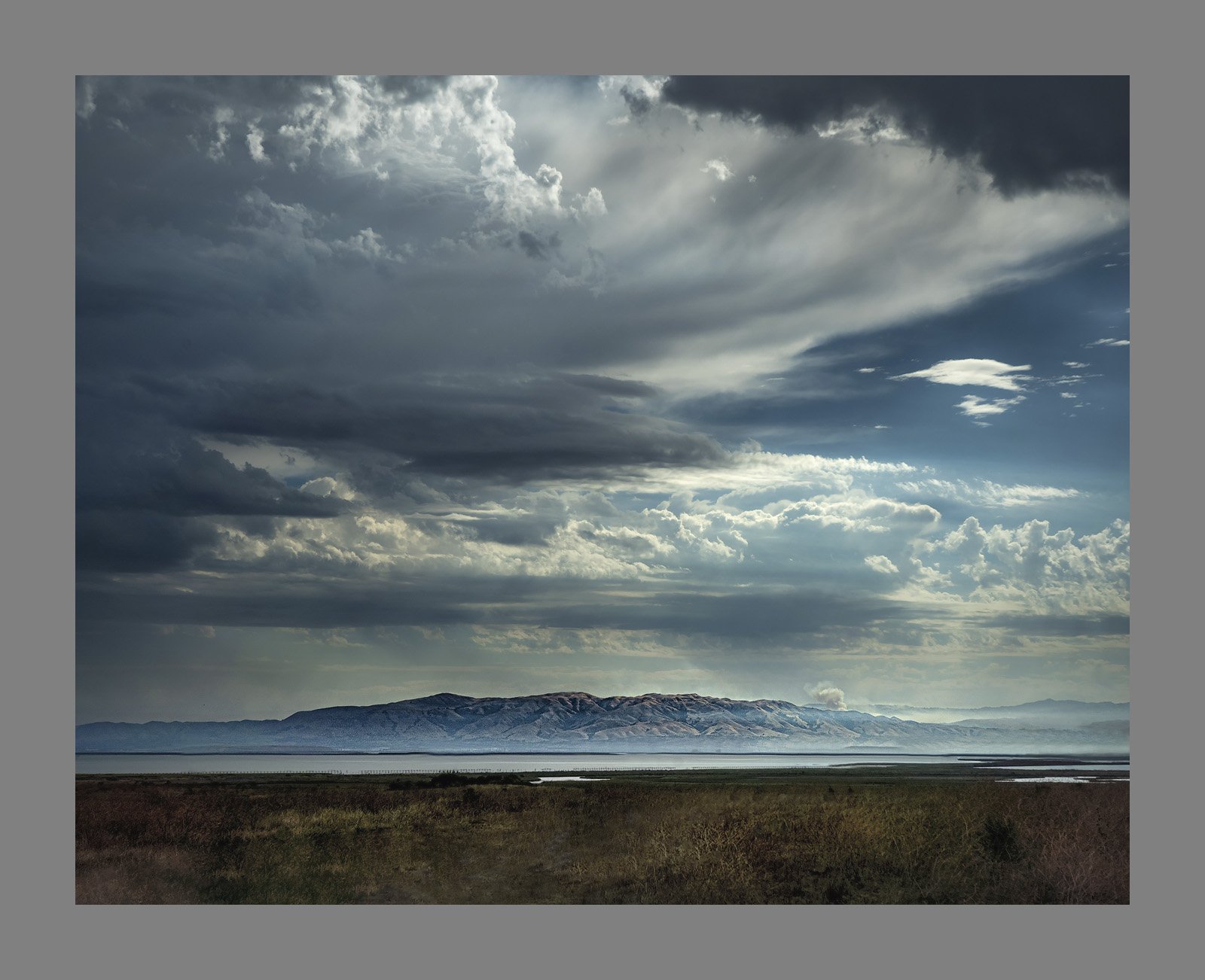
Sadly, this beautiful light happened during the dry lightning strikes that have caused so many fires in my area.
What technical feedback would you like if any?
I often find what seems to be to be an imperfect leading line, or “almost good” foreground. Does this path work well enough?
What artistic feedback would you like if any?
Sometimes I struggle with balance, and I really had to crop this carefully. Do you find it well-balanced?
Pertinent technical details or techniques:
(If this is a composite, etc. please be honest with your techniques to help others learn)
No compositing at all, but color grading, dodge/burn, luminosity masking, the whole other 9 yards
If you would like your image to be eligible for a feature on the NPN Instagram (@NaturePhotoNet), add the tag ‘ig’ and leave your Instagram username below.
I think it is a great composition, well balanced. A small optional suggestion would be to crop a bit off the top. The biggest flaw is that in darkening the sky the effect has bled into the mountain tops.
The cloud, mountain. water, and dark fg layer all work well together. The road really does not. I would clone it out as best as possible and add some contrast in that darkness.
Welcome aboard, Jeff. Real fine first post. Great sky! I am kind of in the Igor camp on the road. Not a photo killer for me, but if it could somehow be removed or minimized, I think it would add a lot to the rest of the image.
Here is en edit trying out some of these ideas . It’s funny, when going back in to LR I noticed that a few days ago I had made a version that cropped the path entirely off the bottom. But I like this clone-it-out approach better than that brutal crop.
This is a grand landscape, captured and processed with care. Keep this stuff coming!
I guess I am the odd man out, but the swing of the road rreflecting the cloud seemed to me to add energy to the image not present in the revision.
I fiddled with it a bit… Burned the road, dodged its surrounding brush, and dodged a bit of the left sky. I did this fingerpainting with Snapseed on my tablet, so better results could be achieved with more care. I am interested in your thoughts, Jeff.
Thank you @Dick_Knudson for your analysis and your edit. I prefer your edit to my initial post (and to the “no path” version).
Bottom line for me is, I’m learning that, almost regardless of improved edit ideas, this photo might always be a “great sky, decent mid ground, and mediocre foreground”. I greatly prefer some other shots from this morning, and now I know why
I do appreciate you all chipping in and helping me think through the path, and some smart edit alternatives.
Ok I’ll be the real odd man out. I like the shot as delivered originally. The road gives the photo some purpose for me. It leads me to the fire. As a grandscape it has presence . The haze at the bottom of the mountain looks natural to me. Too bad you couldn’t get a lightning strike to finish it off.
My opinion is to leave the road in. Not the most dynamic FG in the world, but still decent. My objections are more with the processing. The whole image looks too dark to my eyes, esp the FG and blue sky. I like the composition.
Thank you Kelly. Absolutely, I was trying so hard to capture stills of the lightening, but I had absolutely no skills for that and failed (my whole adult life has been spent in CA and we’ve basically hardly ever had lightening).
Yes, I would agree with your assessment. Two things for sure, the sky definitely needed increased luminosity in the highlights, and the foreground was too dark, so I agree with the direction of your rework.
Leading lines can be tricky. My rule of thumb is that leading lines should lead the viewer to something of interest. The road here does not, it leads the viewers eye to the lower right corner of the image. But I’m still in favor of leaving the road in the image, because I don’t view it as a leading line. Rather, I view it as a horizontal line that fits in within image that has other strong horizontal elements (mountains, clouds). So for me your rework addresses my concerns.