I noticed this transient lighting while shooting one morning but saw it a bit too late. I was drawn to it and so decided to revisit it on the following day. Only after I started processing it that I realized that it’s somewhat a difficult scene to render. I am not sure if I have done it justice, especially the beautiful light filtered through the leaves. I used a CPL to help tame some of the highlights, but not 100% sure if it was the right move. Any feedback is always appreciated. Thank you in advance!
V3.0:
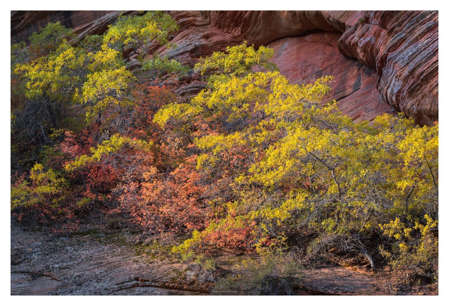
A rework based on @Tony_Kuyper and @Bonnie_Lampley’s suggestions. Boosted the yellow saturation. Address the URC area: tonality, color. Brighten up the center leaves.
Adhika, To me a fine image and a good composition, You did the right post-processing . Little nit, maybe you should get rid of the black things at the bottom.
Ben, thanks for the feedback. I see what you mean about the darkest nooks and crannies at the most bottom section. I tried cropping it away but it makes the image top heavy, if you know what I mean.
Adhika, you’ve got a fine collection of gentle, warm colors here, in the trees and the rocks. I doubt that you’ve have done as well with out the polarizer taming the reflections. My first thought was to crop the rocks off the bottom, but extended viewing has changed my mind. The shadow areas fit the lighting. If you want to reduce their visual impact, do some dodging through a “middle” darks luminosity mask. Select the lightest darks mask and then subtract one of the darkest masks, leaving you with a mask the works on the middle dark tones, but not the blacks. I think you’ll find that reduces the darkness without turning the blacks grey.
@Mark_Seaver thanks! Good to hear about your experience with those darker areas at the bottom.
I rework the bottom area based on your suggestion and also @Ben_van_der_Sande’s comment and have posted a revision on the original. I end up also burning the highlights near the bottom to reduce the contrast just a little bit so the transition out of the frame is a little more subtle.
For some reasons, I feel that the CPL makes the contrast somewhat more muddy in the leaves. Maybe should have gone somewhere before full polarization…
Adhika, I think the quality of the light comes through nicely in this scene. Nine times out of ten, I think the benefit of a CPL on vegetation outweighs the potential loss of glow. Reflections are a different story, but with leaves a CPL is usually very helpful. The leaves here have a glow, your processing has kept that intact despite the use of a CPL. I also like @Mark_Seaver suggestion on the darks, and how you handled it in your rework, nicely done.
The thing that really makes this image work for me is the red rock formation in the URC, it adds balance to the image, and takes this far beyond being just a mosaic of autumn leaves.
I like this image quite a bit Adhika. I do think that the background rocks are intruding a bit in terms of attention. I had the same issue in the area. The cliffs are so dramatic that it’s hard to shoot anything in front of them without them drawing you in. And in this case they’re starting to make the composition look busy. I really like the lower right corner by the way as well. I can’t comment on how much the CPL helped of hurt. I used to experiment with it on foliage and found it to give some really unpleasant results which weren’t worth the boost it gave in color. I almost always use CPL partially to not give that flat look. It can suck the life out of an image. I like the use of shadows in this image. They’re subtle but noticeable.
@Igor_Doncov, thanks for this feedback. This is quite interesting because I thought it is how the the rock BG (especially that arch) interacts with the trees that makes the image for me. I think @Ed_McGuirk echoes the same thought. I am glad there is a variety of thoughts here. Always useful.
I will have to experiment with the CPL setting a little more. I have always used CPL as a binary filter, but I should experiment with partial polarization. For this image, I think it is okay until I zoom in to see the individual leaves. Then, I can see some flatness.
I think it looks fine. The color feels a bit dull, but I know saturation level is quite personal. However, more color in the leaves would help distinguish them more from the rock creating better separation of the available elements.
@Tony_Kuyper, thanks for this input. I should look at pushing those yellows a little bit more. I was worried that I would lose the glow/sheen even more. But maybe that’s not true.
This is lovely. I’m with you on the rocks making the photo. What struck me was how the bedding in the URC rocks was continued in the LLC rocks. I thought that perhaps that feature could be used to frame the trees. To my eye, that would work if the luminosity/clarity of the two corners were more similar. I had a crack at that - darkened the URC a bit + lightened/increased clarity in the LLC, then lowered the exposure around the trees using an inverted radial filter. Finally, increased the lights on the trees with a regular radial filter (all adjustments in ACR). I think you captured the light on the leaves very well.
@Bonnie_Lampley, those are amazing suggestions. Love it. I made a rework based on your suggestions, especially on the URC area. I think that makes a really huge impact. I also took the time to boost the yellow as @Tony_Kuyper’s pointed out above. The revision is posted in the OP.
Adhika, the changes in the rework are subtle, but make a nice difference. I think @Bonnie_Lampley suggestions were very helpful in pointing you in a good direction.