Hi Ed, 
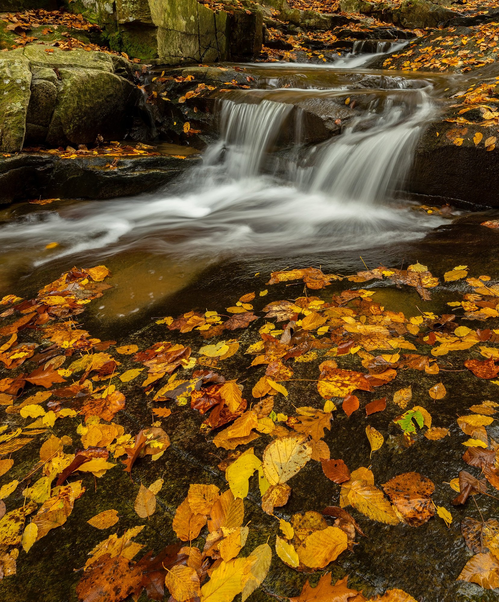
From a personal preference point of view, I like this composition much better than the previous one from a few days earlier with one exception, this one doesn’t have water flowing over the rocks in the corner (obviously from less waterflow) but that was a nice bonus IMO.
Not a big sacrifice, that little bonus waterfall in the corner was just something I liked.
The amount of FG is extra nice in this one because I get to enjoy viewing the textures in the FG rock and leaves.
I really like how the leaves outline the shape of the exposed rocks this side of the water.
That long horizontal rock just this side of the water has a very appealing texture (and is more visible as a result of the reflected light from the rushing water).
I like the inclusion of the upper portion of the scene because it shows depth and adds context, it gives us a good notion about where the water is coming from.
Showing the top of the big rock (at the top) shows where that rock terminates and cropping down would cause that to be lost.
It might be good to add some exposure to the small dark rectangle in the ULC, it’s only because it’s right in the corner that causes it to draw attention, if it were out on the scene it wouldn’t have that affect IMHO.
As for the color cast, I can’t count the number of times I’ve been in the woods at dawn and at dusk where there is a nice golden color everywhere from the sunrise or sunset, so, I think the color cast shown in this image is very plausible, realistic and appealing.
While I like the edit for color correction that @Donna_Callais did, it changes the mood by changing the perceived time of day the photograph was taken, her interpretation makes me think it was taken during mid-day rather than early morning or late evening.
There is certainly nothing wrong with that approach if that was the mood you’re wanting to show.
Whenever I look at an image for the purpose of critique, I tend to try to find elements that should be left as they are rather than looking for elements that need to be changed and I guess that the “Cup Half Full” approach (as opposed to “Cup Half Empty” approach) is a more positive and more fair way IMHO.
If I were to only look for elements that need to be changed, it’s too easy to overlook the positive elements that could offset the negative elements.
For example, If I were to say: “Crop down from the top to eliminate the small dark rectangle in the ULC”, yes, that would work to eliminate that negative element, but, it would also cause a more positive element to be lost, which is the top of the large rock showing the shape of the top of that rock, IMHO, you would lose more than you gain.
Anyway, enough rambling about critique philosophy (I do stray from that on occasion myself, so, not throwing stones  )
)
This is a really good image in every way with the minor exception of the small dark rectangle.
Your skill with the 14-30 f4 lens, slow shutter speed and the CPL certainly shows!
I am curious though, did you use the CPL as a means to reduce the shutter speed or was there a glare there that needed to be mitigated?
Was there a specific reason for using a CPL as opposed to an ND filter?
Well done!!