Run Off +edit

I was able to get away this last weekend and spend a day in the Merced River canyon before meeting up with my buddy Preston. Rain and snow continue to pelt California as the snow piles higher in the Sierra Nevada. The rains and run off creating many, many temporary cascades and falls, I couldn’t help but try and capture some of it.

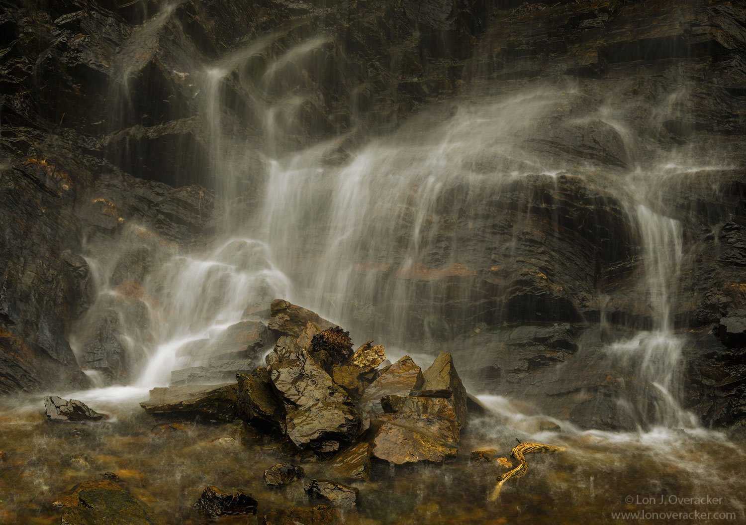
EDIT: Thanks for the feedback. Funny, I knew that piece of wood in the water (yeah, not a rock) was problematic even before capturing the image. The problem was my weak unwillingness to remove the stick. You see I would have pretty much gotten drenched to remove it. You can’t really see, but there was a lot of water dripping over the ledge several feet above. It was pretty much like a heavy rain over that pool. I was even too lazy to walk back to the car for my rain jacket… :roll_eyes:

I didn’t try CA cloning, thought it was too big. I did edit this and selectively dropped the saturation, contrast of that piece of wood to mitigate its presence. I also went ahead and dropped the brightness of the rock on the right. And additionally backed off of the yellow in the rocks/pool. A little more realistic now, I hope.

As always feedback, comments and critique always welcome. Thanks!

You may only download this image to demonstrate post-processing techniques.

What technical feedback would you like if any?

Processing, color, sat, etc. of course. Minimal processing here. Some minor cloning in the water; a stick and small, brighter rock. Some subtle tweaking of saturation (reds, yellows) and a little Selective Color for the whites in the water. Of course a little more punch than the RAW file, but nothing to complicated in post.

What artistic feedback would you like if any?

Wondering if the small, flat-topped rock on the right with the dark facing bothers anyone? Cropping I think would make too tight on the right. I guess I could lose the cascade on the right? Thinking about it now, I suppose I could have darkened the tones on top to minimize it’s presence?
Any thoughts on that? Or general impressions.

Pertinent technical details or techniques:

Nikon D800E, 28-300mm @85mm, f/18 .3s iso 100. Single frame

2 Likes

Your composition is very nice and well balanced, Lon.

The processing is very pleasing, and I like the soft look of the light and the water.

With regard to flat-topped rock, if you darken its top, I think that would work. Cropping it out would put the right-most cascade too close to the edge.

My only concern is the curved orange stripe on the stone near the bottom right. It’s saturation is pretty high and grabbed my eye right off the bat. You might want to tone that down a bit.

Looking forward to more from you Merced Canyon trip.

It was great to see you after too long a time, my friend.
-P

This turned out great. I like the golden color of the rock and nice comp on the cascade. The flat top rock doesn’t bother me a bit. I see what PB is saying about the orange rock, but it looks good and natural to my eye. No suggestions here, real nice.

Excellent image imo. This is one of those images where the image is more than what was there. The rocks below have a life of their own. They seem to rise out of the water almost defiantly. I’ve seen this kind of effect in your waterfall images before. I think it’s how these rocks ascend to a point together with the overwhelming water everywhere that pulls this off.

I thought - why all that yellow? So I tried to change the WB. It caused the bg to be bluer while the rocks remained brown. It was a total failure. This image all in brown with a variety of tones is far more powerful. It simplifies things without color.

One thing though - that half submerged wood has to go. It’s totally disruptive.

Great work? - Check

I’ll take that as a compliment since I agree with the statement. I think it may be true in many cases for many images. I’m not sure entirely what you meant, but one of the powers of photography is what we don’t show you and what we choose to photograph. So in that sense, what I’m showing you might have more beauty, impact, whatever, than was actually present at the time of capture. This was simply a roadside image - the water draining in to a drainage collection that ran under Highway 140 and in to the Merced River. Depending on how it goes, I may even show another, wider view. We’ll see.

Thanks for the comment and observations. Much appreciated.

If this was “just” a roadside image, then you need to be shooting from roads more often !!!

This is truly a case of it’s not what you see, but rather how you see it, and as Igor said you made more of it than what was there. The composition here is great, I just love how the cascades are draped around those beautiful gold rocks in the foreground. The repetition of all those little cascades gives the view a lot to appreciate. I tried removing the log with Content Aware Fill, and it was surprisingly easy to do, and PS did a great job with it.

This clearly gets into a matter of personal taste and preferences, but I think the warm WB here makes the background rocks a little muddy looking. However, I love what the warm WB is doing to the foreground rocks and water. I tried a an alternate treatment where I cooled the darker background rocks. i think this makes those golden foreground rocks pop even more. And it shows what CAF did to remove the tree branch. My level of cooling of the background rocks may be too much of a deviation from your original intent, but direction-ally I think some slight cooling in the shadows of the background would help.

1 Like

I like Ed’s idea of cooling off the background, but call me crazy, but I prefer leaving the stick in the scene. I like it there.

Thanks for the comments and suggestions Ed. I like your edit. May I ask what you did the cool down the rocks? A Darks luminosity mask perhaps? I think it looks good and makes the water stand out nicely against the dark rocks. I think I kinda accepted the muddy look because I knew the entire scene had showering water drops falling through; and with the semi long exposure the falling drops weren’t really recorded, but they were, creating a slight mist or fog. But regardless, I like what you did and curious on what you did.

Regarding the wood, I had mentally accepted it and now kinda can’t unsee it… however if it were never there in the first place, I would agree it looks better without it. Nice job!

Thanks again

Thanks Lon. I used the Tony Kuyper Luminosity Mask panel to accomplish this. Tony’s panel has a one click function called Neutralize Color Cast 1, which I ran. This created a new layer with the entire image cooled down. It actually cooled it more than I liked, so I just reduced the opacity of the Neutralize layer to about 50%, the level where I thought the background water and rocks looked good. At that point I placed a white layer mask on the TK Neutralize layer, and manually painted black on the foreground rocks/water to restore that area to it’s original warm WB before the cooling.

Alternatively I could have applied a TK Darks 2 or 3 Mask directly to the Neutralize layer and then this would have only cooled the shadow areas through the entire image, including the shadows in the foreground. I use this second Darks mask approach most frequently when I am trying to cool shadows, but in the case of your image I also wanted to cool the white water in the background. Thus I took the manual painting approach instead. I hope this helps.

1 Like

Very cool patterns in the cascades, Lon, and it definitely conveys “wet”. I think your edit is an improvement and I don’t think you want to remove the stick. I like it there.

Thank you so much @Ed_McGuirk! Other than not having the “Neutralize Color Cast” (I’m assuming in Panel V6? I’m still on v4…), I follow what you did. In fact I have quite the similar approach using “painting” on masks (black or white… it’s either Wax on, or Wax off, right? ) rather than using any crude selections. But of course it all depends on what you’re trying to accomplish and what the image is giving you.

Thanks again all!

Yes I am on the TK Panel V6. I think it would be very worthwhile to upgrade to V6, Tony has added a lot of functionality from V4 to V6, which makes many things easier to do. The Neutralize Color Cast feature is one that I’ll often try on images when evaluating color…

It’s a cool image! I was originally thinking Wildcat Falls. I like the warmer white balance over all, but the cooler shadows work well too. The desaturated stick works fine for me. But as you said, if it were never there, that might have been best. I like it!