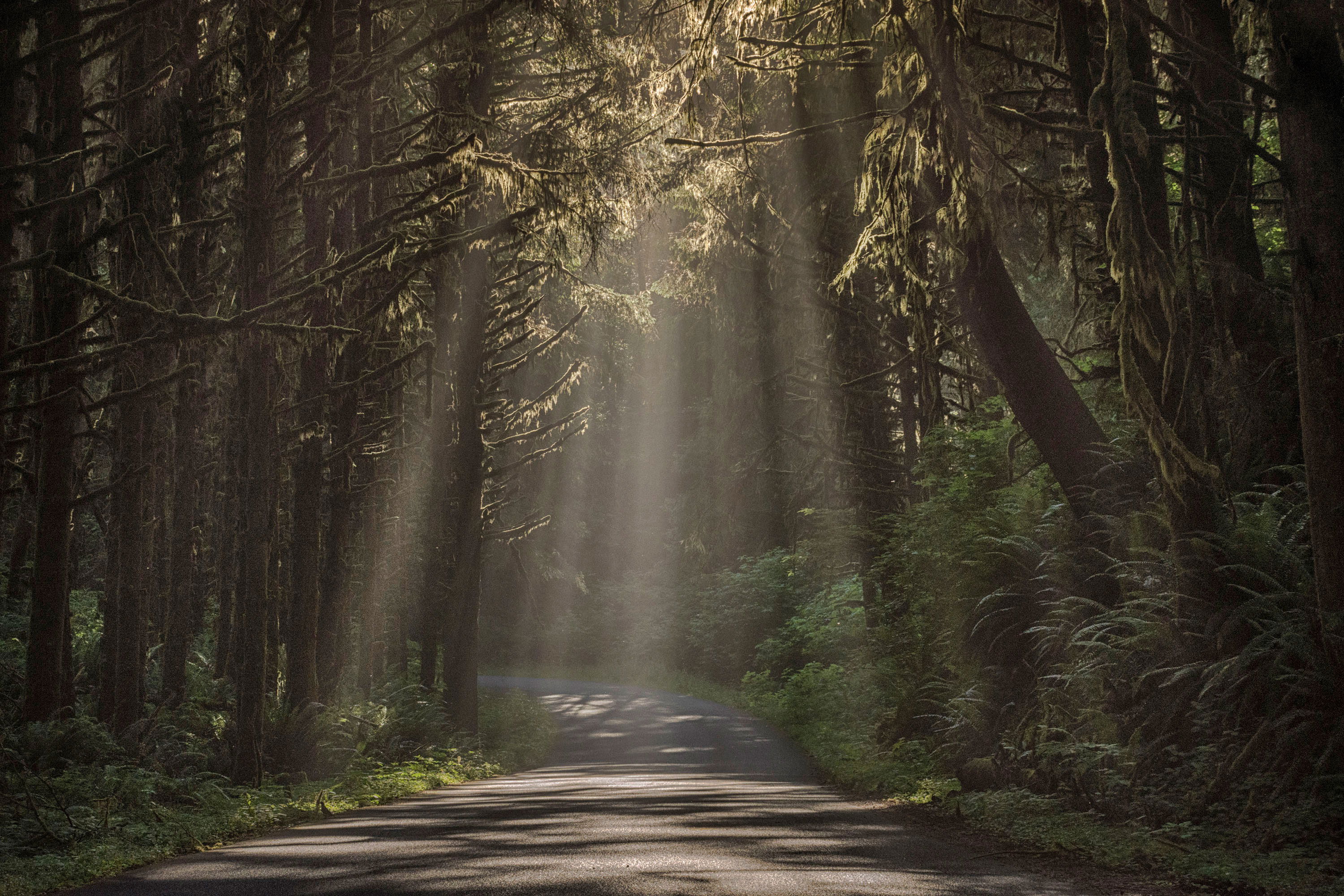
I was driving to the beach at Enola State Park in Oregon. It was pretty breezy and I was thinking it too late for the sunrise light . I was starting to adjust my expectations as to what images I could create. I turned the corner to find this light streaming though the trees. Hopped out of the truck and took this image, hand held.
Specific Feedback Requested
I am trying to assemble a portfolio for submission to competitions. I have a hard time selecting images and need critical feedback inorder to develop criteria to use in evaluating these images. This particular image is dramatic, but technically, I wonder about a couple things. Is the road to visually busy and distracting? Is the composition balanced? Any comments are welcome.
The composition feels right, to me. And I do like the dramatic light. I tried cropping the road but it needs to be there to ground the rays, if that makes sense. I may consider burning the brighter part of the road to lessen its visual weight.
Hi Janine, and welcome back. I think we’re having a few technical difficulties as I can only see the small thumbnail, not the whole picture right now. But from what I can see it’s a great shot. Did you mean to say Ecola State Park? I’ve never heard of Enola State Park in Oregon…anyway, I live in Oregon and go to Ecola regularly for sunrise and fun long exposures. This image really looks like the road up to Ecola.
I’ll take a closer look at this when I can see the larger image.
I personally don’t find the road distracting. It provides a venue to display the patterns of light very nicely. Image how it would look it up that light fell on the ferns instead of the road. There would spots of light everywhere instead of shapes. In my opinion you the sunlit patterns on the road are part of the story in this image, a significant part.
The light shaft and the trees on both sides are largely symmetrical. A centered composition through the plane of symmetry is the right one for me. That’s how I view things.
The left side of the image is less interesting than the right. Perhaps the lighter tones could be raised a bit. You would have to experiment but I wouldn’t crop from the left. I tried cooling the WB a bit (-20) because I like fog to look that way but it may not be your cup of tea.
I think the road and the composition look fine to me. The only small nit I have is that the shadows seem a tad noisy. Most people won’t notice, but I’m sitting pretty close to my monitor with my reading glasses on. Nice shot.
Janine,
This is gorgeous and I for one would not hesitate to enter it in a competition. The shafts of light are fantastic as is the lighting in the trees. I like @Igor_Doncov’s rework and I think the road is essential to the scene as it does help take the viewer into the image. My only suggestion is the same as my brother @Michael_Lowe about needing a little noise reduction in the shadows. Very nicely done!
Janine, overall I think this image is fine. I think the composition is well balanced in terms of the arrangements of the elements, you have essentially equal spacing on both sides of the road. This visually directs the viewer to the light rays, which is what you want. I do agree with @Igor_Doncov that the left side trees are slightly less interesting than the right, and agree that dodging some of the lighter tones on the left trees would help. However, I prefer the warmer white balance in the original.
Is the road too busy visually? I’m going to assume that your intent is to have the viewer focus attention more on the light rays in the center than on the road. The road has more contrast and brighter highlights than the light rays, which to me gives its more visual weight, and thus the road competes for attention with the light rays. To direct more attention to the light rays, I would increase the contrast in the rays, and decrease the contrast (and reduce the highlights), in the light on the road. The intent is to create a more equal balance in contrast for the road vs. the light rays. I would also increase contrast in the shadows overall slightly too. Here is a rework which reflects my suggestions.
You guys are awesome. Thanks so much for the feedback. I darkened the road in the foreground a bit in this second version. I think it improves the eye movement upward, and then back down. My eyes don’t get stuck on the road as much.
Again, thanks!