One more update. What a creative trip, taking into account all the thoughtful feedback. @Bill_Chambers you were very much on point to address color cast and vignetting. Like you, the vertical capture has sorta grown on me, and that is the one I have pursued the last 2-3 days.
Currently it is a 4X5 with foreground non-essentials cropped out. Reduced color cast, but the colors in this are probably more saturated than actually seen at the time. I like the 3 or 4 diagonals, and I think what remains in the image is the fraction of the original that works well together.
Update as of 7/19.
This is the update (from last week), taking advantage of the observations offered by all. Thank you very much.
Also included a vertical of the same scene, as @Diane_Miller wondered about what was beyond the border. Not sure which I prefer now.
That workshop in 2017 started me on an evolution of my skills of seeing, capturing and processing images that has taken me to NPN, and other waypoints. It is a great trip so far.
Portrait scene
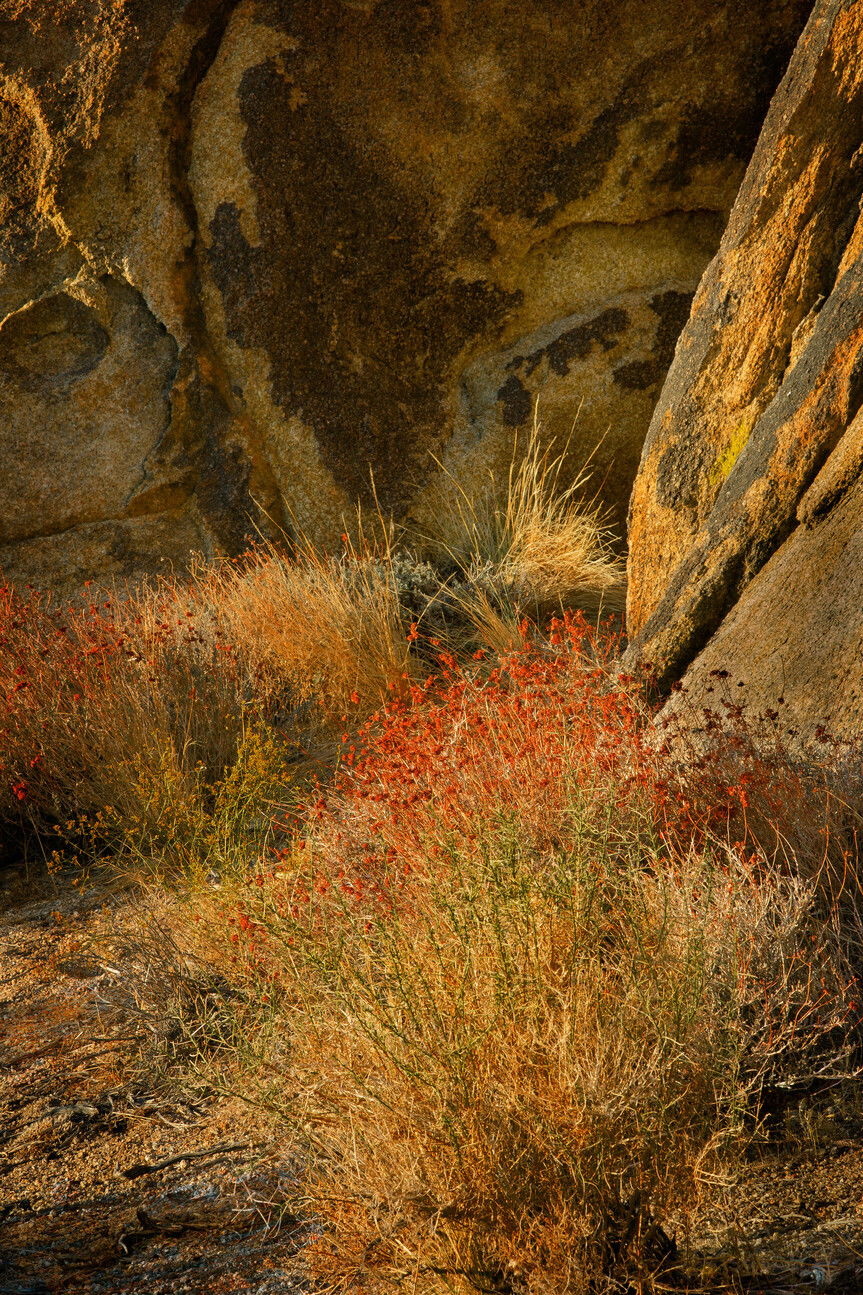
This is the originally posted image

My only trip to Alabama Hills with Jack Graham and Guy Tal was quite an eye-opener. Lots of dramatic lines and shapes in the big landscape. This was my favorite, though: a small scene. Had to work in PS to develop luminosity and color contrast. Too heavy-handed?
Is this a composite? No
If you would like your image to be eligible for a feature on the NPN Instagram (@NaturePhotoNet), add the tag ‘ig’ and leave your Instagram username below.
3 Likes
Oh My God – you got to meet and work with Guy Tal?!! Could I lick some dust off your boots? I’d love to hear about the eye-opener part!
It’s not easy for me to critique this scene as it’s not quite my cup of tea. I wouldn’t say it’s heavy-handed by any means, but I wonder if there is more color separation to be found by starting with a cooler WB. But maybe you tried that.
I wonder if you have a slightly different view with the camera aimed a little more to the right and a little wider angle. The hillside going up on the right looks very interesting with the very interesting clump of vegetation as a base.
I generally like images with an overall color cast. This cast feels a bit strong to me but not by much. One thing I would comment on is the bottom of the image. The plant seems to be partially cut off and trailing off the bottom frame. It would be preferable if the ground continued under the bush to provide a full border around it.
This is a really good take on the AHs. The reds are intense, but fit with the area in warm light. I might clone out or burn the little plant in the LLC, and might experiment with a bit of a vignette (not sure it would be an improvement though).
Jack and Guy are quite the contrast. They are friends and I hung out with them when they were doing their pre-workshop scouting of the area. Jack does have some stories!
Yes, some of the stories he told might have been about you!
The warm cast to the colors is strong, but I’m good with that becuase it is an autumn scene in golden light. I’m usually a fan of achieving some color separation and contrast, but I think what you have here works fine because it is such a strong statement. As Lon likes to say this color cast looks deliberate, not accidental.
In terms of composition I’m okay with the sage being dead center. I think the dark bush in the LLC feels a bit out of place, I would normally recommend cloning it away, but that may be hard to do given the shadows around it. If a clone doesn’t work well, my second choice would be a crop from the left, I think this comp would also work with the sage off-center.
I agree to cropping a little off the left in the horizontal frame. For me the rocks are more interesting than the vegetation and I prefer the vertical but the bright ridge close to the left border is a bit distracting. I wonder if it could be burned down, with lower contrast, and also the part of the bush below the red flowers.
Lovely scene Dick, and just the kind I like. I prefer the horizontal format best, but the vertical was surprisingly engaging. To me, the color cast is very heavy, too much for my liking. To be honest though, I’ve never been to the Alabama Hills and everything where is live (Florida) is lush green, so your rendition may be very accurate, but it still appears overdone to my eyes. I downloaded it and played a bit with it to reduce color cast and to react to some of the other comments. I pulled it up in Luminar 4 to reduce color cast and add just a very slight bit of extra definition to it, then exported it to PS and ran it through NIK Color Effex 4 to put a slight vignette and also to brighten center/darken border a very slight amount, but I placed the center right in the middle of the green plant, not in the center of the image since the green plant is the main focal point. As I mentioned, I may have overdone the reduction of the color cast, but here’s what I came up with.
Original
Revision