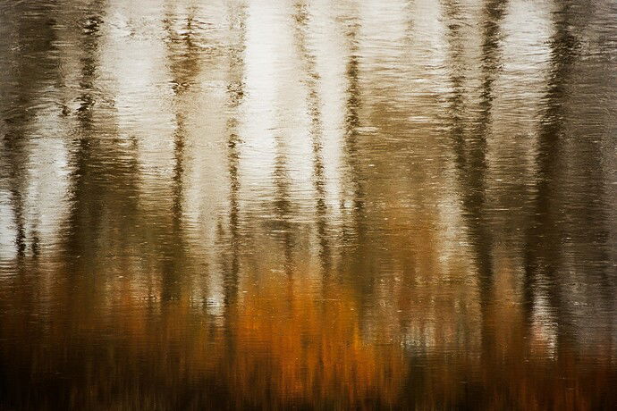
Rework…
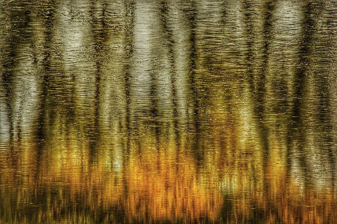
These are reflections in a river from 2 Autumn’s ago. It wasn’t really this brilliant but my mind imagined it so.
Specific Feedback Requested
Hi Sarah! Any feedback is welcome!
Technical Details
I added saturation, contrast. The original reflection was pretty dull but I wanted to make it more vibrant. I also flipped it to put the bushes on the bottom to look like a fire.
3 Likes
Hi Vanessa –
Overall, I think the composition works nicely (feels balanced and well organized) and I like the subject matter. I also like the texture of the water as it adds some visual interest. It looks three dimensional in an interesting way, especially the top portion.
My main point of feedback is that I think the processing is a bit too strong, especially in terms of the contrast. With the saturation, I get that you were going for the vibrant oranges and I think they are fine. The upper part of the scene has a greenish-yellowish tint that I think looks a bit unnatural or over-saturated. It also looks like the processing might have degraded the file a bit.
So, overall, I like the concept and think the composition works. You could try being a little gentler with the processing to get a more subtle result while still accentuating the oranges so the photo is in line with your vision for the scene. Thank you for sharing!
1 Like
Hello @Sarah_Marino , sorry if my reply is too late. I tried reworking it based on your suggestions. I agree the green needed to go! Not sure if it’s still too saturated. Thank you so much for taking the time to give your feedback, I really appreciate it.
2 Likes

