Please share your first response before reading the hidden notes below. The photographer is looking for an unbiased initial impression.
Feedback Focus: Artistic / Expressive
Questions for Viewers
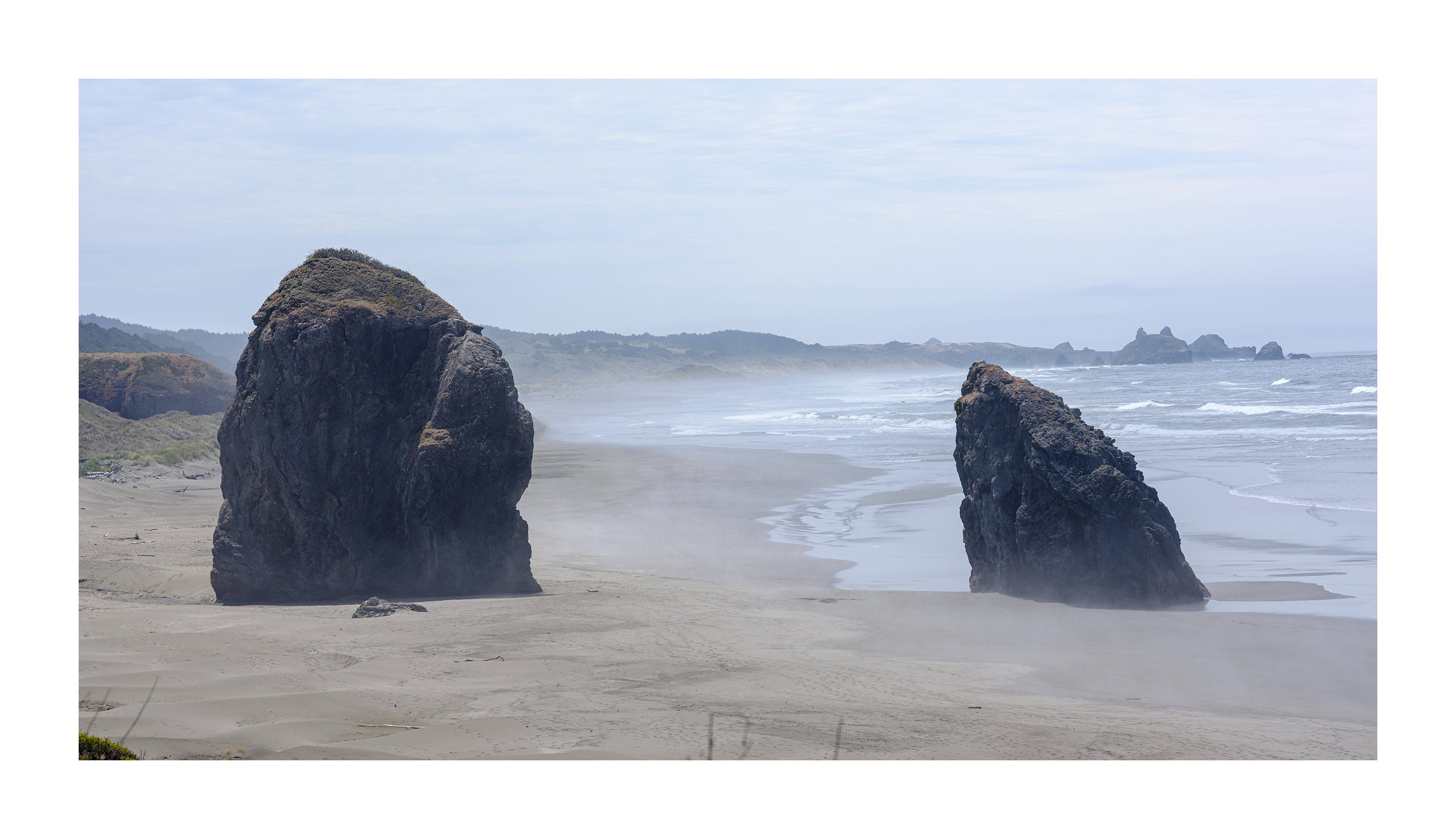
I’m wondering how these stacks strike you? Particularly with respect to their background.
About This Image
If you’re like me you have been admiring the many fine images of the sea stacks at Bandon. Some are aesthetically beautiful and others are emotionally turbulent (Cole Thompson’s work comes to mind). And yet when I’m there and see the real thing I feel very little for the place. That was the case several weeks ago. Fortunately Oregon has many sea stacks. These were further south. I was drawn to these two from the start and no matter how many different other perspectives I considered the original vision was still the one for me. I even drove back to it from Crescent City the following day to take further advantage and even this perspective didn’t look as good as the day I saw it due to different light conditions.
Feedback Requested
Would this have been better shot at a higher tide with and a slower shutter speed?
It is impossible to say whether it would be better at higher tide and slower ss without seeing it at higher tide and slower ss. Captain obvious I know. I’ve never been there, so it would be pure conjecture. I like it as presented.
Interesting too with this question because the smaller, post view gives me a much different response vs. when I open the larger view. The small view, the two main rocks blend more, or are a part of the background more, it seems. When the larger view opens, it’s really clear the two main rocks are the main feature and almost dominate the scene.
This takes me back to a recent comment I made on how it seems you often buck the standards. In this case, composing with the two main rocks (ok, stacks…) there’s an expected yin-yang, ping-pong effect with the even number. But if I count the smaller rock in between the two, then I count three. What validates the composition for me is the one of the right is leaning in and a bit smaller, so there isn’t really a visual compete between the two. If that makes sense.
Even though the rocks dominate front and center, they are seemlessly connected to the bg beach, ocean, dunes and headlands. The contrast really speaks and captures the mood of the Oregon coast.
The only suggestion I have might be to clone out the triangle of rock on the right edge (not enough room to clone - but hey, a transform would work!)
Igor, I like this image very much. I opened it on a large screen, the two stack are really impressive and your composition supports it. I like the small one in the middle, sth would be missing without it. Excellent DOF and shutter speed. I would only try to crop off the dark rock at the right border and maintain the frame propotions and positions of the stacks.
Igor, the symmetry of the three stacks and having them centered in the frame makes them the center of attention. The surroundings, especially the land circling into the distance as it fades in the mist sets the stage very well. Even with the surf showing, there’s a quiet, relaxing feeling here. The clean light blue sky adds it’s own bit of quiet.
The composition’s flow works well for me. In my mind if I remove the stacks, I still like that sweeping flow through the image. The stacks, of course, improve on that.
You are a brave soul to take the image at a time of day without shadows; I would probably have been having a nap. It does add an element of elegance though. I agree that it is best viewed large.
The sea stacks strike me quite well. While they stand out, they do not take attention away from the background which is wonderful. It all works well together. When I enlarge the image, it appears that there is something that looks like a tripod(?) in the background, left of the middle stack.
Oh good. There’s some interest in this image. First of all I wanted to say that I wanted to emphasize the boldness of the rocks by offsetting it with the quieter tones of the background and also it gentler curves. I think that’s what drew me to this. The rocks are apart from the scene but also part of it. Actually Lon noticed this very well.
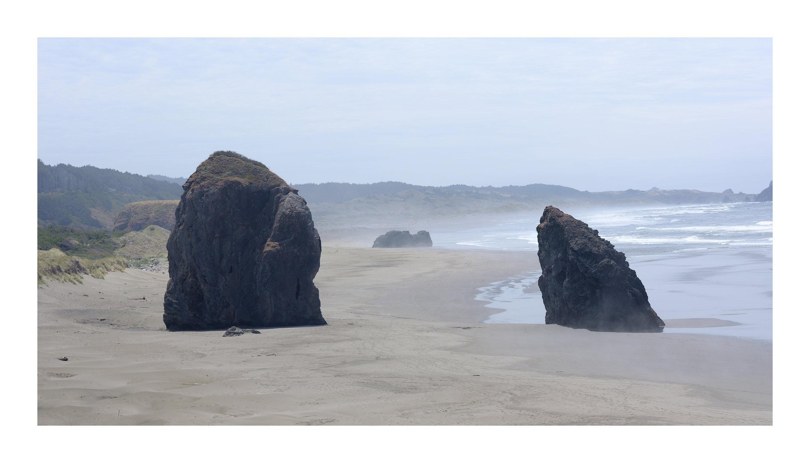
Yes I as aware of this issue, the ping pong issue. Here is another version where it is more pronounced. I feel that the two rocks are bound together in some way. I no longer like to get into the psychology of inanimate forms but it does seem that the right one is leaning towards the left one. I don’t want to take it further than that other than there is a connection between the two. In the image below I realized that the ping pong effect was more pronounced because each rock was too close to its side of the image. So it wasn’t so much that they were 2 of them but that they were polarized. I’m still undecided which image is better frankly.
I usually don’t shoot midday much either. There is a light mist in the image which was absent the following day. So I saw the subject differently. I had noticed the previous day that the left rock when viewed from an angle came down to a point. Somehow its impact seemed greater because of that. I therefore embraced its darkness to emphasize that downward force. This one required a lot more processing and therefore to me looks like a creation than a straight copy of reality. I struggled with myself for a bit as to which I liked more but it’s really comparing apples to oranges. You can see the second rock behind the first and I was never able to separate them. I moved closer in order to hide it but then the proportions started to break down.
I Love this image, Igor. The mist and the softer light help to soften what could have been very harsh. IMO the tide level is perfect. The water surrounding the stack on the right and the wet sand between them gives me the feel that the right stack is being pulled away from the left and hence the leaning. Relationship between the two stacks, maybe:o) I also prefer the image with the stack in the middle. Somehow it helps to soften the bluntness of the “relationship”.
Looking at a reasonable viewing distance, not with my nose an inch off the screen) I like the image as presented - its very strong.
The stacks are dark enough to really stand out against the lighter sand. Not sure what water would be like but sand is a great, and fits well with rock and strong rock eventually crumbles into sand.
The middle rock is interesting, not distracting … and part of the lovely background leading line curve that pulls you through between the stacks, and past the 3rd rock and out to the far Right.
If might work even better if the right was extended a bit so the curve out to the right lasts a bit longer?
Hi Igor,
It took me a while to get back to this one. I’m a little late to the party, I fear. To me, the original image is understated and feels very static. Yeah the right rock is leaning toward the left one, but I don’t feel your connection to the scene as much as I usually do with your landscape images.
FWIW, I wonder if black and white and perhaps a slight crop off that corner (or removing that sea stack that leave the right edge) would make this feel more engaging? Not to knock it as is, but I feel like there is something missing (detail in the rock on the left, a more interesting sky, more contrast or simply less color since the color doesn’t feel critical to the scene).
That said, the other one, with the distant rocks between the two foreground rocks, feels a bit more intentional and interesting to look at. It engages me more, but again, I’m late to this one, and I might be an outlier.
Oh, and that left rock’s solo portrait is very cool. It almost seems to be floating.
Igor: I’ve been to Bandon many times and seen these stacks in all kinds of light. When opening the large version the subtlety of the light comes through and elevates this for me. Eliminating the center rock in your second view actually works better for me. I do like going back and forth between the main stacks and the central rock gets in the way. A natural photo bomber so to speak. If you were to work the second view my only tiny 1¢ nit would be the little intruders on the bottom edge. Nice take on a familiar but compelling scene.>=))>
I agree the second version with only the two stacks ping-ponging each other better conveys your stated vision for your picture.
Your analysis was new to me - seeking to explain interactions between shapes in an image.
I understand about balancing a composition, dark areas vs light negative space etc etc , but hadn’t appreciated the same process between the 2 rocks in your image
I need to think about this and consider how I can use it in my compositions, once I have understood all the implications.
Mind blown with possibilities and compositional experiments
 What validates the composition for me is the one of the right is leaning in and a bit smaller, so there isn’t really a visual compete between the two. If that makes sense.