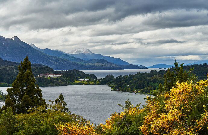
From a recent trip to South America.
What technical feedback would you like if any?
Added a gradient filter to add modulation to the sky and seperate the clouds from the mountain?
What artistic feedback would you like if any?
This was a difficult composition on site. There were so many variables in the foreground and background and things were blowing.
Pertinent technical details or techniques:
(If this is a composite, etc. please be honest with your techniques to help others learn)
If you would like your image to be eligible for a feature on the NPN Instagram (@NaturePhotoNet), add the tag ‘ig’ and leave your Instagram username below.
You may only download this image to demonstrate post-processing techniques.
Hi Chris,
Stunning scene! it Looks as though you managed the dynamic range well and your shutter time has frozen the blowing elements.
To me the bottom right hand corner seems too bright and the saturation of the yellows, which are amazing pulls the eye. I’d suggest burning down the lower right as the luminosity is as bright as the light source coming from the cloudy skyline. Those flowers appear to be back lit and therefore wouldn’t be as bright as the sky but as bright as the other foliage in the lower left.
1 Like
Chris, this is a very dramatic and moody image. Thre weather sounds like it was pretty difficult shooting conditions, but that weather also gave you some nice clouds and light. I like the composition a lot, everything is nicely arranged and balanced.
I agree with the excellent comment made by @Nathan_Klein about the backlit trees, needing some tonal balancing to be more appropriate with the light in the sky. A tweak to that would take a good image up another notch.
Nicely done, Chris ! I think the clouds and distant mountains look great - beautifully handled in fact. Maybe toning down the yellow flowers would be an idea, as others have said, but overall I think you’ve composed and executed this just fine to give a strong sense of the feel of the landscape.
Thanks for the excellent comments. You’ve all brought to light for me how mindful I need to be during PP. In the back of my mind the bushes were a problem, because they made the other adjustments more difficult, and I failed to address them first or at least go back to them.
So I masked the bushes and darkened them, and in the process also softened them with the clarity slider. In addition I tightened the crop and brightened a slight bit.
Thanks again,
Chris
1 Like
Chris,
Quite a beautiful landscape image. The skies like you have there are great for providing all kinds of lighting to grand scenes like this.
I like your repost, but might suggest a compromise between your two images. I think in this light the vibrance of the yellows would still be pronounced. One easy tip would be to take whatever layer you used for the adjustment, and simply play with the opacity slider; real easy to say reduce the adjustment by 50% - or whatever works.
The only other suggestion I have is the observation that this is slightly slanted. I know there’s an illusion with the shoreline, but just looking at the water level/horizon just above the two small islands, looks very slightly tilted - and not by much. Not a biggie. (and it doesn’t help that the layers of clouds are also slanted in a ccw direction.
Lon

