Hi Mike,
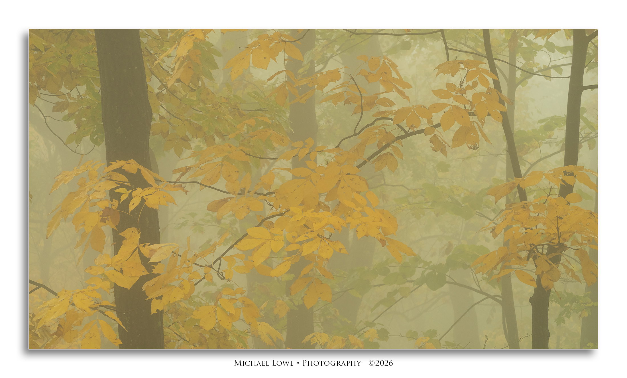
I like this one even more than the last one posted. The pano format works perfectly and you filled it beautifully edge to edge with those trees all decked out in their autumn splendor. The atmospherics with the fog add some mystery to the scene and seals the deal for me. The fog looks a little green to me so my only suggestion would be to move the green slider a little bit towards magenta. Beautifully done!
Very very nice. The composition is more interesting than the previous one. One thing I would try is to see how a cool color cast would make this look. I’m not saying it would be better. But I would experiment in that direction. I love this image. I like the greenish fog. I think that works well with the yellow.
This is just beautiful Michael. The greenish colour cast doesn’t bother me at all. Instead, it adds to the overall effect of this image being more like a gentle watercolour rather than a photo. I can see it with a slight canvas texture in a frame on my wall. Very nice.
I prefer the composition of this to your previous image. It’s really well balanced. Everything is soft and sultry with a moist fog obscuring contrast in a good way. Because this image sits very close to your other image on the browse page you can see that this image has a greenish yellow tint to it whereas your previous image had a cooler, more blueish tint to it. I think each works well for the image presented but I would like to see a possible comparison of this image with a cooler looking fog. Sensational image though. Did you switch to Olympus?
This is wonderfully moody. I also felt like it had a green cast, but in my mind, fog can be green. I know it’s not, and I think Preston and Ed have a good point here on brightening and making sure you are intentional about the greenness. To me, it adds to the mood. It seems like in animation or comic books, fog would be green. I don’t say that as a slight against the image at all, just as a cultural explanation of the hue fog takes in other media and perhaps why it feels appropriate here to my eyes.
Mike, this image carries a beautiful hush. The fog softens every edge and turns the deeper trees into half remembered shapes, while the yellow leaves in the foreground glow with the muted warmth of a candle seen through gauze. It feels less like a photograph and more like a memory of autumn, the kind that surfaces unbidden years later when the air turns a certain way.
The palette holds the whole emotional weight. That gentle olive wash receding into mist, paired with the soft ochre of the leaves, gives the scene the quality of a watercolor left to bleed at the edges. Nothing shouts. Even the brightest leaves seem to be whispering. There is a tenderness in that restraint, a sense of the season letting go quietly rather than going out in a blaze.
The dark trunks keep the softness from drifting into pure dream. They are the bones of the image, patient and grounded, while the leaves are the breath. Something is ending, but it is ending gracefully, with the trees standing witness.
A lovely meditation on stillness and the slow surrender of autumn. Thank you for catching it before it slipped away.
Michael, this does look better than your previous view. I like the overall yellow and yellow-green tone, that adds nicely to the sense of mystery. It would be interesting to compare this version with one that has a subtle reduction in the green.
Most certainly dripping in mood! I think the tighter crop really works to great effect here. And for such a seemingly closeup/zoomed in scene, the fog really comes across so very dense.
Color/hue/sat are certainly personal and subjective. I do agree with others in seeing a slight green-ish cast to the fog. That doesn’t mean bad or off-putting, but an example of how such scenes can be interpreted. I would be curious to a cooler mood, but have no complaints or nits on how you’ve processed and presented this. Wonderful!
I find this wonderfully dreamy – the forest at its best! I did wonder about variations on the color cast, although I assume it is intentional. Also wondered about a bit more midtone detail – just as a v2, not an improvement.
Hi Michael, this image is beautiful! It looks like a painting in the best way. I think the green color cast works well with the tones of the foliage. This image isn’t asking to be true to life, but an interpretation. The composition is great, that branch is filling in the space nicely. Great work!
Hello Michael, this is an image to get lost in. I agree with Lynsie that “it looks like a painting in the best way.” To me it conveys a serene, magical, mysterious feeling. Very creative and well done.
Michael: Looks almost like a watercolor and not a photo, which I think is a very pleasant effect. Nice job working this scene and subject so thoroughly.>=))>
I agree this is a stellar composition, and love the mix of trunks and intersecting branches. The mix of green and yellow leaves hits the sweet spot as well. As many have noted, this really does look like a painting. If this was just hung on a wall somewhere by itself, I’d be fascinated to see how many passersby would see it as a painting vs. a photograph.
Both the lack of variation and the green tint add to that effect, and I think it’s nice to have a choice in how it is presented. As a personal choice, I really like the subtle touch of @Diane_Miller’s version, but will be the first to admit it looks less painterly.