The photographer is looking for thoughtful feedback on the image as a whole, especially around the areas noted below.
Feedback Focus: Artistic + Technical
About This Image
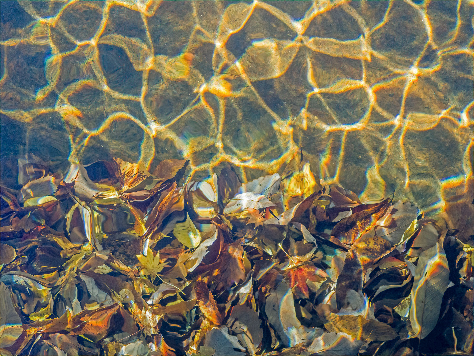
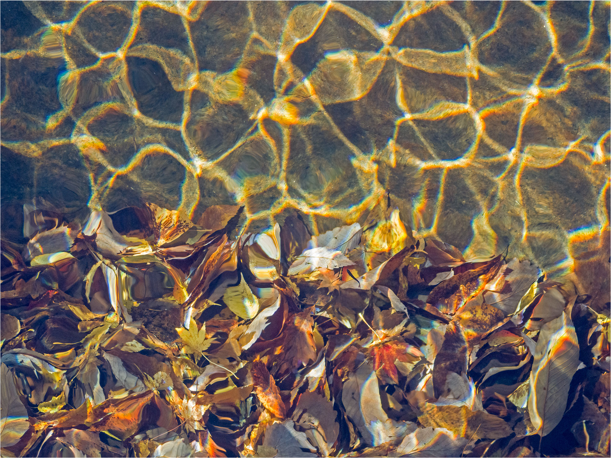
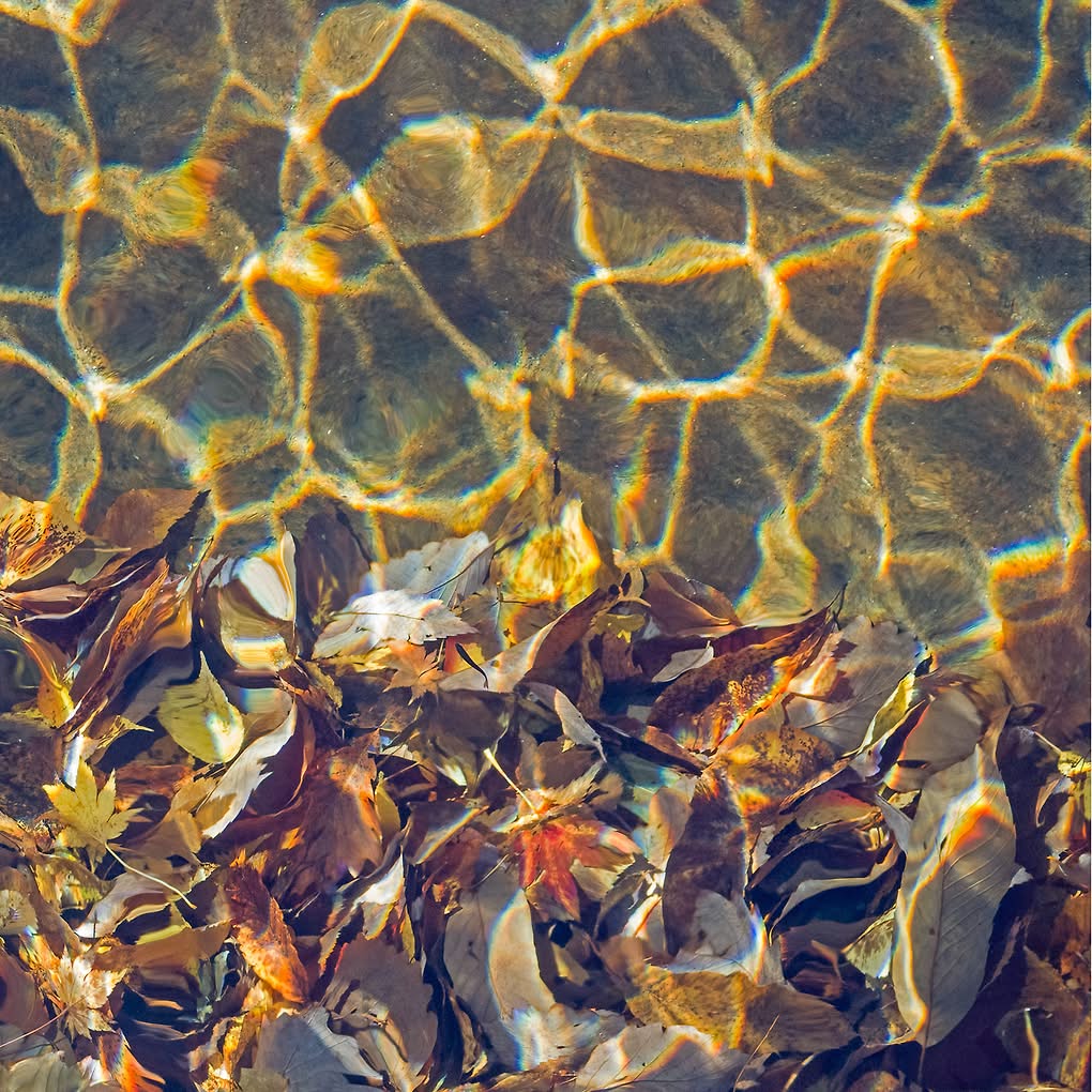
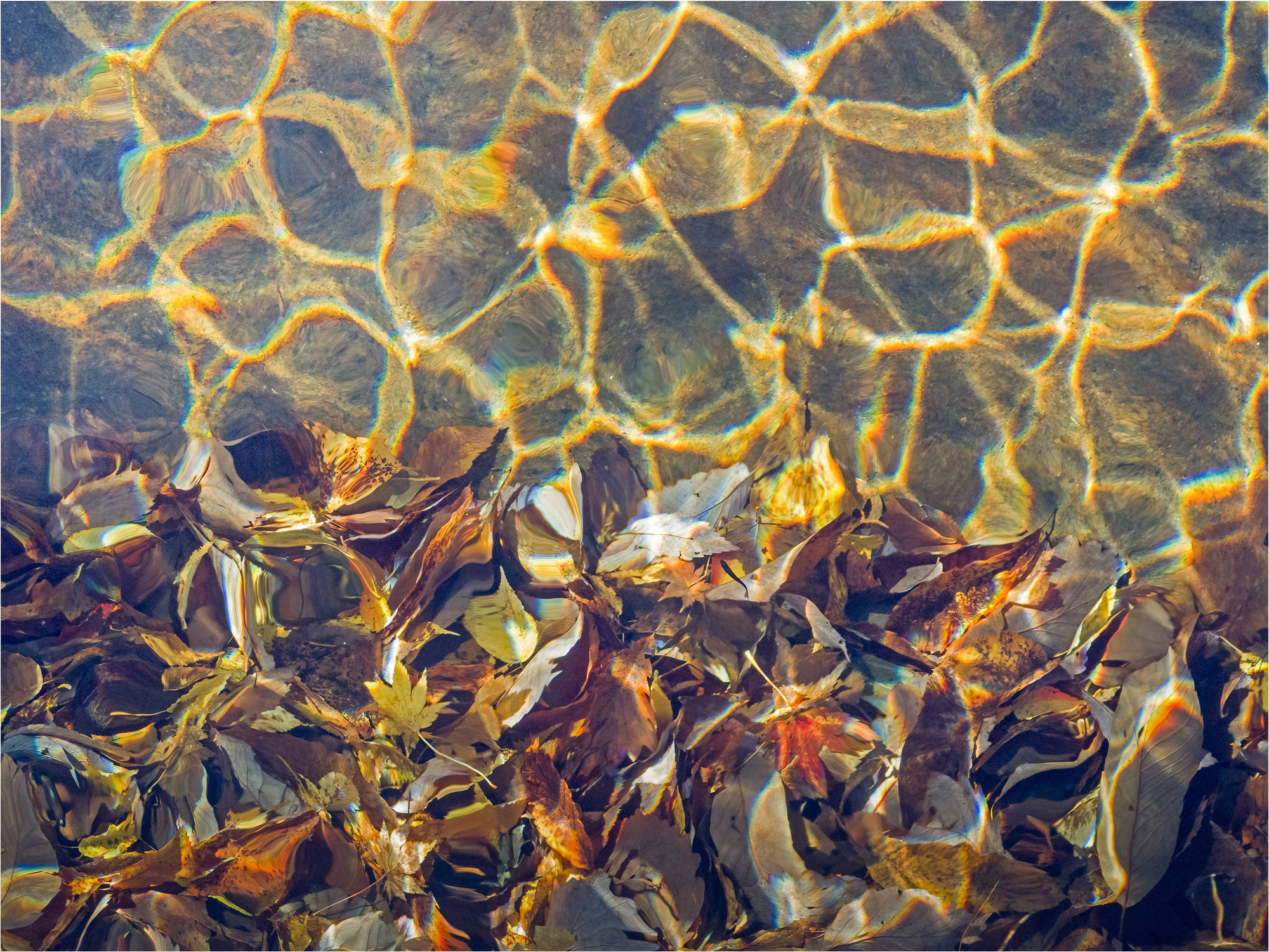
I was inspired today by @Bonnie_Lampley 's “Fall Floatsam” to upload this. It is a shot I had taken yesterday from a bridge over a forest river, looking almost straight down. The water was so clear and the late sunlight so golden that I did not feel I needed to play with the colors later. I liked how a light breeze caused ripples on the surface which cast a pattern and added some refractions. I also liked that the water was clear enough to show detail on the leaves.
Feedback Requested
I seldom take shots like this, so would welcome anything you might say to either improve it, or for me to improve on a similar shot next time. (It was an unusual lens choice, as I was birding at the time).
Oooh, very cool! The leaves have just enough detail that we know they are leaves, but they’re quite surreal at the same time. Gentle breezes or currents make for great ripples.
I might increase the contrast (though luminosity adjustments, not a contrast slider) a bit, but that is just. my taste. The one thing that you might consider is brightening the far left edge so the exposure there +/- matches the rest of the frame. That’s something I learned here on NPN when doing abstracts - usually it’s better to have more or less equal exposure across the frame (of course, there’s always exceptions!). Maybe a crop from the top to make it less 50/50?
Thank you @Bonnie_Lampley. Just the sort of advice I need. Brightening the left edge is surely an improvement. And adding contrast is also good, though I do like everything a bit darker, as that’s how I remember seeing it. Originally I rotated the shot a little CCW to make ripple and leaves sections more 50/50, and preferred this balance, but in nature I sometimes upset an image by striving for unnatural symmetry - so I’m in two minds about this. Anyway, I’ll do a revision later. Many thanks for your suggestions.
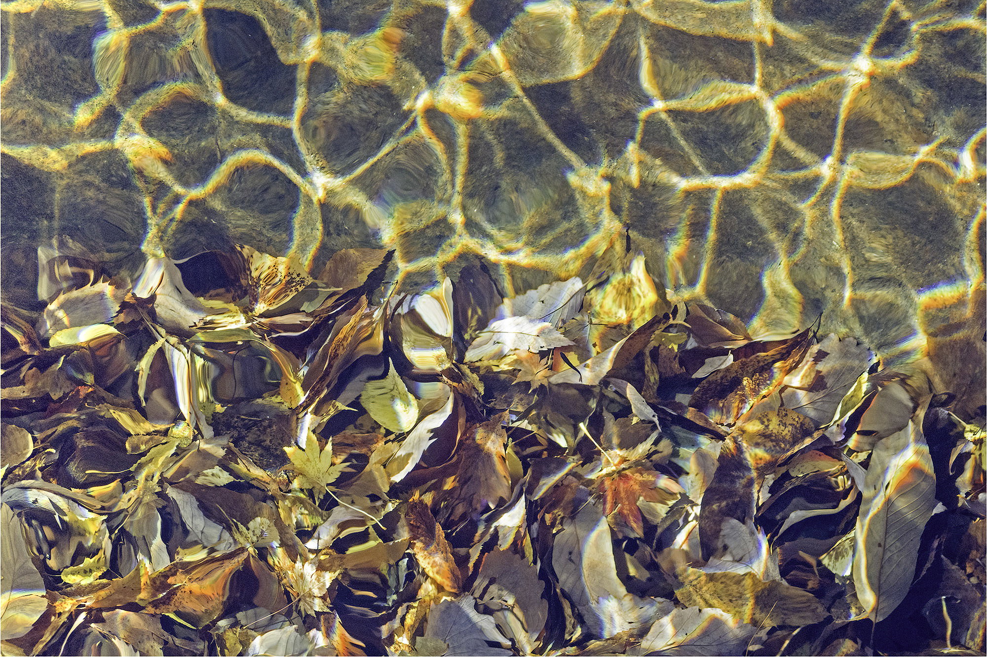
@Don_Peters - Thank you, Don. Interesting to see how you went in a different direction to Bonnie with lightening/darkening. I like your version per se, but I do prefer to try and reconstruct the tones I remember (or think I remember) seeing. You also removed the dark in the left side, and you kept the original rough 50/50 ratio. So I feel I’m getting great input for a revision of this. Muchas gracias!
I love this image. The play of light in the reflections on the water is mesmerizing. There is a surprising amount of detail in the leaves even thought they are under water. The color palette is so very rich. I have included an edit I tried in which I did a square crop, lifted the shadows some in the LR corner, and darkened the light leaf in the LL corner. This cuts off the dark side of the image and preserves what, to me, is the best of it. I also like the division of space better.
Thank you @Chris_Baird . I think I’m going to go for the square crop - I like how compact it makes the scene. And I might just darken that fairly central leaf as it is more prominent now.
Mike, this is excellent. I like how the refracted light mimics the leaf shapes, with the main difference top to bottom being the level of detail. I agree with @Bonnie_Lampley about dodging along the upper left.
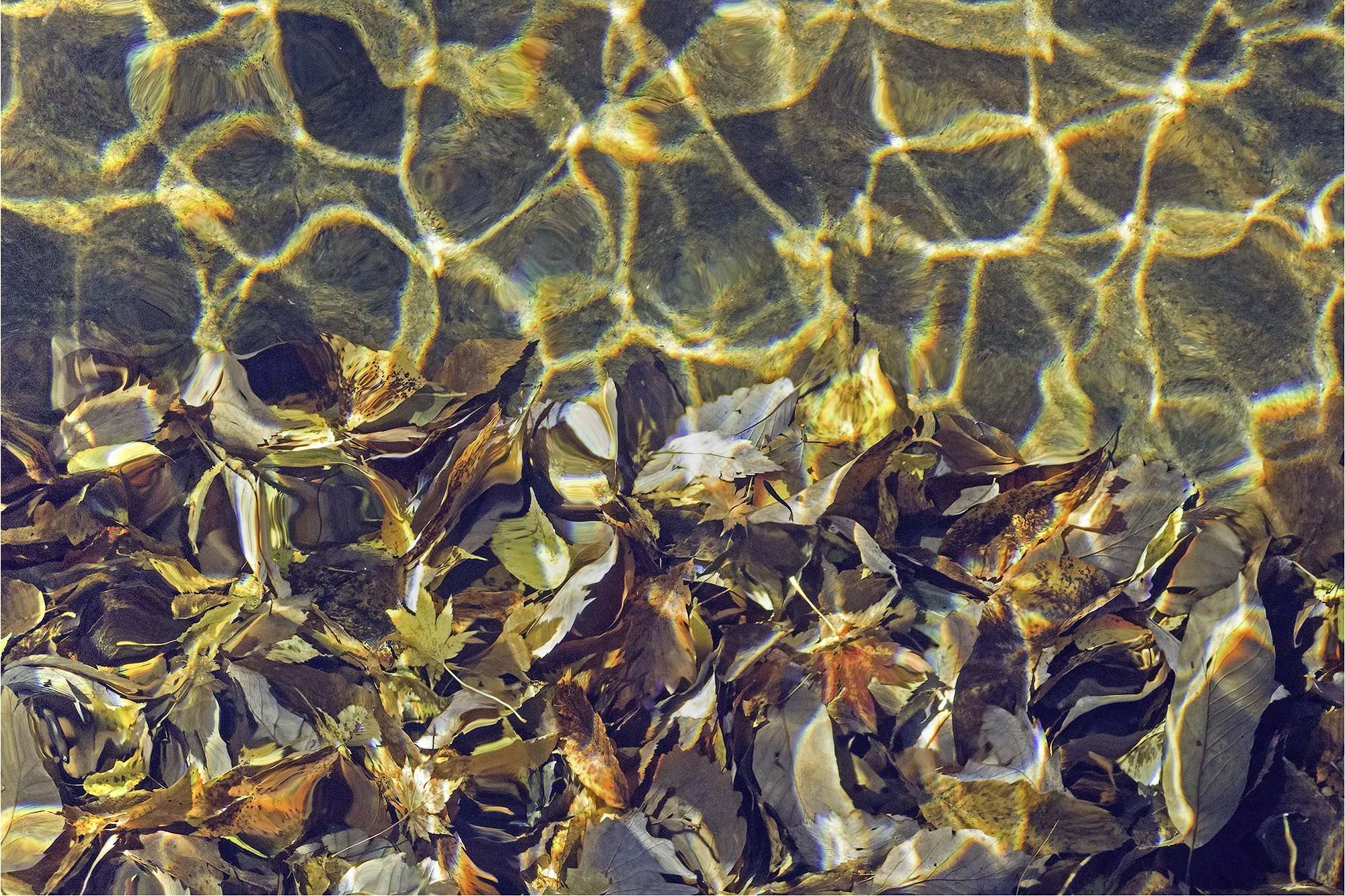
As if you haven’t gotten enough input to confuse you, Mike, here’s another interpretation. I like the original framing as the vertical space above the leaves makes me feel like we’re kind of looking at a vertical section with an upward feel to it and the leaves are about to float to the top. I downloaded your image and played with it in LR by messing with that upper left corner (brightening, contrast increase and warming). Then applied a couple of vertical gradients to darken the lower leaves and brighten the scene from the top of that to the top of the image to enhance the sense of uplift I got from this in the first place. That’s the good and bad of abstracts-everyone sees something different.
Hi Mike! Love this image! Abstracts are so fun because of all the different interpretations. I prefer your original view and contrast level with the crop that Bonnie suggested, as well as brightening the left edge. The various colors and brightness of the leaves add wonderful interest and engagement with the warm tones of the ripples IMHO. Terrific-Holly
Thank you @Mark_Seaver@Dennis_Plank and @Holly_Lehr. I like all the suggestions - but overall I’m not 100% satisfied with the shot itself and really want to get back there for a better shot. It’s a case of another year and another lens probably. But the scene will always be there in autumn. Anyway, I’ve kept the original format in the end (the square I do like also) and improved that too dark ULC. I’ve also modified the lighting balance between top and bottom, though I’m not sure that it’s better now. Thanks again for the learning curve! I must try more shots like this.