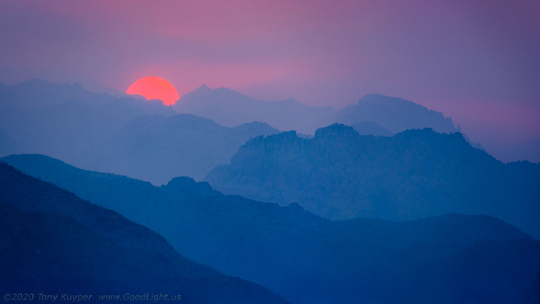
I’m new here and tried to find the earlier posts referred to, but can’t. But I think this one is drop-dead gorgeous! The atmospheric perspective defining the ridges is so clear, leading to the smoky sun and the subtle colors in the sky. I have seen suns that color several recent late afternoons, but without such a gorgeous landscape.
Smoky or not smokey, this is a really good image. The blue layers could be mountains, or waves, or clouds, or just an abstract. It really doesn’t matter. It’s art. One of your recent best in my opinion. I think it works well because it’s such a departure from reality - it’s stylized reality. When photographs look both real and stylized - that’s when it doesn’t work, in my opinion.
I did not comment on the previous post but I did visit it. I prefer the changes you referenced in this post. I also think the less dominant sun helps with the mood. This is really a fine piece of work!
I did comment on the earlier post, and I think this current post is a stronger image. The sun is less dominant by being partly obscured by the mountain. And I think seeing a half-sun like this creates a much more dynamic look. I also like having more breathing room around the sun at the top too. The mountain ridges are still wonderful looking, and the noise reduction helps. Overall, I just think this image works better.
My only suggested tweak would be a very, very slight dodging of the purple/pink tones in the sky.
Tony, I had not seen the original post, but in looking back at it, I like this one much more. There is a much better balance in luminosity between the sun and ridges. There is a really wonderful palette here.
Tony,
This is absolutely gorgeous! The mountain ridgelines make for some wonderful layering and creating some lovely depth to the image. I like the fact that the sun is not completely above that last ridge as it makes it more dynamic IMO and I love the pinks and blues in the sky. My only suggestion ; just my personal preference; would be to back off the blues just a touch on the mountains. Beautifully done!
I prefer this rendition Tony. I especially like the analogous colours and the sense of depth that a less dominant sun provides. The magenta to deep blue colour transition works well for me.
I like this image a lot. The layered ridges remind me of the Blue Ridge Mountains except with sharper edges. The smoke has a similar effect to the mist and haze out here. The color and saturation look good to my eye and fit the conditions. I like the subtle magenta glow in the sky as it provides a nice contrast to the blue in the ridges.
Spectacular! Arresting! I absolutely love this image. It really draws me in. The atmospheric perspective is amazing. That red semi-circle of sun really pops.
Just a totally drop dead amazing image IMHO. The only small nit is the same one I had with the previous image. I would like to see even less detail on the mountainsides. But that is just my personal preference and I think I was in the minority on that opinion. Print it and hang it on the wall.
Tony, the blue ridges fading into a slightly warm sky and rising sun are wonderful, with the minor caveat that the sun feels like it’s getting a bit too much attention. I’m thoroughly enjoying the subtleness of the colors and the change from blue to magenta. This would make a fine wall hanger. In your earlier post, the sun feels way to dominant. It is amazing that you had enough smoke to point a 300 mm lens right at a fully risen sun in that view.
Wonderful photo. I like the decreasing progression of saturation from front to back. The brightness of the sun is just right. Not too overpowering. This looks like a watercolor painting. Beautiful!