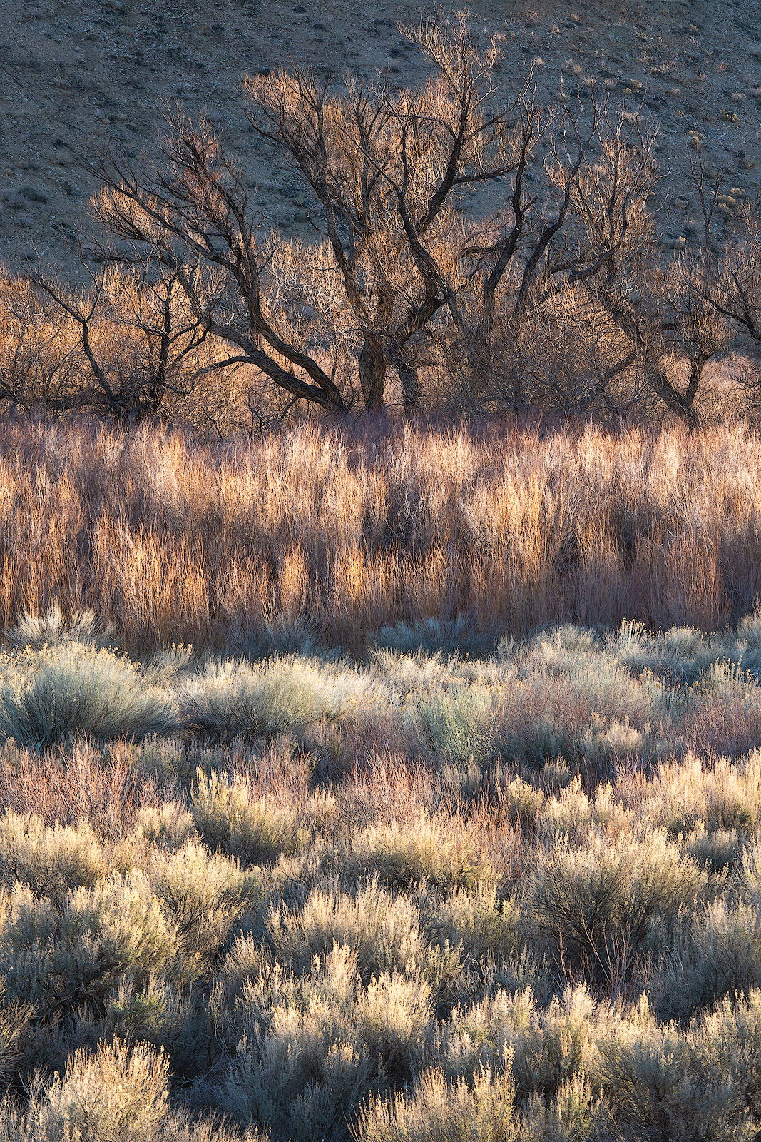
I love the early light. This particular scene sure looks familiar. I remember another post in identical light and in a similar area. Those trees also look familiar. Maybe you were with another NPNer ? Or maybe just a coincidence or I’m just crazy.
Anyway, I like how the vertical format emphasizes the different layers, whereas a horizontal would have a different look. I think this would work better with a hair more room above the uppermost branch. That hillside makes a nice layer, and it feels a little cramped to me. Looks like a really fine morning.
Thanks @Bill_Leggett, it’s a favourite spot of Erin Babnik’s so I’m not surprised you’ve seen it before. I think she ran something like five workshops this spring so I imagine there’ll be a few shots around.
I can add a bit more on the top as this has a slight crop I think. I have a few more from the areas which are cropped in as smaller vignettes but I liked this one overall.
The light of course makes this scene special. And yes, this is a popular area - well, at least a few other members have posted beautiful images from around there.
Since you mentioned, I too would like to see just a bit more breathing room up top. As you also elude to, there are many possibilities here and I’m sure you have other comps as well. I see a couple options here and of course are simply personal choices at this point.
If you do have more room up top, one option would be to also include a short crop off the bottom to eliminate the bright bush in the LLC. Actually that has more to do with the long vertical here. So with a little more up top and a little less at the bottom, you have a nicely weighted, balanced image. On the flip side, since the light and vegetation is so eye catching at the bottom you could actually crop in to the cottonwood purposely to emphasize the light and vegetation. Just a couple thoughts, alternates.
Also a personal choice, but I think you have room to boost the colors/saturation a bit.
Lots to love about this scene. Wonderful as presented - but I think you have options and tweaks.
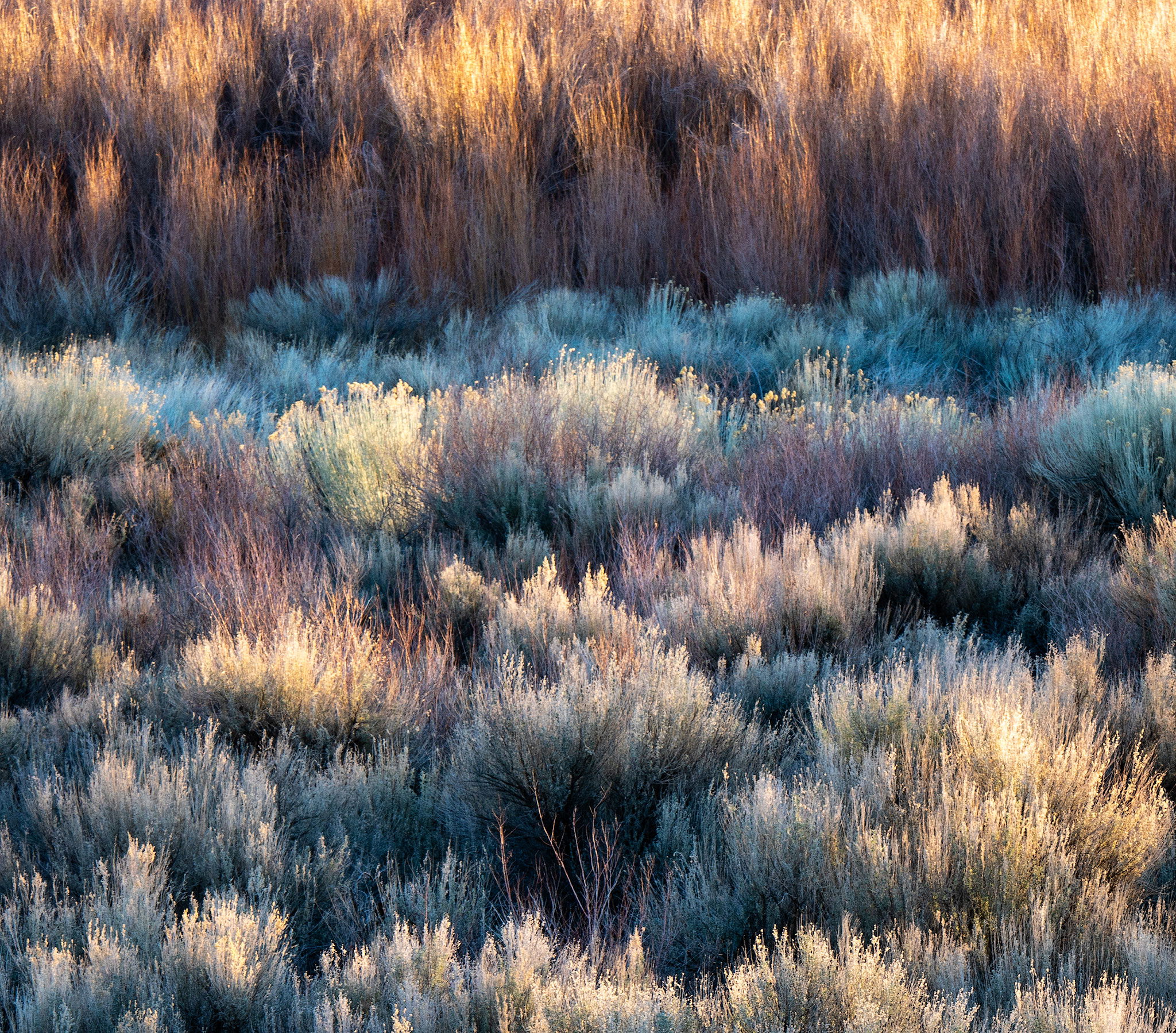
The first one in this set of 3 is The One. Colors, textures, light, very nice, everything about it.
Your first post has strong horizontal lines across the center cutting the image in half (ouch), and is lacking in color compared to The One.
This type of shot using polarized light can be very nice as well (slightly lowering contrast and saturating colors).
Thanks for posting.
Vicki, I’m coming late here, so I won’t be redundant with other’s comments. My initial reaction to your original post was that it needed more contrast, and deeper black point / shadows, to bring out the most in this image. Your reworks have gone in a better direction in terms of exposure/contrast.
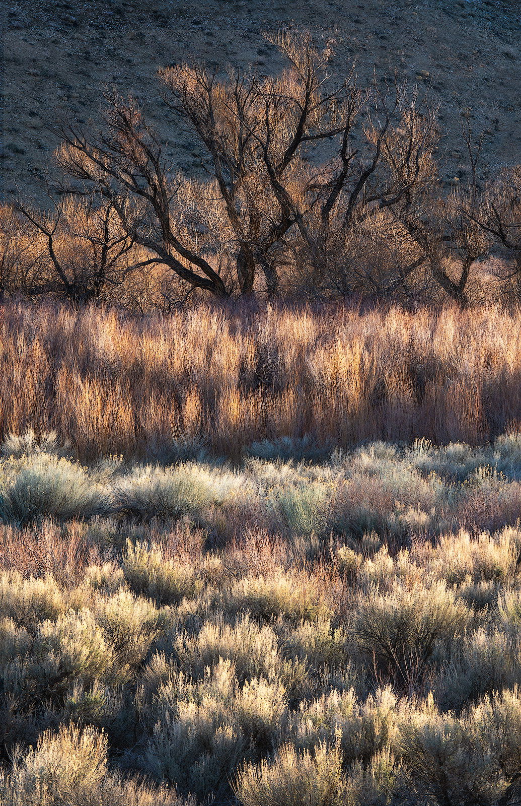
In terms of your reworks, the second is my first choice, it really simplifies things and gets down to the essence of it for me. The third image is my second choice, although I might slightly burn down the bottom half of it. I think both of these two are very good.
I am not a fan at all of the first image. To my taste it looks overly harsh in terms of contrast, and the blue green color of the shadowed grasses does not look pleasing to me (but I like those grasses in the other two reworks)
Thanks for taking the time to post the new versions and rework the original. They are all excellent! I think the processing, color/contrast are much better in these new ones and I like each crop. The first I think this crop really gets to the heart of the light display and beauty of the vegetation of the area. To me though, the first, closer rendition looks a little soft.
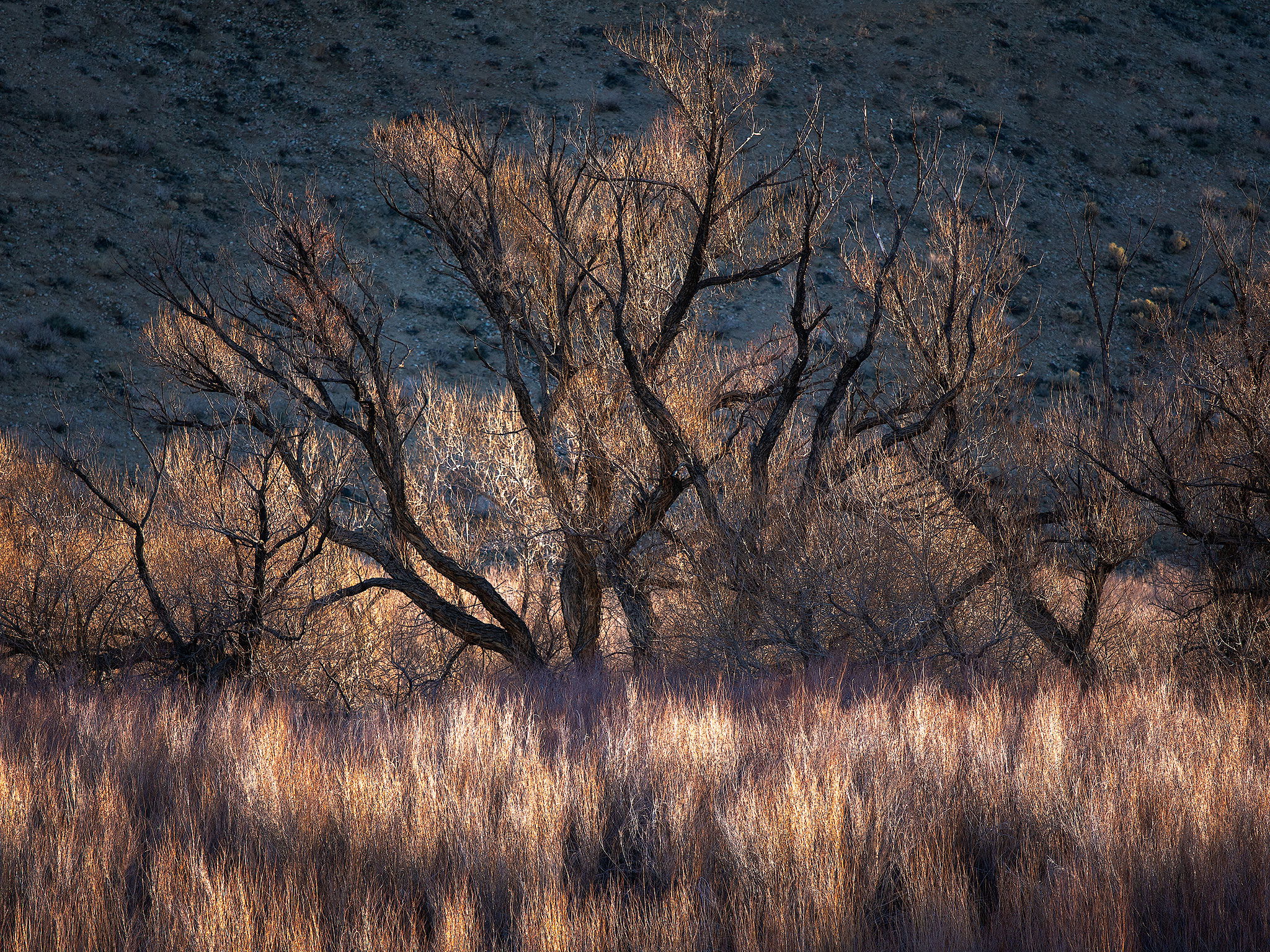
The horizontal crop featuring just the tree and the grasses works beautifully as well. the only nit there is wishing for some room up top - as in the third version.
Speaking of the third, I think you’ve nailed it with this one, colors, processing, comp, etc. - including that extra space up top! Fabulous!
Vikki, I think the first works quite well, because it’s simpler and emphasizes the layers, the tones and beautiful light values. I personally do not care for the second, mainly because it’s cramped. The third I think works better with more space above. However, there’s one caveat: it appears you may have done some content aware reframing. If that is what was used, it is wise to review closely and clone out repetitions. If you have a close look at #3, I believe you’ll see a few. This feature works great if used judiciously.