What technical feedback would you like if any?Any feedback is welcome
What artistic feedback would you like if any? All you see in it.
Pertinent technical details or techniques: Nikon D81o, lens 105mm, F8, 1/250, iso400
(If this is a composite, etc. please be honest with your techniques to help others learn)
If you would like your image to be eligible for a feature on the NPN Instagram (@NaturePhotoNet), add the tag ‘ig’ and leave your Instagram username below.
You may only download this image to demonstrate post-processing techniques.
Hi Ben,
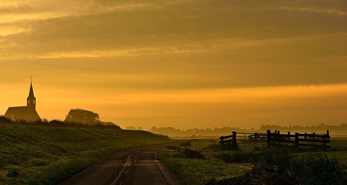
I like the colour and contrast of this scene.
For me and this is subjective the composition of the sky has a lot of visual weight in the frame. I think I would have shot this wider and gone for a wider aspect ratio. 16:9 or a 2.5:1 that would also give more space around the building
1 Like
Ben,
Photography is so much about light, and the quality of that light. You’ve captured that beautifully here. Although somewhat dim, I like the lead-in quality of the road. Then fencing on the right and the church/steeple on the left provide great balance and the glow, mist and overall mood and atmosphere are just wonderful.
I don’t know what you could have done to improve this - other than Nathan’s suggestion of giving this a wider capture giving the building more room. Otherwise, this is just wonderful.
Lon
Ben, you have gone all grand landscape on us in recent weeks, and it seems to be working quite well for you. Overall this is a really nice sunrise image, with a great feeling to it. I agree with Lon that this image has a lot to do with the quality of the light. While the church, road and fence are all major elements, it’s the sky that is the star of this show. But to me the bottom half of this sky is more interesting than the top so I agree with @Nathan_Klein comment to crop to a 16:9 aspect ratio. And doing some add canvas/content aware fill can easily give you some breathing room to the left of the church.
You also have some really nice mist on the landscape in the distance. I’m wondering if an increase in luminosity of the highlights and mid-tones here would enhance the look of that mist, and add even more vitality to this scene.
1 Like
Ben, beautiful shot. I agree with @Nathan_Klein that it would be nice to have a bit more space to the left of the church but nothing to be done about that now (unless this is cropped and can be adjusted). To me, the hue of the sky feels a touch green (almost bordering on brown on the right, even); I don’t think it’s my calibration.
Also, unless they are quite a bit sharper in your full-resolution copy, I’d probably clone out the birds in the sky. If they look good in the full size, though, I’d definitely leave them!
I like this image a lot. As others have said, I would like to see more on the left (or lose the church completely), I really like the foreground interest…the road leading in and going around the fence. I want to travel that road. The light is gorgeous in the foreground.
Beautiful light and a really nice dreamy scene. The comp works for me as presented.

