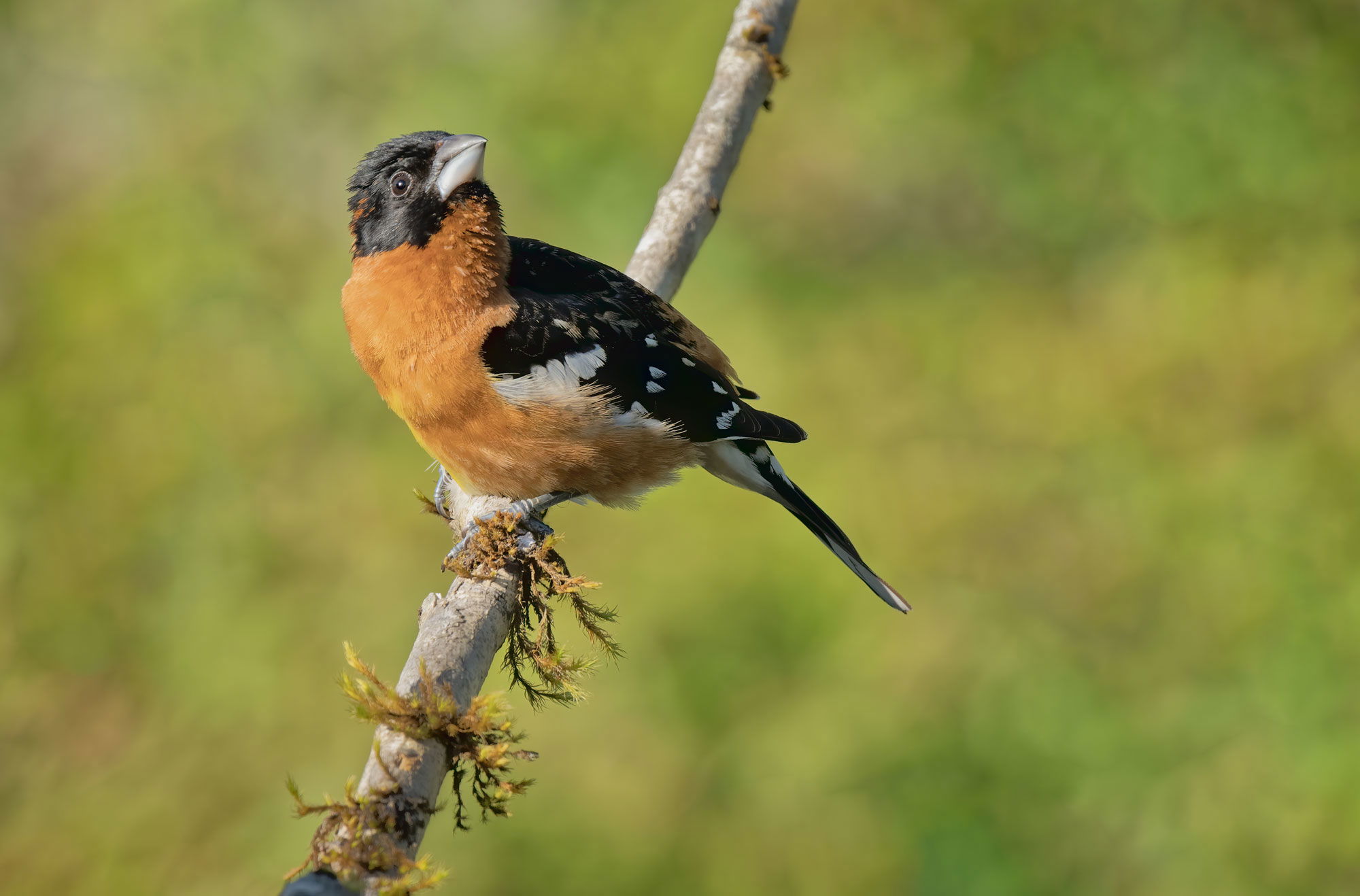
A somewhat exaggerated head turn which reminds me of some high school yearbook photos from the late 60’s…
What technical feedback would you like if any? I had to decrease the saturation 20% to match the TK sharpening action conversion to the posted image. Everything is set to sRGB: camera, PS, LR, etc. When I first convert the tif to jpg, the viewed image on my calibrated ASUS proArt monitor is identical but when I open the jpg from the windows file menu and view it on the same monitor, it is oversaturated. Same when view on my ipad pro. Maybe I need to ask Tony Kuyper, but does anyone if there is a way to fix this so posted images are not oversaturated?
What artistic feedback would you like if any?
Pertinent technical details or techniques: iso 1600, 100-400 at 400, f7.1, 1000th, A7R4, no flash, handheld, 50% full frame
(If backgrounds have been removed, etc. please be honest with your techniques to help others learn)
If you would like your image to be eligible for a feature on the NPN Instagram (@NaturePhotoNet), add the tag ‘ig’ and leave your Instagram username below.
Hi David
I do not know about the Windows image file, but the iPad pro display could be P3 not sRGB.
By the way nice photograph.
Peter
Hi David, Sorry I can’t help you with your post processing question. Nice pose here with the upward turned head. I would add more room on top if you have it. The bird’s head and neck seems kind of soft.
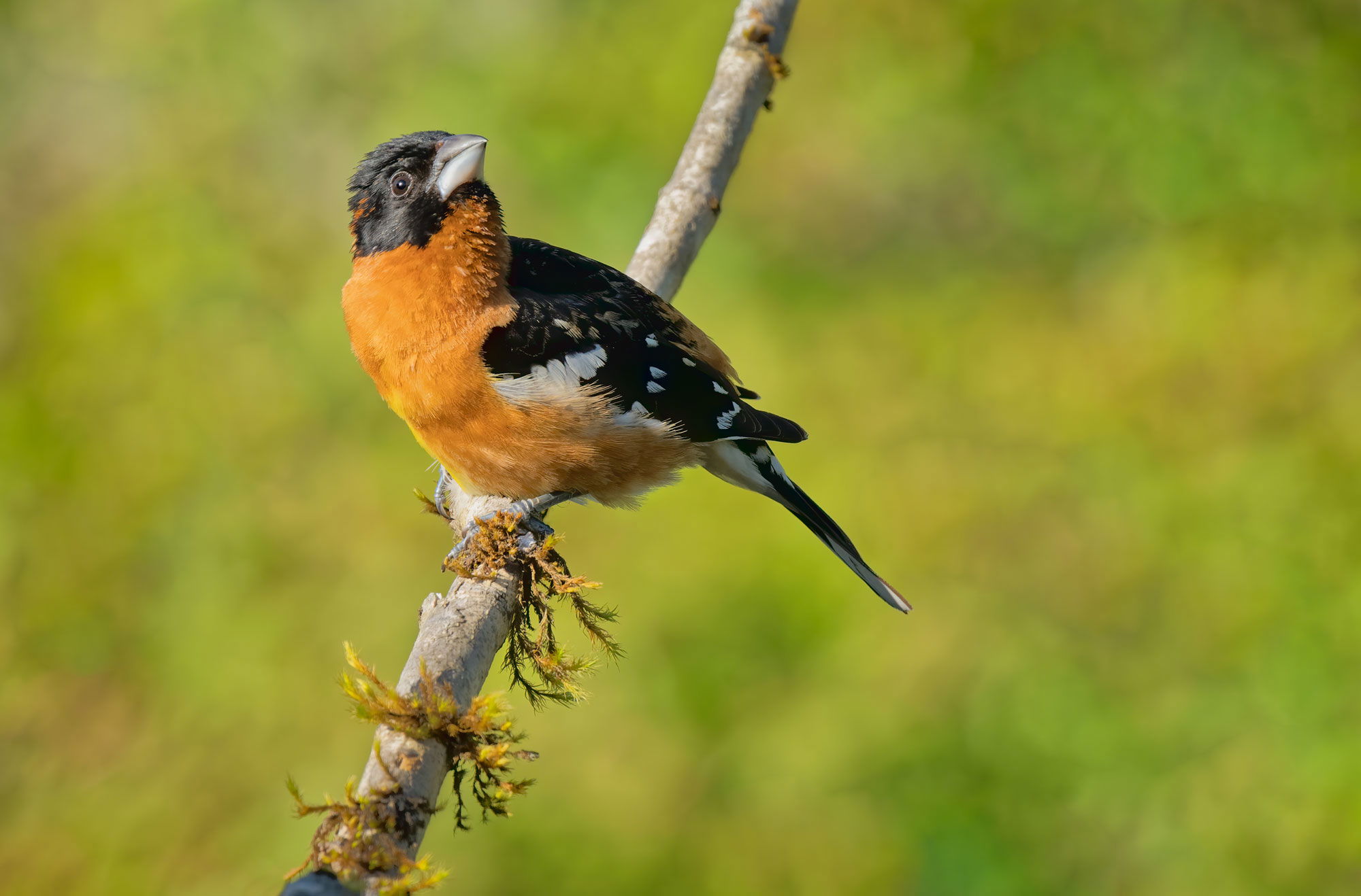
What a gorgeous background David. I agree with @Allen_Sparks about needing more room up top. The bird is almost looking straight up but there is not much room up there. If you have the room you might also consider a portrait crop to give this guy lots of looking room. Sorry, I can’t help you with your processing question. Good luck.
Hi David. Late to the show on this one. I like the image and haven’t a clue what could be going on with the saturation. However, I’d suggest you post the question in the discussion forum where you’re likely to get a larger audience.
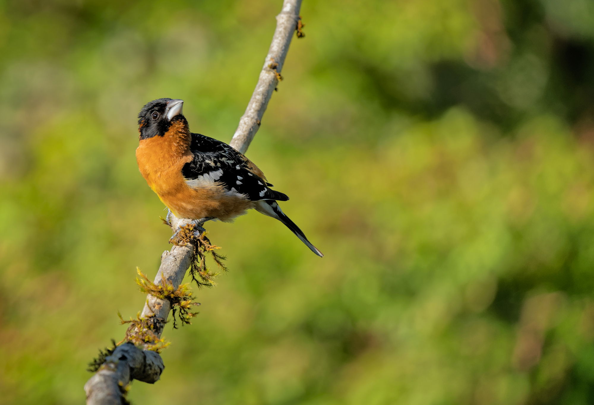
Reposted above from original and reprocessed. see third image above.
Number 3 looks spot on for this species, David.
David: can’t help re the processing, but the increased contrast and saturation on number 3 make it very appealing. Well done. Richard
The third one looks good. Nice detail and colors. The extra room on top helps.
An excellent colorful and nicely detailed capture of this Grosbeak, David! Good job with the composition. The 3rd version is definitely my preference. There is one thing that you might look at for the cause of the saturation shift when viewing in a Windows browser after converting to a jpg. Usually there is a jpg conversion option that you can select to embed your monitor profile. If you de-select that option it shouldn’t change when viewing in a Windows browser application.