Slowly working my way through the catalog of glacier images from my August trip to Iceland. A fair bit of map dreaming prior to the trip raised the possibility of a trail-less hike along a high rocky ridge that runs alongside a rapidly growing, iceberg-filled proglacial lagoon (not the famous Jökulsárlón, but another in the Vatnajökull area). The slow transition from thick fog, to brooding tendrils of mist, to sunrays illuminating that mist, to the final arrival of a mostly clear blue sky made for beautiful hiking and lots of exciting artistic opportunities. Here are three scenes from that hike. Which one of the three, if any, stands apart from the others?
Specific Feedback Requested
In particular, I’d be interested in hearing which of the three images works best, and why. Any other suggestions for improvement are always gladly received.
Technical Details
Is this a composite: No
None of the images are composites, blends, etc. All were processed in Lightroom and Photoshop for tonal balance; I applied increased saturation to the blues in the ice in the first and third images.
Image 1: Sony a7r III, Tamron 70-180 mm f/2.8. 145 mm, ISO 50, f/13 for 1/25 sec.
Image 2: Sony a7r III, Tamron 70-180 mm f/2.8. 96 mm, ISO 50, f/13 for 1/20 sec.
Image 3: Sony a7r III, Tamron 70-180 mm f/2.8. 77 mm, ISO 50, f/13 for 1/10 sec.
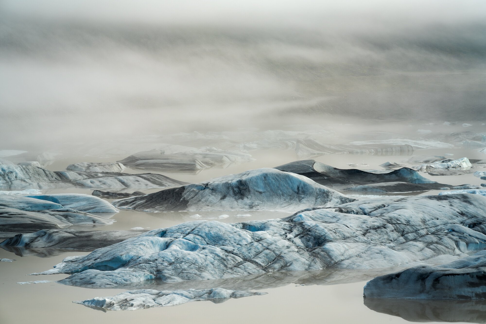
Wow, Jeff. All three are really great. I initially chose the last one, but looking them over again, I would respectfully select the first one with one change. I would crop about half of the sky/clouds. I think that makes the icebergs more the focus of the image. That one evokes a mystery and mystical feel.
All three are excellent images. The second image suffers compositionally due to the fact that you have that very strong triangle (perhaps the point of focus) on the left edge of the frame and it just pulls everything towards it. I liked the first a lot but eventually went with the third as my favorite. It has the strongest composition and the dark background provides an overall mood for the white ice. The right triangle on the right is not optimal. I liked it so much that I played with it. I think I cooled it a bit to bring out thee blues in the ice. I added vignette and played with contrast I think.
I agree, all three images are good. My favorite is the third one.
The first image has the most interesting icebergs, but has has much less of a sense of depth and grandeur than the other two images. So I agree with the crop of the top suggested by @David_Bostock for the reasons he stated.
The second image has a dynamic composition, with the greatest sense of depth. But I agree with @Igor_Doncov about the triangle rock on the left, it has too much visual weight on the frame edge. I could see a crop, primarily from the left, to minimize this issue. With that said, I wish there was also slightly more breathing room at both the top and bottom of the frame, they feel a bit cramped.
I too think the third image is the strongest of the three images presented. It has a very well balanced composition, with a good sense of depth. I like that one of the icebergs is clearly dominant visually. The wisps of fog in the background are also very appealing. My suggestion for tweaks to the third one would be to darken the water, but not the icebergs, or the background.
Love all three Jeff. For me the first is my favorite, and I can see/agree with cropping off some of the top and right to make it even stronger. Nice series!
Thanks. as always, @John_Williams@Harley_Goldman@Ed_McGuirk@Igor_Doncov and @David_Bostock. I definitely did not expect the third image to be the broadly popular choice! I have added v2.0 that significantly removes some of the yellow in the water and darkens the water. That yellowish-green-brown water, though true to reality, is one of the things I did not like about v1.0, so this is an improvement in my mind. I struggle a bit with the idea that this is a bit too strong of an image manipulation, though I do think that de-yellowed water is still realistic. What do you think? Too much?
Interesting observations about the impact the dark triangular berg in the second image has on the overall scene. I hadn’t noticed that effect before, but I think @Ed_McGuirk 's suggested crop is an improvement. In the first image, the cropped cloud sky/clouds as a couple of you recommended, and that is an effective suggestion. I will admit that the first image is my favorite of the three.
Finally, @Ed_McGuirk , I’ve now heard a couple of times that my compositions can feel a bit cramped at the top/bottom, in this image and at least one other. I’ll need to start paying more attention to that when I’m setting up a composition as that isn’t something I have considered previously.
Thanks again, everyone. I’m curious what you think about the modified third image.
Jeff, I’d like to reiterate that all three images are very good. The suggestions and opinions offered here are mostly about pretty subtle, small things. But tweaking small things can sometimes be the difference between a very good and an excellent image.
Color is one the most subjective aspects of photography. If you were using these images for display in some scientific glaciology exhibit, then realistic color might be what you want. If your intent is to create images that have artistic merit, then enhancing color and contrast to accentuate elements or emotions is part of the game. IMO, what you have done with color and contrast in the rework looks good and is far from being overdone.
Regarding the comments on the edge triangle, and cramped. One of my personal biases is that I am a stickler about avoiding edge distractions. Not everyone may agree that it is cramped, but for me it is slightly cramped. It’s not always easy to notice small issues with edges while shooting. Thus, I like to compose slightly wider than I think I need, leaving me processing flexibility to crop slightly to eliminate issues with edges, leaving enough breathing room, leveling the image, etc.
I think edges are important because generally (though not always), you want the viewer to concentrate their attention on the center of the image, and not have their eyes wander out to the frame edge. Things at the edges that can cause issues with edge distractions are bright hotspots, high saturation elements, shapes that are awkwardly cut off, lines that the lead the viewer out of the frame, or elements that have high visual weight. Triangles are very powerful shapes that have high visual weight and attract the viewers eye, IMO the crop helps to keep the viewer in the center.