Lovely photo. It makes me wish I was standing right there looking at it. My suggestion is that the rocks seem a bit flat, might look better by bumping up the midtone contrast and increasing the highlights/and or the whites.
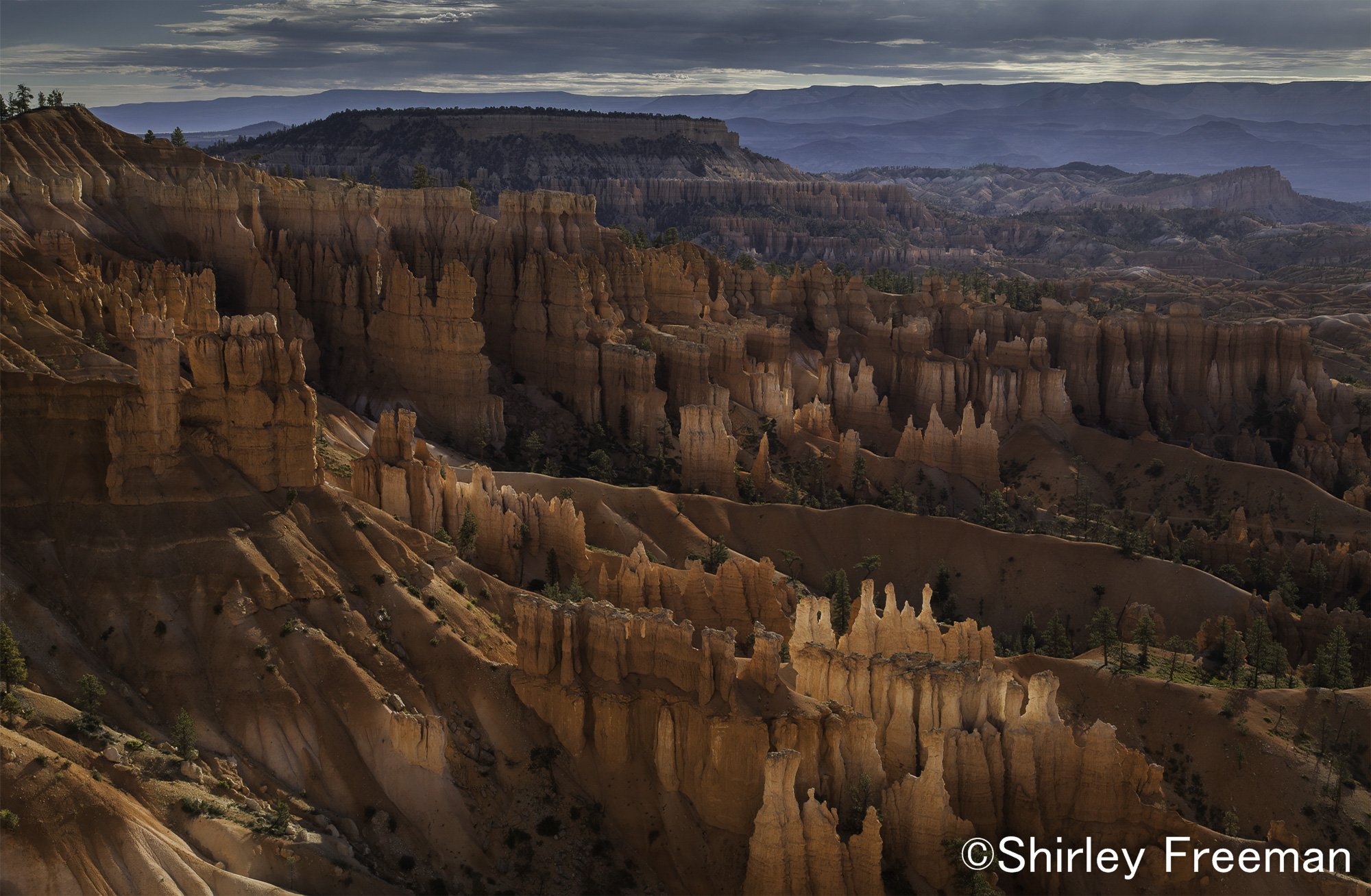
Thank you so for commenting that it makes you wish you were standing right there looking at this scene, that makes me feel like I am in the ballpark! I appreciate your advice. I am uploading the changes I made (very slight as I don’t want to go over the top, and not look natural). What do you think?
Thank you, Stephen. I appreciate that. I like things to look natural if I can. It was such a blessing just to get to see this beautiful place, and I am enjoying editing and reviewing (and reliving it once more) while it is raining here in NC.
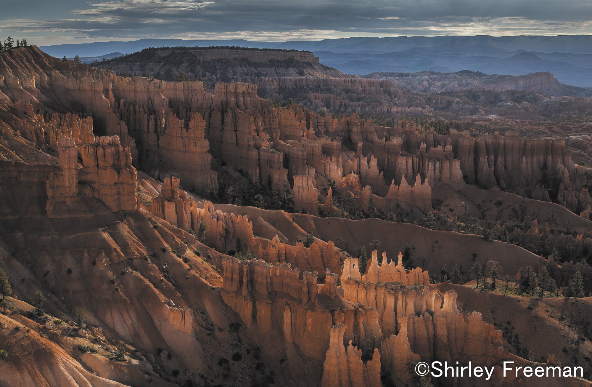
This is a fine take of this iconic location, Shirley. I’ve shot from this spot a couple of times, and I think you did a good job with comp and exposure. And it seems you got this at the right time in sweet light to capture the signature glow of the layered hoodoos. Something to be proud of.
Thank you, Harley and Bill. I would love to go there again, but right now it isn’t possible. My husband has lost all interest in traveling, and so the only time I leave him is for a visit up to Maryland to my hometown, and I am just hoping I can keep doing that. He is 10 1/2 years older than me, and I see him failing in many ways. I just have to be satisfied to go back and edit old photos for the time being!
This is a fantastic capture and wonderful rendition of this classic iconic spot. Technically, I think you’ve executed this perfectly. I have no nitpicks or suggestions. Wonderful image.
The second, edited photo, looks better to me. The fine points of “how much pop to dial in” is such a subjective experience. As we all know, there is no right and wrong, it’s personal preference. My only nit with the edited photo is that now, to my eye, the sky looks slightly too dark for the foreground. Others probably think it is perfect, but I’d suggest lightening the sky up a tiny bit.
Shirley,
Nice image. Your rendering of the hoodoos is fine, but that sky and background are distracting. I suggest darkening them either through a gradient, vignette, or mask to deliberately focus the eyes of your audience to the hoodoos. It will also enhance the drama, which is presently quite low but has potential to be high.
Also, since you are in the processing frame of mind, try it in B&W. Could be wonderful.
Hi Shirley, the glow of the image is reaching into the shadows to much and adding to much color to them. This effect makes the image appear way to digitally enhanced. One of the few photographers that seems to understand this and gets it right is Alain Briot. My guess is that after 20-30 years as professional photographer/fine artist/teacher that he has figured out a de saturation of shadows workflow and it has become part of his style. You might take a look at his work to see what I mean.
There are a few ways to pull color out of the image. Learning how to use/implement enhanced Black point, midpoint, white point, is one way.
Also I am interested to know if you have tried using the LAB color space workflow for your canyon image work. LAB color space is known to really intensify an images color using LAB channels and especially in canyon color. Dan Margulis wrote the definitive book on it in 2006. So its not a new technique, just seemingly highly unknown. There are a few you tube out there which go thru the work flow.
Thanks for allowing the download for image critique. I put the image thru my black shadow de saturation action and posted it. Working on a JPEG is not ideal but I think you’ll get the idea.
Shirley: One of my favorite spots that I’ve been fortunate to witness in different seasons. You have some marvelous light and I like your second take a lot. I see Fitz point but I prefer the glow you have. >=))>
Thank you, Ed. I am a visual more than one for reading, so at first glance at your edit of my image, I wasn’t sure what you were trying to teach me, because I it didn’t look like I remembered the red rocks/hoodoos being, even if it has been 4 1/2 years since I was there. Then I read your comment over a few times, and realized you were mainly talking about the shadows casting too much red in them, or at least that is my take from your comment (the link didn’t work). So, I used NIK to work just the shadows, desaturated them some, and even added a very tiny bit of blue in them to cool them some. Anxious to hear from you and any others. I feel like I have already had a very good response from so many, and I greatly appreciate it. Bill, thank you for your comment as well.
Hi Shirley, You took an interesting approach to de saturate those shadows unfortunately the over-all image brightness is down a tad and it did not reach into the shadows. The image I posted prior used a CMYK workflow. That workflow is out of reach for most folks.
So I tried another. We need to create a selective mask targeting the shadows only. Simply bring in your first image into Photoshop. Run TK6 rapid mask2 Action and create a composite mask of darks4-darks2= then set layer output to hue/saturation. Then open up hue/saturation properties to bring down saturation. You can also put the image layer in its own group, set a mask to white, and paint in where you want the eye to follow the glow. Creating understated shadows is a simple technical issue.
The name of the game (IMHO) is not to have one big glowing image but one that you designate how you want to have the viewers eye travel thru this grand vista and tell your story of your experience. You definitely had princess light arrive at the perfect moment,
Ed, I truly appreciate the time and effort that you have spent on my image. I have come away with the idea that you are presenting, I think, and will, when I have some time to work on it later, will try some of your tips. As for now, I have some other non photography things calling for my attention. I also think maybe I need to consider that you kind photographers have spent ample time on this one image here at NPN, and I am really grateful to all of you.