The photographer is looking for thoughtful feedback on the image as a whole, especially around the areas noted below.
Feedback Focus: Artistic + Technical
About This Image
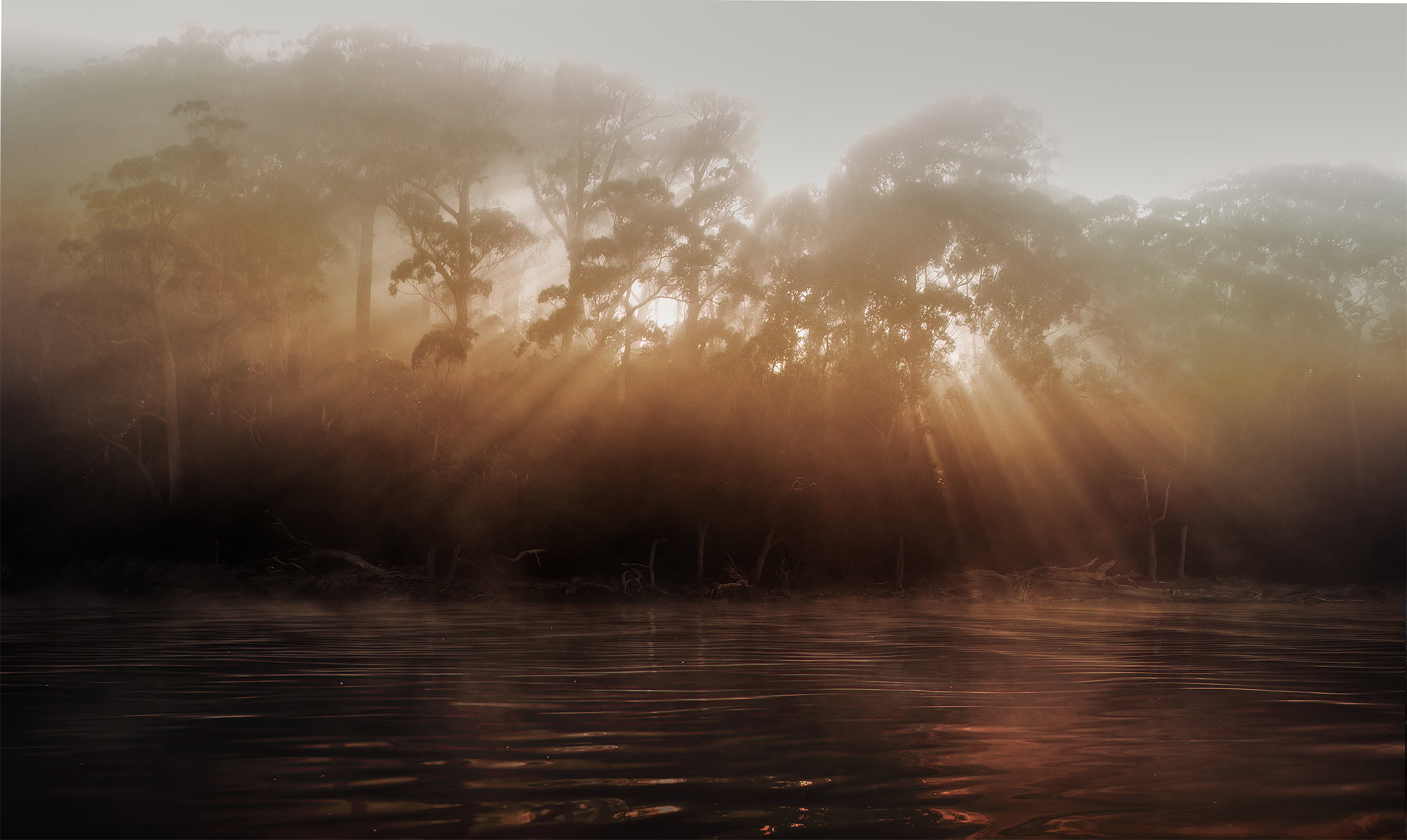
This image caused quite a stir at my Camera Club meeting. The subject was a silhouette. Many argued that it wasn’t. Thankfully, the judge for the evening thought it was and gave it an honour.
We kayaked across Tasmania’s Lake St Clair very early. What we initially thought was fog turned out to be smoke from massive wildfires in the World Heritage park.
Feedback Requested
The raw file is not as colourful as this. The colur has been pushed lots. The raw file is almost black and white. Does the colour strengthen the effect of the image?
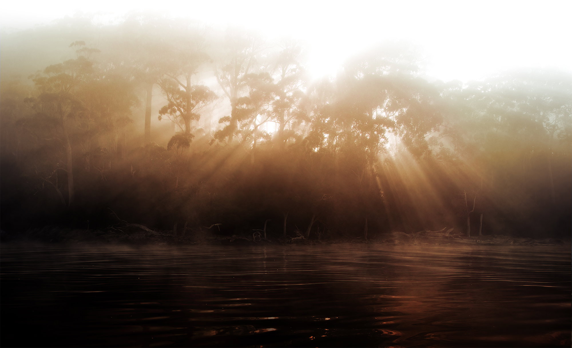
Glenys, This is a photo that could be processed in many ways, all artistic choices. While it’s not full black, the light through the trees does silhouette them well. I like the big oval of crepuscular rays and how the trees disappear towards the top. Personally, I’d like to see a bit more contrast in the water, since that covers almost half of the frame and more detail near the top. Here’s a quick take on my thinking, all done by burning-in or dodging through luminosity masks that target specific luminosity ranges (mid-brights and mid-darks).
WOW! Who says a silhouette has to be black? For me, this is simply flat-out drop dead gorgeous!! The shape of the rays, slightly off-center and the range of detail in the trees holds my attention and rewards looking around!
I do wonder about a different version with just a bit less water and a bit more at the top, but I hate to even think this might be improved by one percent. Fantastic and wonderful!! I’m so happy your judge was better than so many I have seen.
Hi Glennie,
I liked this immediately when I saw it. Part of it is the nearly blown sky in the upper right. I like it when people break rules a bit, and I think the glaring brightness up there adds greatly to the image. I have no idea how it would print, but I’m guessing Mark’s version addressed that.
I wouldn’t mind seeing a slight increase in the foreground water’s luminosity. I know this is part of a silhouette challenge, but for me, I would love to feel a little more of that water’s visual effect as other than foreground space.
@Mark_Seaver , thank you for taking the time to do the edit. I really like it! The water was silky smooth gentle waves, and you have brought that feeling out. I also like the bit more detail in the tree tops.
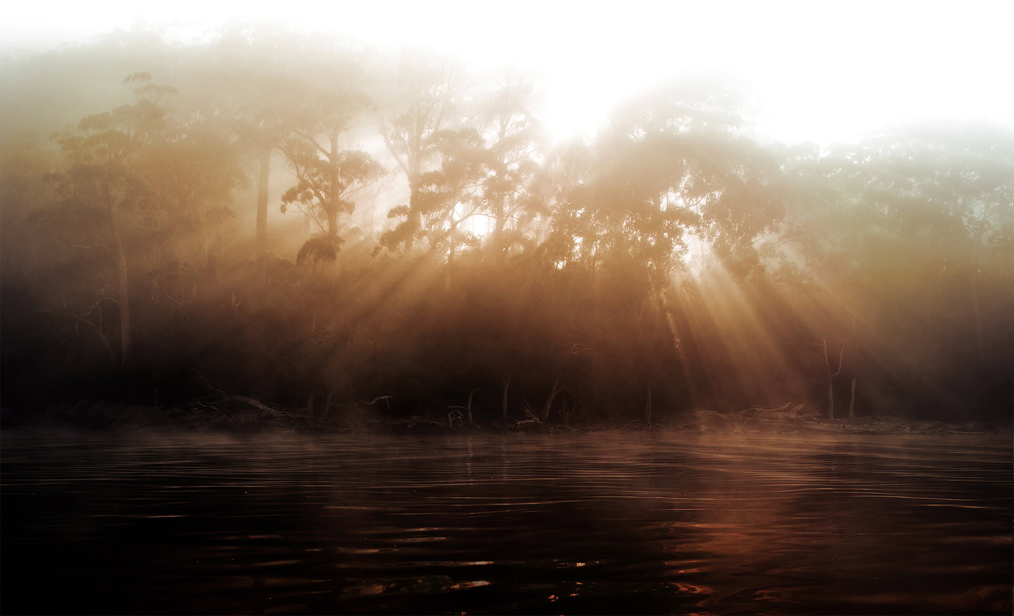
Hi Glenys, beautiful image! Knowing that it is smoke and not fog, your edit makes that clearer. I don’t mind the sky being overblown like your original, but that does feel more like fog or mist than how light through smoke would render. There are brighter areas between the trunks and I would like to see a little of that brightness above the canopies as well. Not as bright as the original, but maybe something in between on just that spot so there are three patches of sun that form a triangle?
I agree that it IS a silloutte in much the same way that a monochromatic image need not be black and white. I prefer your initial image as I think its softer feel better transfers the foggy vibe to us. Really nice work!
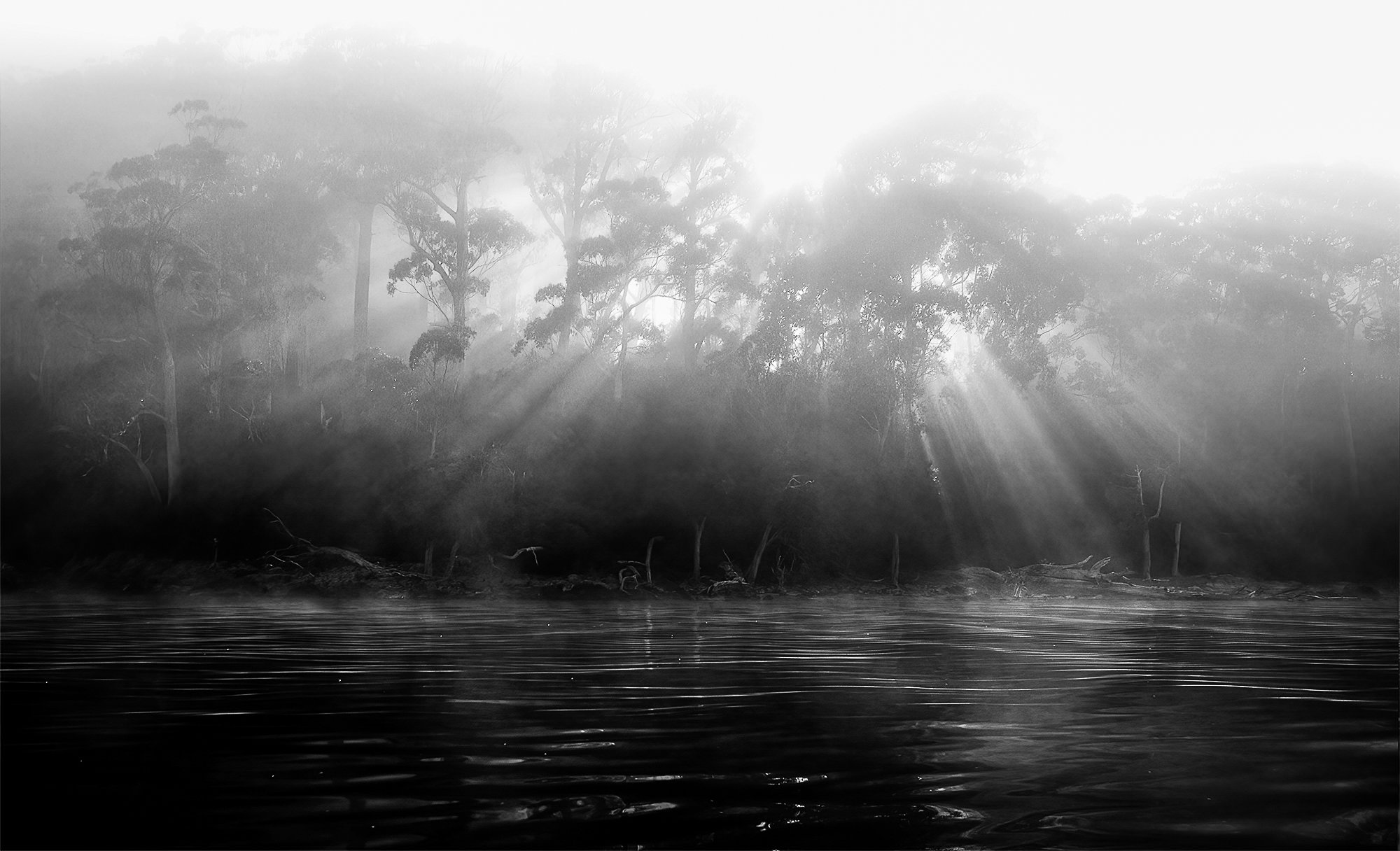
Beautiful Image. You asked whether this is better in color since the raw file was nearly black and white so to better be able to answer your question, I downloaded it and did a conversion to B&W and did a little bit of processing on it. Not much though.
They are both different and so I can’t really say which I prefer but if the idea was to capture a silhouette, then I believe I prefer the black and white.
The strong outline of the trees and the sun rays radiating down through gaps in the trees is very powerful in both images but perhaps tells a better story in the color version because those types of light rays usually have some warmth to them. I also like the the warmth in the reflection on the water in the right third of the scene in the color version. I was able to bring out the water a little bit in the B&W version which may actually be too much. Your call on that.
In the color version I see on the right side of the image that the tree in the upper right portion of the image is almost B&W but with maybe a green hue to it and it looks a little out of place next to all the vibrant oranges in the rest of the scene. If you can somehow add some orange color to that area I think it would help.
[D1] This area is lacking the color that the rest of the image has
[S1] My eye immediately goes to those strongly backlit trees and the sun rays coming through the trees in the center of the image creating great balance! Well done!
Once again, thank you to all for your thoughtful comments.
@Diane_Miller , after reading your comment s again. I like the idea of a little more on top and a little less on the bottom. When I looked on my phone at the edited version, I cringed! It’s funny how a very small image can have an impact that my computer screen did not. So I have gone overboard on darkening the sky and might settle on a version with something in between almost blown and yuck. Thank you @lynsie for that as well!
@David_Haynes I have also processed this image as a black and white . I liked your suggestion on bring out the water a little bit. The trees in the far background are a bit odd. I’ll go back to the raw file.
David, I know there is some work being done on the site. Are (D1) and (S1) suppose to show up on the image?
Glenn’s,
For some unknown reason, my suggestions on your post don’t show up on the image but I think you still get the idea. I’m working through it with David Kingham to find a solution. Sorry about that. Wonderful image.