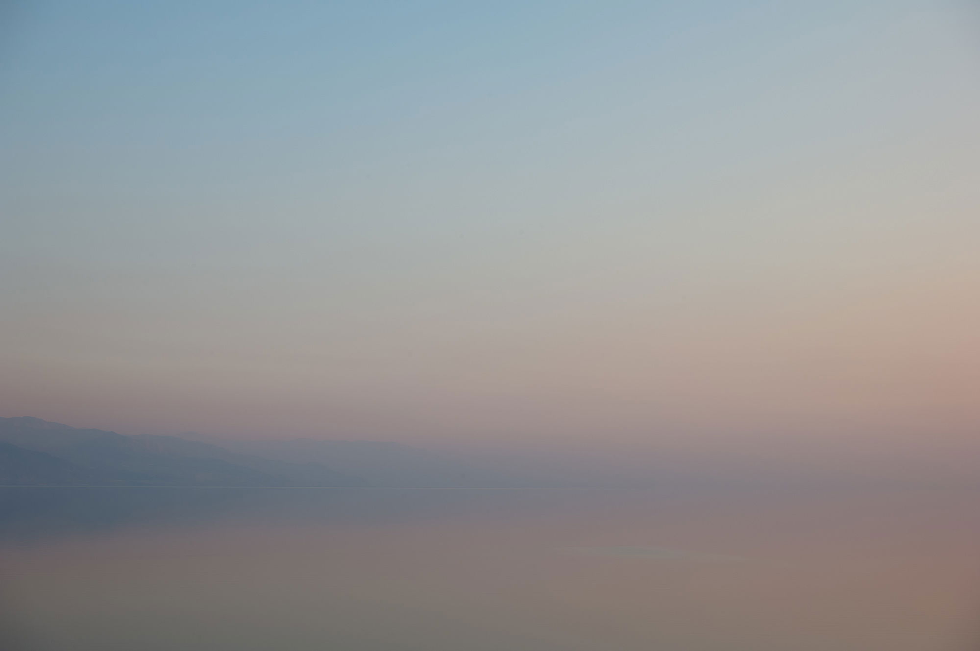
This is my first post in this specific Critique Gallery. The image was taken from the shore of the Dead Sea (Israel), in a misty evening. I like the image, I hope it gives the emotions I felt getting there after much time, in this strange place suspended between different and complicated worlds, 400 meters below the sea level and in a seemingly alien environment… Along the break that will split apart the continent…
But I am not sure all this is just in my mind, or whether the image can give some feelings to others. I would be happy of receiving some comments.
What technical feedback would you like if any? Any!
What artistic feedback would you like if any? Any!
Any pertinent technical details: Medium format digital, 70 mm equivalent, 1/180 sec, f6.8, ISO 100, hand held.
You may only download this image to demonstrate post-processing techniques.
A very subtle image, Antonello, and one that I could look at for a long time. To me, this evokes a “beginning of time” feeling, as if the land were just emerging from the sea. I like it a lot.
Nice! I like the soft colors and the overall softness, and having that mountain show up over on the left side really helps give a nice place to ground my view.
Nicely done.
Probably just a matter of taste, but my “eye” looks for something to anchor to, and the mountain on the left isn’t enough. The misty, soft look is indeed very interesting, begging a photographer to do something with it. But I’m left with a big “?”
Simplicity at its finest. I think you have just enough reality of the headlands to indeed form an anchor or place for the eye to go to, but the image isn’t about the land. I think this is wonderful as processed. I suppose you could experiment with boosting the saturation - or at least try and bring out the pinks and color gradation a bit more… But as presented, wonderful.
Sad or unfortunately, the conditions and result remind me very much of what we saw in most of California for most of 2018 - from the smoke. Mist from the sea is much preferred.
Thanks Dennis, Genny, Rick and Lon for your comments! @Rick_Cloran: that’s exactly the point, I was looking for (and was in the mood of) an “essential” image, but the danger in such case is to get a touch too much… essential. So it is really personal… @Lon: I played with saturation and contrast and all that but, in the end, I opted for this version (which is quite close to what came out from the camera…). And yes, I understand what you say about the fire smoke. I was in California (LA area) in late fall 2017 and there was already a prelude to what happened a few months ago… For the Dead Sea, this “mist” is really a blend of water vapor, salt and dust from the nearby deserts. The mountains on the horizon are in Jordan, in a desert area (and Petra and Wadi Rum are not far away)
I like the soft colors, but even as an abstract this is a bit too minimal. I can’t distinguish between camera blur and haze blur so it leaves me puzzled. If the distant mountains were sharp and and darker, it might be something to focus on a bit.
Dear Tony, thanks a lot for your comment - I was going for a minimal abstract image but in fact this may have gone a bit too far. I attach a version with a darker land - I have other versions as well but I think they lose the feeling I was trying to convey. This version is bit less extreme. but still on the minimal side. Camera was not blurred, by looking at full resolution… I also attach a different view (where one can see the salty areas along the shore). All the best!
Antonello
I like your last image very much as well. The water is like liquid mercury against that shoreline, Coupled with the ambiguity of water and sky this is a work of art.
In the original the visibility slowly declines from left to right. I’m not sure how I feel about that from a compositional point of view.
Also, you could crop down to remove some of the blue in ulc. These are artistic considerations without one being necessarily better than another, but I like to compare and feel the difference.
It’s by no means “too far” for my tastes, Antonello! I have a strong attraction to abstracts in the first place, but the best for me are those that include some tiny element of reality for the viewer to find, orienting them into insights about the larger shapes and scales of the painting. I seldom see it in photos, but you’ve achieved it perfectly here. The image is still interesting and even compelling with all the detail on the left “hand cropped” from view, but it jumps to the next level once you move your hand to reveal the subtle detail. Very well done and worthy of large walls.