What technical feedback would you like if any? Any
What artistic feedback would you like if any? Saturation and Vibrance; I feel that I may have made the greens to vibrant in post processing.
Pertinent technical details or techniques:
(If this is a composite, etc. please be honest with your techniques to help others learn)
If you would like your image to be eligible for a feature on the NPN Instagram (@NaturePhotoNet), add the tag ‘ig’ and leave your Instagram username below.
‘ig’ stinsonc
You may only download this image to demonstrate post-processing techniques.
Chris, welcome to NPN. This is a lovely scene with the bare tree standing as a sentinel watching over a nicely inviting spring landscape. Hiding the sun behind the tree was a good idea. The strong white lines around all of the smallest branches are an over sharpening artifact or due to using too much “clarity”.
Hi Chris, and welcome to NPN. I think you will find NPN to be both welcoming and very helpful. It’s a place where you will receive honest feedback & critique, but without the ugliness and pettiness of some sites.
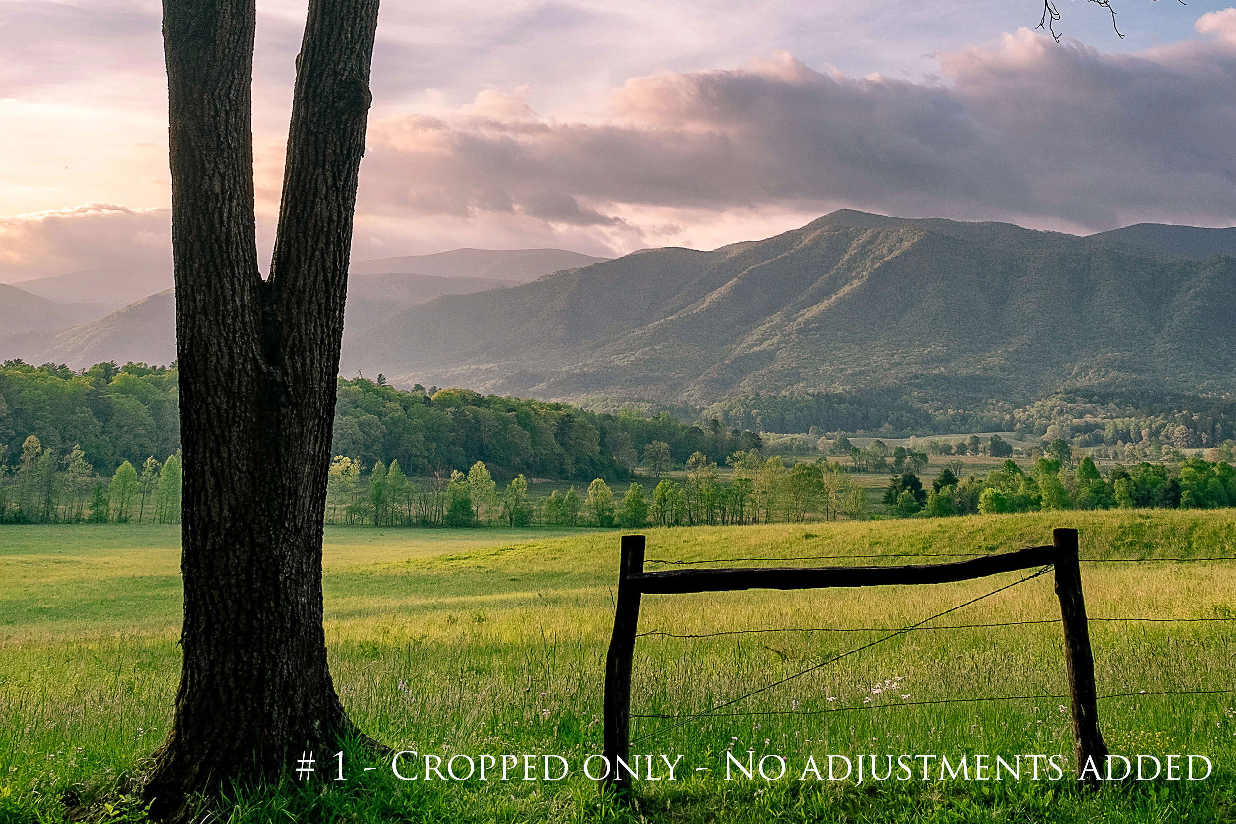
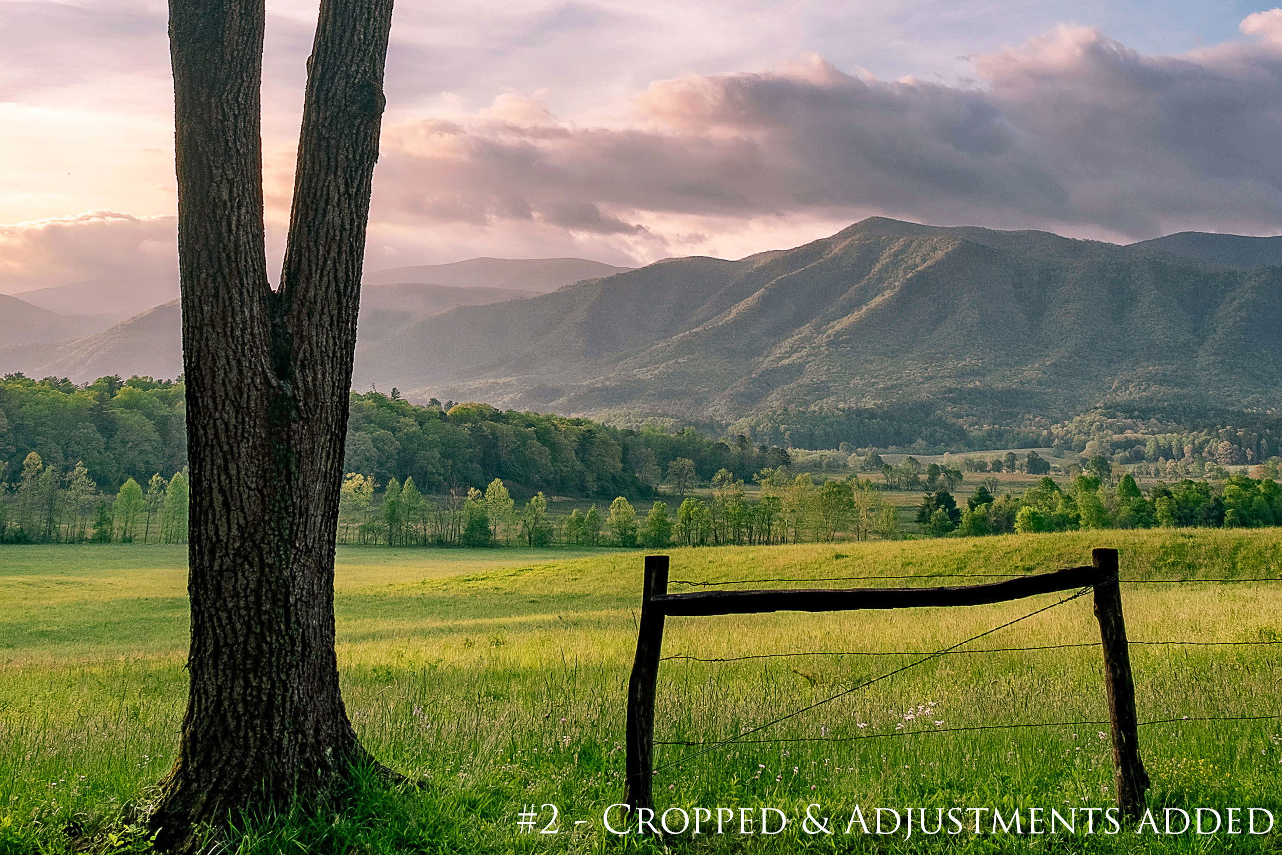
Can I assume this is Cades Cove? Certainly looks like it anyway. You’ve captured a beautiful image here; I love the fresh greens and the peaceful “feel” this evokes. Well done. As far as critiques, I have a couple. Since you’re new, please allow me to preface my critique by saying my comments aren’t meant to say “I’m right and you’re wrong”. My comments simply reflect the way I see the scene and, as you know, ten shooters might see it ten different ways. I downloaded the image and played with it a little and will include 2 images below.
That said, let’s begin. My initial view was a little confusing in that I found myself looking at the sky and clouds and when I looked down I saw another, almost separate image. IMHO, the bottom part of the image is where the strength lies. Because of that, my first thought was to crop most of the sky out and turn it into a horizontal image. Two reasons for that - it draws my eye to the strength of the image and also, in my experience and in my marketplace, horizontals tend to sell better. Being a horz. I wish it had more room at the bottom so the beautiful trunk didn’t end so abruptly at the bottom border. Even as a vertical, I have the same thoughts about the trunk ending so abruptly. After cropping it, I added a few MINOR adjustments, slightly burning in some shadow areas to create a bit greater sense of depth, dodging the tree trunk to reveal more detail there, slightly dodging here and there, and playing with the selective color in PS just a wee bit to hopefully further accentuate the shadows and colors. Below are two images - # 1 is the image with just the crop added, and # 2 is both cropped and adjustments added. Again, this is just “my take” on it, and not a judgment in any way at all. Your image is a beautiful shot as presented.
Hope to see many more posts from you. I’m originally from Alabama, but have lived in the panhandle of Florida now for many years, and I’m happy to see someone posting southeastern images here now!
Chris, welcome to NPN, this is a great first post, with a classic view of a very special place, Cades Cove. I think your processing of exposure, contrast, color and saturation look good. You have left some detail in the shadows of the trees which works well. The greens that you have here actually have lot of yellow in them, which is what one would expect in springtime. To my taste the colors look very natural, and are not too saturated, they just look like vibrant spring colors.
I like that your composition has three strong elements that create a pyramid effect, the tree, the gate, and the mountains. I do wish that you had slightly more breathing room below the tree and gate post, they are a little tight to the bottom. While I like how @Bill_Chambers suggested crop places more emphasis on each of these three elements, I think you were also initially attracted to the spindly branches of the tree. I think a square crop would accomplish some of what Bills reworks does in terms of emphasis, but it would also retain some of those interesting branches.
Here is a rework with a 1:1 aspect ratio. When i did this crop there were some branches suspended from nowhere in the upper right corner, which i removed by using Content Aware Fill in Photoshop.
Chris, welcome to NPN ! I am not familiar with Cades Cove and I appreciate you sharing this beautiful first post.
I think both @Bill_Chambers and @Ed_McGuirk have given helpful suggestions for this image. My initial impression was to crop it along the lines similar to what Bill has suggested, but Ed’s rework is also a nice option.
Thank you so much for your input Bill. I just started taking photos about 6 months ago and was thrilled when I found out about this website. Only way to get better is good ole fashion C&C. I love your take on this photo and I think going landscape makes it a much better imagine all around. Once again I greatly appreciate the feedback.
Thank you so much for your feedback Ed. Yes cutting the trunk and gate so low was a bummer, I will have to take a look next time I visit to see if there was more room available or if I did that to keep from the road showing. Cades Cove offers some gorgeous scenery but sometimes you have to fight traffic to capture it haha. Once again thank you for sharing your feedback, I love getting views and ideas, that’s what makes us better in the long run.
Welcome to NPN - and an excellent and quite lovely spring landscape for your first post.
The great thing about this image and scene is that the suggested crops work great - as does your original framing - which I like very much. I’m guessing the “road” was a primary factor in making the bottom so tight. Probably the only thing that can be done is adding more “canvas” at the bottom and stretching or cloning in some grass. But then not everyone is good with that. And regardless of the reason of the tightness at the bottom, the result is the viewer assumes the tall tree and sky are more important; and as Bill suggests, cropping brings that emphasis back to the spring landscape.
Having said that, what you presented works beautifully for me. I happen to really like the pretty blue sky; it compliments the spring yellows/greens beautifully. And those branches occupy enough space to make this a nicely balanced composition.
As far as color/saturation goes I would say the green/yellow along the fence line at the bottom is slightly saturated, but the field and landscape have a nice spring glow to them. It’s just the darker greens at the bottom that are slightly off. As we often say here though, the color/sat is certainly within the realm of personal choice and honestly, it’s only off slightly.
Well done! We look forward to more posts and your participation!
Well, welcome aboard! Many here have enjoyed decades of this passion and I hope it continues to grow for you! It’s something you can enjoy of course indefinitely…