The photographer has shared comprehensive information about their intent and creative vision for this image. Please examine the details and offer feedback on how they can most effectively realize their vision.
Self Critique
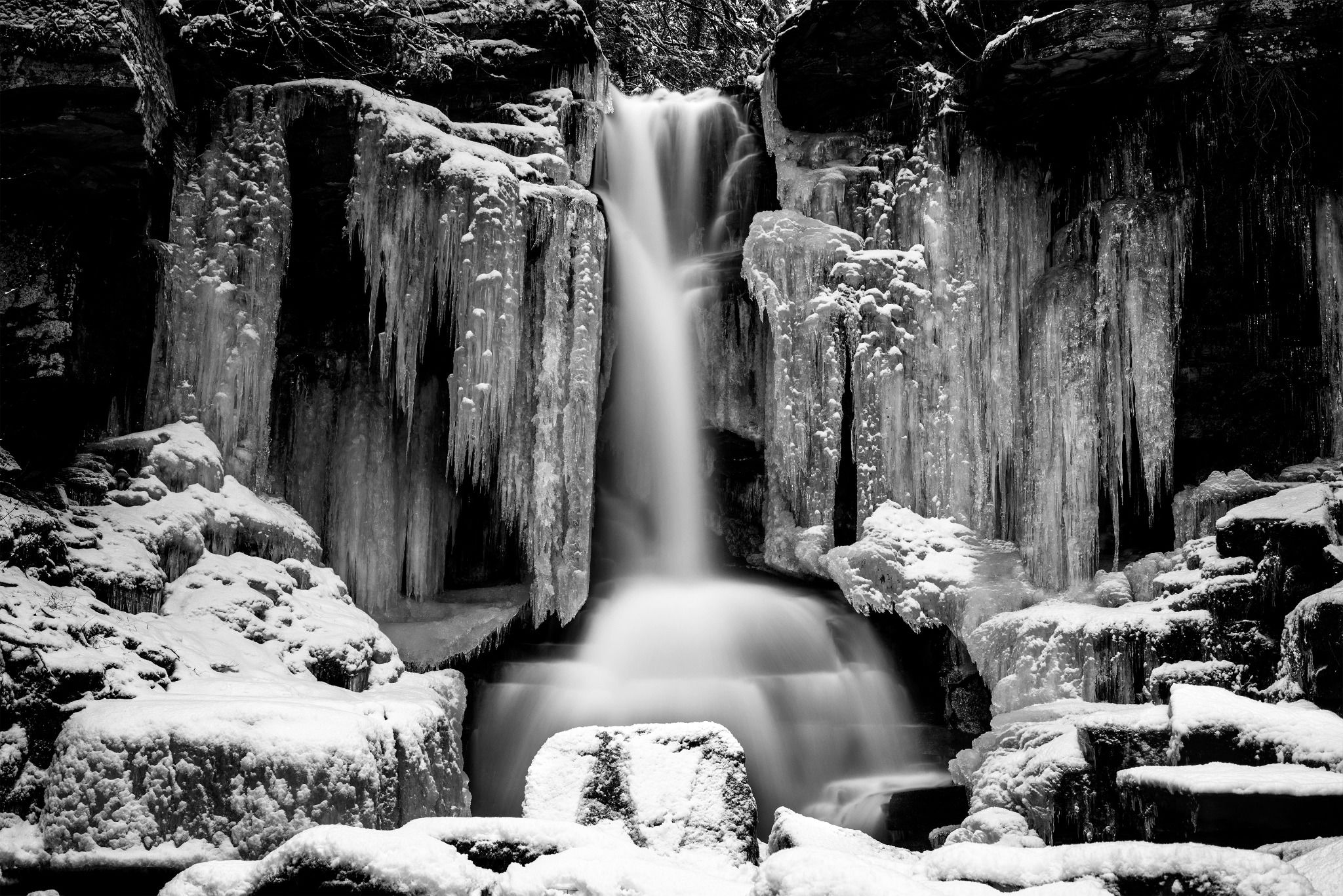
I shot the falls dead center because I felt that the symmetry on both sides and the foreground led to a really balanced image. I second guess it the more I look at it though. I also can’t tell if that big foreground rock is more of a distraction than leading line. I do love the way the ice and snow covered rocks to either side create a natural frame.
Creative direction
My vision for this was to showcase the rushing water winning out, for now at least, against the icy grasp of winter.
Specific Feedback
All overall constructive critique would be appreciated. Specifically composition and editing.
Technical Details
D750, iso100, f11, 8sec, 50mm
Description
I’m lucky enough to have this falls on my neighbors property less than a 5 minute walk from my house. Of course when it’s - 25 degrees out that 5 mins feels a lot longer. The base level of the falls is about 20’ below the gravel road that runs alongside it. Climbing down was a little sketchy with the ice and snow
but definitely worth the risk for the view.
Amazing image. I think you have something special here. The composition is delightful. The rock below is good.
If it is then it’s due to its brightness. The arc of bright snow that it is a part of is too bright in my opinion. The main interest is the beautiful detail surrounding the fall. Everything else should be processed to be subordinate to it.
Rick, welcome to NPN. This is a great start. I agree with your decision to use the symmetry of the ice and center the falls. The details in the ice are great. I’m an admitted detail nut, so I’d like somewhat reduced contrast to see more in the darkest areas. The snow/ice at the bottom is lacking in detail, which I think you can get to show with a bit of burning-in. How nice to have this “in your backyard”.
I also like your centered view of the falls, Rick. The rock in the foreground doesn’t bother me, but I think you limited yourself a bit on bringing out the falls because of the bright patches of snow here and there. I think you could raise the general brightness of the image quite a bit while still holding down the brighter areas to show more detail and to give that ice a fairy land look.
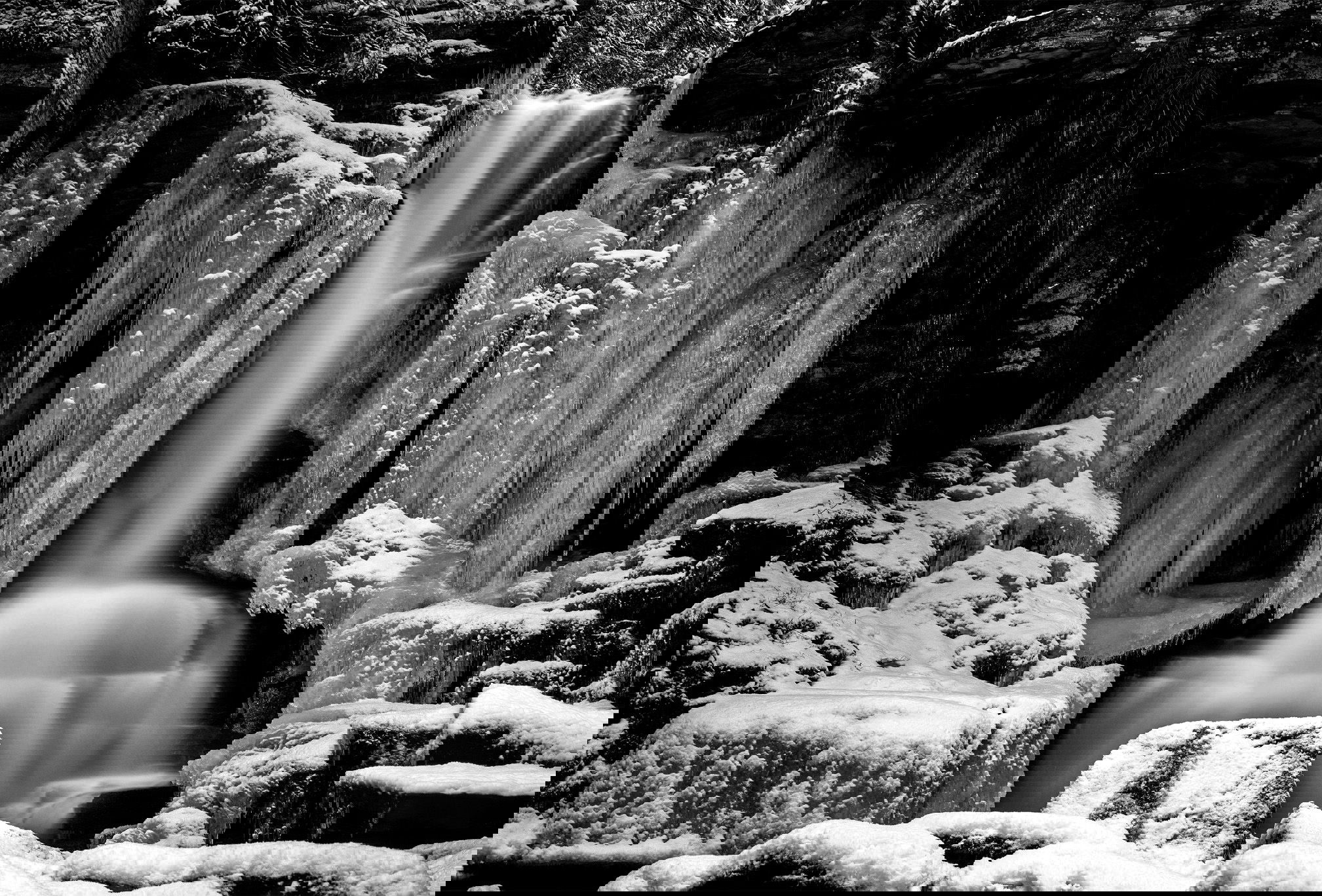
Welcome, Rick. This is a great image to introduce yourself to our community. The rock doesn’t bother me. I kinda like the way it seems to split the falls. A little more detail in the snow and shadows would be nice. The shadows seem to be unrecoverable but there’s still detail to be had in the snow. I realize it was a tricky exposure situation. Doing a little edge patrol, I would probably crop off the sliver of ice on the right. I don’t know whether it’s a good or bad habit, but I always try to find multiple crops in images. I tried a pano format. It’s certainly not better than your exceptional image.
Welcome Rick, this is a wonderful image to get rolling with!
I love the composition, and totally agree about the balance; it’s like an altar. As @Igor_Doncov noted, the ice around the falls adds so much.
I think some waterfalls look good with extreme contrast, but you have so much good stuff around the falls that I agree with the others that less contrast would look better here. I think the foreground rock is an essential piece of the composition, it’s just too bright.
I’d brighten up the water as well, since the natural flow of the composition is to lead the eye to the center.
Small nits on a great image though, well done Rick.
Rick, welcome to NPN – a very gorgeous first post!! Good comments above. I wonder what the view is like from the road, or if it is possible to shoot the same view from a bit higher, to move that center rock a little lower ? But I well know how uncooperative terrain can be when it comes to composition.
Fantastic, @Rick_Pagan. I don’t have anything to add to what’s been said above, but thought I’d chime in with a “nice introduction to your work” kind of comment. FWIW, I’m also a compulsive cropper, and if I were to try a pano crop, it would be to remove the lower sections of rock and snow, so if you are game for another crop, that might be worth trying. Nonetheless, I don’t mind the foreground rock, and I do think it balances the image and keeps us grounded in the center.
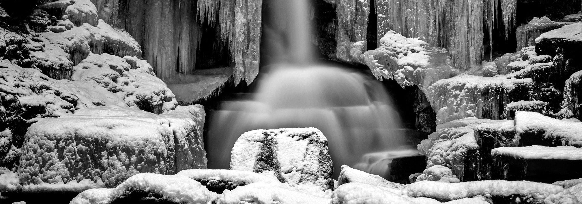
I don’t think either of these crops are better, but I thought I would share anyway, as did Michael:
Welcome Rick! Really great composition and decision to go B&W. As some of the others have said, I think the foreground rock, and maybe all the snow covered areas are too bright . I might try to lessen the brightness there (as per Michael Lowe’s edit) and add some brightness to the waterfall, to better focus the eye on that. Yet another crop option might be to go with a square crop and eliminate the dark rocks on each side. Regardless, it’s a very captivating image as is.
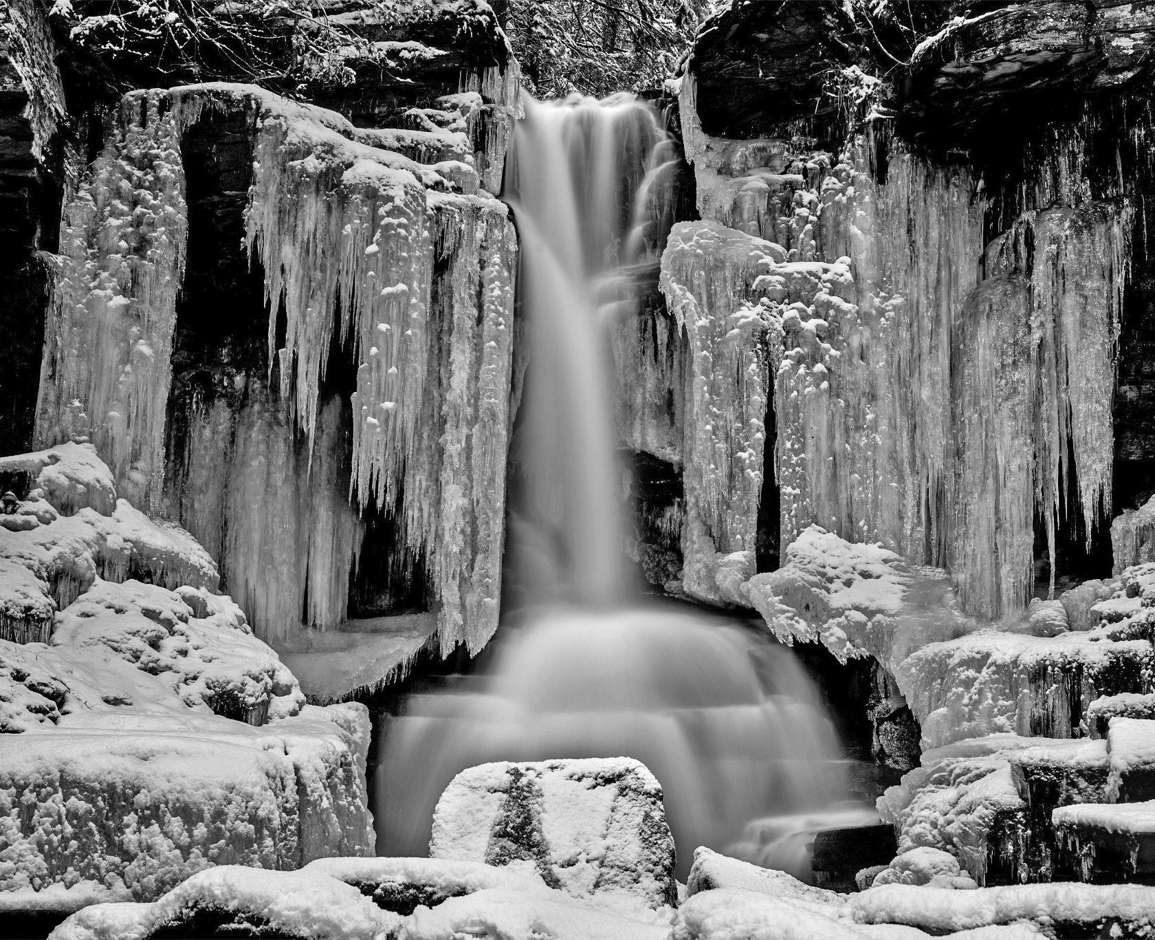
Thanks Michael. I think I can probably get a lot more detail back in those shadows than it appears in the jpeg. I may have gotten a little heavy handed dodging and burning in post… Going to give it a better look when I get home from work. You guys have all given me some great ideas.
Hi Diane. There’s almost no view from the road itself. There is probably 10 or 15 yards of a lightly wooded area between the road and the drop down to the base of the falls. I tried shooting a few shots from up there using some trees as natural framing. There was kind of just too much going on with stray branches and such blocking the view and couldn’t find an appealing angle or shot I liked though.
Hi Rick,
First off welcome to NPN! I think you will enjoy the website and the comradery of like minded individuals.This is certainly a beautiful first post. You have already received some wonderful suggestions from everyone. The FG rock does not bother me other than the snow being a little hot. I am not trying to muddy the waters for you, but I have another crop suggestion for you. I could see cropping a little of the darker edges from the right and left sides so it isn’t quite as dominant. I hope you do not mind, but here is a rework with what I was thinking. Just my opinion of course. I also played around with the shadows/highlights tool a little to even things out.I hope to see more of your participation.
Great comparison. There’s also something very theatrical about this image. It’s like a stage production. That especially true about the most recent crop. I find it all very stimulating.
Hi Ed and thanks for the welcome. I don’t mind you reworking the image at all. I’m here to learn and take my photography to the next level so having a visible reference to suggestions is helpful. I work nights so haven’t been able to play with it yet but in my head, after reading all the advice I’ve gotten, I actually kind of pictured it similar to the crop and adjustments you made. Thanks for taking the time! Can’t wait to get home and start editing lol. I’ll repost whatever I come up with.
I haven’t figured out how to tag a bunch of people in one comment instead of replying to their individual comments yet but I want to thank everyone for taking the time to give constructive criticism. I re-worked the photo a bit. Tightened up the crop, and boosted the shadows quite a bit. I re-did my burn layer completely trying to subtly burn all the snow on the rocks while keeping it looking natural. Also dodged the ice and falls more heavily.
I like what you did with the repost, the crop looks good and you brightened the water and the icicles. I think I would still try to tone down the brightness in the snow as Ed did in his edit. Great work.