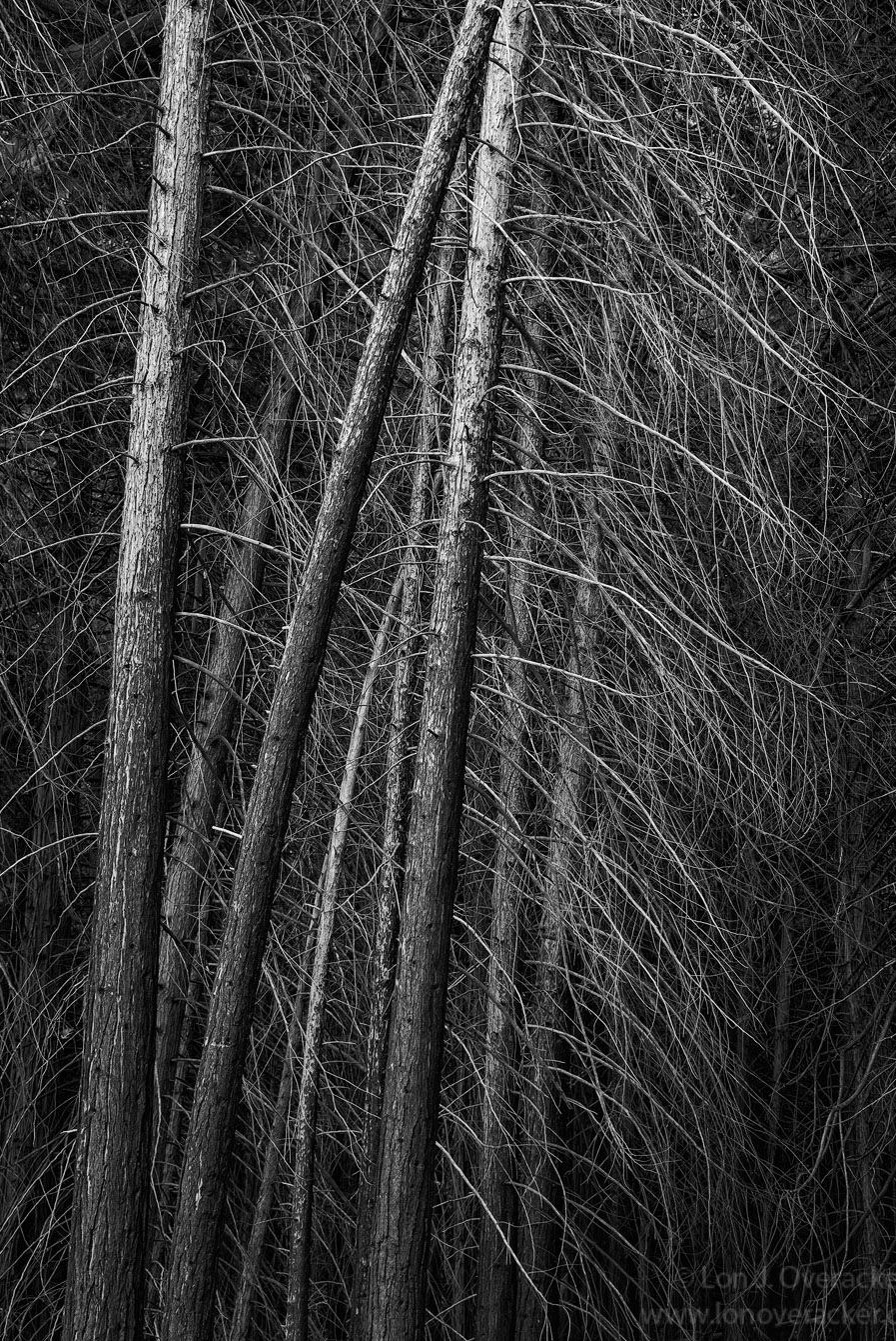
Yup, Yosemite is a a great, if under appreciated destination for fall color. But of course we all know it’s so much more. I’ve been photographing this section of bare cedars for many years; located just past the Swinging Bridge area, directly across from Sentinel Meadow.
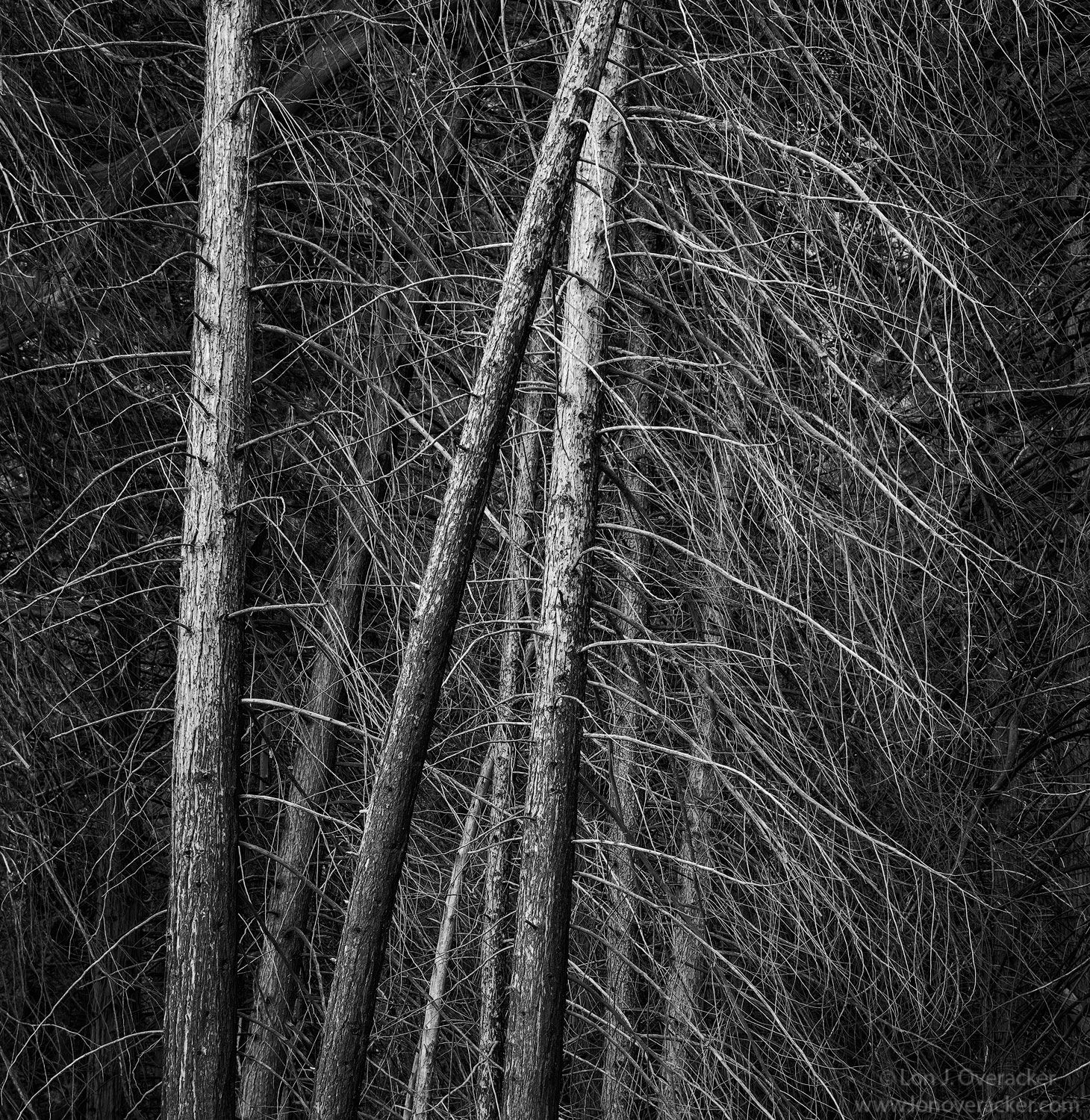
I’m also posting a cropped version and would like to know your preference. Personally, I like the natural (+enhanced) vignetting as well as the odd lean of the trees. Also looking for title suggestions
Sadly, given the horrific fires in CA, I also see this image as a tinder box…
What technical feedback would you like if any?
B&W conversion ok? I continue using the Nik Silver Efex Pro 2 plugin. Noise wasn’t an issue with this particular image.
What artistic feedback would you like if any?
Any/all feedback of course. I’m particularly interested in your preference for the lean of the trees. The cropped version I did a bit a skew to bring them more vertical. But the original is presented “as seen”. Just wondering if the non-vertical view point is an issue for you the viewer.
Any pertinent technical details:
Nikon D800E, Nikon 28-300mm, @68mm f/11 single image
I really like this and for me, absolutely the uncropped version. The full version has a lot more depth and mysterious mood to it compared to the cropped. Great tonal range, too. Excellent image, Mr. Sexton.
While both are superbly done, I am leaning toward the original; pun intended; Lon. The Nik Silver Efex Pro has created a wonderful range of tones in the scene and the vertical format emphasizes the vertical lines of the tree trunks nicely. This also has a wonderful air of mystery to it IMO. Sorry; not coming up with a title for you.
I’m going two ways on this. On the wall, I’d prefer the uncropped. But for a full page in a magazine, I’d much prefer the cropped version to leaving a gutter alongside the full view. There’s even a third option: Shoot it horizontal for a double-truck in a pub. If you planned for the gutter in your layout, it would be a dynamite centerfold.
Either way, it’s terrific. I can’t even imagine it in color. I know your spot well, and I have to confess I’ve never raised the camera to my eye. Clearly my loss!
Lon, I do like both, but for me the cropped version works better. The B&W treatment is the right choice for sure. No suggestions for change beyond the cropped version. As far as a name, I’d be lost on that idea with my first look here…
It looks like the cropped version is pulling ahead, so inspired by the great state of Florida I’ll toss my hat in the ring and vote for the original to keep things controversial. I think the long trunks accentuate the branches better, and the seductive right side of the image that provides contrast is lost.
Lon, this a great subject, but it’s your B&W processing that takes this to another level, the contrast here is just perfect. I’m going to go against the grain and the square-ish crop. I generally prefer trees in a 3:2 ratio, but as originally presented my only nitpick is that I think you have included a little too much at the top. Here is an alternate that retains the original aspect ratio, but takes some off the top and left. It may be a bit tight on the left, but there is room on the right to re-orient it.
Lon, both views work very well, even as they create notably different feelings. I like the uncropped version slightly better as it shows off the complexity of the shapes as well as a stronger sense of movement. The cropped version appears to be more contrasty and a bit brighter in the lightest tones, which changes the mood. (Is that brightness a visual artifact related to the display?)
Thanks @Ed_McGuirk, I like your crop. The good news is that I think there are many options here. As others have mentioned, I think the mood and response is changed a bit with each version.
@Mark_Seaver, actually I cropped early on and ended up with 2 psd files, so they ended up being processed slightly differrently. I believe I did the b&w conversion first, then cropped. But also, using TK’s web sharpening and sizing action I believe I tweaked (levels, burn, etc.) at the resized version so yes, they are slightly different. Good eye!
Lon: Hard choice for me as I do like both and not just blowing sunshine at you. I think I do slightly prefer the cropped version for the classic aspect ratio. As for a title, how about Dry Bones? Great vison and superb presentations. >=))>
Really nice job with the conversion, Lon. The tones a re spot-on. I gotta go with the uncropped version. I love the depth, and the branches give this a fine sense of movement. nicely done!
-P
Gave me a chuckle @Bill_Fach and now I’m Walkin’ on Sunshine… Thanks for the title suggestion too. A good one, thanks.
Thanks @Preston_Birdwell for the comment too. I prefer the uncropped version as well. I just think the long format, the leaning and vignetting give this a little romance and intrigue..

 The Nik Silver Efex Pro has created a wonderful range of tones in the scene and the vertical format emphasizes the vertical lines of the tree trunks nicely. This also has a wonderful air of mystery to it IMO. Sorry; not coming up with a title for you.