"Chaos in the flood" with REPOST

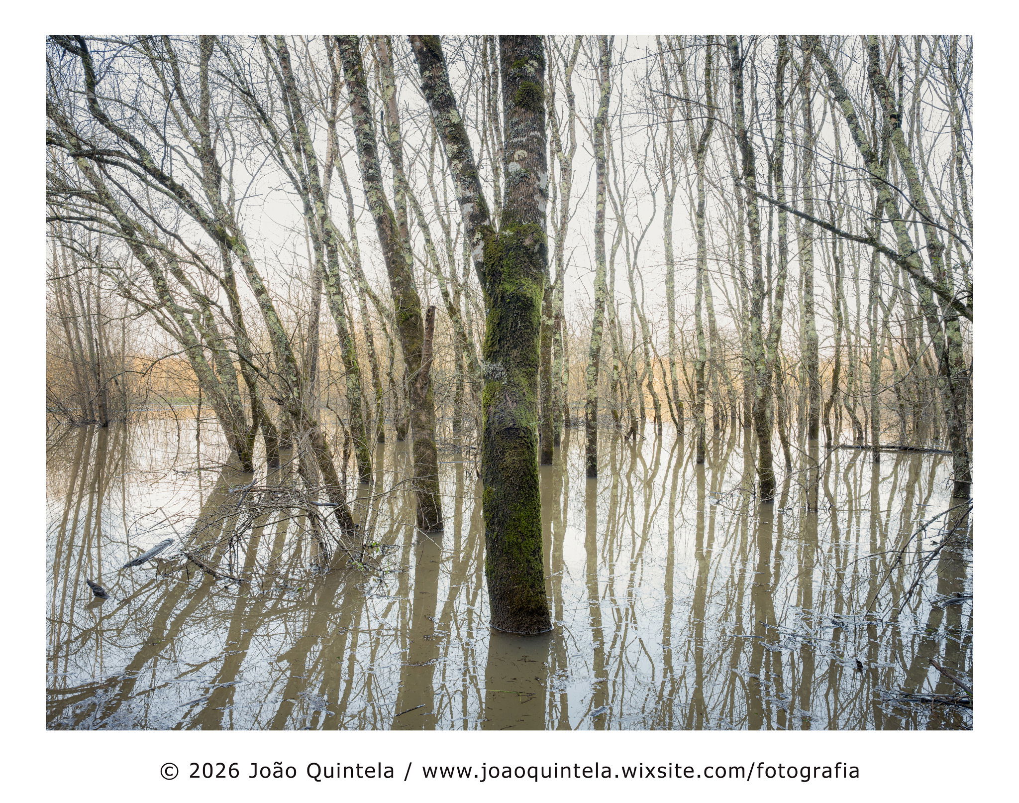
As usual, @Igor_Doncov is spot on, so from the moment I saw it, I couldn’t unsee it…
so I deleted the trunk and a few other horizontal distractions as well in the LRC.

I don’t usually delete such large objects, but in this case I think it really makes a difference.

REPOST with @Igor_Doncov suggestion

Critique Style Requested: Initial Reaction

Please share your immediate response to the image before reading the photographer’s intent (obscured text below) or other comments. The photographer seeks a genuinely unbiased first impression.

Questions to guide your feedback

Does it work for you? I chose to leave the sky almost burnt, without information (actually there is something there, but I chose not to touch it)
What about chaos and the attempt to control it? Does it work?

Other Information

Please leave your feedback before viewing the blurred information below, once you have replied, click to reveal the text and see if your assessment aligns with the photographer. Remember, this if for their benefit to learn what your unbiased reaction is.

Image Description

In recent weeks, Portugal has been severely affected by several storms and depressions causing strong winds and heavy rain. The damage has been terrible, and even today, around 26,000 customers are still without electricity.
Several cities have been severely affected, and the country’s main highway collapsed in the Coimbra area due to the force of the Mondego River.
In the area where I live, it is normal for the Feremetelos lagoon to flood and overflow its banks, but we are used to that here.
After three weeks, the weather took a break, so I was able to go out for a walk, get some fresh air, and take some photos.
This is one of the photos I liked.

Technical Details

Nikon Z7ii
Nikon 24-120

Specific Feedback

.


Critique Template

Use of the template is optional, but it can help spark ideas.

Vision and Purpose:
Conceptual:
Emotional Impact and Mood:
Composition:
Balance and Visual Weight:
Depth and Dimension:
Color:
Lighting:
Processing:
Technical:

1 Like

On first glance, this appeared to be a composite image. It almost looks like an accidental double exposure of film days, especially in the central horizontal band. Even looking more closely, I’m left wondering. For me, you have achieved a sense of chaos—I am confused, if that’s what you were hoping for! But I love the subtle colors, the tan band off in the distance, the sweep of the reflected trees on the left side, and the washed out sky.

Hi Joao,
This is my kind of image and needs to be viewed large to really appreciate all of the textures and details contained in the scene. The image is obviously busy, but you organized it beautifully IMO with all of the vertical lines of the trees and their reflections. I am also enjoying the subdued color palette as well as the slight high key presentation. I was originally going to suggest a crop from the left to get rid of the clump of trees in the BG, but when I did I did not like it as well. I also find the reflections to be a bit mesmerizing. Very nicely done!

Strangely enough I don’t find this to be disordered. What sticks out (pun intended) is the horizontal line that comes in from the right midway down. That seems strange because of all the wood pictured in this image why would I pick on that one.

João. I like this. The lack of texture in the sky and in the reflections puts the emphasis on the trees, with all of their interesting “decorations”. As with @Ed_Lowe, my first reaction was to do something with the clump of trees on the left edge. I don’t think that a crop would work, because that would cut off the leaning trees on that side. An alternative might be to reduce their contrast both in the trees and in their main reflections, but that’s quite a challenge also. To add a repost to your original post, click on the pencil icon, an editing window opens with the first thing shows in the text that inserts your original image (starts with ![…), insert the cursor above that text and press the upload icon. You can add text above or below the new image for further description.

My impression is that when you can bring order to the chaos of forests/trees, the result can be both striking and beautiful. This works very well overall and, as a bit of a side note, I love the way that distant bundle of trees fits into the gap created by the lean of the near trees.

I’m with you. I try very hard to capture an image that I don’t have to remove objects from, but in this case I agree it very much improves that right side.

Joao, the second version is spot on to my eye. I am fascinated by your use of an composition near to symmetry, thereby keeping a lot of tension.

Peter