The photographer is looking for thoughtful feedback on the image as a whole, especially around the areas noted below.
Feedback Focus: Artistic / Expressive
About This Image
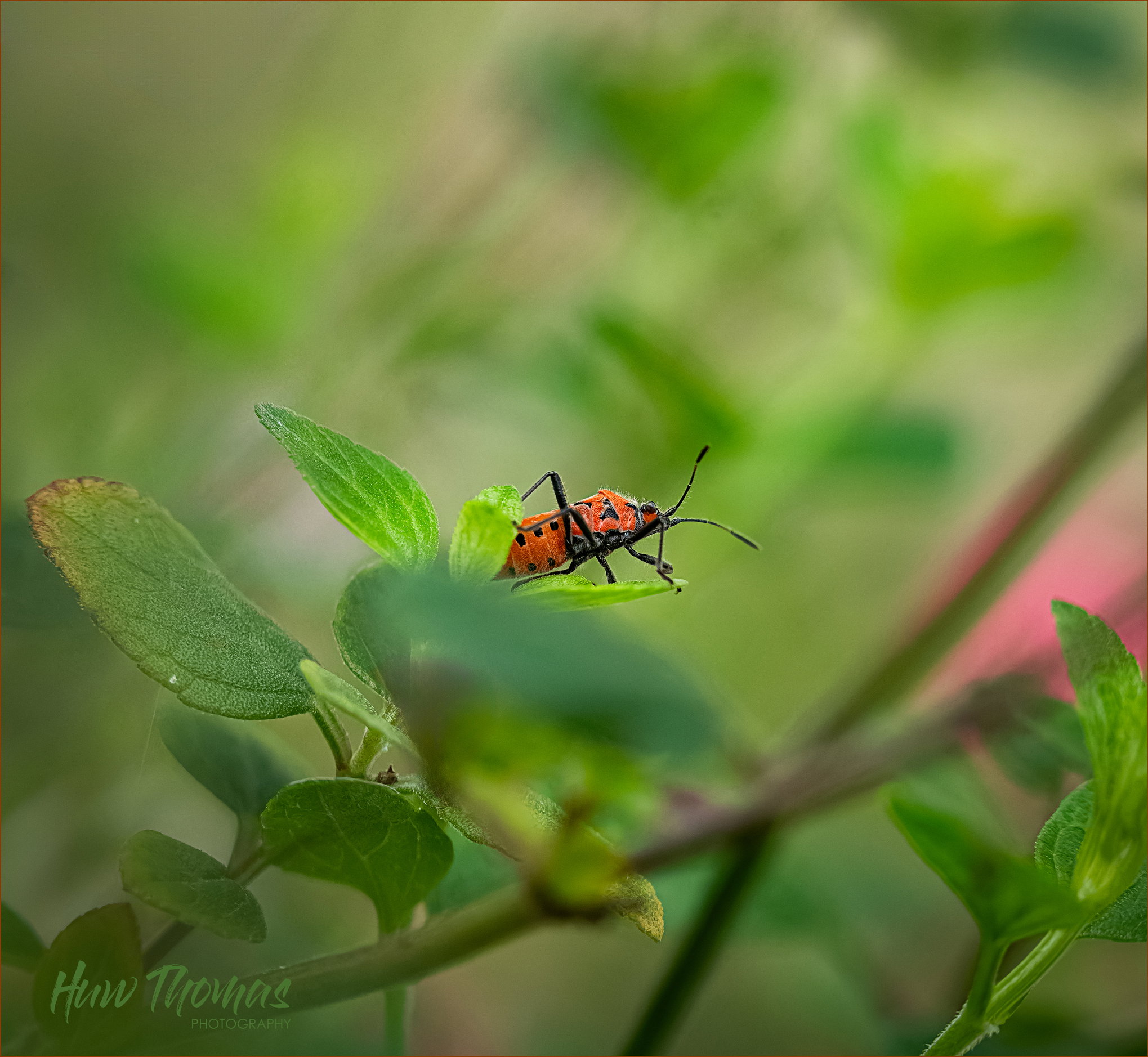
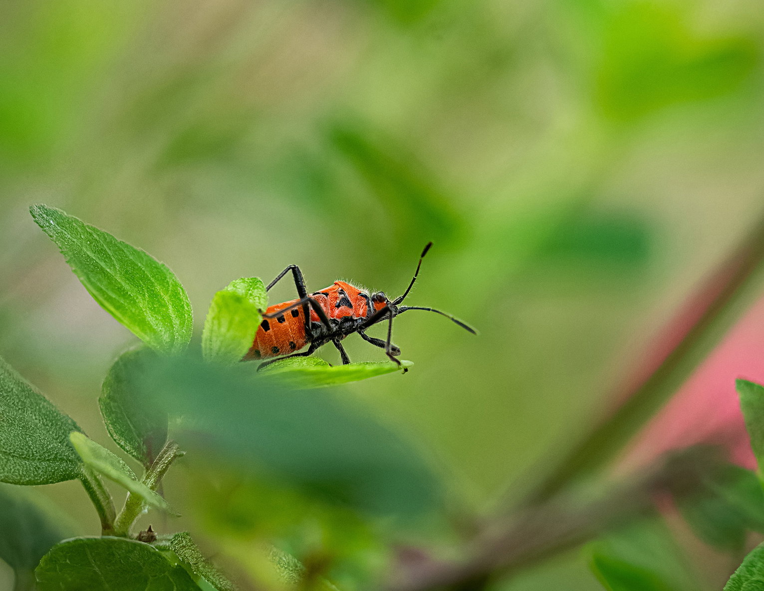
Such a gorgeous coloured bug
Feedback Requested
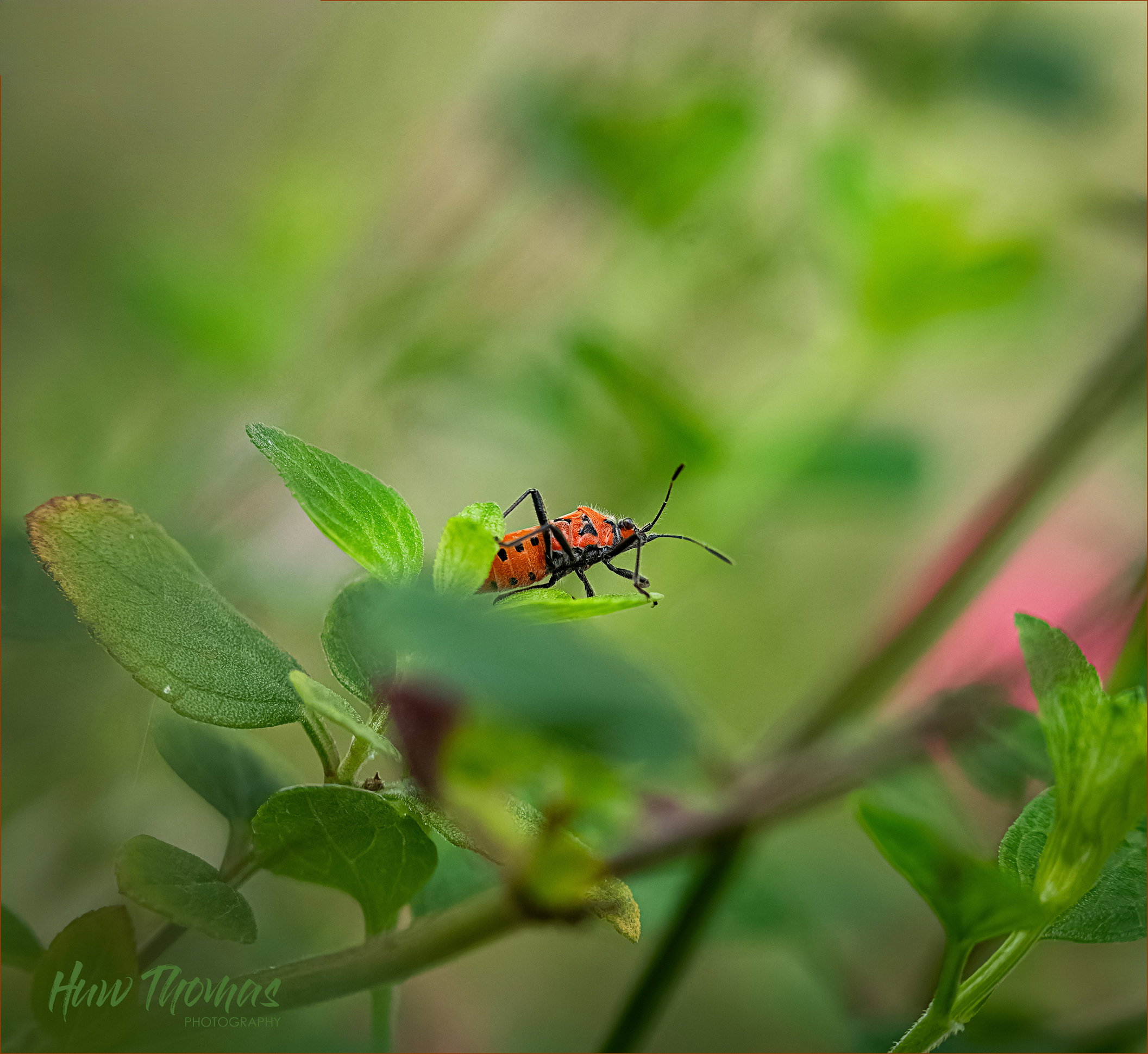
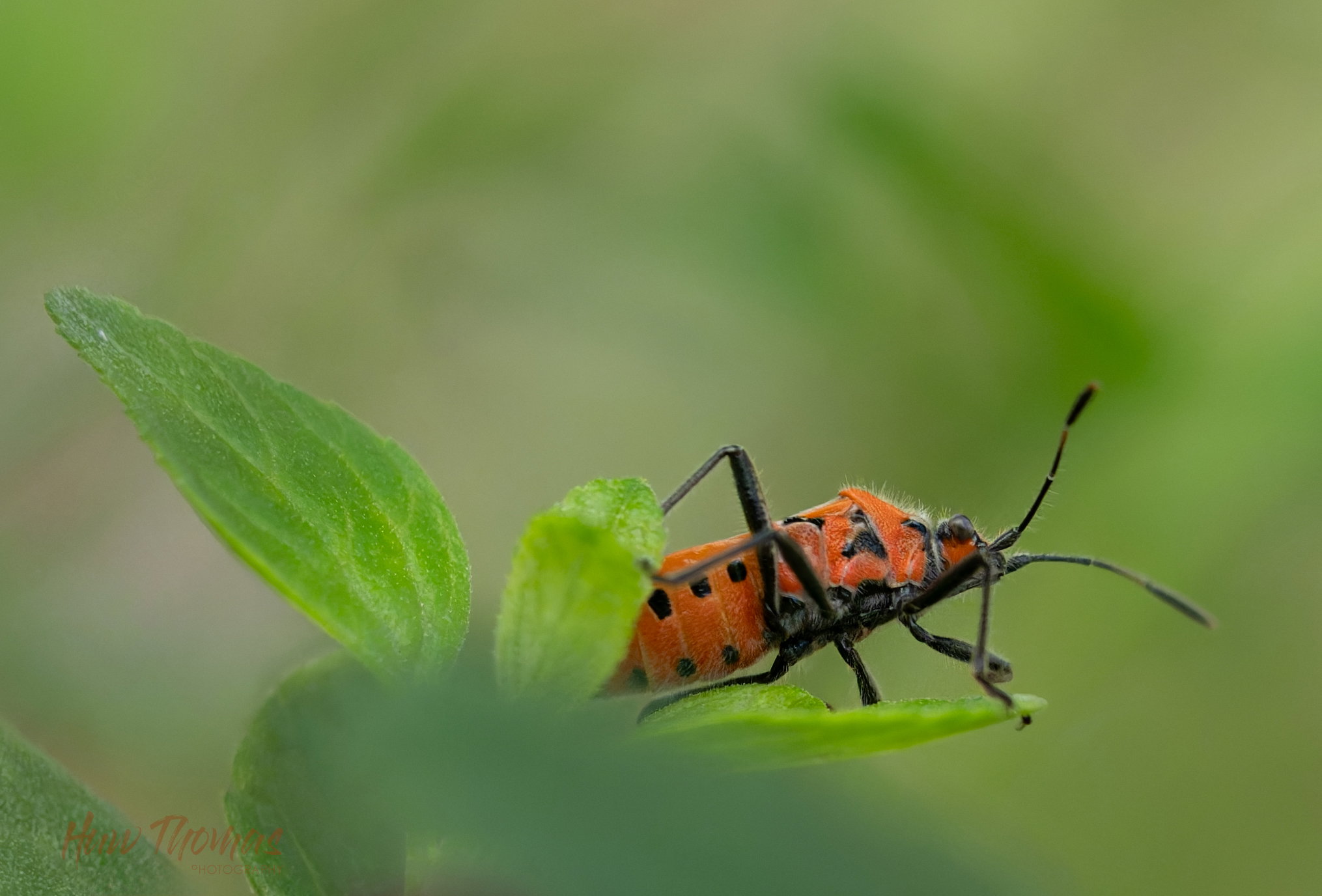
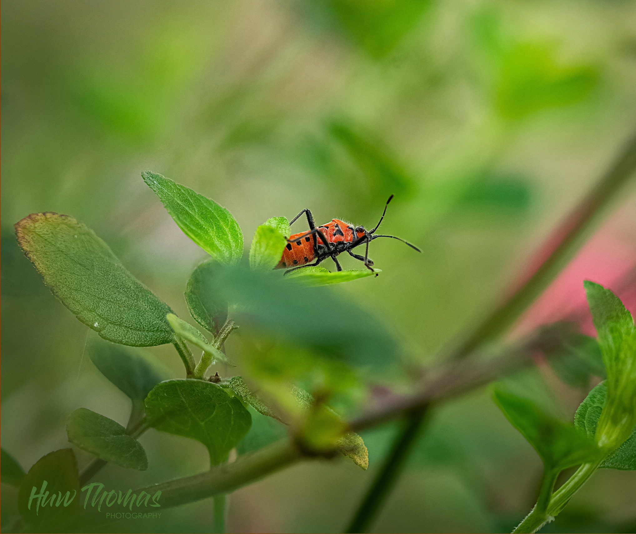
Wider angle or close up?
BG colours too distracting ?? I haven’t really been able to get rid of the flowers below the bug, the purple salvia flower and other OOF stuff
Huw: We have a number of these guys in our garden in the Spring but don’t see them much when it gets hot. Worthy subject indeed although your environmental challenges were tough. I like the tight crop and the detail. From a composition standpoint I would like a bit more room in front of him and less behind although trying to retain all of the leaf is a good point. On the wide angle the dark flower is a major eye magnet and needs to go. I kind of like the OOF pink salvia although I wish it was closer to the critter. Here are a couple variations on the wide shot, one with a tiny crop and one more aggressive. I used AI generative fill in PS to make the dark flower go away. Back to you. >=))>
@Bill_Fach did an awesome job getting rid of the purple flower and I like his tighter crop a lot, Huw. I don’t think I can improve on those suggestions. Just an observation and it may be an optical illusion, but in your post, the oranges don’t seem quite as bright and eye catching in the close-up as they do in the wider view. If it’s an optical illusion, it’s an interesting one that I’ll have to keep in mind.
Nice capture in a pleasing setting! I do like @Bill_Fach 's tweaks. The bug is very slightly different in the two versions, with the smaller one having subtly less contrast and showing more sharpening – possibly from the sharpening that occurs when converting to JPEG. Neither has an embedded (tagged) profile but it does appear to be sRGB. When I open a file in PS I get a warning of missing or mismatched (to my working space) profiles. Having the profile tagged is still important for some browsers and viewers. And opening a file with a profile inadvertently mismatched to a PS workspace will give incorrect contrast and colors.