The photographer is looking for generalized feedback about the aesthetic and technical qualities of their image.
Description
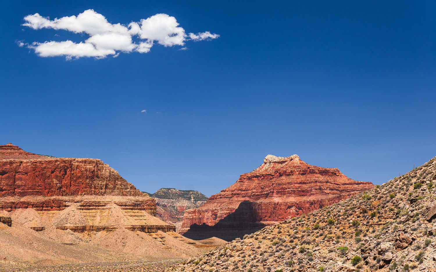
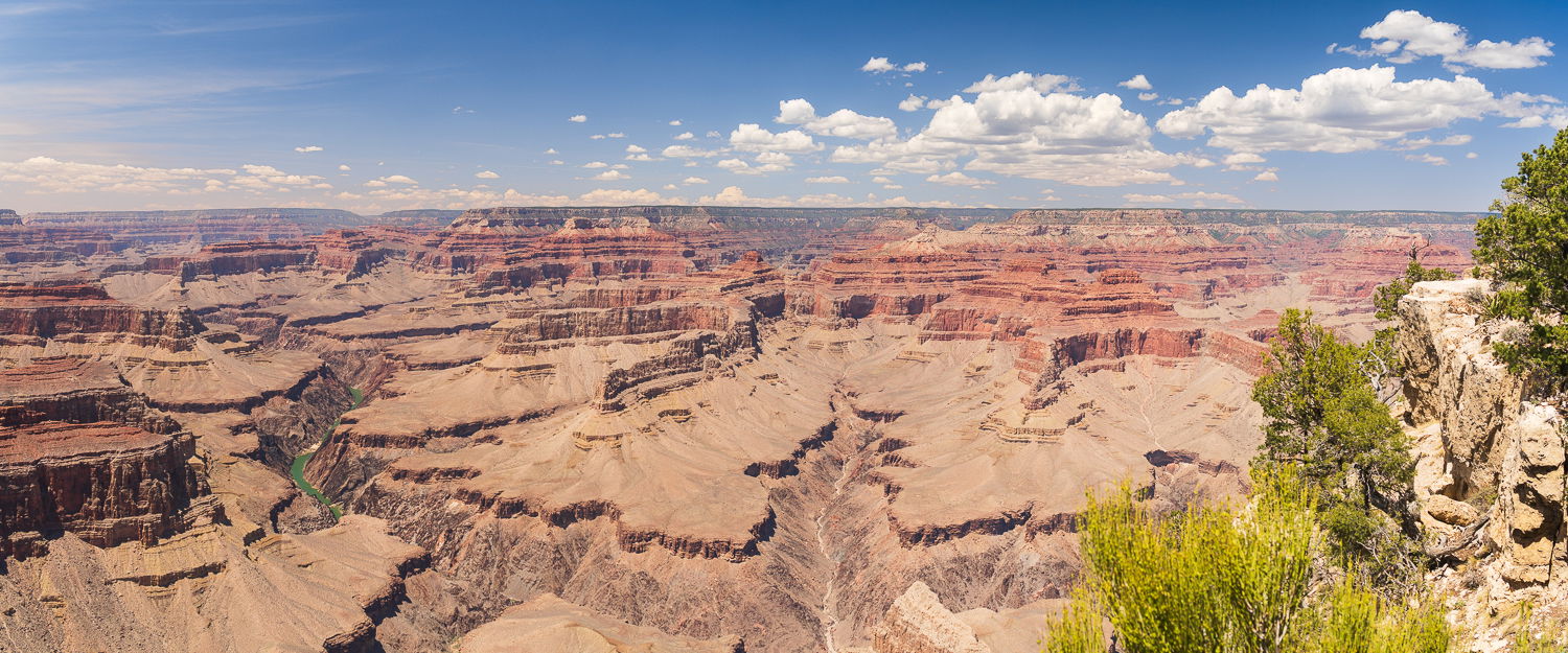
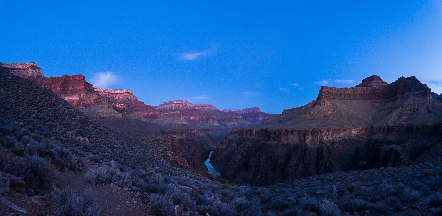
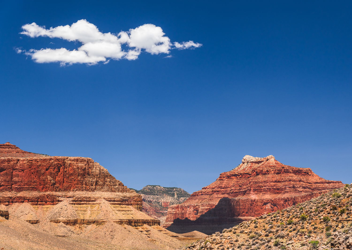
Hello friends! Consider this my comeback image after a few months hiatus
I went on a solo four-night backpacking trip at the Grand Canyon last month, which was wonderful and challenging. I took many photos, this just happens to be the one I edited most recently and wanted to share.
I enjoy the simplicity of the composition and the contrast of the white clouds with the shadow they case on the cliffs.
Specific Feedback
Too saturated? Contrast & colors look OK? Does the composition feel imbalanced? (I wonder if it’s too heavy toward the left.) I used the tone curve for all the heavy lifting on this photo, which is not my normal workflow. So I’m still calibrating my internal sense when using it, any feedback appreciated.
Technical Details
Camera: Sony a6600
Lens: Sigma 18-50 @ 38.7mm
Settings: 1/160s, ISO 100, f/7.1
Critique Template
Use of the template is optional, but it can help spark ideas.
This image brings to mind the “old west” when travel was by horse. Too saturated did not come to mind for me. It does remind me of shooting Fuji Vevia which in the days of film was a richly saturated film used by many landscape photographers. I could see some might feel this is “unbalanced” but the foreground slope on the right, to my eye, contrasts and balances the butte and cloud on the left, maybe not in the literal sense but for me this works.
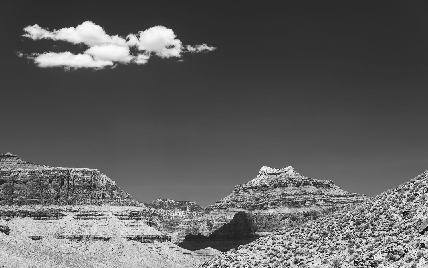
This looks like mid-day and I might experiment with a BW conversion to take advantage of the lighting and have a little fun thinking back to the Wild West days! Otherwise, this is a fine representation of the South West and a memory of your adventure!
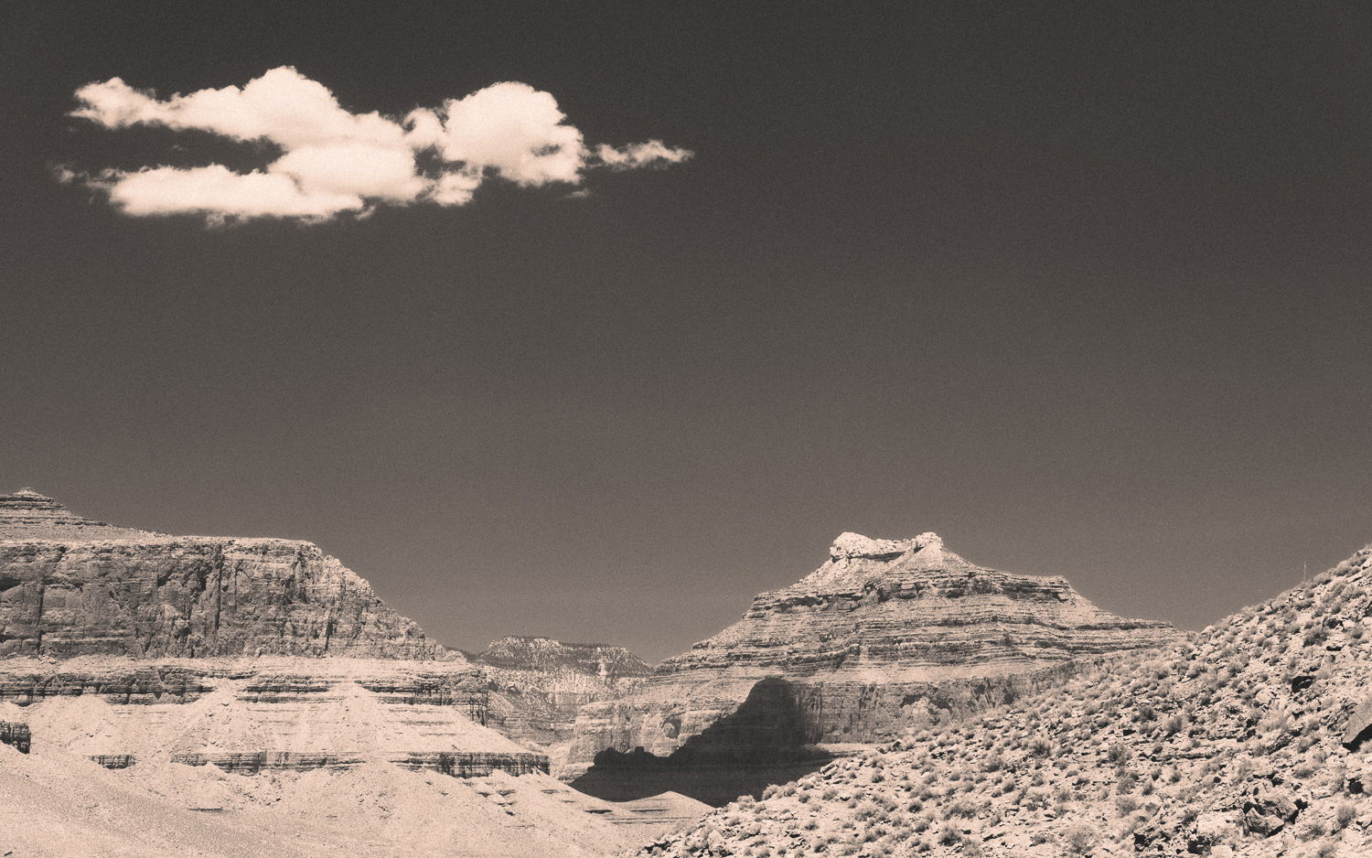
I’m with Keith regarding the “old west,” almost to the point of iconic - all that is missing is a couple of characters on horseback. Even a sepia-toned version could emphasize that nostalgia even more.
But of course, that wasn’t necessarily your intention or reaction to the scene. I think this works nicely as the grand landscape that it is. I must say for me the cloud really makes the image. Without it, I’d say crop to a pano. But really I think the cloud and the slope on the right balance the weight of the image. I also like the color contrast between the earth tones and the bluebird sky. And no, I don’t think oversaturated, but certainly blue skies are open to personal preferences and interpretations. You’ve done well in processing this one.
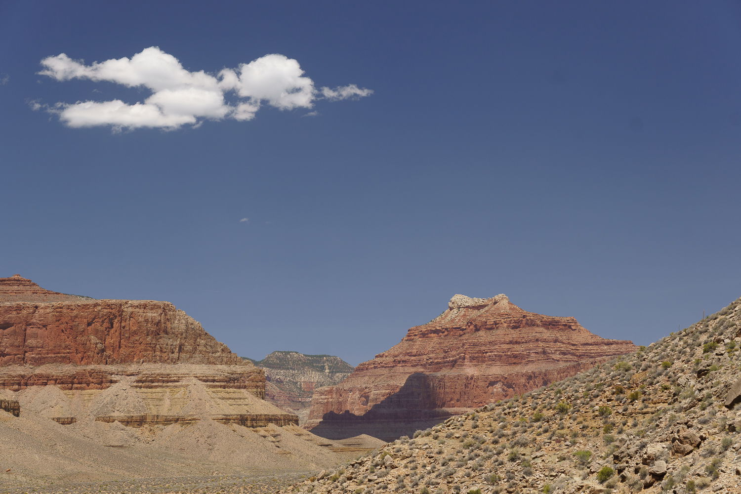
I only have a couple very small suggestions. The striations in the buttes are slanted a bit - Yeah, Yeah, I know the landscape and sedimentary layers are NOT necessarily level, and in fact most of the time are probably not level. So that takes us to mental exercise of wanting it to be level. The second thing is that I’m wondering if adding a small amount of sky above would give that cloud some breathing room. Not everyone is comfortable with that kind of edit. I get it. Very minor thoughts - call them tweaks to an otherwise excellent capture.
This is a very graphic image of the desert environment, including the cloud. The color and saturation are fine to my eye.
I do have two items to note: First, there is a tiny bit of cloud just below the large cloud that for some reason grabs my eye. Second, the cloud shadow on the butte is very dense, almost dead black. I would think that we should be able to see more detail there.
I like the various angles and textures of the strata. It would be interesting to see some more shots from your trip.
-P
I personally like the color contrast in the original, but it’s fun to give it a try!
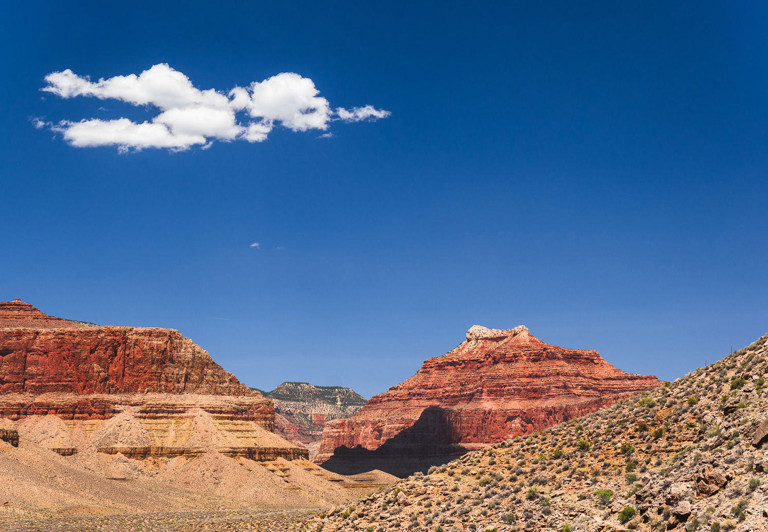
Lon and Preston, thanks for the suggestions. I had noticed subconsciously the same things you both called out, here’s my updated version taking into account your suggestions and a bit more:
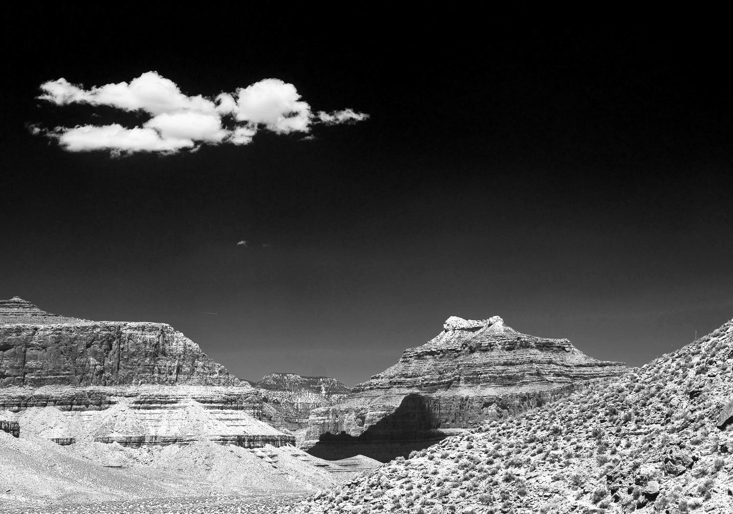
Matthew, Here’s an example of making a B&W conversion as Keith suggested along with Len’s addition of more real estate at the top to create more breathing room. I think the B&W complements the nice dark shadow in the center here. There are lots of ways to make B&W conversions. I used the TK Magic Mixer - available for the TK9 Plugin for Photoshop. Nice image.
I’m gonna go against the grain here. I do feel the image is a little unbalanced and left heavy. I do agree with the others about maybe adding a little canvas to the top and cloning out that little stray spot of cloud beneath the main cloud. I also feel the shadow looks a little weird. Almost too well defined and dark if that makes any sense. Still an enjoyable photo.
@Larry_Greenbaum@Michael_Lowe thank you for your comments! Larry, I like the BW conversion you posted. It goes way further darkening the sky than my natural inclination (as you can see from the one I posted above), but I like the otherworldly result.
Thank you Michael, I go back and forth on the balance. I tried cropping a bit from the right and I think it feels more balanced? As a nice side effect, it frames out a couple mildly distracting plants poking up from the hillside in the original.
Matthew, to my eye, it looks much more natural in the raw file. I can see more detail in the cliffs. It’s probably just a side effect of being more saturated/darkened after processing.
Hi Matthew,
You have gotten some great suggestions so far and have several directions that you can take this image; which is a good thing. I am not trying to muddy the waters for you, but for FWIW I could see just a little less blue saturation in the sky of your last color rework. Just my opinion of course as the blue may have been that intense. For me the crop works really well and I love that cloud as it reminds me of the starship USS Enterprise.
Maybe a bit late to the discussion here, but having just returned from a raft trip down the Grand Canyon, I had to reply. Matthew, I can attest that your colors are spot-on as to representing the reality of the colors of the rocks and the sky. If you are intending to be representational, you certainly have captured it well. I do like the re-crop in your June 27 post and the dodging up of the shadow to show some of the detail evident in the RAW. The cloud certainly belongs there and is necessary for a balanced composition. It’s beautiful country and you have presented it well.