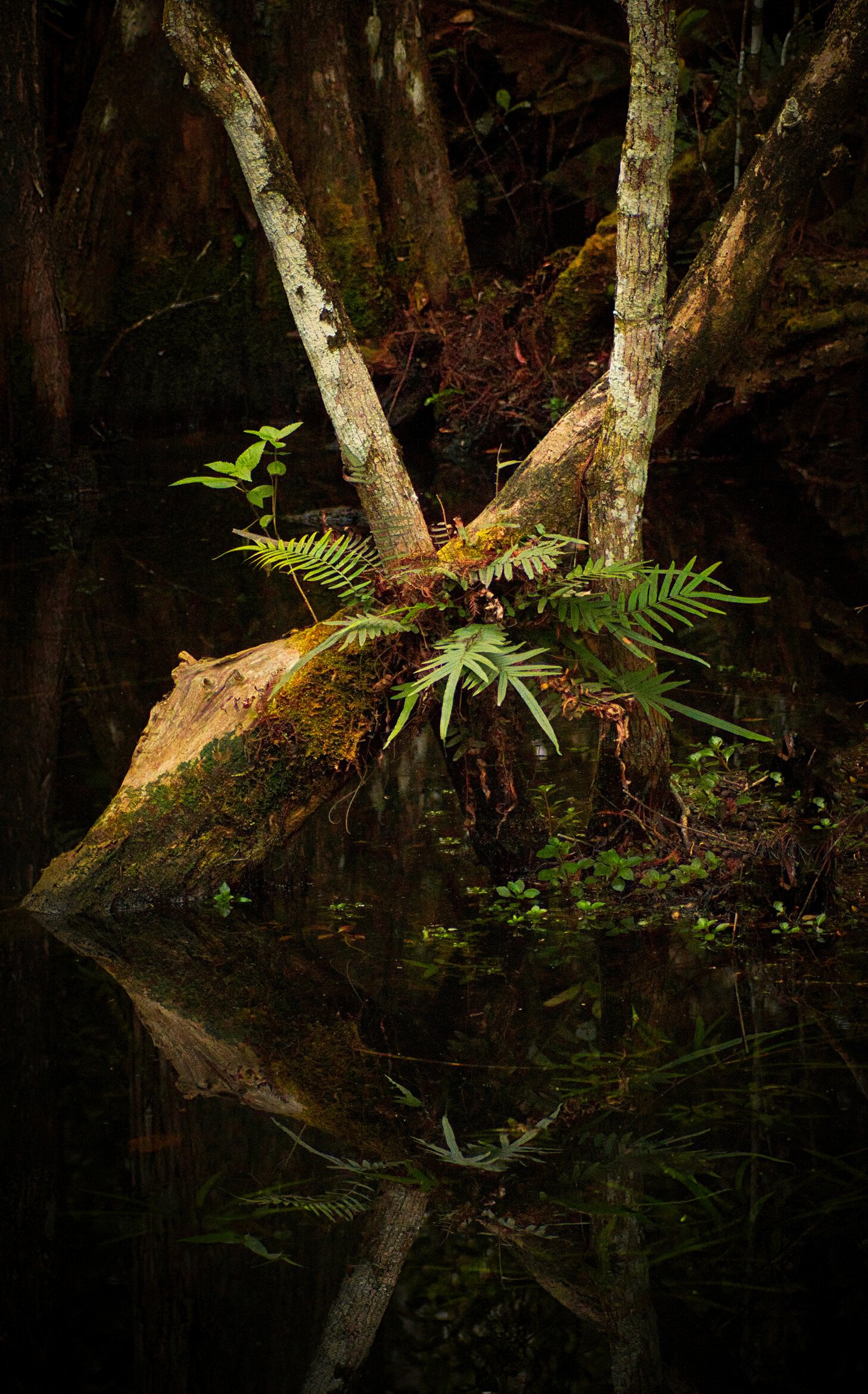
I went down to the Big Cypress to see the damage done by recent hurricanes. Glad to report very little damage. While there, I went to visit my friend Scott who does swamp walks for Clyde Butcher and is a Florida Naturalist. When I arrived, Scott was still out on a guide, so I started making images at Leon’s Pond, which is next to Clyde Butcher’s Big Cypress Gallery.
While working, I started a conversation with another photographer who stopped in. It turns out she is a member of NPN also. I forgot her name, so if you see this, let me know.
Type of Critique Requested
Aesthetic: Feedback on the overall visual appeal of the image, including its color, lighting, cropping, and composition.
Conceptual: Feedback on the message and story conveyed by the image.
Emotional: Feedback on the emotional impact and artistic value of the image.
I love the simplicity of this image. The bottom reflection I feel could have a bit more room to breathe, so not sure if you have more there that was cropped or not.
Great tribute to Mr. Butcher! The only thing to improve there would be to take it all the way to b&w!
I appreciate the subdued light and colors. I’m pretty sure you processed with that intent and it’s working well.
Emotionally, I think the presentation is quite somber - which I think appropriate. It’s a scene where you most certainly don’t want to go bold and vibrant. That’s appreciated here.
Only nit/suggestion echo’s Matt’s comment about the lower reflection. And actually the partial reflection of the fern at the bottom. For me anyway, it’s right on the border of my own personal guideline: If you’re going to include something, make it on purpose. Or in other words, the element right on the edge either needs more room, or might be excluded all together. It draws the eye away from the primary message. Having said that, it’s not a deal killer by any stretch, just an observation.
Thanks for taking the time and posting the rework. Ahhhh, the added room at the bottom really helps - at least for my impression.
I’m curious as to your change in processing. Would you mind elaborating on your changes? I think the results are very good and had this been your original I would have been quite content and had very little to offer in terms of changes. But now I have the muted, subdued image still impressing upon me.
So, curious as to your thoughts - not only about the feedback, but your thoughts in reworking the image.