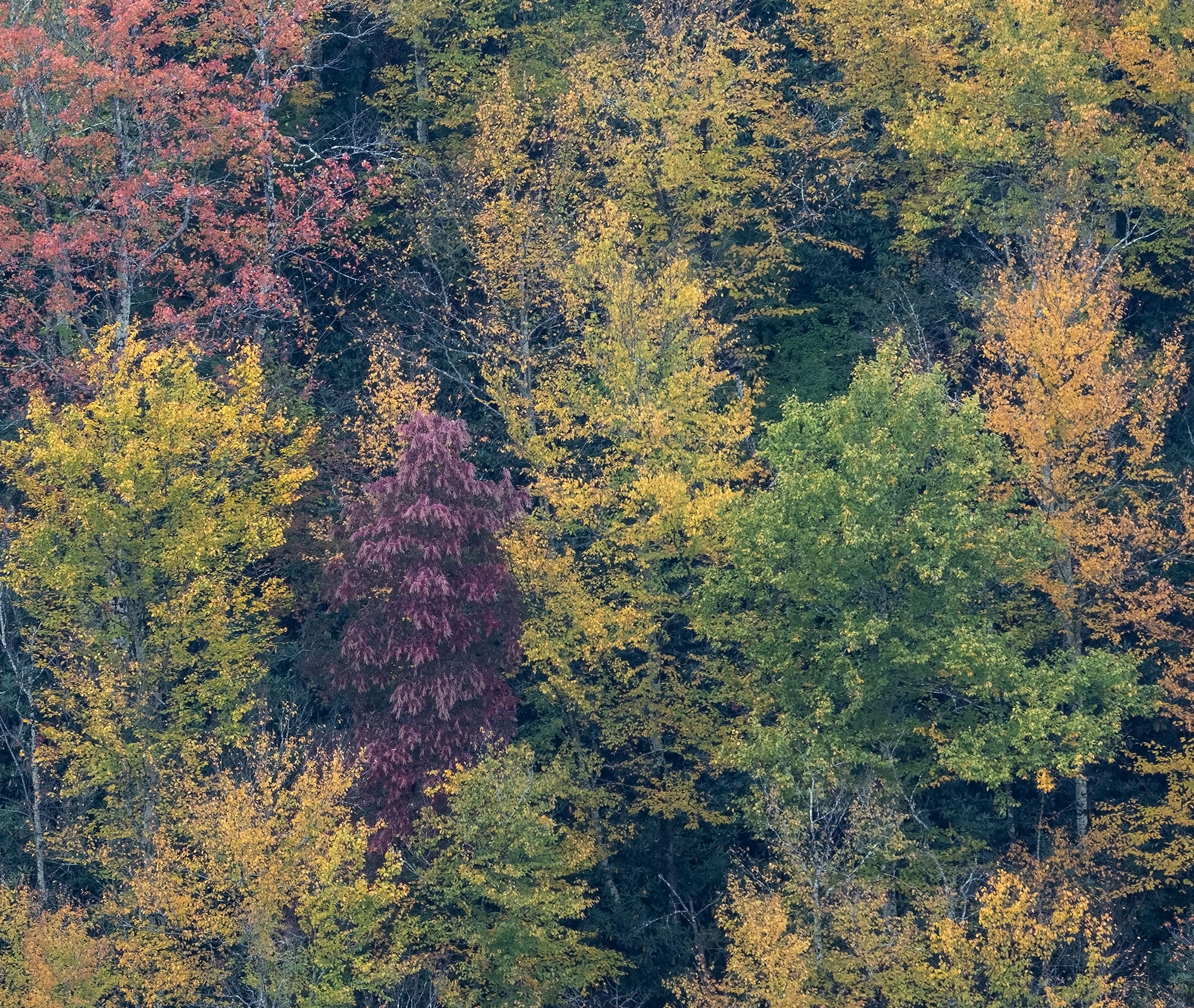
The photographer is looking for thoughtful feedback on the image as a whole, especially around the areas noted below.
Feedback Focus: Artistic / Expressive
About This Image
I do not know about other nature photographers, but sometimes I find myself being jaded with past photography successes at a particular location. Case in point; a visit to Blackwater Falls SP, WV in October of 2025. On that particular visit Mike and I were graced with some magical fog/mist conditions which produced some amazing moody atmospheric images IMO. Fast forward to a few days ago to another trip to Blackwater. We pretty much had peak foliage conditions, a very light drizzle and some fog, although not as stellar as the prior year. At first I was a little bummed about the fog and just not feeling it, even though I went through the motions. It was after I got home and started to really look at the images that I realized even though I did not get any wow images; like the year before; what I captured was the softer side of fall and just as pleasing. This particular scene is a crop from the original. What originally caught my eye was the array of colors that the changing fall leaves can produce. I hope everyone can enjoy these just as much as a flashier scene.
Feedback Requested
Does the softer side of fall come through with this scene? Anything else you notice please feel free to mention it.
Technical Details
Camera: NIKON Z 7
Lens: NIKKOR Z 100-400mm f/4.5-5.6 VR S
Focal length: 250mm
Shutter speed: 1/30s
Aperture: f/11
ISO: 400
This is sweet, Ed. I really like the vibe. A nice mix of pleasing colors. Forest photography is very difficult to succeed at. It’s really hard to simplify it down to it’s essence. You’ve found a nice composition out of all the chaos.
Ed: It’s often said that familiarity breeds contempt but for a photographer familiarity breeds opportunity and a knowledge of your subject that comes out in the final results. The color palette here is marvelous especially because it’s not some hyper saturated cacophony. The different leaf textures are also very pleasing. Well seen and very nicely captured and presented. >=))>
Ed, a very nice image. What impresses me is the diversity of the color palette. You really have it all. And as a result I don’t think the color needs to be amped up. It works well as a softer contrast image.
I really like the varied color palette in this image, Ed. It does come across as a very peaceful fall image.
I can’t seem to get the area mark-up to work today, but there area couple of brighter twigs, one on the left edge and one on the right that you might want to remove.
Ed, I too think that the diversity of gentle colors makes this an excellent fall color photo. The fact that it doesn’t “pop” means that the viewer will need to spend some time looking and I am thoroughly enjoying scrolling through the largest view, looking at the details. The variety of colors is amazing, purple, orange, multiple yellows and greens. The diversity of shapes add interest, also, especially that purple tree a bit left of center.
I like the way the colors are spread from the darker greens to the copper tones and then a bit of yellow/orange all in one square photograph! The softness you mention is one of the aspects I appreciate the most. Over saturated or sharpened colors for my eye are never as pleasing as the softer image you’ve captured. It’s the perfect type of photo for a telephoto lens!