Critique Style Requested: Standard
The photographer is looking for generalized feedback about the aesthetic and technical qualities of their image.
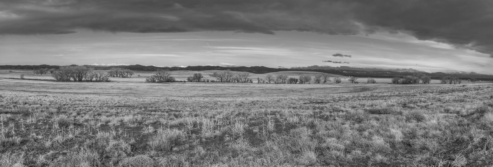
Description
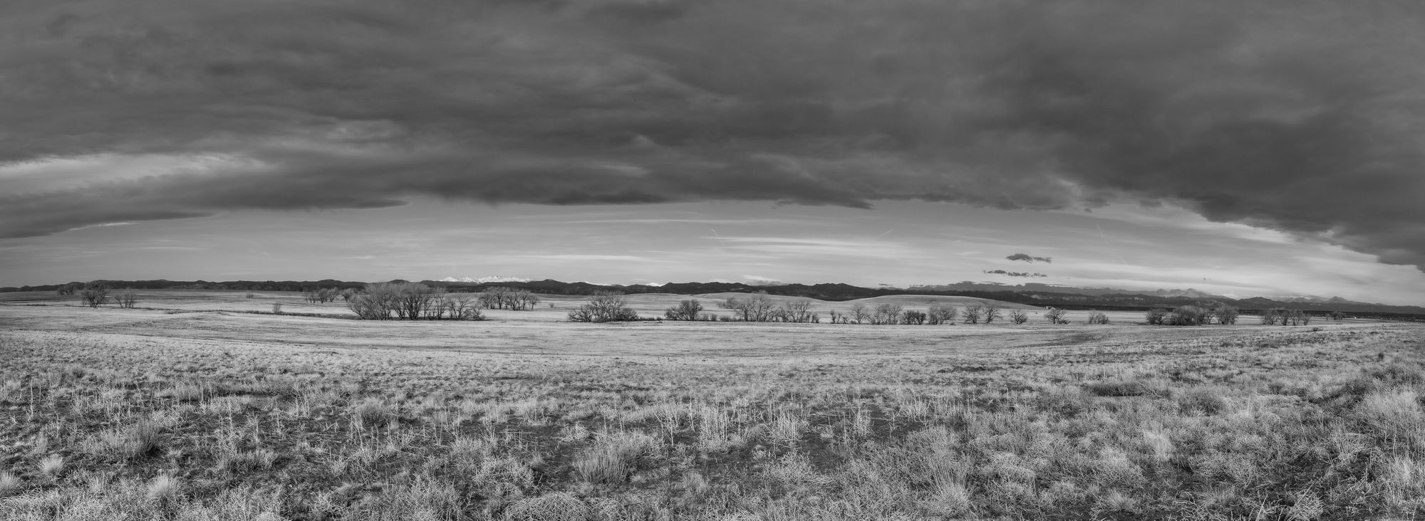
The Rocky Mountain Arsenal Wildlife Refuge sits approximately 10 miles from downtown Denver. Managed by the U.S. Fish & Wildlife Service, the refuge has over 15,000 acres and was transformed over time from farmland to a war-time manufacturing site, to a wildlife sanctuary.
Having the refuge 30 min from me makes it a great place to visit and photograph with abundant wildlife, lakes, and trails. I have photographed this site numerous times and always find opportunities to photograph, like this image. “Colorado Prairie” was photographed back in April 2019 just after sunrise. What struck me for this image is the large mountain wave cloud. The open plains of Colorado situated and surrounded by large developments and close to Denver International Airport, is what strikes me, in that we have a wildlife refuge that survives urban growth.
Specific Feedback
Feedback questions:
- Looking for feedback on size, clarity, lighting, tonal range, contrast, cloud separation.
- Does the panoramic crop feel balanced?
- Are there any visual distractions?
- Is the horizon placement working, or would a higher or lower horizon work better?
Technical Details
- Camera and Settings: Canon EOS T3: ISO 100; Tv 1/100s, f/13
- Lens: Tamron 10-24mm f/3.5-4.5 DiII at 24mm focal length
- Techniques: Handheld with panning Left to Right overlapping each image by 1/3 to help with merging/stitching later.
- Utilized Lr for all post work - Converted from Color to Black and White. Merged 18 images to create the panorama, then adjusted using the Lr Sliders. I always use Adobe Landscape as the profile which does some auto correction initially and then I will adjust as needed. After converting to B&W, is did adjust the color sliders using the rgb color section to enhance the blues, orange, yellows and greens.
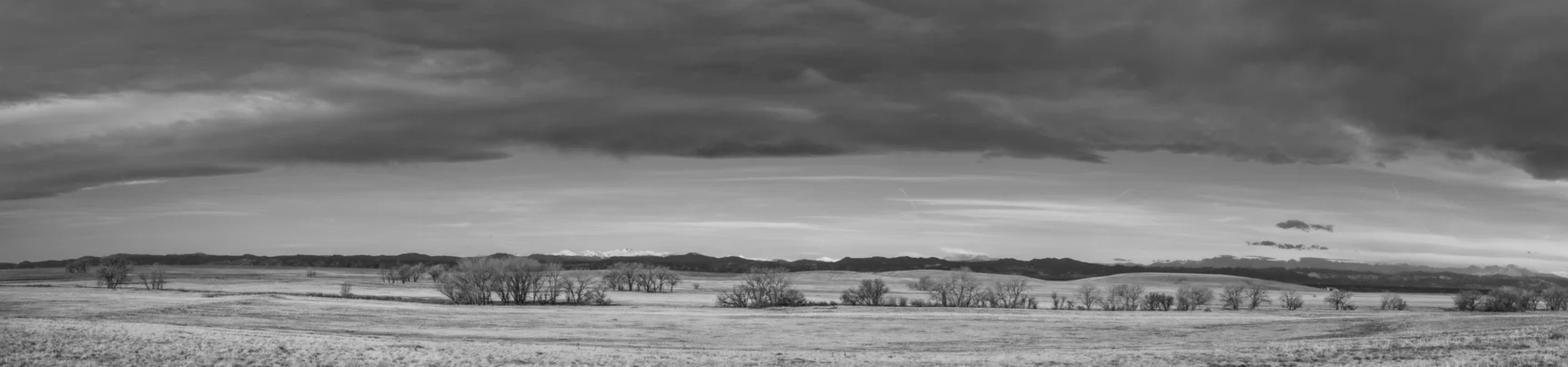
Hello, Todd. I do like the sense of openness and vastness of the prairie. The crop feels balanced. the horizon placement I think is fine. Regarding visual distractions, I feel all the curves produced by the pano blend are a little distracting. I would probably warp them back in PS. I feel some more contrast could be applied. The histogram seems bunched up around the mid tones. I feel the image is almost a little too wide. It’s hard to discern what the subject is. These are just my personal opinions of course.
1 Like
I’m a Denver native and love to go there when I’m back in town. I think you captured the essence of the place , the praise grasses, cottonwood trees, with the foothills and the snow covered peaks in the distance. Presenting a pano also gives the scale of the prairie east of Denver. I think the compositional balance is pretty good, I might be tempted to crop off the bottom a little bit to eliminate some of the bare ground. I do agree with Michael about the curve created by the pano, but it wasn’t too distracting to me. Clicking on the larger image really helped with the tonal range and getting to see all the detail. It is a difficult B&W image to handle because everything out there is mid tones, maybe the clouds could go a little darker, but you handled it really well in my opinion. I think this image printed large would be fantastic.
1 Like
Hi Todd,
Nice work with a challenging subject. The prairie is so vast that we get a kind of diffusion of impact when viewers unfamiliar with the area see such an image. I had to come back to it to see what others thought. I love the sense of a vast prairie with a looming cloud.
I agree that a bit more contrast is a good idea, maybe even texture, if you use LR. Not sure what that would be in PS. I also think a crop off the bottom is a good idea. I think you want to show the prairie, but the line of trees become so small, and the hint of the mountains doesn’t get much attention at all.
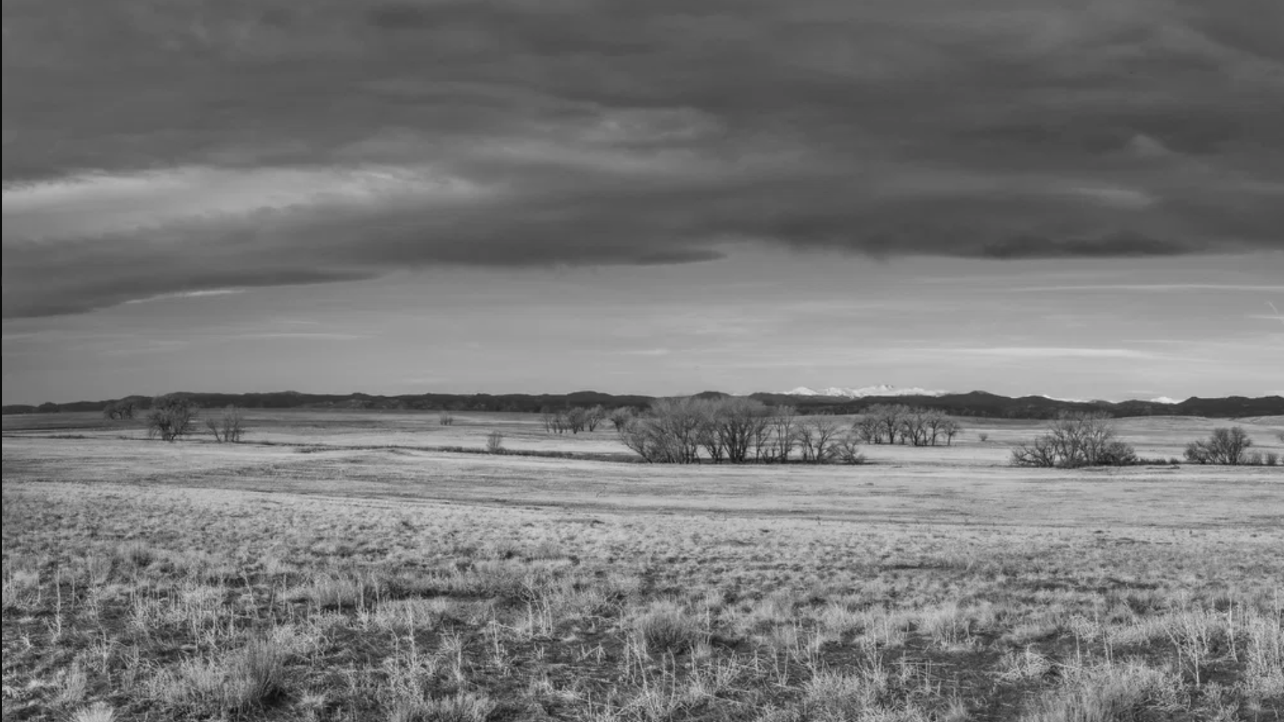
I hate to recommend this after all of that work on a pano stitch, but I think a less wide view would be more impactful. Here are a few options:
-
A crop mainly off the bottom and a tish of the side
-
A good bit less wide
-
More foreground and less horizon
The great news is you have plenty to play with here.
ML
1 Like
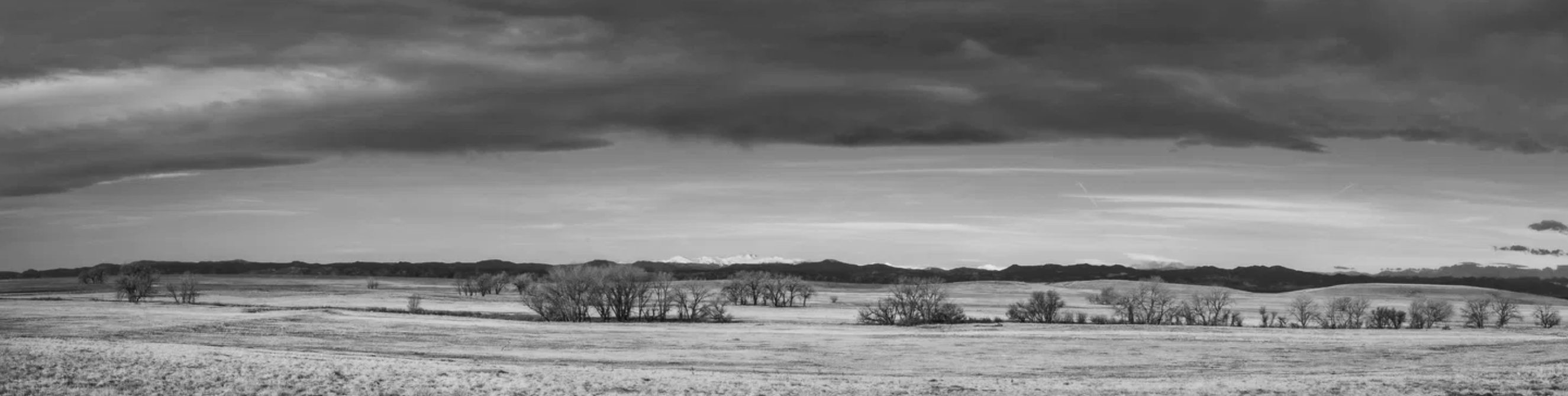
Todd, this does capture the wide open feel of the prairie. However, like the others, the two offsetting curves (clouds and foreground) feel like this was taken through a cylindrical lens. I especially like the foreground with the details in the grasses and the scattered trees. Having the high peaks white with snow if a nice touch. I suggest including less sky, to deemphasize the curved edge of the major cloud and modest reducing of the width. I did a mid-tone selection and then pulled up the tone curve, to my great surprise that resulted in more contrast in the foreground, which I like.
Here’s a look..
1 Like
Driving west into Colorado from Nebraska, I always found it fascinating how tiny the front range would initially appear, and how that little line of mountains would seemingly stretch forever both north and south. This image captures that impression nicely.
Personally I like the “eye” effect that the pano created by curving the clouds and foreground grass, but a more cylindrical stitch might reduce that warping if desired.
I agree with Marilynn that there are some nice snippets in the bigger image.
As to size, I wish it was larger. One of the reasons to stitch is detail, and at 732 px tall a lot is lost in that regard.
Clarity/lighting/tonal range/contrast seem fine in my book. I’m not sure what you mean by cloud separation, but the clouds also seem fine to me. (I like the way they provide symmetry with the foreground grass. That little jag of darker earth in the bottom right corner snags my eye a bit, but not really a big deal.
1 Like
@Scott_Fricke - Thank you so much for the feedback. I will definitely retake a look at how to crop the bottom up a bit more. I think I’d like to see it printed as well. We shall see. Todd
@John_Williams Awesome feedback! Thank you so much. I think with the image itself, going too big, would have not allowed me to post. When I downloaded this to my computer as TIF, it came out to be 88mb in size at 7000x2215 with the dimensions.
Now I notice the foreground and grass appears a little concaved, whereas the clouds are convexed and wonder if that is due to the number of images stretched to create the pano.
@Mark_Seaver - Wow! Comparing this updated image to the original, I can definitely see the differences. I really like the tonality in this image. Looking at the original, it has more of a silver/blue tone to it vs the truer monochromatic feel with the contrast changes. I agree, less sky makes this image more pleasing to the eye, and I like bringing down the clouds/sky more to really bring in the foreground.
@Marylynne_Diggs Great suggestions and sincerely appreciated. I got to thinking more about your critique and wonder if this could be an image that would be a good Diptych or Tryptic with a small amount of separation between the images? I can see this becoming three individual images with varying degrees of views. You provided a lot to think about. Thank you!
@Michael_Lowe All great points! With 17 images stitched and stacked I can see where the “warp” comes into play. Looking at the image on my bigger monitor, I can see where I can crop in the sides a little more, and I did play around with changing the merge from spherical to perspective, which actually made the image worse with a lot of distortion. I kept it in a spherical format. This is the original image in color prior to post-edititing.