The photographer is looking for generalized feedback about the aesthetic and technical qualities of their image.
Description
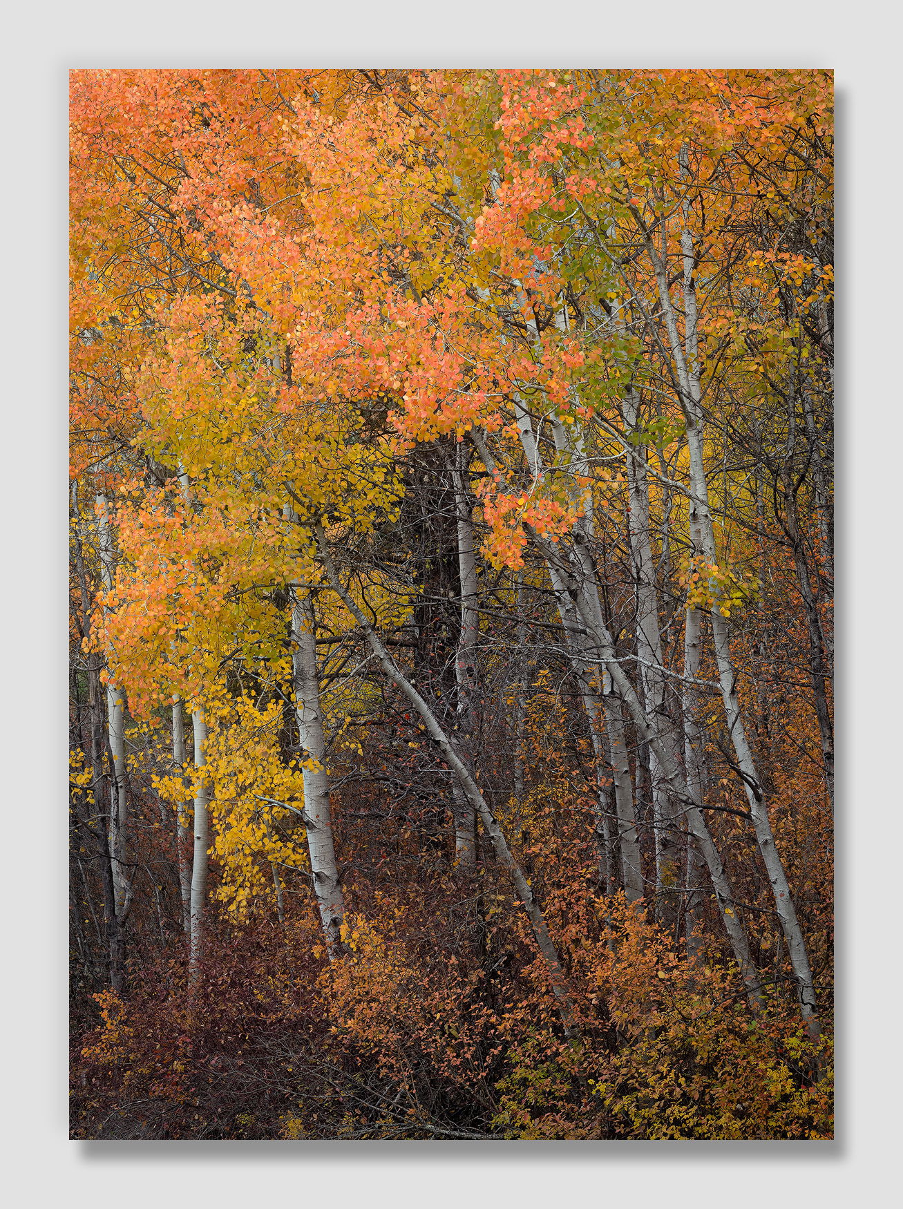
Aspen are not common in the areas I normally prowl for fall color, but there are a few small groves I’ve encountered on the eastern edges of the Cascades.
This little section is easy to miss as you drive by if you aren’t paying attention. When James and I drove by here on our way to a viewpoint to try to catch sunrise last week, I wanted to point it out to see if we thought it would be worth coming back to. Focused as I was looking for aspen, I almost hit a couple of deer crossing the road. Fortunately James saw them and gave a shout in time for me to avoid them. (It was hunting season, and these weren’t the only deer we had to watch out for.)
With that excitement we totally missed seeing the aspen patch, but did backtrack once the sun was up since it was a short distance from where we were photographing the oak. I tried to get some interesting angles/perspectives using a drone, but I’m a newbie there and wasn’t as happy as I was with this view I took from the side of the road.
Specific Feedback
By the time we returned to these trees, the sky was quite bright so I’ve composed/cropped that out. Do you think what remains is still strong enough to appeal?
These guys were quite orange. I’ve tried to be careful with the saturation to keep them from looking garish, but would love your thoughts on that as well.
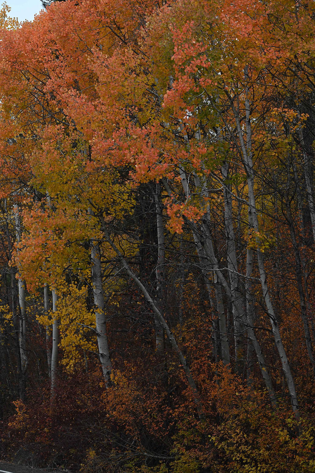
I’ll post the sidecar jpg image below to show what the camera thought about the scene.
Technical Details
NIKON Z 7II
NIKKOR Z 24-200 f/4-6.3 VR at 88 mm
1/40 sec. at f/11.0 and ISO 64
2 images stacked for depth-of-field using Helicon Focus
Critique Template
Use of the template is optional, but it can help spark ideas.
Vision and Purpose:
Conceptual:
Emotional Impact and Mood:
Composition:
Balance and Visual Weight:
Depth and Dimension:
Color:
Lighting:
Processing:
Technical:
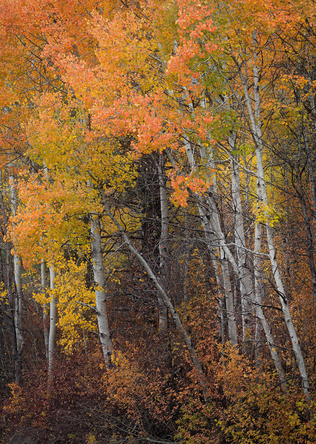
John, the colors in the Aspens look good to me. In Montana, the aspens range from a bright yellow to a strong orange. It looks like you got some of both here. I like how the trunks angle slightly up from the lower right. That adds an extra bit of eye movement. Keeping the colors along the bottom dark also fits well with the angled upward eye movement. As food for though, have you tried mid-tone dodging of the trunks in the right side?
Another wonderful fall scene, and your vision is much better than what the camera thought. I like @Mark_Seaver’s idea about dodging the trunks on the right. Here is a quick and dirty dodge through a midtones-2 mask.
I like this image as well, although perhaps not as much as the oaks. One thing noticed is that the eye is swept off in the upper left corner due to its brightness and saturation. I thought darkening it might be a good idea to steer the viewer more into the center. See what you think.
Living in Utah, I see autumn aspens every year and can vouch for the varied color and saturation of their leaves. The color in your image looks natural to me. I don’t think I would have thought about dodging the trunks on the right but I’m glad Youssef did as I do think it makes a positive impact, as does Igor’s suggestion to slightly darken the ULC. This is a wonderful image, John.
Hi John,
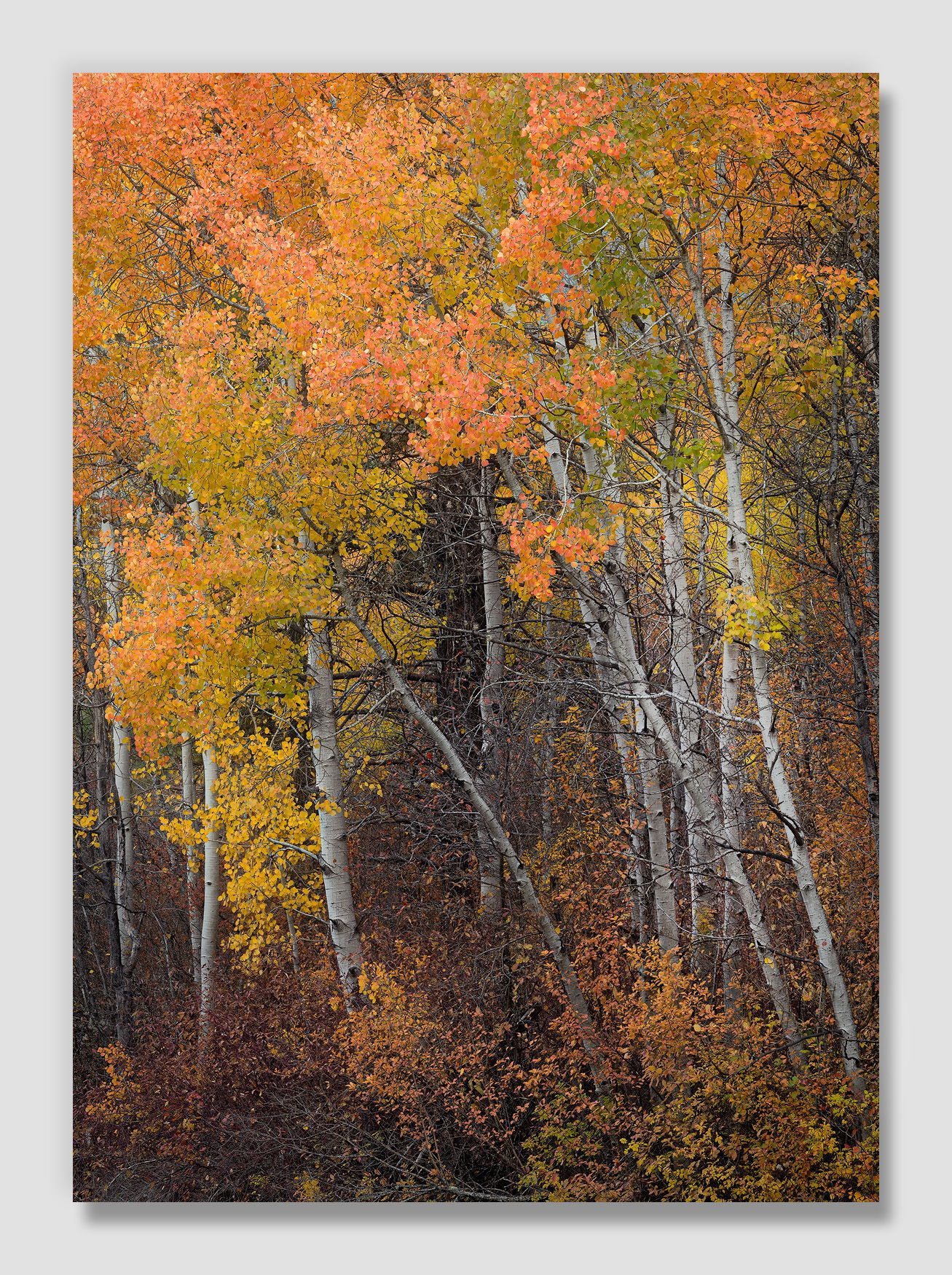
Your tweak with the slight brightening of the aspen trunks is the winner for me and your crop from the original RAW file looks good as well. For my own personal tastes there is definitely enough left that I find appealing. The orange leaves of the aspen also look great IMO. I am also enjoying all of the details that the 24-200 produced in the large version. It is a great lens and I enjoy mine as well. This looks like another winner to me.
Better late than never as they say but I had to let you know how much I love this image. The colors are right at peak with a few leaves beyond peak in the bottom of the image and a few green/lime leaves in the upper right section providing a full spectrum of Fall foliage. I do like my aspen images to have more of a white trunk to them and so the revision is ideal. But what makes this an interesting image is the trunks that are “falling” off to the left a little bit creating some needed tension instead of having all the trunks be ramrod straight. I also think that the foreground shrubs that are much darker in color and tone are essential to pulling this image off.
Beautifully composed and processed, John!