The photographer is looking for generalized feedback about the aesthetic and technical qualities of their image.
Description
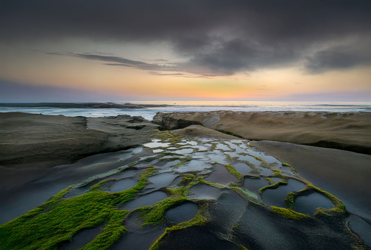
what inspired me was seeing michael shainblum’s youtube video at this location. i had lived in san diego for 15 years and didn’t know about this spot. i was trying to tell the story of this vibrant, beautiful spot transitioning to night time.
Specific Feedback
I feel that the sunset part of the sky, the orange part, is not pronounced enough. I tried making a radial gradient, and increasing the vibrance, but it just looked garish. I am OK with the rest of the image. I would appreciate any advice.
Technical Details
canon rp, canon 24-105 L lens. shot at sunset at hospitals reef, la jolla, san diego county.
Critique Template
Use of the template is optional, but it can help spark ideas.
Vision and Purpose:
Conceptual:
Emotional Impact and Mood:
Composition:
Balance and Visual Weight:
Depth and Dimension:
Color:
Lighting:
Processing:
Technical:
Frank, this is a good one. It’s very well composed. I agree with Preston that the orange area is fine as is.
I took one of the spots Preston mentions to be a bird. In any event, it’s distracting and it doesn’t add anything to the shot, so you might consider deleting it.
This is very eye-catching, Frank. I don’t mind the subtlety in the sunset. To me, the foreground is the subject, and the sunset is simply contextual information. Really great location. On closer look, a surfer or perhaps a buoy is there by the horizon. I agree that it is distracting.
ML
Very eye-catching composition. The FG shapes and detail in the moss is wonderful. The triangle shape leads the eye into the BG colorful sky, which I think is perfect as is. It does not need to be electricly glowing to have impact. I also like the clouds in the sky to keep the attention contained. You did the location justice.
Fascinating and compelling image. It’s beautiful but at the some time mysterious in a way. I’m not sure that anything needs to be changed. We all know what we’re looking at but it seems to be more than that. Some of it may have to do with the symmetry of the image, the geometry of it, the perfection that geometry gives to composition. But that’s only the bottom half of it. As you look upwards the composition changes and becomes more dramatic. Actually it’s all pretty dramatic due to the lighting. It’s definitely an image that brings you back for a second look. I don’t think it needs a vignette. It has a natural one. But you could add it and give it even more drama.
The composition is quite compelling, with the receding pools and the cracks in the earth all converging. I could see a crop that minimized the empty space at the top, but on the other hand it really doesn’t distract from the image and would be fine to leave if you wanted this aspect ratio.