This was taken at sunrise at Cottonball salt flats in Death Valley just before the pandemic hit…February 2020. There are lots of images like this out there in the nature photography world, way better, but this was my first time in Death Valley, and my first time at this location to capture this kind of iconic image, so I was happy.
Complementary colors of the blue morning sky reflected in the sand and orange mountains based on “traditional” color theory.
Specific Feedback Requested
any
Technical Details
Is this a composite: No
16mm, f/11, 1/60 second, ISO 100.
I accentuated the orange and blue in Lightroom a little (it was a spectacular morning!), and with a gradient filter on the sand added contrast by increasing the whites and darkening the blacks a little.
Interestingly, at 1/60 second the original has the moon slightly distorted due to the earth’s movement! In Photoshop I worked on the Moon to remove as much distortion as I could.
Mark, the color contrast adds well to this peacefully inviting scene. The moon is a fine extra in the sky as it helps set the scale. The openness and textures in the flats look very good. The clouds are another good addition to the sky.
Real fine take on DV. I generally find moons that are quite small in images to be more of a distraction than an addition, which is the case for me here. But I am generally in the minority in that opinion. What a fine peaceful morning you captured.
Beautiful light. Interesting clouds. Wonderful textures and patterns. Where is Cottonball salt flats? I’ve never heard of it. I’m going back to DV in December and would like to check it out.
Hi Chris, Thanks. A friend took me there and I’m not exactly sure where it is. According to Google Maps it is north of Furnace Creek which matches my memory. You’ll have fun in DV, it is very beautiful.
Hi @Mark_Muller excellent shot! You did a fine job with the composition and site selection! I like how the horizon is level and on the top third portion of the image. It gives plenty of room for the cotton ball formations in the foreground and the right about of sky in the top third. You also did a great job of capturing the decisive moment with the sun hitting the mountains in the distance.
I’m going to nitpick the image, because there aren’t any major flaws in it. This is more of the last 5% of effort going into an image that produces a 20% greater impact kinda critique. I will divide it into composition and post-processing.
For composition, you nailed it. The only thing I would suggest is trying to get the lines of the salt formation right into the corners of the image. And I mean precisely! This takes some work because at 16mm any tiny adjustment changes the composition a lot. Just a small shift of your camera to the left will shift the image to the right and get them even.
The same with the clouds, just a tiny shift to the left or right to get those leading lines in the corners without losing the bottom lines out of their corners.
With that small change you’d see a huge difference in balance.
That’s it! Just those tiny movements in POV.
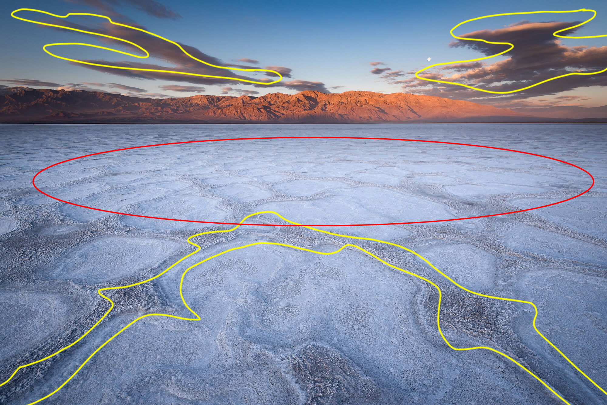
For post processing, there is a small circle in the mid scene of brighter mid ground than foreground. This slight difference is causing my eye to just skip past the very interesting and well selected shape to this brighter region (as indicated with the red circle in the marked up image). Darken this slightly so that the entire foreground is the same luminosity.
Then, my secret trick is, use a graduated filter in LR highlighting only the bottom third of the image and bump the Clarity slider up slightly so that the foreground is the sharpest part of the image. That will draw the viewer’s eye there for a few seconds longer before their eye wants to explore the rest of the image.
Like I said, these are nitpicky things but in my opinion they really top off an already excellent. image.
@Michael_Torkildsen , Wow! Thanks very much for this compositional review. It is really helpful, and I can see how just a small shift to the left would better balance the clouds, keeping in mind the bottom corners where the lines start.
Question: The small circle to darken would be the area indicated in red, right? I think part of the reason it appears brighter is that I applied a vignette to the image, so the middle ended up brighter. But I hadn’t thought that it would “trap” your eye due to its relative brightness, so this observation is super helpful.
Thanks very much for taking the time, and especially to diagram what you are talking about.
I thought it might be from a vignette! Typically our subject is in the center so 95% of the time it works perfectly. In this one case we still want to draw the viewer’s eye away from the edges but this time it also creates a negative byproduct that we can easily fix!