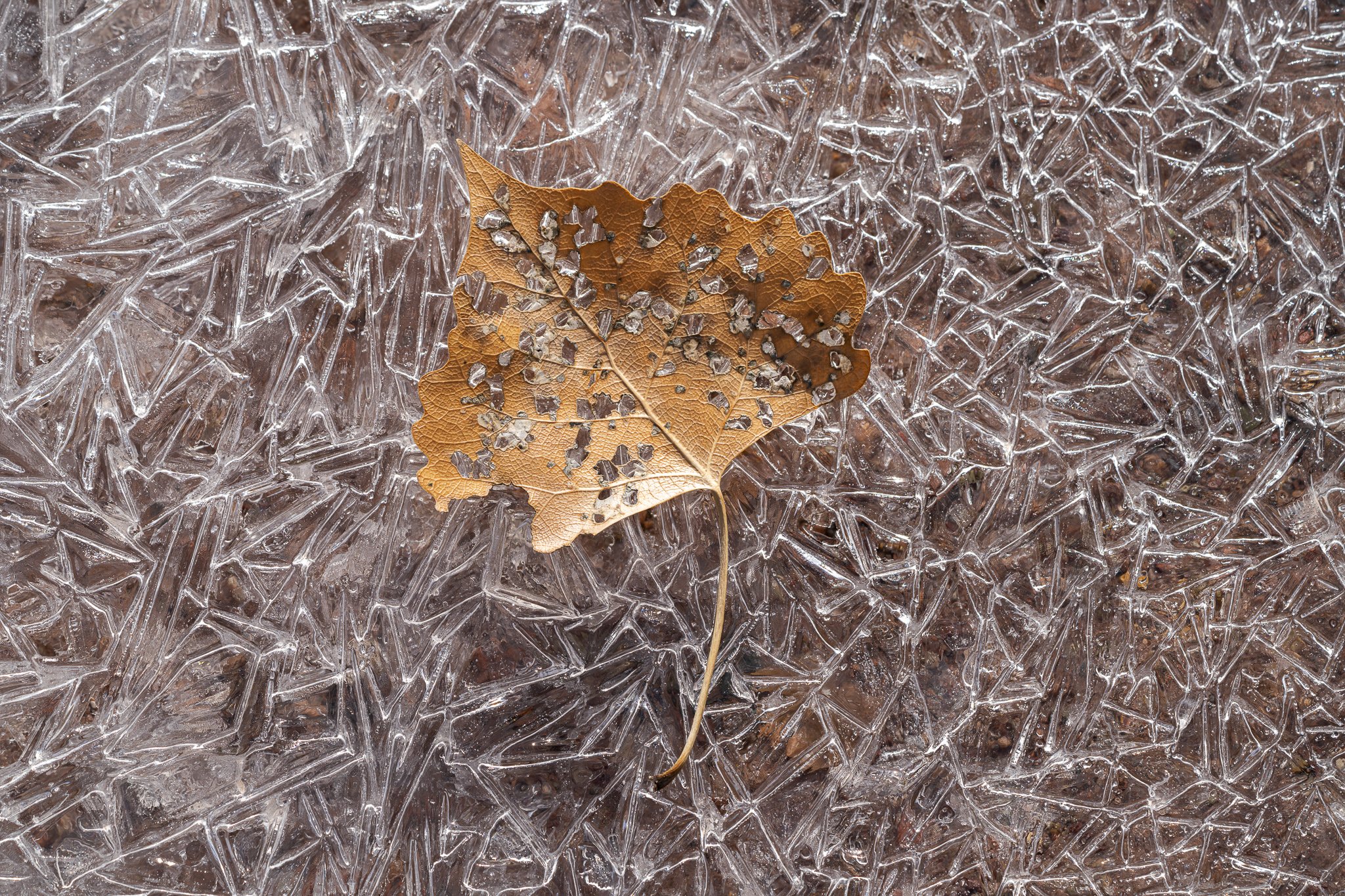
I recently hiked 16 miles for a project I’m working on for Visit Colorado and on that hike I found myself hiking along a frozen stream in the western Colorado desert near Grand Junction. I was pleasantly surprised by this since I was not expecting it, and I had a blast photographing leaves and ice patterns.
Specific Feedback Requested:
I was wondering if people felt this would be better in b/w since the color contrast isn’t very impressive.
I like how you captured the leaf with the curve of the stem following the icy patterns. I think the color works well here because the icy area is almost monochromatic and the color of the leaf brings out the contrast very well. If I were to change anything if might be the highlight on the lower left of the leaf. Well done
Matt, I almost always prefer color to b&w, but that’s me… In this case, I’m loving the crystal patterns in the ice and think that the warm tones both in the leaf and through the ice contrast very well with the chilliness of the ice. I would try burning-in the brightest tones (and maybe the darkest tones) in the upper left so there’s more similarity in contrast and brightness through out the ice. Seeing ice through the holes in the leaf is good fun.
Matt, the clarity in this photograph is striking. I just love the pattern of those ice crystals. I’m not sure there’s enough contrast for a bw conversion. As @Dean_Salman said, I like the pseudo monochromatic look of this as is. No nits from me.
What a wonderful surprise, Matt. I love all of the textures and patterns going on here. I did a quick b/w version and much prefer the color version you have posted here. The color version did not provide enough information for a striking b/w image, at least for me. Did you get more of ice/leave images? Will we be seeing some soon? Love to!
Wow Matt, this image sparkles. How wonderful!! I know very little about abstracts, but I found a leaf buried in some wonderful ice patterns not long ago and I probably spent an hour having fun finding other patterns in the ice. It’s very additive and I decided that I may want to focus more on abstract type of images. I posted one of my ice images and it turned out my processing was way to flat for an abstract. I had lots of help fixing the problem. Sarah Marino mentioned to me in the post that the color in abstracts should be uniform so the difference in color doesn’t draw the eye away from the subject and @Mark_Seaver also mentioned that in his critique. Like others, I think I would like the color image over the B&W. I’m not sure the sparkle would show as much in B&W. It would be interesting to try. If you do, post it so we can take a look at it too. Very nice photo.
Very cool! The texture contrasted with the leaf stopped me in my tracks (so to speak). The texture of the ice peeping out through the holes in the leaf is a nice touch.
I really like the idea of color, here, with maybe a tweak on the ice. I know you aren’t that into major adjustments, but tf the ice were cooled down a bit, there would be more contrast with the leaf. Here’s my thought (in ACR, selected ice background, cooled temperature):
Another vote for color here. To my eye there is (in Bonnie’s adjustment) a pleasing contrast between the 2 main colors of stream bed and leaf, so I’d like that preserved. Seeing the ice through the holes gives the illusion of the leaf floating in the air above the ice, and that also might be lost in B and W. I love the contrast of textures here too.
The details of the leaf is striking and I really like the decay of the leaf. To me, that often become a more interesting image than if the leaf had been perfect. The patterns, texture and clarity of the ice are just amazing as a backdrop for the leaf, but as you point out it would have been good with some color separation. I guess that that is possible to achieve if you are OK with to departure from reality. Since the pattern of the ice is a very important part of the image and is of equal quality everywhere I like that you have an even light in all parts of the frame, and not have added any vignette.
Regarding your question, I think I prefer to try to increase the color separation instead of turning the image to a B&W one.
I took this one into photoshop to see how it’d look in black and white - it just didn’t quite work for me. I think the highlights and shadows just aren’t accentuating the right parts of the frame for it to work. Before I read any of the comments here, I did start fiddling with white balance. I probably went too far here, but cooling it down and adding some magenta looked better to me. I added a very slight vignette and midtone contrast as well. Just food for thought, I’m sure you can do it more tastefully than this.