Edit:
Edit:
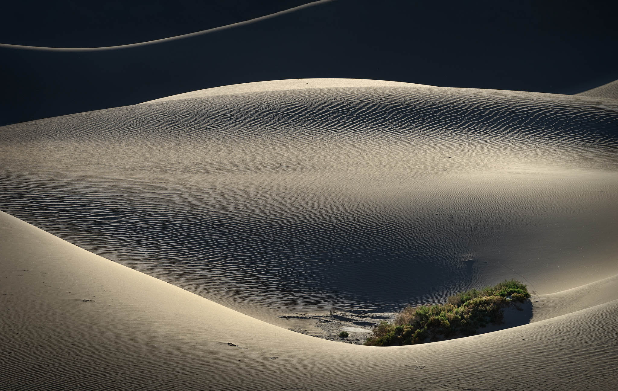
The consensus seems to be that the background dune edge is a distraction. I really wanted to keep it in, but I have to agree that this is better without it. I edited to brighten and warm the bushes, and cool the shadows. Also upped the vignette a bit.
What technical feedback would you like if any? What artistic feedback would you like if any?
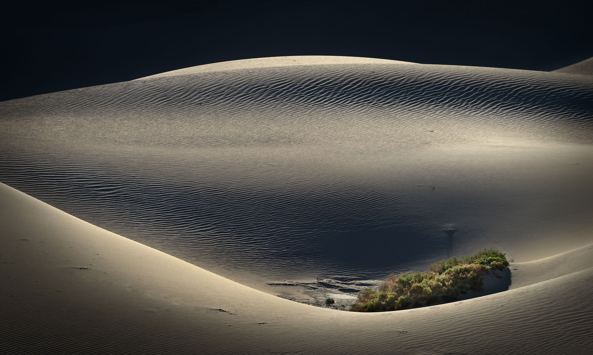
Is that rim-lit dune in the ULC a distraction? This feels sort of boring without it, but maybe it doesn’t work. I felt like the ULC line mimicked the curve of the dune “holding” the bushes, so it held together.
Pertinent technical details or techniques:
(If this is a composite, etc. please be honest with your techniques to help others learn)
Single frame, a7, f/16, 160mm, 1/200s, ISO 400.
1 Like
Hi @Bonnie_Lampley
Very interesting find, and very gorgeous image. The fluid lines of the dunes are stunning. The ULC for me its a bit distracting, i see your point, it really mimics and fits the lower line, but my eyes tend to go there much more than to those greens. I would maybe add a bit more of saturation and create a vignetting effect to make a path to that main area.
Its a stunning desert image, and thank you for sharing,
Cheers
Beautiful light and real nice dune scene. But I do find the lit rim distracting. Like Joao, I find it pulls my eye and holds it there.
Hi Bonnie, what beautiful study of the dunes. I like processing, the contrast creates a lot of impact, and I’m glad that you resisted warming this up too much, good call on the WB. Here’s another vote for cloning the ULC, less is more in this case for me. Really nice work on this image. 
Bonnie,
Not much to add, but I really love the oasis like look of this scene! Really nicely seen, and I also would vote to clone out the ULC.
I kind of agree about the ULC corner because it makes the main point of interests on opposite corners. But that white line adds so much you kind of hate to lose it. It gives it an alien-outer space- space odyssey 2001 look to the image which gives the image an entirely different quality. Is there a way of increasing the image vertically and extending the white line to the right? I’ve tried but don’t have the skill for it.
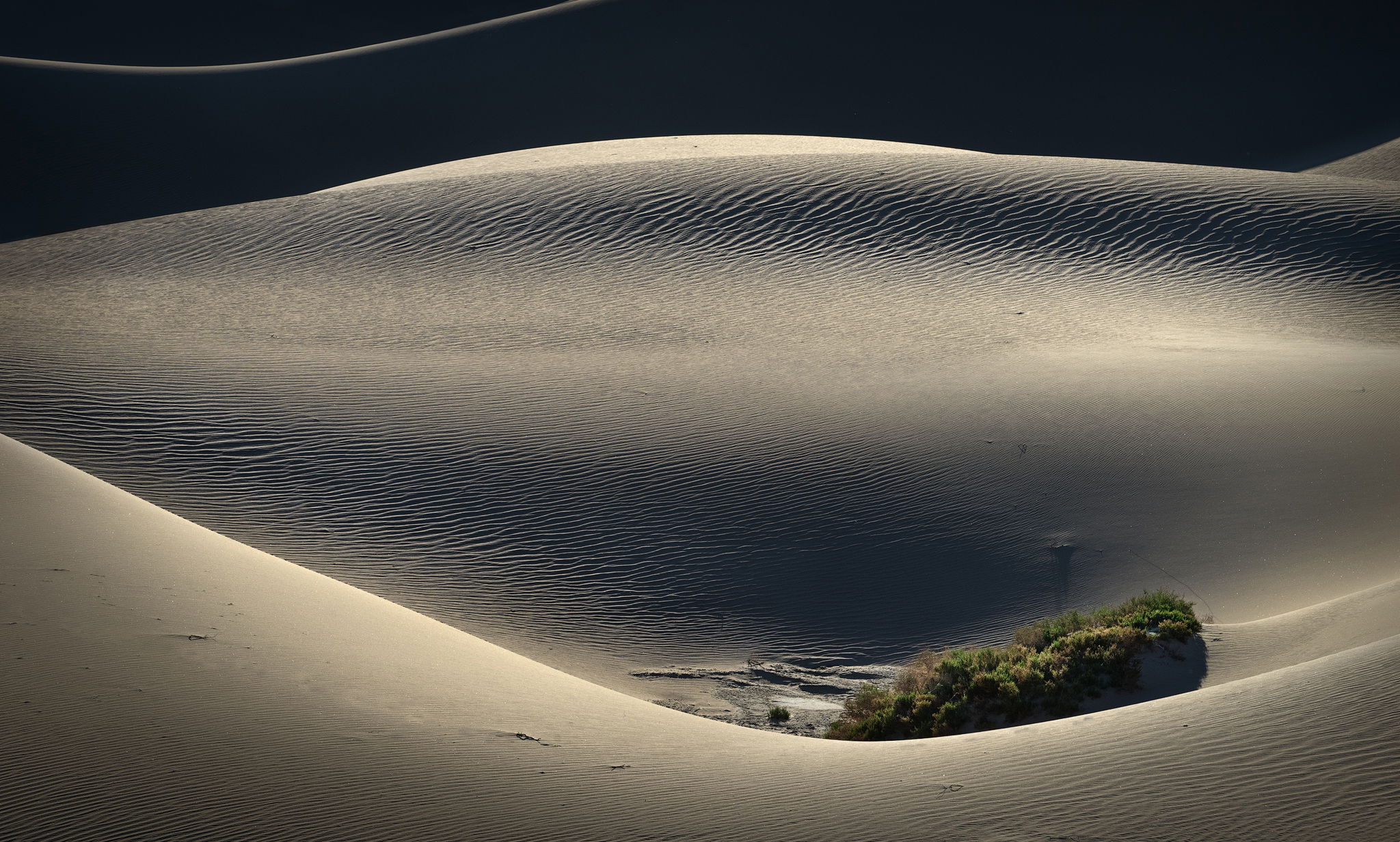
Do you mean like this? Add Canvas 5%, then run Content Aware Fill, and Photoshop CAF was even smart enough to move the line on its own.
Thanks, Ed. Hmmm… I don’t know. As noted by all, that line pretty much dominates. It’s better but something’s still not right. There’s a lack of association between the two.
Thank you, @João_Ferrão, @Harley_Goldman, @Ed_McGuirk, @Alan_Kreyger, and @Igor_Doncov for your input. I tried all of your suggestions, and finally resigned myself to cloning out the background dune edge.  Reposted above. Thanks for taking the time to comment.